DigitalCraft Wiki:Facebook book
Contents
Starting Point
My starting point is a project from quarter nine: Future Memories. This project, given by Jon, was about creating a medium, design or technology to mediate either visual, echoic of haptic memories. One of the realisations I got during this project was that a lot of my memories are collected on Facebook. Confronting, but true. Some of them are actually very meaningful to me. Most of the memories are captured in pictures but also places where I've been, events where I went to and messages that I received are examples that I would like to keep with me. Would it be possible to take the content of Facebook offline and translate it to a more memorable way. This is what formed my research question:
In what way is it possible to take valuable content offline from Facebook, and translate it into a long lasting memorable way?
Design Research #1
I started of with looking at the 'printing out facebook' market. There must be people who already have done it before me. And indeed. There were several companies who also saw the trend coming and reacted on it. Blurb for example, one of the better known 'making book sites', gives the option to load all your Facebook pictures into a book, including the reactions that friends placed underneath the picture. Blurb made this also possible for other social media like Flickr and Blogger. EgoBook is another example, which is created from your status updates, posted and tagged photos, wall posts, links & comments as well as content from friends you select. It is a very personalized book and a clear layout with the recognizable Facebook style. And of course, a lot of online companies but also stores like HEMA are giving the option to print out the pictures you placed on social media like Facebook or Instagram. But only the pictures is not what I am looking for. I find the challenge in designing a way where the online life comes offline in it's complete way: including time - date - location - who - what - why. More in the direction of an old-school journal, but the with the speed of collecting like the online social media.
An example of who comes closer to the idea that I have in my head is YearlyLeaf. They call themselves an experiment in social permanence. They translate your Facebook updates, posts and check-ins into a timeless book: a black notebook like Moleskine. The one that is famous for being used by artists and philosophers like Oscar Wilde, Picasso, and all of us studying at the Willem de Kooning. A timeless appeal, precious and valuable. An website which I found: artifact uprising, has in my eyes the perfect example of what a photobook nowadays should look like. It would be ideal if this could be combined with the content of Facebook. A clean modern design, well organized, with all the precious content Facebook collects for us with only minimal energy from our side.
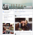
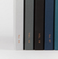
photo #1: YearlyLeaf -- photo #2: YearlyLeaf -- photo #3: Artifact Uprising -- photo #4: Book of Fame
Design Research #2
During my research looking at what other people and companies already did with 'printing out facebook', I also found a lot of useful information about our behaviour according to social media.
From a research from 4 years ago done by Yearbound.net:
Facebook has 750 million users
350 million people login everyday
Each person averages 90 pieces of content per month
30 billion pieces of content are uploaded each month
Each person averages 55 minutes per day on Facebook
An average user writes 25 comments each month
Hundreds of millions of interactions happen each day on Facebook
Most people want to capture and keep these memories
PITCH
After two weeks of research it was time to pitch our idea to the class and teachers. During this pitch we had to show where we are in our research and explain the urgent and relevancy of our project. The research I presented during the pitch is what you can read on this wiki at 'Research #1' and 'Reseach #2'. The relevancy summarized sounds like this:
It is urgent because in my surrounding that people share a lot of things on Facebook, they attend to events, get tagged in photos and like things that they are interested by. An easy and fast way of making a collection of memories. At the same time, I hear people say that they maybe want to quit their Facebook life because of the overload of information of the lives of others which is tiring. Eventually they won't quit because of the memories that will get lost by then. By taking your Facebook life offline and collect & capture it into a real book your memories will be everlasting and it will feel more valuable because it is really touchable.
Ideas and questions I asked myself during the pitch:
Curious about the security rules of Facebook and how much is able to take offline.
Printer which can print your Facebook timeline.
Print program which can 'read' your Facebook page and translate the information into a designed format.
Everything included? Of possible what content will be printed?
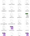
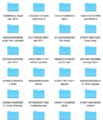
Something which I already started with was downloading my personal information from Facebook. This is possible for everyone. It is just one simple click and then you get all your content e-mailed to you. From all the pictures to chats you had, from events where you have been to till music you listened to. A wide variety of information in HTML form. That is why I decided that my first step should be to translate HTML information to printable content which can be designed. Shortly summarized: translate web to print.
photo #1: HTML files -- photo #2: Photo folders -- photo #3: HTML index
First Sketches
Right after the pitch I started sketching lay out ideas on paper. With those ideas I went to Andreas (very technical and data intelligent man) at the Publication Station to discuss and find out what is possible to translate web to print. Because I already sketched some of my ideas it was easier to communicate and show him what I had in mind.
photo #1: Sketches
He told me very clear that the options were limited. An example is that your workspace online is as big as you want. Your 'artboard' is infinite, while on paper you are limited to a size like A4 or A3. Therefore you have to design a template on a paper and printable size, so you can import the data from the web into it. And if you want to experiment with that, you have to start at the very beginning: which is getting HTML offline and into ICML which you can import in Indesign. When imported in Indesign you can style it the way you want.
photo #1: Explanation Andreas -- photo #2: Pandoc -- photo #3: Imported ICML in InDesign
Next Steps
After I learned how to get information from the web able to design and print, I came to the point to think about the design. What form will it get? In my head the picture of a Facebook timeline came back all the time. I thought of all the functions that Facebook has and wanted to be my analog version the exact same. While hammering on that I couldn't figure out HOW? This resulted in less motivation and inspiration.
When talking to Gabrielle we actually together made the decision to let the functions of Facebook behind, and start with the material, in my case: PAPER. When doing this and work on my project from another perspective it might give the insight that I need.
Tip or artist to look at: http://datenform.de/
But somehow I got a little stuck when I had the paper in my hand. I literally looked at it and thought: what to do with it? I can fold it, yes, but what then? I can cut it, yes, but how will that collect memories? Where does the image go? Then I tried to design a new form of communication, only using form, colour and typography. Give the forms meaning, like a square is a location and a circle a person. The color of the square shows what location and the color of the circle which person. Typografie could ad the time, date and place.
photo #1: forms -- photo #2: color dots as persons -- photo #3: merge
While designing I missed the picture. The picture says everything! Why would I try it so hard with other forms if actually AN IMAGE says everything! Time to bring the image back in my project. Which just the location and time/date functions like online social media. Leave all the tagging, reactions, conversations behind. They are not adding anything, they are only making it too complicated.
The Image Is Back
I got inspired by a video from Lernert & Sander. They made episodes about procrastination, and in one of them there is a printer going on and on and on and on.
When I saw this video I got the most perfect idea for this project ever! What if it would really work what I saw in the video: a printer that can print a loop of paper. Then that would be the perfect visualisation of a timeline with memories, especially when it would go over itself again because when memories get older, they fade. So, I bought a printer, and tried it at home...
P A P E R J A M
Unfortunately, it was not possible. The printer gives a paper jam because it is used to 'eject' the piece of paper when finished printing. Too bad, because I was enthusiastic all over about the idea that it would work. I thought about printers that could print 'forever' without ejecting paper. Like a receipt printer. I found this inspiring image:
But a receipt printer is not able to print images. So I decided to stick to this printer, the printer I have right now, and see what the options are. And fantasise and visualise the things that are not really possible right now in this short time of period, but may be possible afterwards.
The Right Direction
So, it is about the image. And about printing it out. What are the options?
I found a way of printing images over each other. Not by putting the pictures over each other in InDesign of Photoshop, but by printing them, taking the paper back, and print again on the same paper. The images merge very nice and because one image together. Wonderful! Thinking about the amount of images you put on social media, it is a lot! This gives the change to make is smaller again, and still see everything. It makes it compact. But it keeps everything. See here how it works, you start with one picture, and layers the other on top of it. And so on.
Presentation
Tuesday the 19th it was presentation day. I choose to lay all of my proces out on the table. I printed everything so it was easy to grab something if I needed it during my presentation. My proces documentation was hanging on the wall, since this was a poster. The printer was at the table and you could see blank paper going in, and the photo timeline coming out. What I added to the pictures were the codes for location/places and the date.
FEEDBACK
- it could be advancer. there are smaller printers who can do the same.
- why is the printer standing on the table, if you imagined/designed it hanging on the wall?
- shouldn't the code be universal?
