Difference between revisions of "3Dmusic UI design"
Lucashartman (talk | contribs) |
Lucashartman (talk | contribs) |
||
| Line 61: | Line 61: | ||
| − | |||
| − | + | [[File:3Dmusic_UI_design_image08.png | 800px]] | |
| − | |||
| − | |||
| − | |||
| − | |||
| − | |||
| − | |||
| − | |||
| − | [[File:3Dmusic_UI_design_image08.png | | ||
CYMATIC sound wave from a violin | CYMATIC sound wave from a violin | ||
| Line 79: | Line 70: | ||
[https://www.youtube.com/watch?v=05Io6lop3mk Cymatics - Bringing Matter To Life With Sound] | [https://www.youtube.com/watch?v=05Io6lop3mk Cymatics - Bringing Matter To Life With Sound] | ||
| − | |||
| − | |||
| − | |||
| − | |||
| − | |||
====Tool: Cymatic inspired UI==== | ====Tool: Cymatic inspired UI==== | ||
Revision as of 17:31, 14 November 2015
Tools & Trade: 3Dmusic UI Design |

Introduction: assignment
A new 'tool/medium' medium (Bespoke/DIY production technology, critical or speculative artefact. The tool focuses on the design aspect. How can design be used for a tool? What is the experience like, what is the purpose of it?
Animation
In my studies at the department over animation, we are allows creating moving images. We use form, colour, contrast, compassion and motion, as are visual language for tell a story. But there is one aspect of animation creators ignore, “sound”. Sound is a essential part of the medium, it can invoke all kinds of reactions, like atmosphere, suspense, a emotional reaction and so fort. It’s 50% of the animation. There are also a lot of similarities between moving images and sound: - It can evoke a emotional reaction - Both can tell a story - Pattern: repeating certain elements create a pattern - Rhythm: defines the peas of the story - Both mediums can define a certain time & place - Both mediums can show something very real or abstract So why are most animators not familiar with sound design?

Animation: the study of movement and rhythm
The Problem: UI design
There’s a distinct different between the programs. Sound programs look very chaotic with all kinds of different UI designs. Often this effect and plugins are based on fiscal devices. These devices were used before digital sound design programs and so it can be very confusing for the user to use. Programs for designing visuals are userfriendly because they use icon design to specify certain actions. They use a visual language that users can understand more easily.

So why not use a better visual language for sound design programs? That’s because sound is very hard to visualise. My first thought was: ‘why not make my own visual language for sound design.’
So I started a quick research, looking for projects that did something similar thinks.
Similar project
A demo of an interactive piece of "Visual Sound: Project Visual Sound Wave Builder (Max/MSP/Jitter): Project Sound Art Installation Mark Cosgravehttps: Project

A demo of an interactive piece of "Visual Sound
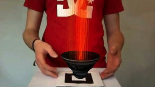
After a while I found a video about “Cymatic”. With the use of vibration on a flat serves covert with sand. The vibration makes the sand move in a certain pattern.
Cymatics, is a subset of modal vibrational phenomena. The term was coined by Hans Jenny (1904-1972), a Swiss follower of the philosophical school known as anthroposophy. Typically the surface of a plate, diaphragm or membrane is vibrated, and regions of maximum and minimum displacement are made visible in a thin coating of particles, paste or liquid. Different patterns emerge in the excitatory medium depending on the geometry of the plate and the driving frequency.

CYMATIC sound wave from a violin
Cymatic Music Visualizer - Animated Software
Cymatics - Bringing Matter To Life With Sound
Tool: Cymatic inspired UI
Is a tool that lets you where a VR head, placing you in an environment. Here you can manipulate vibrating particles moving in a Cymatic structure. The Cymatic structure creates a sound. By changing the structure the sound will change with it. You can save these structures and mesh them up in to a melody. The function of the tool is to create sound by the use of visual effects. The goal is to show that design can changes the way we create sound in a visual way.
Inspiration

Inspiration: Cymatic

Inspiration: Particle UI Design

Inspiration: Visual Sound Design

Inspiration: Trons Fictional UI Design
Tool explanation: How will it function
The user will be put in a virtual environment with a user interface to control particle vibrating in in a Cymatic formation. By looking at the particle you can select them and change their behaviour and sound. For example you can lower their volume, pitch, delay or starch the sound, eco and even multiply the particles. When you finish you can save your visual sound structure and make more. When you have enough sounds you can create a melody or a beat by mashing up the visuals together.
Every thing will be built in unreal, an engine that supports programming virtual environments for all kinds of applications. The hardware contains a VR gear, Kinnect and a computer
Why use VR?
I believe VR brings new opportunistic for reinventing UI design. Going from a 2d interface to 3D interface brings new functionalities to the UI. Like working around the UI, or use head movement for navigation. It’s an opportunity to create new design language for UI functionality.

VR UI Design example
Research & studies: UI design, Cymatic & programming For this project ill will research Cymatics & 3D UI design. Building the tool, I’ll need to learn Programming with Blueprint and using the Ocular VR and the Kinnect motion sensor.

Unreal Engine: building and programming interactive spaces
Source: Oculus Rift DK2 - Unreal Engine 4
Source: Programing sound notes in Unreal Engine 4

[Source: www.youtube.com/watch?v=8jXojr7zeR8 Motion capture camera with the unreal Unreal Engine]
Book: abstracting craft, the practiced digital hand "marcom mccullough" The book offers a detailed analysis of the technical and psychological aspects of digital interfaces. In three sections, McCullough deals first with physiological and cognitive issues (hands, eyes, tools), moves on to representational and technological questions (symbols, interfaces, constructions) and ends with aspects of the practical usage of computers (medium, play, practice). The professed aim of the study is to re-root digital work in physical human agency and to develop a critical understanding of the ways in which the computer as a medium requires a new set of creative skills, especially regarding the handling of complex symbolic abstractions and the ability to construct mental models of objects and processes.
Source: [books.google.nl/books?id=PcwH1WricJEC&printsec=frontcover&hl=nl#v=onepage&q&f=false abstracting craft, the practiced digital hand "marcom mccullough"]

immersive design learning to let go of the screen
Approach: Projects Process
1. Start with Research on the subjects mention in “Research & studies.” 2. Design UI, functions and usability 3. Build the design in Unreal and program it with Blueprint 4. Alpha test 5. Fix the bugs and, work out the details 6. Beta test 7. Tweak bugs 8. Build an installation for the presentation 9. Document: screen recorders, screenshots, test demos, interviewing peoples reaction 10. Right 4000-word assay 11. Deadline
Result: Tool
The end result is a VR installation meant for making sounds by the use of a visuals UI design, a 4000-word assay and documentation video.
Is a tool that lets you where a VR head, placing you in an environment. Here you can manipulate vibrating particles moving in a Cymatic structure. The Cymatic structure creates a sound. By changing the structure the sound will change with it. You can save these structures and mesh them up in to a melody. The function of the tool is to create sound by the use of visual effects. The goal is to show that design can changes the way we create sound in a visual way.
Design usability (for VR)
These are my key takeaways from experimenting with VR at Instrument:
THINK LIKE HUMAN
We’ve moved from open grasslands where we could see danger or reward…to urban spaces where we rely on signs to inform ultimately to computers where we rely on GUI to communicate.
Each of these can be seen as an interaction model in its own right:
The Savannah
The oldest of interaction models. We can see everything, we are grounded. Content obeys the space. Objects in the present are close at hand. The future is on the horizon before us, the past is behind.
The Shop
Like the savannah, the shop implies a space that you can move around in but with a higher level of density. Content can be locked to the walls or planes inside of a space.
The Abstract
The last 40 years have seen the rise of the digital landscape; a two dimensional plane that abstracts familiar real-world concepts like writing, using a calendar, storing documents in folders into user interface elements (UI). This approach allows for a high level of information density and multitasking. The down-side is that new interaction models need to be learned and there is a higher cognitive load to decision making.
Use perspective to your advantage Designers use size, contrast and color to denote hierarchy. These tools are still available in VR, but they are a little different. Size is based on the distance between the user and a piece of content.
Designers now have a full field of vision to play with, and humans are used to turning their heads or whole bodies.
Despite this, designers are trying to force 2D solutions into a 3D space, just like the Virtual Boy.
1 Flat: A common solution
The interface is skinned for the 3D space. It’s difficult to read text or images in perspective. There is no sense of grounding in the space. It’s a wall.
2 Curved: Marginally better
The content is curved around the user, so the tiles always face the user — making it much easier to read text or images.
3 Less content: Better
Less content is better, even if that requires some way to move through it.
4 Surrounded: Best
Hierarchy can be implied by nearness to the cone of focus. Secondary content can be pushed out of immediate view but still remain accessible.
Virtual Reality is immersive; design should support and enhance the user’s sense of presence in the virtual environment.
- Avoid rapid movement, it makes people sick.
- If there is a horizon line, keep it steady. A rolling horizon in VR is like a rolling horizon when you’re on a ship — not good.
- Avoid rapid or abrupt transitions to the world space, they are very disorientating.
- Do not require the user to move their head or body too much. Not only is this disorienting, but the user may be wearing their headset in an environment that they cannot turn around in, like on a plane.
- Be careful about mixing 2D GUI and 3D, the change can be jarring.
- Keep the density of information and objects on the screen low, much lower than in standard screen design. Not everything has to be in view. - Use real-world cues when appropriate.
- Bright scenes are fatiguing. (vermoeiend)
- When in doubt; test, test, test.
UI Design for VR (so far)

Action Sheet

StyleSheets
Inspiration Color Sheet

Inspiration Visuals

Color Pallet


