User:Anna.saaltink
Tools of the trade
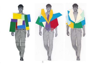
I am by nature an optimistic and enthusiastic person. I love children and the way they experience/see the world. Fashion should be and stay something fun for me. In this world there are happening so many bad things I think fashion should be not too heavily loaded, fun, happy and with a big smile.
Tools of the trade I would like to use as a pre-study for my children wear graduation collection. The theme I want to work with is children clothes combined with new technologies.
- GPS systems inside that if you lose your child you can find them back.
- garments that protect children from getting injured like airbag in clothes, or a material in the garments that is strong like what is inside helmets or protection what you use for skating?
Parents spend a lot on money on clothes for there children even though they grow so fast they will not fit in them anymore after a couple of weeks. Buying and producing all these clothes is not sustainable and with the raw materials in shortage? Also the way it is produced, child labor for children clothes? Yes off course children grow but there can be a better solution? Maybe I could be possible to make garments that grow with you, like you have with some furniture. Or make clothes more multifunctional? Or that you can add pieces at garments like a extended puzzle.
While thinking about children's wear I thought about all the safety rules for producing children's clothes. You have some restrictions for designing children's clothes. I wanted to know these restrictions and what will be the border?
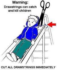
I did research about these safety rules and it is hard to find because they are protected. As a company you have to buy it. They are safety rules for the children wear in the EU. I read quite a lot about it but not the concrete rules. I read it is mostly about the drawstrings in the clothes. This is the information I found about it and the preview what will be in the document you have to buy from this page and you can see a preview:
http://www.nen.nl/NEN-Shop/Norm/NENEN-146822007-en.htm
♦ ischemic injuries (afknellen)
♦ entrapment of the penis in zips
♦ injuries from sharp objects
♦ choking, aspiration, swallowing and suffocation (denk ook aan loslatende prints!)
♦ strangulation, entrapment (zoals door te lange koordjes)
♦ restriction of vision and hearing
♦ overheating
♦ slipping, tripping and falling (denk ook aan koordjes waardoor je aan trappers of zadel kunt blijven hangen)
Drawstrings in de taille en capuchonkoordjes of een riem met gesp: wanneer mogen ze volgens de Europese norm nu wel of niet? Modint verwacht controles op de veiligheid van kinderkleding tijdens aankomende editie van Kleine Fabriek.
"Het is zeer waarschijnlijk dat er op de aankomende editie van Kleine Fabriek inspecties door de NVWA zullen plaatsvinden bij leveranciers. Handhaving van de norm is belangrijk", vindt Barberi. "Iemand die de regels aan 'n laars lapt, mag daarmee geen voorsprong op zijn concurrent nemen." "Per lichaamszone is zeer gedetailleerd vastgelegd wat wel en niet mag. Om kort te gaan is er in de hoofd- en halszone het minst toegestaan", vertelt Nienke Steen, consultant kwaliteitsmanagement bij Modint, tijdens de workshop Child Safety op 21 februari 2012 in de Brandbox te Almere.
Voor oudere kinderen zijn de regels minder streng dan voor jongere kinderen. Voor het kind tot 7 jaar (maat 134) mogen koordjes helemaal niet, terwijl verstellummels (adjusting tabs) en loshangende versiersels maximaal 75 mm lang mogen zijn. Voor oudere kinderen mag een trekkoord in de capuchon wel, mits de eindjes in een lus (korter dan 15 cm) zijn vastgezet. Ook halterkoordjes van een (bikini)top moeten vastzitten.
Voor de borst- en buikzone zijn de regels minder streng. Losse eindjes van een drawstring of sierkoord, mogen, mits niet langer dan 14 cm. Een riem of sierband van minimaal 30 mm breed kent meer vrijheden, hoewel deze niet langer dan 360 mm mogen loshangen vanaf de knoop- of het strikpunt. Voor kinderen onder 7 jaar mogen ze bovendien niet onder de zoom (van een topje) uitkomen.
In de zone vanaf het kruis zijn koordjes toegestaan, mits zij niet lager dan de jurk, jas-, rok- of broekzoom hangen. Koorden op enkelhoogte moeten compleet ingesloten zijn.
Aan de achterkant ten slotte, mogen geen functionele en versierende koorden uitkomen, of worden vastgemaakt. Een riempje is wel toegestaan. Ook aan de mouwen mag vrij weinig: losse eindjes van meer dan 75 mm zijn voor jonge kinderen al te veel. Boven 7 jaar is dat 140 mm.
De regels over koorden en treksluitingen in kinderkleding (te) vaak geschonden (NEN – EN 14682)
Producten die op de markt worden gebracht dienen veilig te zijn. Dat geldt ook voor kleding. Voor kinderkleding zijn er speciale regels over koorden en treksluitingen. Uit onderzoek is gebleken dat deze regels vaak niet worden nageleefd. In sommige Europese landen gaat het om 10 tot 20 % van de kleding. We krijgen regelmatig vragen over dit onderwerp. Reden om aandacht te besteden aan norm EN 14682.
Koorden en treksluitingen kunnen leiden tot verwondingen en de dood in het geval ze klem raken in zaken als speelplaatstoestellen, liften, automatische deuren, autoportieren of spaken van fietsen. In dat geval is er kans op verwurging. Elastische koorden met bijvoorbeeld driedimensionale versieringen kunnen verwondingen aan de ogen veroorzaken.
Een kind gaat van een glijbaan en een knoop aan het uiteinde van een trekkoord van een muts blijft steken in een kleine gleuf aan het begin van de glijbaan. Het koord trekt strak terwijl het kind de glijbaan afglijdt en wurgt het kind. Een kind stapt uit een bus waarbij een sluiting van een trekkoord om de middel van het kind tussen de deuren van de bus blijft steken. De bus rijdt weg en trekt het kind mee. In 2008-2010 is er een grootschalige actie geweest in Europa, waar meer dan 10 lidstaten aan meewerkten. Uit controles bleek dat ongeveer 1 op de 8 kledingstukken niet aan de eisen voldeed. Bijna 70% ging het om kleding voor kinderen onder de 7 jaar.
De Europese Richtlijn inzake algemene productveiligheid vereist dat producten die op de markt worden gebracht veilig moeten zijn. In aanvulling daarop zijn specifieke minimale eisen over koorden en treksluitingen veilig op kinderkleding. De Europese norm heeft ook de status gekregen van een Nederlandse nationale norm; Norm NEN-EN 14682:2007 (hier te bestellen bij het Nederlands Normalisatie-instituut).
NB: We kunnen de norm niet gratis voor u publiceren op Mode-recht.nl, omdat er auteursrechten op rusten, zo heeft de Hoge Raad onlangs beslist.
De normen geven eisen voor kleding van kinderen tot 14 jaar De normen zijn onderverdeeld in twee hoofdcategorieën: Kinderen tot 7 jaar, overeenstemmend met kinderen tot 134 cmlang; Kinderen van 7 tot 14 jaar, overeenstemmend met een hoogte groter dan 134 cm en tot en met 182 cm voor jongens en 176 cm voor meisjes. De normen bevatten onder meer de volgende regels: Geen koorden of treksluitingen toegestaan in de muts of in de buurt van de nek van kinderen tot 7 jaar oud; Geen koorden toegestaan langer dan140 cm in de borststreek of rond de taille.
Museum of fantastic forgeries
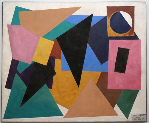
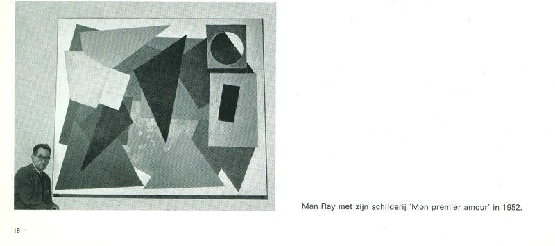
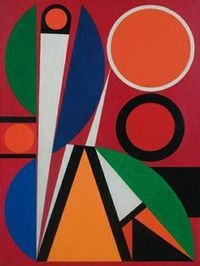
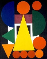
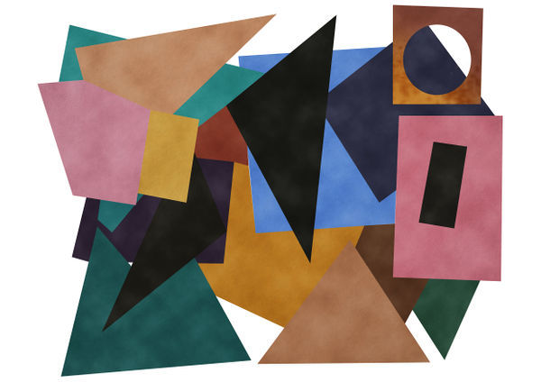
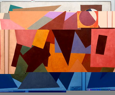
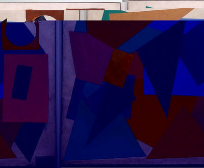
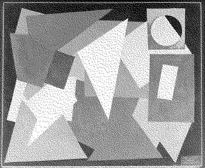
Mon Premier Amour - 1952 - Man Ray - 220 x 200 cm - Oil on canvas
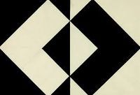
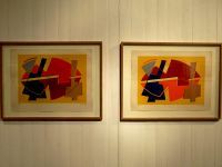
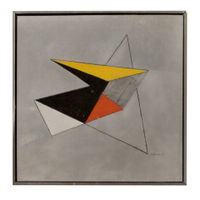
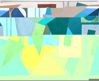
When I first saw this painting I thought wooowww this is huge. I like the colorful composition, geometrical abstraction and the layering of the shapes. After I saw the titel and that it was a painting by Man Ray. I was surprised because I only knew him as a photographer. This made me curious and I started doing research about the painting but I couldn't find a lot of information on internet. Google popped up three pictures what I thought was odd and interesting at the same time.
When I continued researching I found out that there was one more painting that was also called 'Mon premier amour'. What did this mean? two first loves? Thats not possible or is it? The tittle you can interpretative in more ways; this painting was a abstract translation of his first love (a woman) or this painting was his first or this painting was his favorite or painting in general was his favorite? It gave me a lot of questions and made me more curious. I wanted to know more about this mysterious not very known painting.
Research about Mon premier amour and Man Ray
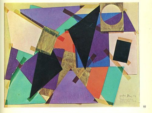
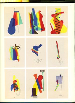
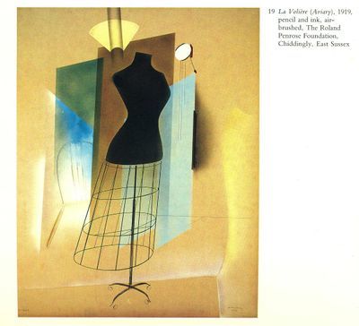
In books, on websites, and after watching a documentary I found a little bit more information about the painting. In all the books and sites I have seen there was little written about this painting and it all said the same thing: Mon Premier Amour' is one of the larger paintings by Man Ray from the early 'fifties. In addition, it is also a rare example of geometric abstraction in the work of this artist. The model for the painting is inspired by collages of coloured paper and airbrush paintings. He used the latter technique mainly in the period between 1917 and 1920. The title of the work, which translates as 'My first love', is probably a reference to this technique, which he used early in his career.
Study before creating Mon premier amour 1952
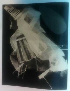
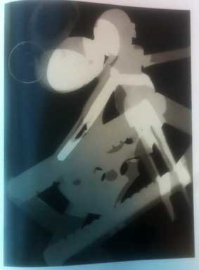
Man Ray - Emmanuel Radnitzky - American painter, photographer, filmmaker, object artist - 1890 Philadelphia - 1976 Paris. Man Ray was one of the most productive, innovative (dada and surrealistic) artist, who could never decide on which of his many talents he would focus. Photographer Stieglitz and the Amory show of 1913 in New York let Man Ray decide he wanted to devoted his life to make art. In 1913 he had his first exhibition and became friends with Marcel Duchamp. In 1917 Man Ray started to make experimental painting with a new technique he developed: the airbrush technique. He started as a painting influenced by cubism and the collage technique. He is trying to give the dadaism a place in America but people there did not understand it. He moves in 1921 to Paris where he gets a lot of dadaist and surrealistic friends. He starts to make pictures because he wanted to photograph his own work. He got famous with his portrait and fashion photography and a lot of years he still got known only by his photography. In 1922 he invents the rayografy (named after him), with that you put objects directly on photo paper and light it. You didn't use a camera or had negatives. I think these rayografys also look as collages and have layers just like the painting. In 1925 he gets into the surrealistic movement and becomes her official photographer and restarts painting. His paintings are in that time surrealistic and sometimes a bit cubistic.
In 1940 he fled back to America and stops with commercial photography and returns to painting. After the WO2 he returns to Paris and concentrate only on painting and drawing. He re-took the interest of making collages, using old techniques and materials he mainly used in 1917.
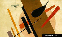
Oil paintings inspired on collages 1917
Example of his developed airbrush technique 1917
Example of Rayography 1922
He was a avant-garde, modernist for his time. Nobody understood him or bought his work. His wife says in the documentary 'you have to die first before getting famous'. What turned out to be more then true. Also she says, I quote: 'painting was his first love and photography was for earning money'. What I found interesting and inspiring to see is that this man blurred boundaries between artistic disciplines. He used so many different medium. I didn't know when I picked this object he made this painting inspired on 1917-1920 colored paper collages and after I found his collage for 'mon premier amour' it reminded me a lot about the way I work. I choose this painting on my intuition, funny that it has this resemblance.
To found out more information about the painting, why it was in the museum and more of these questions I went back to the boijmans. They told me the painting was a gift from Man Ray's foundation in 1972. Before that they had a exhibition about his work in 1971.
Research cubism and abstract art
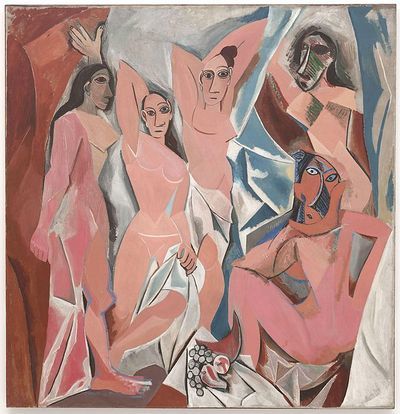
Also I decided to do research to abstracted art in general, and what influenced it. Like that I understand the painting more and that I can put it in time and context. Cubism was the art movement before abstracted art in 1907. It was the biggest influence art movement. Paul Cezanne was the precursor of cubism. He said that nature is built with primal shapes, like cubes, cones etc. But cubism really started with Picasso, he was the most important pioneer of cubism with the painting Les demoiselles d'Avignon. Characteristics of cubism are, confusing perspective, collage, reflection, construction, simplification, etc.
Les demoiselles d'Avignon - Picasso
Abstracted art is a movement in modern art starting in the begin of the 20th century (+-1910). Abstracted art was against the traditions of art schools with objective/ realistic view. They were against art where the reality is exactly pictured and through that is recognizable like a landscape painting. In an abstract artwork you can not recognize a visible reality but form, color, line and material can speak for themselves. Form, lines and color are more important with abstracted art then with other art movements.
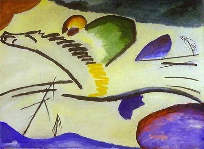
They say Kandinsky started the abstracted art with his aquarel in 1910. People saw abstracted art something without a meaning and knew it had to be appreciated for the beauty of form, line and color.
Geometrical abstracted art is abstracted art with geometrical forms like a square, triangle, rectangle etc. There are closed forms without holes and openings.
De blauwe ridder - 1907 - Kandinsky
Abstraction to The new Aesthetic
I think Mon premier amour is off course a geometrical abstracted painting but also has a cubism influence. I think it is interesting that in that time people were against the objective realistic view paintings and I think it can be interesting to make a link with the art of today. The new Aestetic is an interesting new art movement where I can see some similarity. It is a contradiction in the same way realism is to abstract art. The new Aesthetic is a term introducted by James Bridle, what refers to the increasing appearance of visual language of digital technology and the internet in the physical world and blending of virtual and physical. It has been around some time and we see these new styles recur in our art, designs and products. The pixelation of low-resolution images, the rough yet distinct edges of 3D printing, the shifting layers of digital maps.
Lecture James Bridle: http://booktwo.org/notebook/waving-at-machines/
'Why do we enjoy 8-bit, glitch, and other technological imagery revealing the seams of its construction? "For a while now, I’ve been collecting images and things that seem to approach a new aesthetic of the future, which sounds more portentous than I mean. What I mean is that we’ve got frustrated with the NASA extropianism space-future, the failure of jetpacks, and we need to see the technologies we actually have with a new wonder." says James Bridle about his tumblr, The New Aesthetic. "It’s an aesthetic born of the grain of seeing/computation... the viewpoint of that other next nature, the robot-readable world," comments Matt Jones at BERG.'
Source: http://rhizome.org/editorial/2011/jun/2/new-aesthetic/
After reading this I had some questions, How do you get glitch? What is a glitch?
'A glitch is a short-lived fault in a system. It is often used to describe a transient fault that corrects itself, and is therefore difficult to troubleshoot. The term is particularly common in the computing and electronics industries, and in circuit bending, as well as among players of video games, although it is applied to all types of systems including human organizations and nature. The term derives from the German glitschig, means 'slippery', possibly entering English through the Yiddish term glitch.'
A computer glitch is the failure of a system, usually containing a computing device, to complete its functions or to perform them properly.
In public declarations, glitch is used to suggest a minor fault which will soon be rectified and is therefore used as a euphemism for a bug, which is a factual statement that a programming fault is to blame for a system failure.
It frequently refers to an error which is not detected at the time it occurs but shows up later in data errors or incorrect human decisions. While the fault is usually attributed to the computer hardware, this is often not the case since hardware failures rarely go undetected. Situations which are frequently called computer glitches are:
Incorrectly written software (software bug), Incorrect instructions given by the operator (operator error),Undetected invalid input data (this might also be considered a software bug), Undetected communications errors, Computer virus, Computer exploiting (sometimes called "hacking")
Source: http://en.wikipedia.org/wiki/Glitch
What makes good glitch art good is that, amidst a seemingly endless flood of images, it maintains a sense of the wilderness within the computer. " — Hugh S. Manon and Daniel Temkin, “Notes on Glitch”
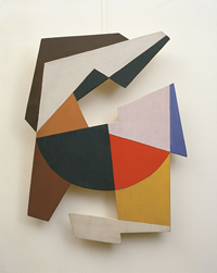
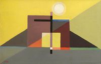
Similar images - influenced - rip offs - look a likes and more
The replica
First I thought to make my copy out of glass and led but 190 by 220 cm will be to big and heavy. Also I wanted to still have the idea of the layers over each other. I thought about make the idea of a big kite but I wanted to do something more digital and 3D.
Then I got the idea to make the painting as a 3D mobile.
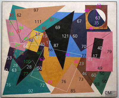
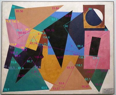
First calculate all the shapes in real size (angles, length, width) measurements.
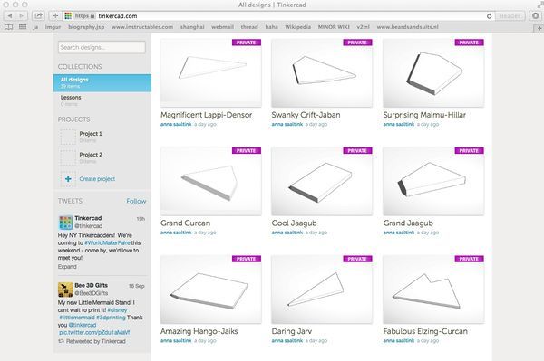
Draw them all separately in a 3D program like sketch up or tinker cad.
I think about make the shapes all 2,5 cm deep, the same as the painting is deep.
After drawing them in the 3D program make them in the program pepakura as a paper fold construction.
Laser cut the fold construction in real size cardboard/paper.
I want to paint the shapes the same color as the painting, mix the paint to the color myself.
In the end I want to hang all the shapes from the sealing before/behind each other like that you create the layering/collage like in the painting.
If you look from the front is looks like the 2D painting but if you move a little it a 3D construction.
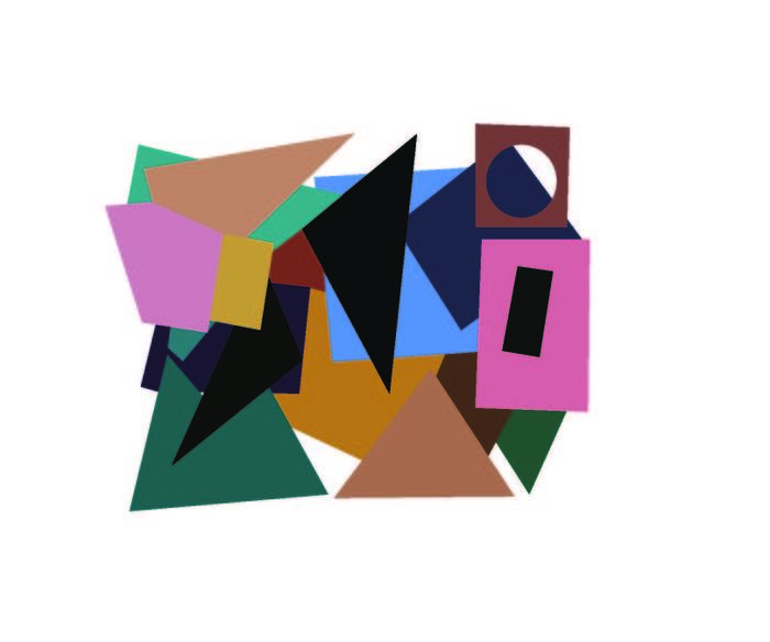
Lenghts & widths + Layering order
Angles + 19 shapes from the painting drawn in 3D program, tinker cat
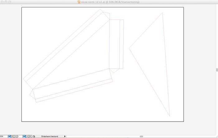
After drawing the shapes in the 3D program I put them in the papekura but the size of the shapes were to big for the program even if i scaled them down. I thought also it would be a learning experience for me to make it myself without the program. I am not good with using illustrator or with perspective drawings so I choose to draw all the shapes with illustrator.
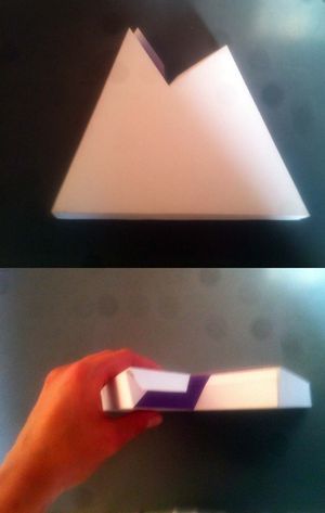
After I did one shape I went to the laser cut station and did a test with white paper. I learned how the machine works, only my perspective drawing was not right, as you can see on the picture. I did research how I could draw it correctly and corrected my first shape.
My first laser cut test shape + one of the 19 shapes drawn correctly in illustrator reduced to 40% of the orginial so it could fit in the lasercut
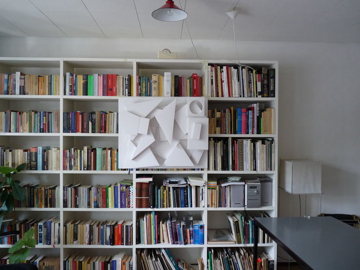
Now I laser cut and folded 18 of the 19 shapes (last one went wrong so I am doing it again today). I did not put the back yet because i have to make a hanging system from the inside.
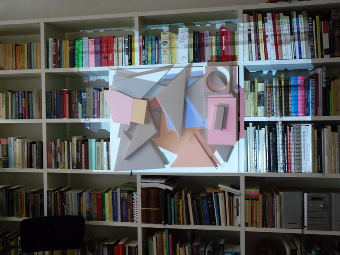
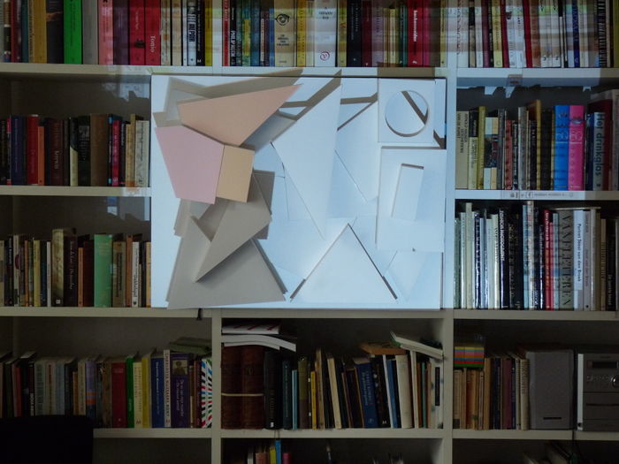
I thought about my idea to paint the shapes in the same color as in the painting but Tim told me it would be the same medium as it was used, So I thought about projecting the painting on my white 3D shapes, to get the right color. It will be a challenge to hang them but also to hang them so precise it will be the same as the projected painting. I will see in the end if I did everything correctly.
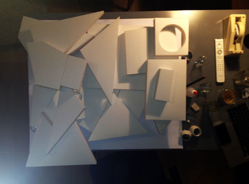
I changed my idea of hanging the shapes from the sealing. Instead I am hanging them at the wall, all connecting to each other. The colors I will project with a beamer but because my replica is 3D I have to make sure the projecting will be correct. I am thinking about taking a picture from the top of my composition and color shapes of the picture as they should be, like that I create perspective in my projection.
Experimenting with the composition of the shapes
In illustrator I tried to get the color of the shapes for the projection but I was not happy with the result because the color is not the same and without the paint it gives a whole different structure. So In photoshop I worked more on it.
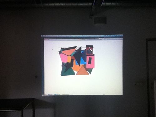
After trying to project the shapes I drew in illustrator with the beamer I realized it was not working.. The beamer was on the same hight and distance as the camera but still it was not projection it fully. I started to read on the internet why it was not working and I read that it was impossible to get it the same because of the different lens of the camera and the beamer.
I watched tutorials what I could to do fix it and downloaded software as: mad mapping and resolume arena but this was to complicated for me as a beginner and with the time we had left. On youtube I found a more easy way of doing it only the problem with this was that you can only do it when you have the place were you will have to show it because ones you move the beamer or the object it will mess up the projection. So I prepared myself testing it. But for the presentation to show it at school I will have to do it before the presentation.
This is the youtube movie I found to do my video mapping: https://www.youtube.com/watch?v=bvvy86zvoX4
Maybe this will be not a good idea because it will be stresfull before the presentation. Also the colors of the beamer where not very nice but maybe if you have a better beamer the colors will be better. Still I wanted to try something else. So I bought a second hand overhead projector to do more experiments with color. With the overhead projector I tried to color the shapes by hand on the transparant plastic directly as it was lightning the object. But I realized I was doing the same as the video mapping only by hand. It was not possible to color the shapes because I could not good see what I was doing while drawing.
I will project the color with the videomapping and the beamer as a tried before but with a better/newer beamer for a better quality color.
In school I tested the video mapping and try to put everything right for monday morning. Only the beamer was stuck to the table with a chain I couldn't get it on the good hight. Like that I have some shadow. This is how it turned out on friday. I hope I can put it on the good hight monday morning but I am not sure.
The replica transformation
For my transformed replica I want to work with the new aesthetic as inspiration. The now a days movement: the new aesthetic I linked to abstract art from the 20 century in my research as you can read above. I want to take away more information like the abstract painters did with their art. I want to make a abstraction of an abstraction.
Tests made in photoshop
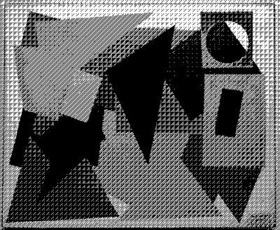
During my research about the new aesthetic I read a lot about glitching in electronics and this interested me a lot. I wanted to get to know how you can make a glitch. A glitch I see as an abstraction. I like glitched images because they all glitched images are unique. I want to make glitching images of the painting first. Maybe combined the glitching with the digitally weaving?
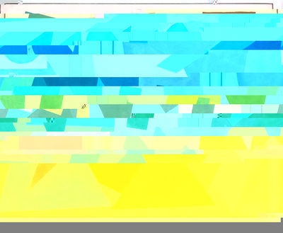
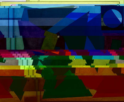
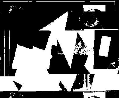
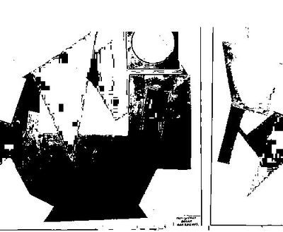
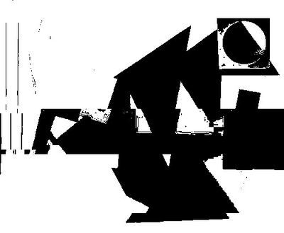
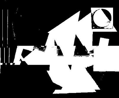
A couple of my many glitches of Mon premier amour I did in text edit
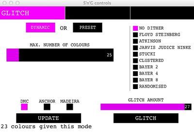
Also I found a software program that can glitch your photo. I found this software on this page: http://www.stitch-n-glitch.com/.
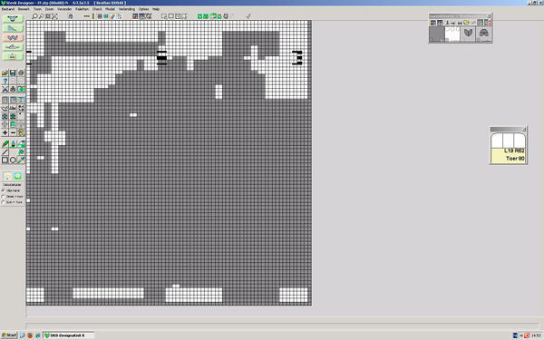
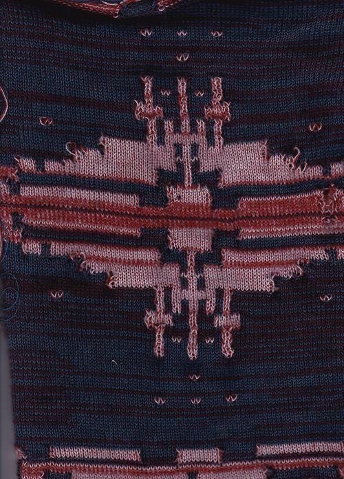
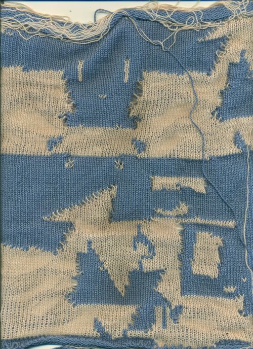
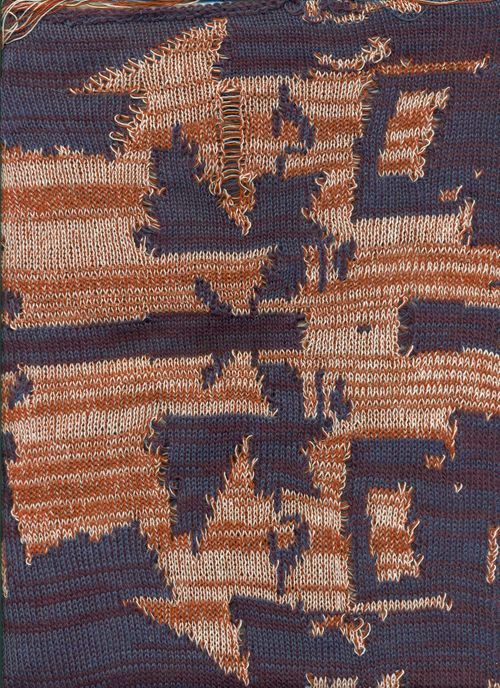
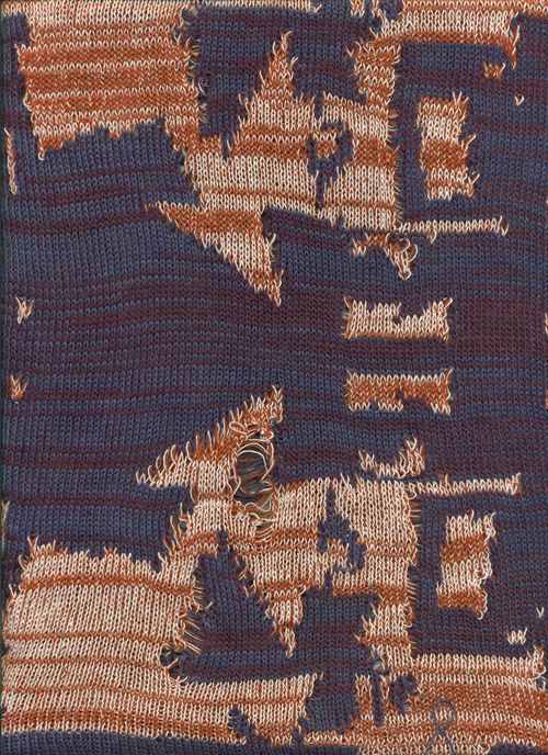
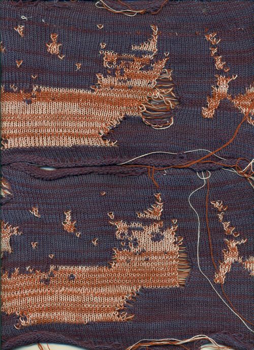
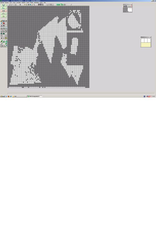
After passing by the textile workshop place they told me they did not have a digital weaving machine. I asked them which machines where digitally and that were embroidery or the knitting machine. I never worked on a knitting machine so why not do that? She told me it would be hard to learn in a short time especially because I want to something different with codes and glitching but I am very curious what I can achieve. I want to use the image of mon premier amour that I glitched on the computer but also glitch while I am knitting so I have a already made glitch and a spontaneous one. I made in photoshop a 4 x 4 pixel file with my glitched image for the knitting machine. When I came to the textile workshop they told me I had to do it in only 2 colors. I still tried to make a pattern out of it but it got really abstract, you couldn't even recognize the painting. Also I made some glitches in the process and I like the first result of it.
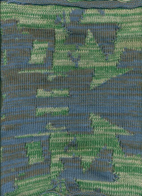
You can only knit with two colors in school but here I used dubble threat so you see can see four colors
Next to experimenting with the knitting machine I read more about glitching with fabrics and knitting on the internet to see what others where doing. I didnt expect that I could find that much about it.
http://www.theverge.com/2012/8/10/3232746/glitch-art-textiles-phillip-stearns
http://yearoftheglitch.tumblr.com
http://xxxclairewilliamsxxx.wordpress.com/glitched-textile/
Next experimentation I will try to make several glitched images in only black in white so I get more a pattern as the one above. I tried it in black and white and the negative one. Curious what I will look like knitted.
This was the first pattern I tried that I made in only black and white as you can see you can see more a real pattern then the other experiment knit. I used only two colors threat what looks to me less nice.
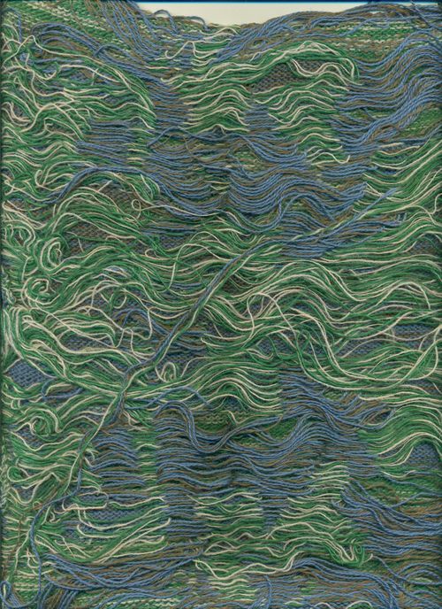
Here I used double threat and it looks better then the first one, still I prefere the first test I did but maybe it was because of the different colors and the big contrast between them. So I wanted to do an other one in the same colors as the first test. Also I looked at the back of the knit what has a lot of threats what can be a interesting thing aswell.
Also I tried other glitched images for the knitting pattern but there where to much threats at the back that the knit was stuck in the machine the whole time and I couldnt knit a lot. Also the textile workshop assistant was not very happy with this because I can break the machines with it.
Tim told me the pattern did not really look like a glitched image and I thought about it but I had not more time to do more research and I wanted to finish something except small samples. I wanted to knit a sweater because I never knitted a clothing piece.
Still I did some experimentations how i can show the different colors in the knitting pattern by using dithering. But after putting the dithered images in the knitting program I still did not get a pattern the same as the painting.
A Thousand word statement
Make from the museum
Day one
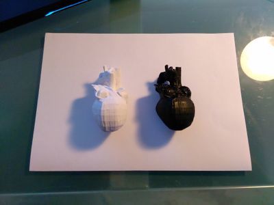
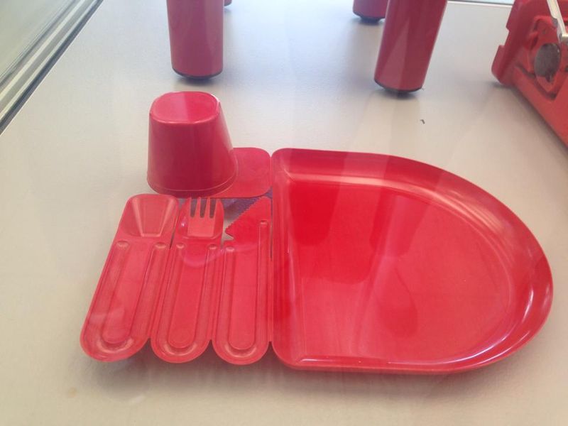
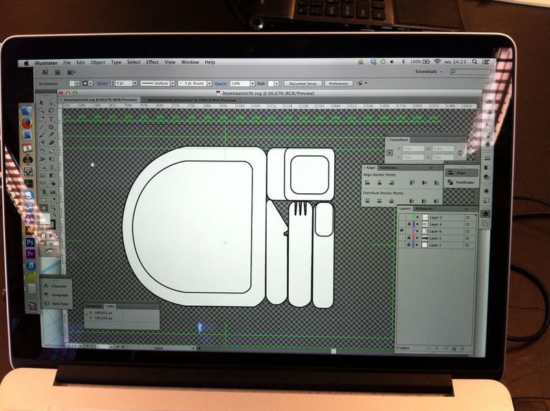
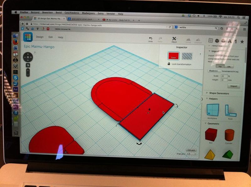
Tuesday 2nd of September As a group we decided we wanted to create a 3D object. After looking at the Boijmans collection we chose a rubber vase and we wanted to scan this with the 123 catch app. This did not work with our object because of the reflection, transparent surfaces and blurry photo's. Most objects were not easy to reach because there were behind glass so we chose a other method and an other object. We chose the picknick set of Jean Pierre Vitrac (1977). We wanted to keep the function and the idea of the set but in a different implementation. We wanted to put together our picknick set with different plates and cutlery we found in shops or at home then make pictures of it and make a good 3D scan with the 123 catch app. After a discussion with the teachers we realized, that we first need to have the data. I order to share it on the wiki page. That for we had to change our idea. We came up with the idea to trace over the photos with illustrator and then transform it into a 3D model in tinker cad.
Day two
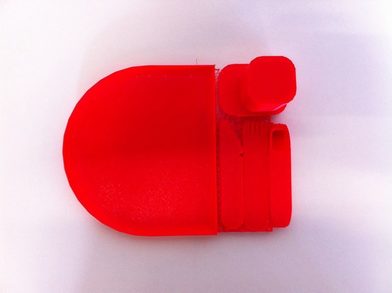
Wednesday 3rd of September We decided to make different versions for the exhibition on thursday. One 3D print model, with the same color and form but in a smaller version because with the printer the exact dimensions were not possible at the WDKA. Secondly we make our own picknick set molt with multifunction cutlery (3 in 1) and a square plate. We wanted to make a more minimalistic form but keep the original snap off idea of the pick nick set of Vitrac. We chose to use the vacuum forming technique. That we are doing tomorrow (Thursday) at the Stadsfablab in Utrecht. We want to make a couple of this object in different colors. That could work in mass production.
Day three
Thursday 4th of September Hendrick finished the 3D drawing in tinkercad and started printing it. Meanwhile our own pick nick set had some troubles. The glue was not fully dry, what may be a problem for the vacuuming. Still Fabienne and I went to Utrecht. Ovethere they told us we could not use or fork/knife/spoon construction because it was was plastic and it would melt. We still wanted to try something so we continued with the plate. This also was not working as we thought. The PET plastic they used and gave us was melting and got to thin, also it was not vacuum the whole plate. They told us it was because of the shape of the plate and we would have dug a hole into the middle so it could vacuum better. Without the result we where hoping for we had to return back to Rotterdam.
Reflection
It was interesting to see how every group approached their project and with what techniques they worked. Hendrick did the digital and 3D-printing part of our project. It was nice to get already an idea of how the 3D software works. Seeing that you can build this in a program and get a read model out of the 3D printer is amazing. We maybe failed with producing the pick nick set with the vacuum forming but we had some nice experience going to the stadsfablab in Utrecht and we learned more about the vacuum technique and we saw what is kind of other machines they have for next time.
