Difference between revisions of "User:Ilja.sofia"
Ilja.sofia (talk | contribs) |
Ilja.sofia (talk | contribs) |
||
| Line 1: | Line 1: | ||
=Ilja Sofia= | =Ilja Sofia= | ||
| − | + | ILJA SOFIA VAN VLAARDINGEN | |
| − | + | <br>24 | ROTTERDAM | |
| − | + | <br>[http://iljasofia.nl PORTFOLIO] | |
| + | <br> | ||
| + | |||
| + | http://i58.tinypic.com/zxk56e.jpg | ||
=Fantastic Forgeries= | =Fantastic Forgeries= | ||
| Line 53: | Line 56: | ||
====Typography==== | ====Typography==== | ||
| + | |||
| + | [[File:Tekst.png]] | ||
| + | |||
Sans serif type, designed by Jacob Jongert, only for Van Nelle | Sans serif type, designed by Jacob Jongert, only for Van Nelle | ||
[[File:Typo.png|450px]] | [[File:Typo.png|450px]] | ||
| − | |||
====Out-of-context mapping class==== | ====Out-of-context mapping class==== | ||
'''Why interesting''' | '''Why interesting''' | ||
| − | + | * Impact first World War, De Stijl, Bauhaus, Constructivism | |
| − | + | * Beginning advertising, first artist to design products for commercial purposes | |
| − | + | * It's already a reproduction | |
| − | + | * Difference between the value of the product then and now (a gulden—750 euros) | |
'''Technique''' | '''Technique''' | ||
| Line 83: | Line 88: | ||
*A save | *A save | ||
*Cigarettes | *Cigarettes | ||
| + | |||
| + | ====Web==== | ||
| + | Some screenshots of websites. | ||
| + | |||
| + | [[File:Websites.png|600px]] | ||
==Imperfections== | ==Imperfections== | ||
| − | One of the most interesting things about the object, in my opinion, is the difference between its value then and now. Why would people pay 750 euros for it in 2014 when it used to be a worthless tin, given freely to | + | One of the most interesting things about the object, in my opinion, is the difference between its value then and now. Why would people pay 750 euros for it in 2014 when it used to be a worthless tin, given freely to sellers in the 20's? I found out people love it because of its scratches and dents; its imperfections. I thought this to be a very interesting and unique approach for my replica. |
<br> | <br> | ||
<br>I associate those imperfections with pixels. | <br>I associate those imperfections with pixels. | ||
<br>'''imperfections ≠ pixels''' | <br>'''imperfections ≠ pixels''' | ||
| + | <br><br> | ||
| + | When you zoom in on the object you can easily see the pixels and therefore a whole range of colours. | ||
| + | <br>The design used to be loved because it only had three colours (yellow, red and blue) and now it has a lot more. | ||
| + | |||
| + | [[File:Pixels.png|400px]] | ||
| + | |||
| + | The technique I thought to be perfect for showing the colour range and relief is '''2.5d printing'''. | ||
| + | |||
| + | [[File:25dprinting.jpg|500px]] | ||
| + | |||
| + | [[File:25dprint2.jpg|500px]] | ||
| + | |||
| + | [[File:2.5D.jpg|500px]] | ||
| + | |||
| + | I'm now busy trying to get the artists [http://www.jannieschmitz.nl| Jannie Schmitz] and [http://www.daandehaandesign.nl| Daan de Haan], who were the first to experiment with this relatively new technique, to answer some questions. And trying to convince the company [http://www.canon.nl| Océ] that I should be the next person to experiment with the printer as I want to try it on different materials. | ||
| + | In the meantime I will be experimenting myself in the FabLab to see how 3D printing small layers on metal will turn out and some lasercutting. | ||
Revision as of 18:34, 18 September 2014
Contents
Ilja Sofia
ILJA SOFIA VAN VLAARDINGEN
24 | ROTTERDAM
PORTFOLIO

Fantastic Forgeries
Research
The artist
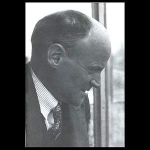
Jacob Jongert 1883 — 1942 was a Dutch graphic designer, illustrator and art teacher. He studied at the arts academy in Amsterdam and got his teaching degree in 1905. In the same period he assisted the artist Roland Holst with his monumental murals. He thought this to be the direction in arts that suited him best but he never really managed to master the exact right technique. He found a new inspiration in S.H. de Roos, a book designer and typographer who brought the Arts & Crafts ideas of William Morris[1] to the Netherlands. After experimenting with several printing techniques he discovered graphic design as his ideal art form. Nothing is more effective in reaching a large audience than the mass production of posters and packages. Jongert was also a very active member of the social democratic party which you could see in his work. Graphic design was a logical choice, as it has the largest distribution. Although in 1911 Roland Horst advised him to leave politics behind and concentrate on his profession. In the early 20s Kees van der Leeuwen hired Jongert to design products for Van Nelle such as packaging for coffee, tea and cigarettes. His work is characterised by a certain simplicity; the colours powerful, the shapes angular, yet his ornamental background notable. He was inspired by the modern German design he saw on the Werkbund exhibition in Koln. He is seen as one of the pioneers in graphic design as he was the first artist to be hired to design products for commercial purposes.
The era
Post WWI / Interbellum
Bauhaus
Constructivism
De Stijl
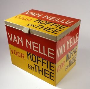
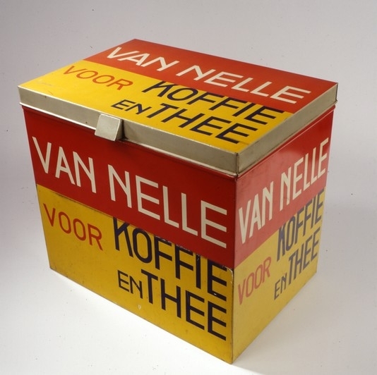
The object
- Coffee tin
- 1930
- 37cm x 41,5cm x 28cm
- Red, yellow, white, blue
- Silk-screened
- Bought in 1986 by Boijmans
- Primary colours
- Asymmetric composition
- Modern
- Sans-serif typeface
Typography
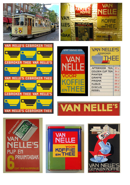
Sans serif type, designed by Jacob Jongert, only for Van Nelle
Out-of-context mapping class
Why interesting
- Impact first World War, De Stijl, Bauhaus, Constructivism
- Beginning advertising, first artist to design products for commercial purposes
- It's already a reproduction
- Difference between the value of the product then and now (a gulden—750 euros)
Technique
- Injection moulding
- Bending
- Folding
- Glass
- Laser cutting
- Make out of one piece
- Ceramics
- 3d Printing
Context
- Grandma's time capsule with cookies, knit works, cat hook(?) and a revolver.
- Trading/slavery, transport, economy, unesco
Compagnon
- A save
- Cigarettes
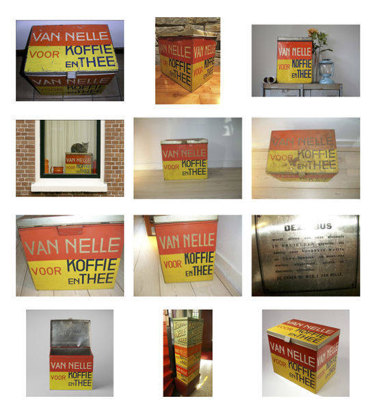
Web
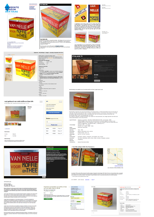
Some screenshots of websites.
Imperfections
One of the most interesting things about the object, in my opinion, is the difference between its value then and now. Why would people pay 750 euros for it in 2014 when it used to be a worthless tin, given freely to sellers in the 20's? I found out people love it because of its scratches and dents; its imperfections. I thought this to be a very interesting and unique approach for my replica.
I associate those imperfections with pixels.
imperfections ≠ pixels
When you zoom in on the object you can easily see the pixels and therefore a whole range of colours.
The design used to be loved because it only had three colours (yellow, red and blue) and now it has a lot more.
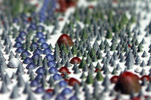
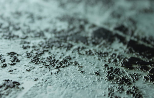
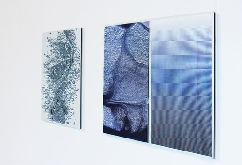
The technique I thought to be perfect for showing the colour range and relief is 2.5d printing.
I'm now busy trying to get the artists Jannie Schmitz and Daan de Haan, who were the first to experiment with this relatively new technique, to answer some questions. And trying to convince the company Océ that I should be the next person to experiment with the printer as I want to try it on different materials. In the meantime I will be experimenting myself in the FabLab to see how 3D printing small layers on metal will turn out and some lasercutting.
