Difference between revisions of "User:Jeanine Verloop/Unravelthecode"
| Line 30: | Line 30: | ||
=====Examples===== | =====Examples===== | ||
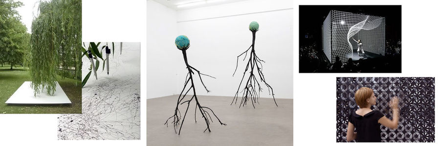
[[File:Jeanineverloop unravelthecode 4examples.jpg|1100px]] | [[File:Jeanineverloop unravelthecode 4examples.jpg|1100px]] | ||
| + | |||
| + | '''Tree drawings, Tim Knowles | Nervous Tree, Kristof Kintera | Smart Wall FLOW 5.0, Daan Roosegaarde | ||
| + | ''' | ||
| + | |||
| + | For my examples I searched for an illustrative approach instead of illustrators. As I see now my examples are more in the field of radiation than radio. My first example is tree drawing by Tim Knowles. I found this very interesting because of the analogue approach. The result is a illustration of that day wind movement. The second example is Nervous Tree by Kristof Kintera, an electromechanical sculpture. I visited his exhibition in the Kunsthal and was intrigued by the trees. They move very weird and very explosive. The third (last two) example is a dance performance and the Smart Wall FLOW 5.0 by Daan Roosegaarde. I put these two together because of the similarities and difference. Both are performance pieces relying on the performer and the spectator. They react to the presence of the human, this is where the difference is. The Smart wall really reacts and the dance performance is calculated and seems to react. | ||
=====Personal examples===== | =====Personal examples===== | ||
=Week 2= | =Week 2= | ||
Revision as of 13:25, 20 September 2016
Illustration Department
Unravel the code 2016/2017
0889920@hr.nl
Contents
Week 1
Workshop
Hertzian Tales | chapter 1 and 2
The first thing that got me thinking was the role of the designer as an semiotician (a translator of objects?). Making a logical design that could be used without thinking about it. I get the appeal of a semiotic design, we all want to feel smart and semiotic design makes that possible. When I think about it, it seems like all the objects I use are trying to hide their complexity from me so I can feel smart. For instance apple, the iphone does not invite it's owners to understand and explore the technology in their own way. Design is too often used as a way of limiting the user in understanding and exploring their object. In a way I think this relates to the enslavement Dunne talks about, the enslavement to concepts of use which the machine (and perhaps society) dictates.
It's interesting to think about the concept of use. How a designer / company / producer can make a product so understandable without giving any away any of the technological workings. How we accept the way we have to use and object and how a creative person could spoil the picture of how an object should be used. Also interesting is the mindlessness habits in which we use machines, think about endless scrolling on social media.
Design is used as a tool to make society more ready for innovating concepts, by basing it on familiar objects. I don't know how I feel about that, it feels like the designer is becoming a slave to the comprehension of the every day men. Design is seems must be understood rather than interpreted. (Critical design: Asks more questions that it gives answers >> << Affirmative design: Evolution of products, not reinventing the wheel)
Makes user-friendliness us lazy and incompetent of understanding the objects in our everyday life. I agree when Dunne talks about how the potential of new aesthetic experiences should not be dominated by machines expressing human and animal like behavior. We don't need to stay in the recognizable, we should stimulate and be stimulated to think about new and modified reality. The electronic object does not have to be pleasing and fulfill our expectations, it can surprise and provoke. In his books Dunne states that we, as designers, need to leave behind the desire to model the new world of electronic products in our own, human, image. One can wonder if it is possible for us to let that desire go.
User-unfriendliness does not have to mean user-hostility. I never thought about the poetic function of langue as user-unfriendly. In it's everyday use language is practical, informative and instrumental, the words are “transparant”. The poetic function of language give words a certain opacity, because the writer is no longer passing information or seeking to instigate action. Your know language can all of the sudden appear strange, unfamiliar and unknown.
I don't think this short text covers all the information given in the first two chapters of Hertzian Tales but these are the subjects that triggered my brain.
Examples
Examples
Tree drawings, Tim Knowles | Nervous Tree, Kristof Kintera | Smart Wall FLOW 5.0, Daan Roosegaarde
For my examples I searched for an illustrative approach instead of illustrators. As I see now my examples are more in the field of radiation than radio. My first example is tree drawing by Tim Knowles. I found this very interesting because of the analogue approach. The result is a illustration of that day wind movement. The second example is Nervous Tree by Kristof Kintera, an electromechanical sculpture. I visited his exhibition in the Kunsthal and was intrigued by the trees. They move very weird and very explosive. The third (last two) example is a dance performance and the Smart Wall FLOW 5.0 by Daan Roosegaarde. I put these two together because of the similarities and difference. Both are performance pieces relying on the performer and the spectator. They react to the presence of the human, this is where the difference is. The Smart wall really reacts and the dance performance is calculated and seems to react.

