Difference between revisions of "User:Naomimaria"
Naomimaria (talk | contribs) |
Naomimaria (talk | contribs) |
||
| Line 80: | Line 80: | ||
http://designobserver.com/images/spirograph.gif | http://designobserver.com/images/spirograph.gif | ||
| + | [https://www.youtube.com/watch?v=A32W7NfM8ws | spirograph / platenspeler] | ||
She’s a Rainbow: Notated in Color. Our intention is to visually represent how music flows from note to note, and how combinations and repetitions create beautiful patterns that are as mesmerizing as music itself. Idea: Ana Gómez Bernaus Conceptualization: Ana Gómez Bernaus + Greg Abate Music Notation and Translation: Greg Abate Art Direction & Design: Ana Gómez Bernaus | She’s a Rainbow: Notated in Color. Our intention is to visually represent how music flows from note to note, and how combinations and repetitions create beautiful patterns that are as mesmerizing as music itself. Idea: Ana Gómez Bernaus Conceptualization: Ana Gómez Bernaus + Greg Abate Music Notation and Translation: Greg Abate Art Direction & Design: Ana Gómez Bernaus | ||
| Line 91: | Line 92: | ||
https://s-media-cache-ak0.pinimg.com/736x/54/47/39/5447397de03a3dd354e160fa4a778687.jpg<br> | https://s-media-cache-ak0.pinimg.com/736x/54/47/39/5447397de03a3dd354e160fa4a778687.jpg<br> | ||
http://www.wystancurnow.com/ingram/wp-content/uploads/ingram_home_hydro2.jpg | http://www.wystancurnow.com/ingram/wp-content/uploads/ingram_home_hydro2.jpg | ||
| + | |||
| + | |||
| + | http://66.media.tumblr.com/d514619ec53b21d91064cec9b04b5e51/tumblr_inline_mzf1n0VNKH1r11yps.png<br> | ||
| + | Hiroshi Kawano, Design 2-1, Markov Chain Pattern (1964) | ||
| + | |||
| + | http://65.media.tumblr.com/6fc0f1004846f4f6397dd557e89c3e1d/tumblr_inline_mzf1nwDBLa1r11yps.png<br> | ||
| + | Jeff Donaldson, panasonic wj-mx12 video feedback (2012) | ||
| + | |||
| + | http://danieltemkin.com/Content/Glitchometry/OffByOne_Nada.jpg http://danieltemkin.com/ | ||
| + | Circle Saved With The Wrong Proportions 36" x 25' (2016) at NADA art fair 2016 | ||
Revision as of 22:23, 7 November 2016
Contents
Naomi van Maasakkers 0891744
Naomi is a graphic designer, she believes in communicating through color, language and experimental type which triggers and challenges the medium.
With these tools she creates new authentic images. Naomi focuses on printed- and web matters.
She is a creator with a strong focus on posters, her advanced skill returns back in her books, visual identities and websites.
Unravel the code V 2016/2017
Week 1 + 2
Inspiration Projects:
What do radio waves look like? Or, perhaps, what do you think they look like? Buzzing, concentric circles radiating outwards from a tower? Or maybe wavy lines undulating along the great expanse, hidden from the human visual range? The fact is they’re invisible, so we can’t see them without the aid of some kind of apparatus, and if light-painted visualizations of WiFi networks are any indication, they’re likely a sight to behold.
Visualization tests:
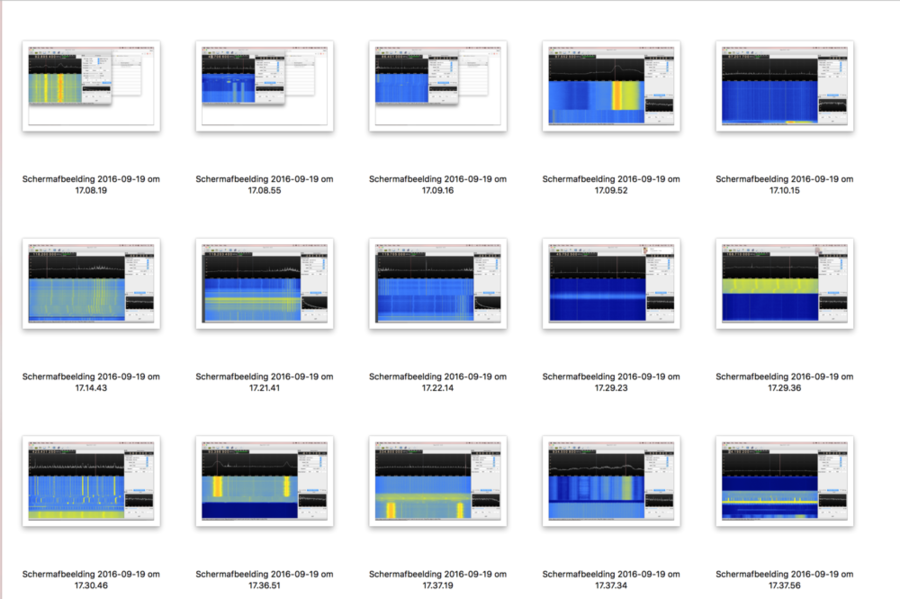
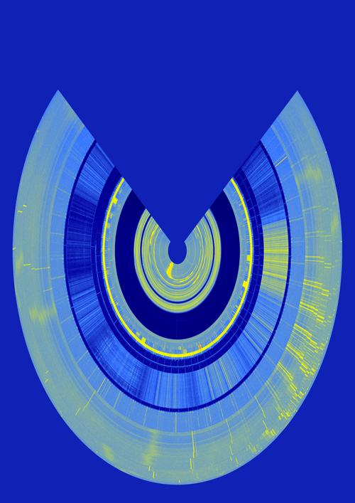
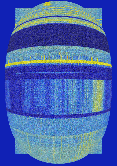
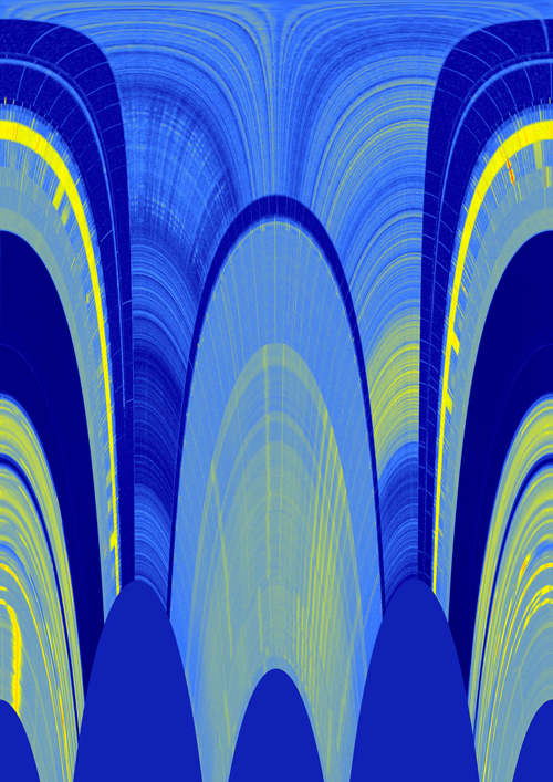
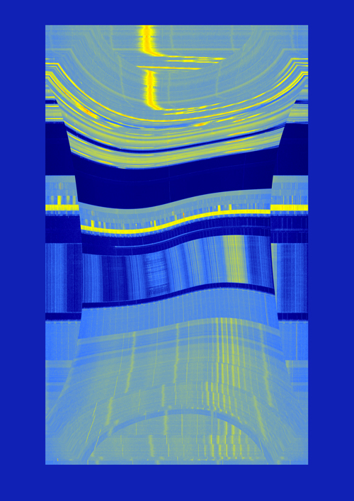
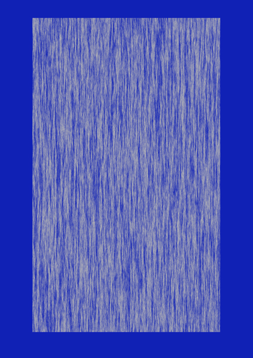
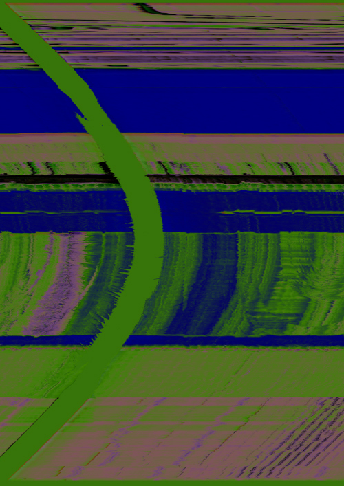
My week with the RTL SDR, at first I tried to work with the visuals, as I am a graphic designer, I screenshotted a ton of radio waves and limited my self in photoshop to only use their effects to see what the potential is just with radiowaves, without manually changing everything but making it an automatic process in photoshop. I think the images that came out are quite interesting. What I can do with them? I don't know but I'm going to reverse the process and put them in to audacity to create sounds with the new waves that came out
Week 3
Workshop 2
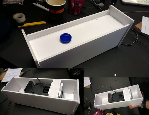
For workshop 2 we got the assignment to work with someone else's project. We got the project to translate "sound" to water waves. We built a box where you could put in a "cap" of water and the vibration of the water will be shown in this cap. We also tried to use very light fabric to create this vibration but this didn't work so we came with the solution to use a small cap because a big capacity of water didn't work with the capacity of the speakers. We experimented with music and with calling someone and using emotions in our voices.
Assignment
I worked with Jerry Estié on this assignment. We started out discussing radio and really wanted to something with transferring information in another way. For inspiration we decided to look into the past instead of into the future and looked up a database of sci-fi devices in books from the 40s to the 70s. We used the site Technovelgy for this. We found a project that was talking about which was about animated symbols to help those who haven't bothered to learn to read in a multimedia age. (From The Diamond Age, by Neal Stephenson. Published by Bantam Books in 1995). The word "mediaglyphic" just means a glyph (a symbol that imparts information nonverbally) created or seen in commercial media. The root word for media means middle; the media stands between us and the events or things it covers. We decided to take this what once was a sciencefiction project to this new era. Now a days when you scroll to facebook, newspapers, newspapers on the web, we mainly look at images and small headlines, so we don't have to read too much. When I scroll to facebook I don't read anything anymore I just scroll and see pictures with a small text. So we want to critical look at this aspect and use gifs as news headlines. We started out with The New York times and decided to try to do an whole article. In the screenshot below you can see it's divided in colors, everytime a new sentence starts the color will change. Headlines are of course bigger than normal text. Below you can see the website with working gifs.
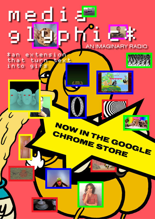
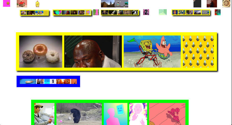
original article The Sweet Emotional Life of Bees
http://imaginaryradio.businesscatalyst.com/index.html
Poster: https://indd.adobe.com/view/3a5b7e9e-da62-4aa0-a221-1569b600f267
International Workshop
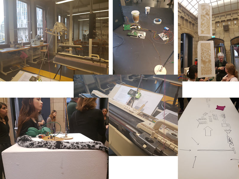
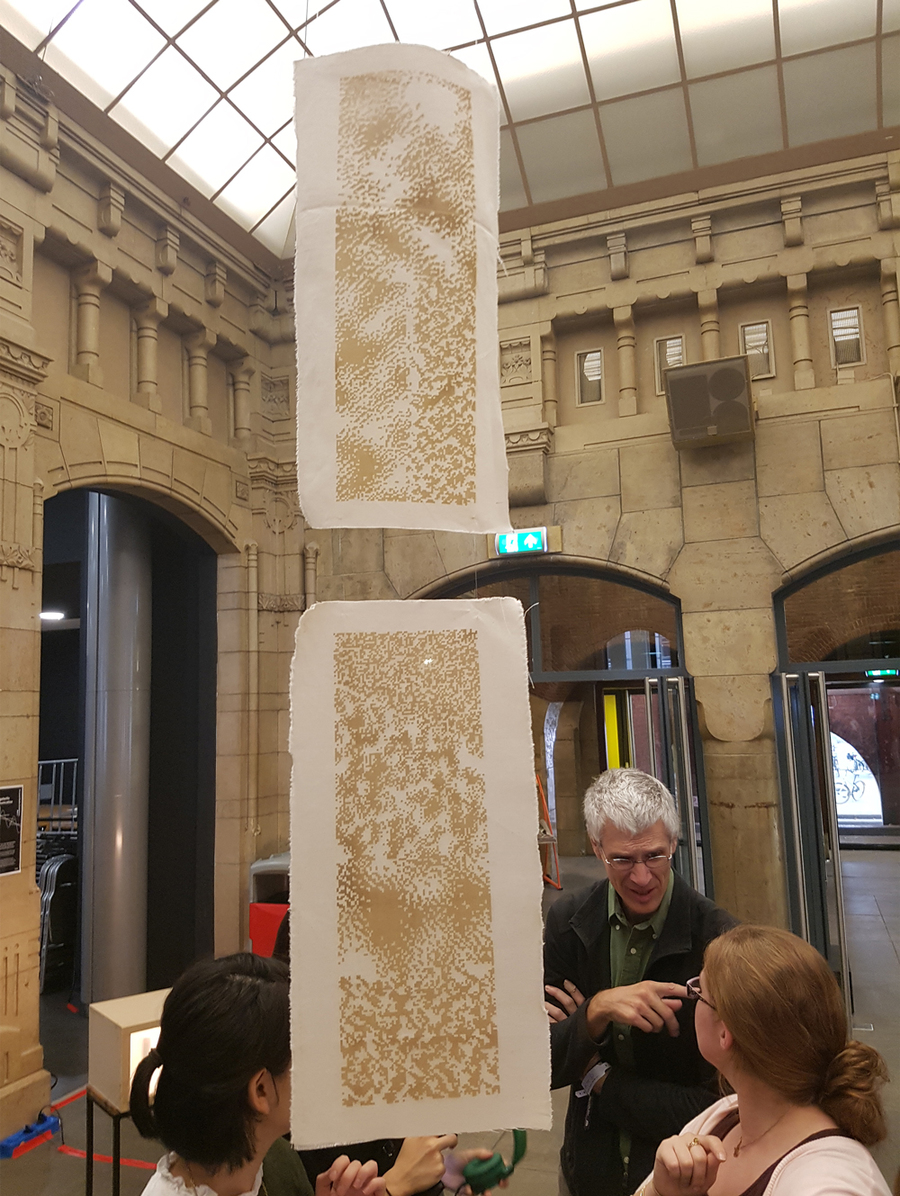
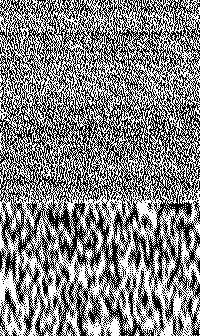
An intense fun day with the MICA students. Our group was Post-Radio aesthetics, we started out exchanging ideas with each other and tried to make it a whole concept. We were thinking about how we can't experience radio waves, so we started discussing how could we make these radio waves tactile without losing it's visual experience. Because our bodies cannot experience radio waves, how can we create a tactile, analog way to bridge that gap? We used a number of techniques to accomplish this goal. Through the use of a hand built radio receiver, we recorded a sound made it into an image in Photoshop. We converted this image into a bitmap and abstracted the bitmap in six different images of the radio waves. We engraver these six different iterations on fabric and created them on a knitting machine.
Q10 VISUALISING SOUND
Visualising Sound - Audio Responsive Generative Visuals | Made with Processing
Ernst Florens Friedrich Chladni (German: [ˈɛʁnst ˈfloːʁɛns ˈfʁiːdʁɪç ˈkladnɪ]; 30 November 1756 – 3 April 1827) was a German physicist and musician. His most important work, for which he is sometimes labeled the father of acoustics, included research on vibrating plates and the calculation of the speed of sound for different gases.[1] He also undertook pioneering work in the study of meteorites and so is also regarded by some as the father of meteoritics.[2]


When looking into cymatic frequencies and patterns I noticed that the patterns coming out of it could really look like spirgoraph art.
She’s a Rainbow: Notated in Color. Our intention is to visually represent how music flows from note to note, and how combinations and repetitions create beautiful patterns that are as mesmerizing as music itself. Idea: Ana Gómez Bernaus Conceptualization: Ana Gómez Bernaus + Greg Abate Music Notation and Translation: Greg Abate Art Direction & Design: Ana Gómez Bernaus

New machine aesthetics: the radio paintings of Simon Ingram
In the early twentieth century, machine aesthetics were considered shorthand for a fascination for or celebration of the machine; a techno-utopianism and optimism driven by modern mechanised cultures. In 2012 the phrase 'new aesthetics' appeared, firstly as a response to the kinds of images that contemporary machines seemed to be producing and secondly to the redefinitions of aesthetic awareness that these networked aesthetic machines suggested.2 The argument is that human experience and sensory responses are being decentred at the same time that machines appear to be capable of producing works of art.3 New aesthetics suggests a new way to think about the relation between an artist and a machine. Rather than a human picking up a tool, like the brush as an extension of the human hand, the artist and his painting machine have become a very particular assemblage of ftows.


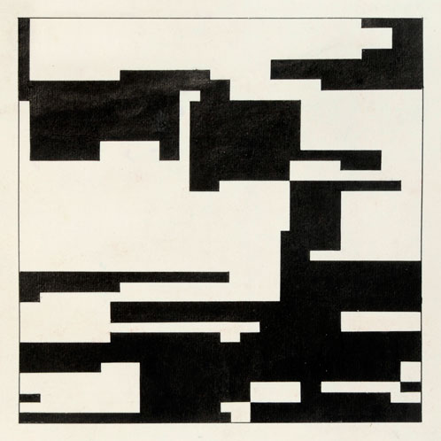
Hiroshi Kawano, Design 2-1, Markov Chain Pattern (1964)
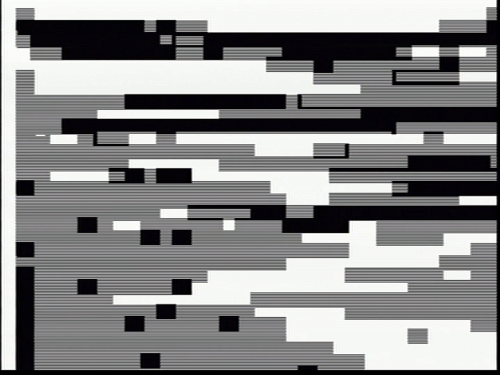
Jeff Donaldson, panasonic wj-mx12 video feedback (2012)
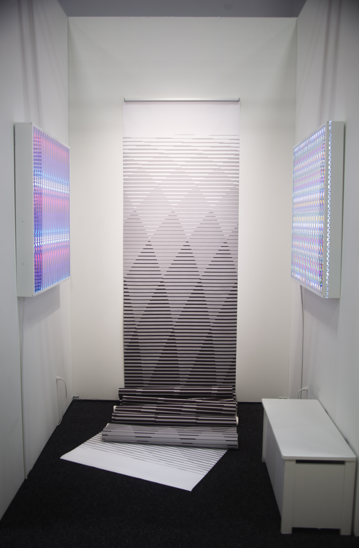 http://danieltemkin.com/
Circle Saved With The Wrong Proportions 36" x 25' (2016) at NADA art fair 2016

