Difference between revisions of "User:Philip"
| (37 intermediate revisions by the same user not shown) | |||
| Line 505: | Line 505: | ||
== Q14 - Only touch == | == Q14 - Only touch == | ||
| − | + | === Start research === | |
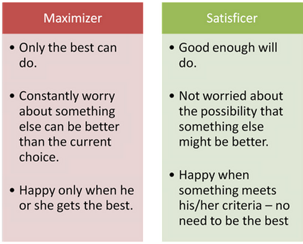
[[File:Maxvsat philip.png|frame|B. Schwartz in the Paradox of Choice. People who are in the category of maximisers tend to have higher levels of depression and lower happiness overall.]] | [[File:Maxvsat philip.png|frame|B. Schwartz in the Paradox of Choice. People who are in the category of maximisers tend to have higher levels of depression and lower happiness overall.]] | ||
The first ideas about my theme for Q14 are about what makes people satisfied and happy about the product they are using. Not making something easy to use, isn't the only way to research this. I started reading the book: [http://wp.vcu.edu/univ200choice/wp-content/uploads/sites/5337/2015/01/The-Paradox-of-Choice-Barry-Schwartz.pdf The paradox of Choice by B. Schwartz]. A central theme in this book is the difference between people who tend to be maximizers in comparison to satisficers. The basic question here is: How can it be that depression rates is western countries are on the rise? The amount of luxury most people in western countries experience is tremendous. He basically states this: | The first ideas about my theme for Q14 are about what makes people satisfied and happy about the product they are using. Not making something easy to use, isn't the only way to research this. I started reading the book: [http://wp.vcu.edu/univ200choice/wp-content/uploads/sites/5337/2015/01/The-Paradox-of-Choice-Barry-Schwartz.pdf The paradox of Choice by B. Schwartz]. A central theme in this book is the difference between people who tend to be maximizers in comparison to satisficers. The basic question here is: How can it be that depression rates is western countries are on the rise? The amount of luxury most people in western countries experience is tremendous. He basically states this: | ||
''If the ability to choose enables you to get a better car, house, job, vacation, or coffeemaker, but the process of choice makes you feel worse about what you’ve chosen, you really haven’t gained anything from the opportunity to choose.'' | ''If the ability to choose enables you to get a better car, house, job, vacation, or coffeemaker, but the process of choice makes you feel worse about what you’ve chosen, you really haven’t gained anything from the opportunity to choose.'' | ||
| + | |||
So what do philosophers across history say about happiness and desire? | So what do philosophers across history say about happiness and desire? | ||
| Line 527: | Line 528: | ||
| − | + | ||
| − | <gallery widths=350px heights= | + | |
| − | + | ||
| + | |||
| + | |||
| + | |||
| + | |||
| + | |||
| + | [[File:Mindfulness-1024x438philip.jpg|left|500px]] | ||
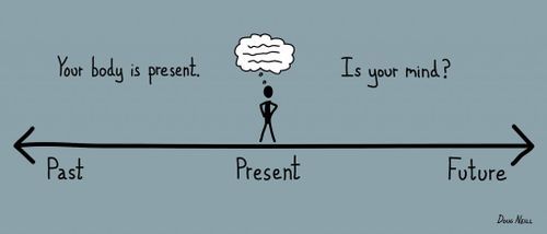
| + | Another theme that has always had my interest is mindfulness. Not necessarily meditation or Tai Chi, but really just being at this moment at this time only. People tend to always be busy with people and places they are not with at that time. This is not necessarily a bad thing, it becomes a bad thing when you are never really experiencing your direct environment. Due to the smart techniques used in many digital devices and services people get lured into a reciprocity cycle. This is a widely used way to get people to return to platforms increasing the attention time. It also destroys your focus, attention span and overall efficiency. In my opinion people are not really aware that they 1) are being heavily persuaded to use services more often and longer. 2) are getting drained out of focus and that your attention span heavily decreases when you are being distracted by notifications too much. | ||
| + | |||
| + | |||
| + | |||
| + | |||
| + | |||
| + | |||
| + | |||
| + | === Process of making === | ||
| + | <gallery widths=350px heights=450px> | ||
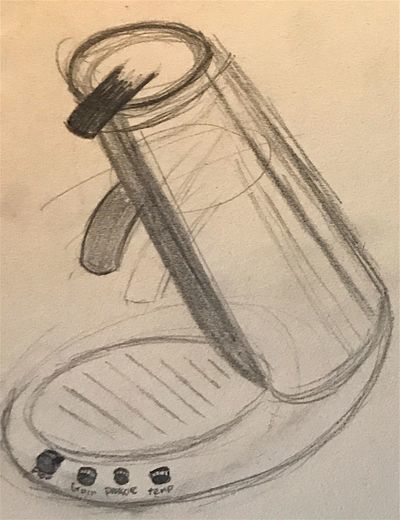
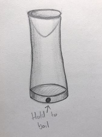
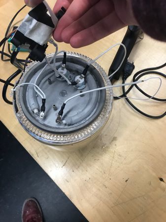
| + | File:IMG 3522 kleinphilip.jpg|To raise awareness about doing only one thing at a time, this is the first idea. A kettle that only heats up when you touch it. | ||
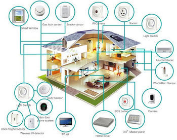
| + | File:Smart-home 0philip.jpg|The kettle is also meant to de-automate. There is a tendency to automate everyday, perpetual tasks called the smart-home and Internet of Things. My question is if this isn't only overcomplicating life and takes away routine. Does this really make us happier? | ||
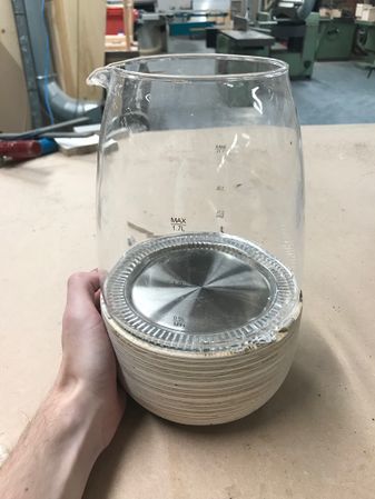
| + | File:IMG 3563kettlephilip.jpg|The standard kettle I altered. | ||
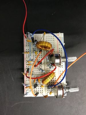
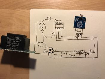
| + | File:IMG_3541philip.jpg|The circuit. A 230V and a 5V circuit are combined through a relay switch which gets triggered by a capacitive touch sensor. | ||
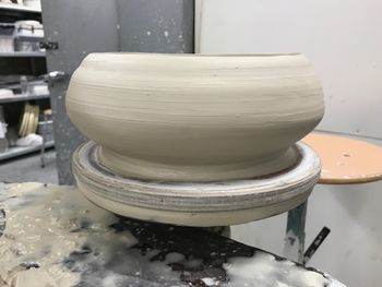
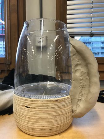
| + | File:IMG_3545kleidraaischrijfphilip.jpg|I made a couple of clay versions to try out shapes of the base of the kettle. After a couple of attempts and information about working with clay it turned out not to be the right material. It is quite difficult to get it to an exact diameter because of shrinkage in the oven. You need to first make a mould to get something exactly the right size. | ||
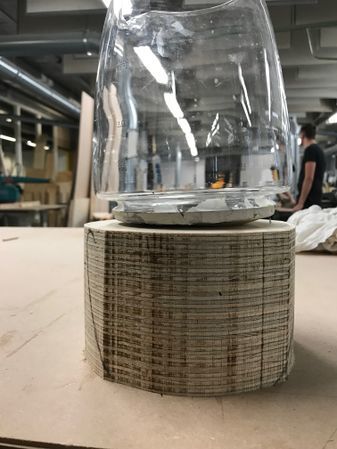
| + | File:IMG_3565voorbeeldphilip.jpg|The draaibank example in the woodworking station. This is kind of the effect I wanted for the base of my kettle. | ||
| + | File:IMG 3571philip.jpg|After gluing multiple multiplex plates on each other and making it somewhat circular. | ||
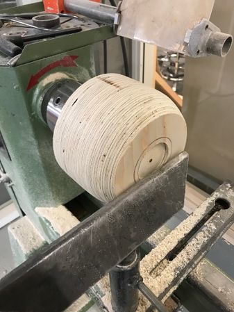
| + | File:IMG_3572philip.jpg|First shapes start to form on the draaibank. | ||
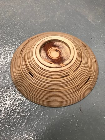
| + | File:IMG_3587eerstehoutenversievanhoutphilip.jpg|The first wooden model of the base. I was happy with the wooden layer effect, sadly there were all kinds of holes and dents on the side because of inconsistency inside the multiplex layers. | ||
| + | File:IMG_3599philiphandvattest.jpg|For the surprise I had Tim make a handle on the kettle. I felt like a kettle would always need a handle, but after these tests, I realised this object is really about heating. A handle would imply too much of its use and restrict people from really wrapping their hand completely around the base. It also just looked really silly. | ||
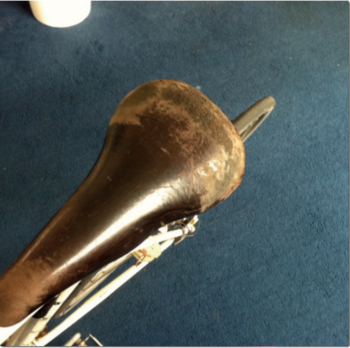
| + | File:Versletenzadelphilip.png|Because the wood wasn't to my liking, I started searching for ways to treat the wood to make it more 'finished'. I started looking for literature that were about the personal connection with objects. I came across [http://digitalcraft.wdka.nl/wiki/File:P251-lee.compressedphilip.pdf this article]. It is about the effect of wear and decomposition on the perception of a product. Because materials wear, they contain information about it's use. And because each products use has marks of its user this strengths the bond. Read the article! I've marked sections that are most important so you don't have to read the whole thing. | ||
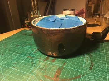
| + | File:IMG_3611potphilip.jpg|To enhance the wear of the base, I've painted the base in copper paint. Copper tends to create patina which creates a more worn effect. As explained, this wear will be different across people which enhances the bond between the person and object. | ||
| + | </gallery> | ||
| + | |||
| + | === The final setup === | ||
| + | To go with the kettle at the exhibition, I've made a user manual to explain more about it's use and thoughts. | ||
| + | [[File:Gebruiksaanwijzing-01philip.jpg|border|900px|center]] | ||
| + | |||
| + | |||
| + | |||
| + | <gallery widths=450px heights=450px> | ||
| + | File:Uiteindelijkeopstellingexpophilip.jpg | ||
| + | File:Uiteindelijkeopstellingexpophilip2.jpg | ||
</gallery> | </gallery> | ||
| − | -- | + | |
| + | |||
| + | === Research used === | ||
| + | [[File:Broken probes toward the design of worn media.pdf]] | ||
| + | |||
| + | [[File:Intangibles wear materiality via material composition.pdf]] | ||
| + | |||
| + | [[File:Growing Traces on Objects of Daily Use A Product Design Perspective for HCI.pdf]] | ||
| + | |||
| + | [[File:Design Frictions for Mindful Interactions.pdf]] | ||
| + | |||
| + | [[File:Patina-inspired Personalization Personalizing Products with Traces of Daily Use.pdf]] | ||
| + | |||
| + | http://www.timewellspent.io | ||
| + | |||
| + | [https://journal.thriveglobal.com/how-technology-hijacks-peoples-minds-from-a-magician-and-google-s-design-ethicist-56d62ef5edf3 How technology hijacks peoples minds from a magician and Googles design ethicist] | ||
| + | |||
| + | |||
| + | |||
| + | |||
| + | |||
| + | == Essay == | ||
| + | === Forward/Introduction === | ||
| + | ''(tell us about yourself and your practice)'' | ||
| + | |||
| + | My major is Communications & Multimedia Design at the Hogeschool Rotterdam. There I learn to design interactive products. Normally this is in the form of interfaces. I mainly learn to design websites and applications. Also the basics of the technical development is included, the purpose of this is to enhance the communication between the designers and developers. My interest has always been in between. I enjoy the technical aspect as much or even more so than the designing aspect. Next to that my interest has always been to use the knowledge of interaction design on physical products. I find it more interesting to build stuff that people can hold, lift and manipulate in ways that use all senses. Instead of mainly visual. Even though touchscreens are ever more present, every app and website will eventually feel the same on your device. I find it really interesting to include these aspects in the design process. | ||
| + | |||
| + | === Abstract === | ||
| + | ''(in 250 words or less, explain the essence of your research project)'' | ||
| + | |||
| + | This research is about finding ways of creating moments of rest, reflection and disrupt mindless interactions. Because modern day products are designed to take away interactions, frictions and attempt to create a seamless journey all together []. My point of view is that this will create a bunch of problems that did not exist before. By creating automated systems that allow people to never do perpetual tasks again, you create a way of living in which you are serving the system, not the way it should be, the system serving you. | ||
| + | |||
| + | My interests lay in strengthening and enhancing interactions, not taking them away. Making people step away from the ‘newer and faster is better’ paradigm. Schwartz in The Paradox of Choice states that by always wanting the best instead of what is good enough makes you constantly worry about other options that could be better. This eliminates the peace of mind that comes from being happy with what you have. Being happier about the choices you have made has a big impact on your overall happiness. My belief is that because of social interactions and commercial statements people are being pushed to compare themselves to others more and more. People are being told that they should get everything out of life by buying the latest GoPro for example. | ||
| + | |||
| + | This research explores ways to change existing products so that they communicate this vision. There should always be a functional aspect in these products, as well as a clear change in the normal use of this product. It should make people think about why this change is made and what the idea behind it is. | ||
| + | |||
| + | === Central Question === | ||
| + | ''(state your research question)'' | ||
| + | |||
| + | In what way can I change everyday products to make people aware of what actually makes them more satisfied? | ||
| + | How to disrupt mindless interactions and create a moment of rest, reflection and appreciation? | ||
| + | |||
| + | === Relevance of the Topic === | ||
| + | ''(why is this worth pursuing? explain the urgency of your project)'' | ||
| + | |||
| + | It is relevant to be investigating effects of marketed statements made about the way people should feel about their consumer habits. Because this will make me, and people reading this research question and think more about the effect their work has on people. Not only in the way ‘problems’ of everyday life are solved. But also in the way the products or services effect people’s life and happiness in a much broader aspect. | ||
| + | |||
| + | Timewellspent is an organization dedicated to creating a humane future where technology is in harmony with our well-being, our social values, and our democratic principles. They have an interesting take on how design challenges should be changed to make technology be on the side of people. For example: change “Let’s make it really easy to send messages to one another” to “Let’s help people communicate well”. By doing this they hope designers will start thinking about how messaging each other influences someones focus, work efficiency and overall well being. They also hope that by doing this designers will stop the race for attention and instead being of actual value to people’s lives. Changing automated mindless interactions causing people to consume much more information than would satisfy them into conscious choices to be interrupted or consuming information. | ||
| + | |||
| + | Now that people are having numerous devices in their direct environment that cause interruptions it is more than ever relevant to educate people about the effects of this. For both users and designers. | ||
| + | |||
| + | === Hypothesis === | ||
| + | ''(what do you think will happen or what will the effect be of your work?)'' | ||
| + | |||
| + | My goal is that people will start wondering why it is important to do one thing at a time sometimes. To deliberately not get interrupted and not being afraid that they will miss out on things. I hope people will think beyond “oh, that’s funny”. Or “I would never buy such a thing because I want everything to be efficient”. I want to make clear my products are not necessarily made to be actually used in everyday situations. It is more to make people think about the alteration that has been made and why. | ||
| + | |||
| + | === Research Approach === | ||
| + | ''(how do you define and design your research? what activities/approaches/methods will you pursue while conducting your research?)'' | ||
| + | |||
| + | My research consists of reading papers about consumer habits, the effect of mindfulness, social media usage, etcetera. The most part of my research will consist of building prototypes and testing these with different people. | ||
| + | |||
| + | === Key References === | ||
| + | ''(how does your work relate to contemporary makers? what a key analogues/works of inspiration?)'' | ||
| + | |||
| + | Makers that relate to my work are B. Schwartz, writer of “The paradox of Choice”. T. Harris, works at timewellspent.io and ex-Google Ethicist. Buddhist wisdoms, like the Buddhist economic philosophy. Vincent van Rheden, maker of a number of projects that enhance interactions [http://www.vincentvanrheden.com/Mindful%20Blenders.html view these for example]. Objects that couple the intensity of the input to the intensity of the output. Jesse Howard, he is making products that are easy to build and understand for any person to fix or adjust. Also Jonas Vorwerk has made a couple of projects that are about slowing down and connecting people. In [https://jonasvorwerk.nl/artworks/lichtbos/ his project Lichtbos for example]. This is an interactive forest built to trigger curiosity and facilitating a public space for people to talk to each other. This facilitation is done by adding a playful effect by making the LED's react to the people around it. | ||
| + | |||
| + | === Literature === | ||
| + | ''(what texts will/can support this investigation?)'' | ||
| + | |||
| + | Do Knobs have Character? Exploring Diversity in Users’ Inferences - E. Karapanos, S. Wensveen, B. Friederichs, JB Martens. | ||
| + | |||
| + | Growing Traces on Objects of Daily Use: A Product Design Perspective for HCI - E. Giaccardi, H. Robbins, E. Karana, P. D'Olivo. | ||
| + | |||
| + | Patina-inspired Personalization: Personalizing Products with Traces of Daily Use - MH Lee, O. Son, TJ Nam. | ||
| + | |||
| + | Crafting Quality in Design: Integrity, Creativity, and Public Sensibility - S. Bardzell, D. K. Rosner, J. Bardzell. | ||
| + | |||
| + | Design Frictions for Mindful Interactions: The Case for Microboundaries - A. L. Cox, M. E. Cecchinato, S. Gould, I. Iacovides, I. Renfree. | ||
| + | |||
| + | Broken probes: toward the design of worn media - M. Ikemiya, D. K. Rosner. | ||
| + | |||
| + | Intangibles wear materiality via material composition - H. Kwon, H. Kim, W. Lee. | ||
| + | |||
| + | Millions on a ‘digital detox’ because the internet is ruining everything - A. Kharpal from https://www.cnbc.com/2016/08/04/millions-on-a-digital-detox-because-the-internet-is-ruining-everything.html | ||
| + | |||
| + | === Experiments === | ||
| + | ''(what are you going to test out and why?)'' | ||
| + | |||
| + | I am going to test if this type of interaction actually makes people rest and reflect. How does this fit in a daily life? If it fits at all. What are the reactions of people at the exposition and before that? Is it feasible that all products require you to handle really only that single product at a time? Is it possible to derive some sort of guideline for designing ‘full attention’ and ‘non-disruptive’ products? And how do interface designers go about these questions? How to, as a designer, sell to your client that the customer shouldn’t need to pay so much attention to their brand? | ||
| + | |||
| + | I think this it is important to ask these questions because there is a big problem rising due to ever increasing attention seeking services. Designers of digital services should really start paying attention to the stress and other side effects the services they are developing have on their users. The ‘digital detoxing’ trend didn’t come about because people really like staring at their phones all day. My hope is that at some point there will be a good middle way. You do want to look up information at any time, but you do not want to get hooked by doing that. | ||
| + | |||
| + | === Insights from Experimentation === | ||
| + | ''(what have you pulled from your hands on practice based research?)'' | ||
| + | |||
| + | Insights I have found are: | ||
| + | |||
| + | - People generally do not take a deliberate time off in terms of distraction. Whenever I let people try the kettle, they get reminded and aware of how many distractions we encounter. | ||
| + | |||
| + | - The fact that this is a household everyday object, many people want it to be fast, efficient and quick. I feel like it is good that people inherently have this association because they will then sooner wonder why this change in product behavior has been made. This also thought me to look deeper into product references and associations some forms or functions carry in them. | ||
| + | - What people want and what is actually good for them rarely matches. | ||
| + | |||
| + | - People are generally aware of the addictiveness of social services, but are generally not taking deliberate action against the addiction. | ||
| + | |||
| + | - People are not so much aware of the negative side §effects of being interrupted continuously. Not actively being 'in the moment’. | ||
| + | |||
| + | - I cannot derive guidelines for designing ‘mindful products’ at this point. More testing is needed, especially across different design disciplines. | ||
| + | |||
| + | === Artistic/Design Principles === | ||
| + | ''(what is your own criteria for designing?)'' | ||
| + | |||
| + | My core principle in every project I do is to enhance interactions, not taking them away. Not automating perpetual tasks. In a post-digital world the digital and physical are intertwined and sometimes hard to separate. This is the spectrum I am working in, combining physical products with digital information to make use of the richness of haptics in 'the actual'. Since the digital revolution started, humanity has taken a big leap in terms of information accessibility and connectivity amongst people and regions. But as every upside has a downside, the digital revolution has also limited sharable information to pixels. My feeling is that we are now on the verge of a change in that account. It is becoming ever more cheap and easy to implement technology in products. This allows designers to broaden the mediums used to share and hold information. My aspirations are to continuously question and refine ways of letting people access, share and hold information in this post-digital world we live in today. | ||
| + | |||
| + | === Realized Work === | ||
| + | ''(what did you actually make?)'' | ||
| + | |||
| + | My proposition is an everyday object that is changed to create a moment of rest, reflection and de-automate the everydayness of that object. A kettle that only heats up whilst holding it is my final product to show at the exhibition. It is an everyday object that everybody knows its purpose of. Because household products are generally made to make life easier, faster en more efficient, this is a good contrast in this case. Because then people will wonder why this change has been made. | ||
| + | |||
| + | === Final Conclusions === | ||
| + | ''(What was the point? What do you take away?)'' | ||
| + | For now I can only really conclude that this project is nowhere near finished. Even though I’ve build a product that looks rather finished, I’ve only shine light on a really small aspect of the entire thought process. I can take away from this project from a research perspective that I’ve build a foundation of knowledge and research on which I can go much further. The kettle is only a fraction of the story I eventually want to tell. | ||
| + | |||
| + | The point of this project was to find a way of creating a moment of rest and reflection. I think I did succeed in that with this kettle. I think it is a good approach to look for an everyday object to manipulate in a way that de-automates and slows the user down instead of automating and accelerating. | ||
| + | |||
| + | |||
| + | === Reflection === | ||
| + | First and foremost I am super glad I chose this minor. It didn't only teach me a whole lot about design art, technology, thinking, making, talking, writing and reflecting on work, it also gave me a bunch of inspiration and aspirations to build on further. It have helped me find a super interesting graduation project, something I would probably not have succeeded in in such a way without the help and broadening of Jon, Tim and all classmates. | ||
| + | |||
| + | Enough feathers in the arse of Digital Craft. I could have done better at conceptualizing thoughts by making quicker prototypes. In pretty much all 4 projects a problem for me was that I was building hard- and software for a too long time. I didn't succeed in coming up with ways that could have had the same conceptual and communicative value in a quicker way. If I had done this better, I could have had a more iterative process. This always results in more thought through final presentations and better overall progress. | ||
Latest revision as of 15:27, 11 January 2018
Philip Ghering
0888689
Communicatie & Multimedia Design
http://www.philipghering.nl
Contents
- 1 Digital Craft minor 2017: How to be Human
- 1.1 Week 1 & 2 - On the body
- 1.2 Week 3 & 4 - Sensors and sensitivity
- 1.3 Week 5 & 6 - Mind (of) the machine
- 1.4 Week 7 - Not Mica but Donghua project
- 1.5 What is my Craft?
- 1.6 Q14 - Only touch
- 1.7 Essay
- 1.7.1 Forward/Introduction
- 1.7.2 Abstract
- 1.7.3 Central Question
- 1.7.4 Relevance of the Topic
- 1.7.5 Hypothesis
- 1.7.6 Research Approach
- 1.7.7 Key References
- 1.7.8 Literature
- 1.7.9 Experiments
- 1.7.10 Insights from Experimentation
- 1.7.11 Artistic/Design Principles
- 1.7.12 Realized Work
- 1.7.13 Final Conclusions
- 1.7.14 Reflection
Digital Craft minor 2017: How to be Human
Week 1 & 2 - On the body
My body part was the brain. These are the resources i used:
Inside the mind
Brain computer interface
Proof that Darwin was right
10 ways monkeys are more like us than we think
Your 21 senses
Proprioceptors
10 lesser known but important human senses
Khan Academy lesson on Somatosensation
How many senses do you have?
3d model of a spine
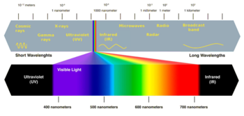
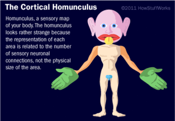
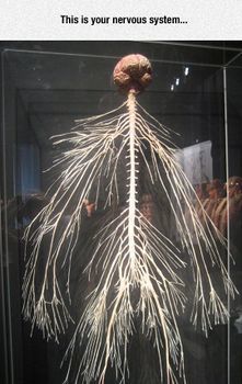
I became aware of the fact that we can actually sense a lot more than our five senses (hearing, tasting, touching, smelling and seeing) would logically allow us. The conservative science world has adopted the truth that humans have only these five senses. The reason for that is unclear to me. I became fascinated by proprioception for example. That is the way you can know where your arms and legs are relative to the rest of your body. Imagine being in absolute darkness, you can still tell if you've lifted your arms up due to receptors in your muscles. Also you can sense when you're hungry, in need of sleep or rest. You can tell when you have to stop exercising. These are all things that we could not know if we actually only had the traditional five senses. Also there are many different types of receptors needed to know all types of touch for example. Super hard pressure turns to pain, while heat also turns to pain.
I wanted to go into a direction that explores these mysteries around our sensing. The limitations and possibilities it beholds.
'I agree'
Because of the judgement in time we decided it would be best to completely team up and do one project together. Instead of all making something separately, with at least one thing in common. 'I agree' was the result of that.
Experimentation and concepting
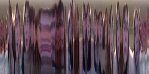
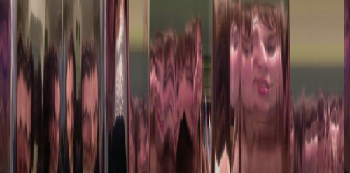
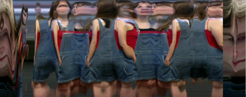
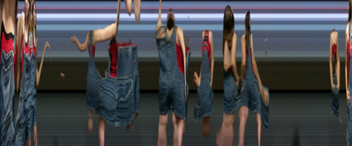
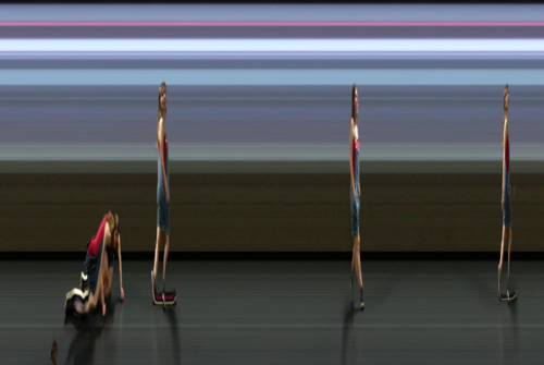
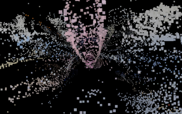
Slitscan, the first prototype of taking pictures using the webcam. Using a program called 'Processing' we literally abused someone's body by deforming it:
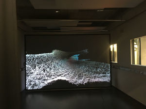
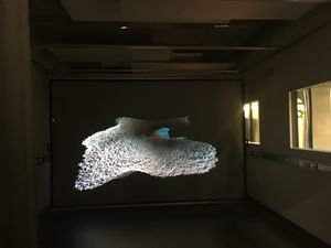
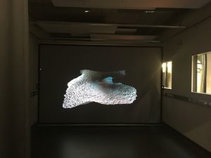
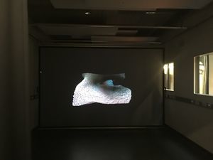
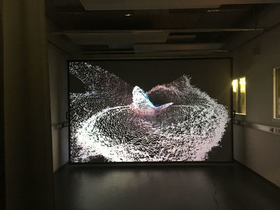
The eventual result of our research is a sequence where the pixels come together to form the last picture taken:
We became interested in further 'abusing' and deforming the body in a digital way. So we thought further into how this actually happens online in any sort of way. The most interesting thing we could think of was the fact that our pictures and other content gets abused by services we use. That is where the concepts originated from.
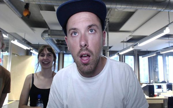
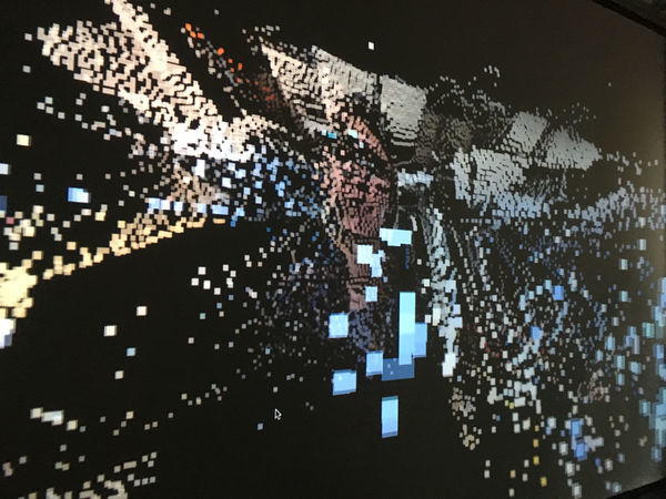
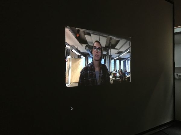
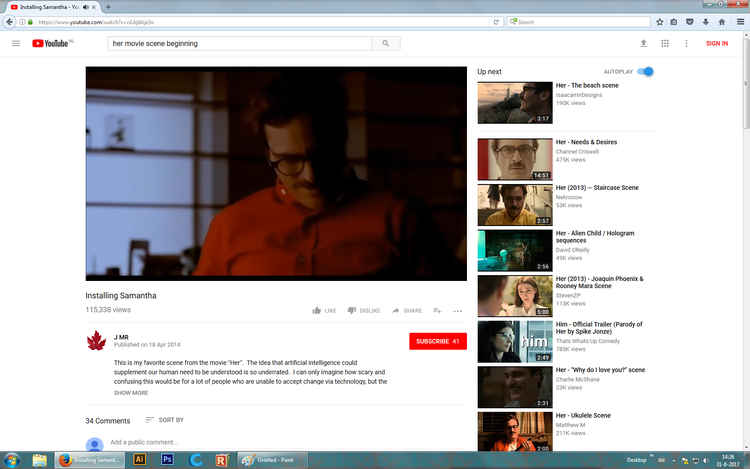
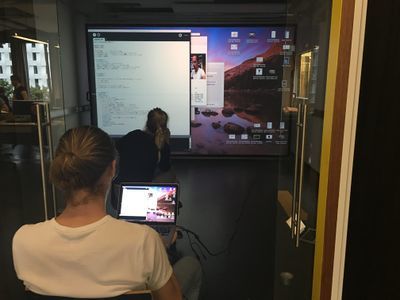
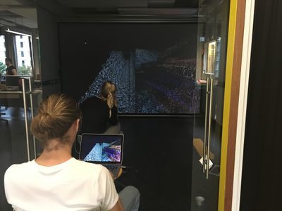
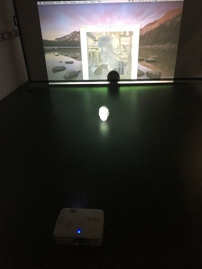
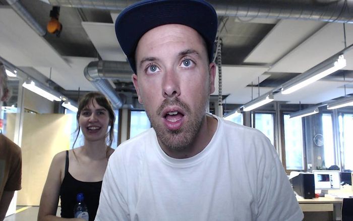
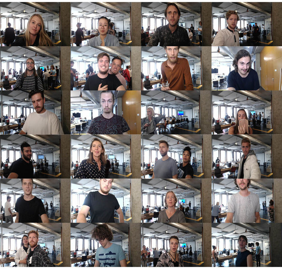
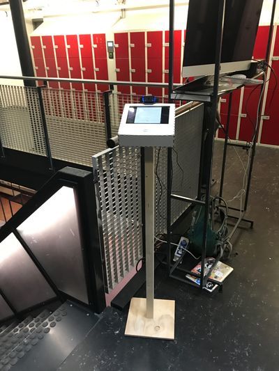
'I agree' consists of a webcam attached to a long pole standing straight, with a spotlight shining in the background. A welcoming voice of a woman beckons people to come closer and asks if they will agree to see what's next. If they agree, she tells them to press the button. Pressing this button will make the webcam take your picture and spread it to multiple screens throughout the room.
Before you are able use 'I agree' you have to agree to the terms and conditions.
Have you read the terms of use? No. Have you accepted them? Yes. You probably have never thought about the possible consequences of signing a contract which you have not read. Although millions of people do it everyday, by pressing ‘I Agree’ at the end of every pop up screen of terms of and conditions you come across.
Thank you for letting us confiscate your personal freedom. By blindly accepting the terms and conditions, you have officially lost control over your rights regarding the service you are using. From this moment, your personal data are now under copyright of I agree, or any other service you agreed to use.
Congratulations, you have now exposed yourself to the whole world (wide web) to see. Your identity is now forever stored on the web. Your online ID will forever be accessible for the eyes of everyone.
Concept
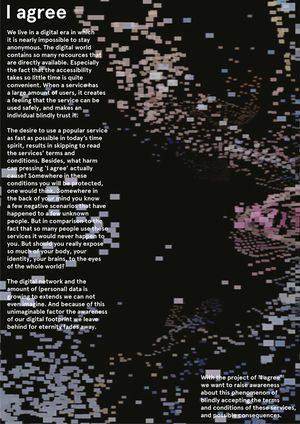
We live in a digital era in which it is nearly impossible to stay anonymous. The digital world contains so many recources that are directly available. Especially the fact that the accessibility takes so little time is quite convenient. When a service has a large amount of users, it creates a feeling that the service can be used safely, and makes an individual blindly trust it. The desire to use a popular service as fast as possible in today’s time spirit, results in skipping to read the services’ terms and conditions. Besides, what harm can pressing ‘I agree’ actually cause? Somewhere in these conditions you will be protected, one would think. Somewhere in the back of your mind you know a few negative scenarios that have happened to a few unknown people. But in comparison to the fact that so many people use these services it would never happen to you. But should you really expose so much of your body, your identity, your brains, to the eyes of the whole world? The digital network and the amount of (personal) data is growing to extends we can not even imagine. And because of this unimaginable factor the awareness of our digital footprint we leave behind for eternity fades away.
With the project of ‘I agree’ we want to raise awareness about this phenomenon of blindly accepting the terms and conditions of these services, and possible consequences.
Spoken text by the voice
'Hi there, how are you?'
'Don’t be shy, come closer!'
'I enjoy meeting new people. Would you like to be friends?'
'We can share an experience. But first I’d like to show you something.'
'Do you agree to see what’s next?'
'Stand in front of the light and press the button to start.'
Behind the scenes
People that agreed
Final exhibition setup
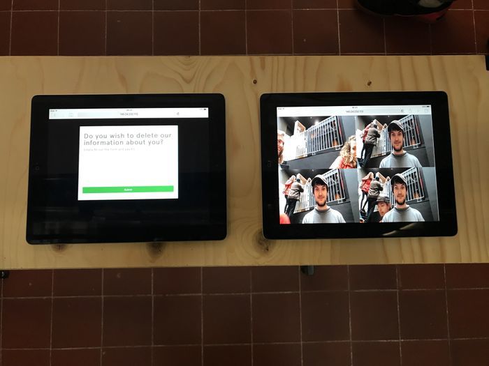
We added the possibility to let us delete your photo for €5. You can do this through the left screen on the right picture. This is a simple form with payment system. This proposes an alternative to the current situation of free services. We think it would be better if these services allow users to choose a paid version which guarantees privacy.
Week 3 & 4 - Sensors and sensitivity
Individual research
I first started doing research into different types of sensors and what a sensor really is. When is something a sensor and when it isn't.
Article on sweating hands, it's meaning and experiment
Emotional sweating across the body: Comparing 16 different skin conductance measurement locations
The truth meter
These articles explain what sweaty hands mean and how you can measure it. So I had the idea to make an 'excitement meter' that could be a new comparison tool for IMBD for example. To let people watch films with these sensors on their fingers to show in an objective manner how exciting the film actually was.
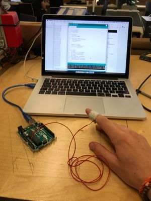
My first expriment trying to make a sweaty sensor. This radically failed due to the fact I couldn't find a way to get this sensor to give actual reliable readings.
I also thought I could push myself a bit further creatively-wise. So I started doing a little more research into something I've found interesting ever since the first time my physics teacher in high school explained the basics. Gyroscopes!
Gyro sensors - How they work and what's ahead
OK, to actually build one yourself is super complicated and requires quite a lot of special materials. Especially because I want to be able to connect other electronics to it. And using a Gyro 3-axis breakout sensor is something I've done a couple of times in the past so there's no challenge in that. So I started looking at video's for inspiration.
Da Vinci machines
Water sound waves
Magnetic Field Visualizer - How To See Invisible Magnetic Lines - 3D DIY
CYMATICS: Science Vs. Music - Nigel Stanford
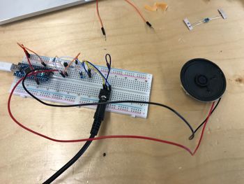
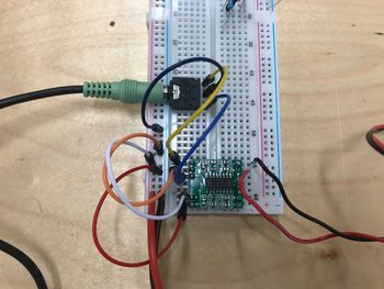
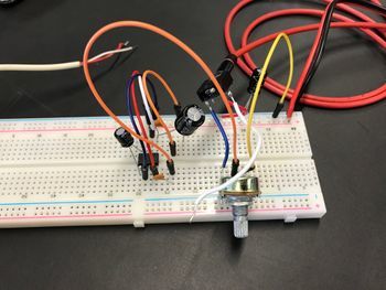
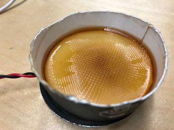
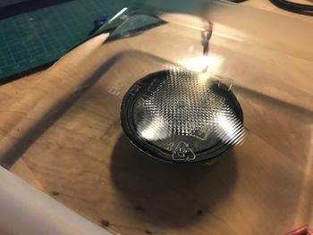
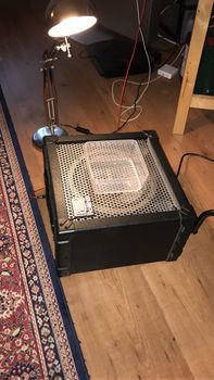
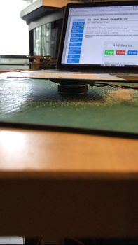
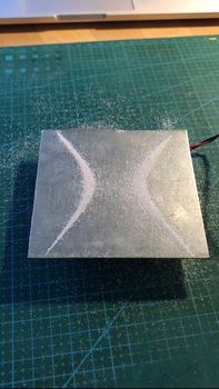
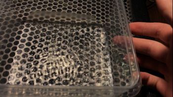
This really is an awesome video clip. Visualizing sound is something that attracts me a lot because it blurs the lines of our sensor. All of a sudden you can not only hear sound but you can also see them in the form of wrinkles, patterns, bubbles and splashes. From here on I started learning how to build a speaker circuit.
How to Build a Speaker Circuit with Adjustable Volume
A simple 1 watt audio amplifier
LM386 Audio Amplifier Circuit
With this last setup I managed to make a couple of nice patterns.
Combining ideas
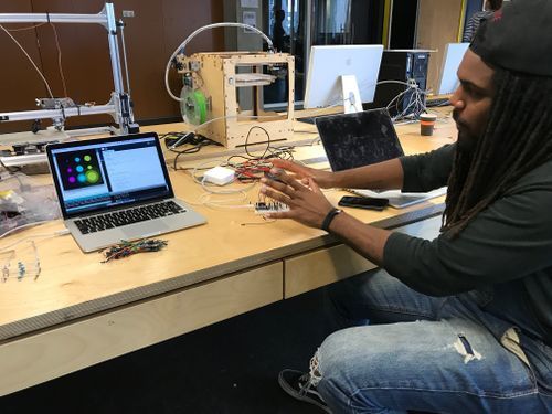
When I teamed up with Kenah we decided to use his idea, the body voltage meter, as an input for my sound visualizer. After some research into the body voltage meter we could not find more than people being afraid of radiation and static electricity building up in their bodies. Another way to sort of measure body voltage is using capacitive sensing. This is not the same but allows you to measure proximity and/or touch. This happens by moving your hand through a magnetic field generated by the sensor. Your body is then the other side of a capacitor, changing the capacitance which you can measure. This number can be converted to distance. This requires lots of calibration and filtering the measured values.
Because we found out the capacitive sensor is an unstable manner to sense proximity we attempted to build a theremin.
Our theremin which is not functioning at all.
After this attempt and a talk to Jeanine who build one last year we decided not to do the theremin as it is very difficult to get it as well calibrated and reliable as we had in mind. We did more research into capacitive sensing and we found out they are used in every touchscreen, trackpad, magic mouse and many other touch based products. Nobody we spoke to had any idea about this and found touchscreens to be rather magical. Therefore we sketched out some ideas of what we could do with this.
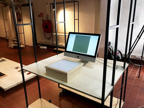
We found the first idea to be the most fruitful because of the fact it demonstrates the capacitive sensor the clearest way. So I made a little test setup in combination with processing:
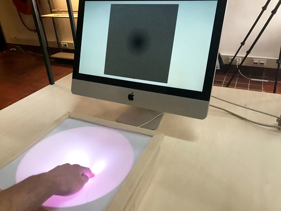
This is when we realised it is more like a trackpad when you make it squared, not like a beam. The circles get bigger when you (almost) touch a sensor pin.
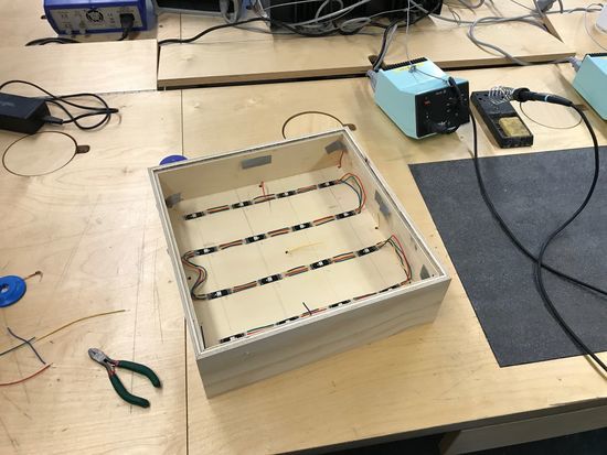
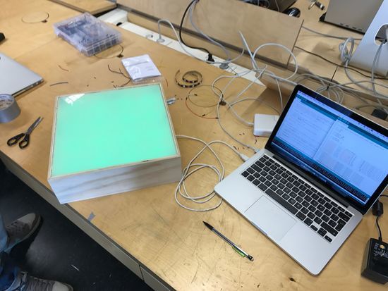
Therefore the idea changed into a super low-resolution trackpad that sort of demonstrates how this principle works. The LED's show where your hand is by lighting up.
Final product
These are WS2814 LED's which have special drivers inside which make it super easy to address each individual LED. Only 1 data line is needed. The LED's are grouped to match the sensors. Sensor 1 activates LED 1. Sensor 2 activates LED 2 & 3. And so on. The middle sensor activates LED 6, 7, 10 and 11.
Week 5 & 6 - Mind (of) the machine
Reconstructed Memories Workshop
When I was younger I visited the Booijmans museum, the painting I found most fascinating was 'Zomerlandschap' by B.C. Koekoek. The canvas is pretty big and extremely detailed. The only image I could find of this piece is greatly reduced in quality by the Booijmans museum. Therefore I wanted to get this picture in high resolution.
With this image enhancer it would be possible to greatly increase the resolution of any picture you can find (online). This makes it much harder for lots of websites that deliberately decrease image resolutions, for example to prevent people from bypassing the need to pay for high resolution images.
Sadly, the algorithm only works for pictures that only contain faces. This is because the model is trained on faces and pretty much only knows what faces look like. So in this case, the computer has no clue what to enhance as there is no reference to trees anywhere in the training data.
This does mean that you can feed the algorithm anything, as long as the images in the dataset are alike enough. You can for example feed it lots of licence plates first so you can re-enhance the blurred licence plates on Google street view. This means all blurred faces can be de-blurred as well. This can cause major privacy issues for everyone visible on these pictures.
On the other hand, big opportunities for the police come up because often private surveillance are poor quality making it hard to get a good view of someone doing any sort of crime. They can use the picture enhancer NCIS style making it easier to recognize the person.
Of course, with these sort of technologies, there are up- and downsides. Based on the purpose, who and the way it is used determines we, the crowd, feels good or bad about the use of this technology.
Another interesting aspect of this technique is that the computer starts to have some sort of imagination. When a human looks a blurred face, he can imagine what that person looks like in real life because we know what faces look like. So based on all the faces you've seen, you can fill in the gaps about this new one. You imagine the rest of the pixels. This is what the computer does too. Based on all the faces the algorithm has been fed, he can make an educated guess about how a new, blurred face will look like in higher resolution. For me, the idea that computers can have imagination is fascinating. Because then, can computers have creativity? Can they then also empathise with humans?
This imagining can also lead to problems though. It remains a guess. The computer can just have imagined wrong, just like we sometimes do. But because it is the computer saying it, people are tended to trust the answer more. It is a pretty large shift from dealing with computers that compute and give us mathematical answers to computers that imagine and give us guessed answers. In the NCIS example, I believe it could be more problematic to see a wrong face of a person you're searching for than a blurred face. If you're really looking for someone that looks like the computers guess, you can potentially overlook the actual person because he does not resemble that image enough. I believe these are the problems we are going to have to deal with when these technologies will emerge on a bigger scale and will be used for more different kind of tasks.
A project that explores issues surrounding artificial intelligence
I started off trying to understand what Artificial Intelligence, Machine Learning and Deep Learning is. This video helped a lot with that:
Deep Learning Demystified
The basic idea is that deep learning is really good at finding patterns. And because it saves the probability something will be according to the same pattern, it can make predictions and combine certain input. So, what API's and such are available for me to use? Here's a really complete and useful list:
50+ Useful Machine Learning & Prediction APIs
So what products on the market right now already use this technique? Another great video:
10 Machine Learning based Products
Especially the Alpha Go project has gotten a lot of attention in the media. This is mainly because people are astonished that a computer with this software was able to beat the world champion Go player. Go is a game in which you have a really countless amount of possible actions. That's why the game is more based on intuition rather than pure logic. Chess is a game that is more logic based because you can actually calculate every single move to determine the best option. This software is built on top of Tensorflow, a super nice framework that allows pretty much anyone to build Artificial Intelligence systems for their own purposes.
Getting started with Tensorflow
This allowed me to test out lots and lots of different things people have tried out and posted on Github. Many of them are build around Tensorflow, some others use Torch as the main computational framework. (CU)Torch allows people with a Nvidia CUDA processor to be super quick in training and sampling models. Tensorflow does not allow this (as easily). Here's a list of nice Github pages:
Example implementation of the DeepStack algorithm for no-limit Leduc poker
Train your own image generator
Multi-layer Recurrent Neural Networks (LSTM, RNN) for word-level language models in Python using TensorFlow.
Music Generator Demo by @Sirajology on Youtube
This repository contains code in Torch 7 for text classification from character-level using convolutional networks.
Deep learning driven jazz generation using Keras & Theano!
Character-level language modelling
A Neural Algorithm of Artistic Style
Of course some worked a lot better than others. For example the character level text generators did not give me readable output. Because these are character based they do not actually save a file that contains all available words. They try to find patterns in the sequence of characters and make words out of that. It works reasonably well considering the fact the system does not understand the concept of words at all, but it requires and incredible dataset of text. And still often it returns non existing words. The word-level did surprisingly well. Even though the sentences are complete gibberish of course, you can kind of understand the bigger picture of the text you feed it. I've tested it with Geert Wilders' speeches of the last year, and sometimes it actually samples some right wing statements.
The Deep Jazz github actually make some decent piano music off the jazz song it was fed. When I fed it Welcome to the Jungle - Guns 'N' Roses, it kind of did the same thing. So I'm not really sure what is happening but it certainly does not understand genre yet. I believe it is made to only sound well when you play the midi file on a piano. But overall nice start.
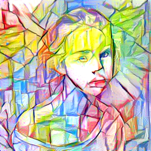
Also the Artistic style neural network does a really good job creating some nice pictures. It works with two input pictures, one is the style and the other is the actual input. So it transfers the style into the input picture creating new image. This does not have to me a certain style of art. You can also make a picture of a skyline go from day to night for example.
For me the interesting thing was that all of a sudden my computer did something creative. It had imagination and creativity. I found a nice article on intuition vs logic: http://artificial-intuition.com/intuition.html. This article states: "Intuition is theory-free. It does not require a high-level logical model. This neatly solves a bootstrapping problem of Artificial Intelligence. You cannot create high-level models until you already have intelligence." This is why the Alpha Go system (Sonnet) is genius. It is build to be general purpose, you can feed it anything and it will find a way to deal with it. It will find patterns and (when there is a feedback loop) learns from its mistakes. This whole training process is intuitive trail and error.
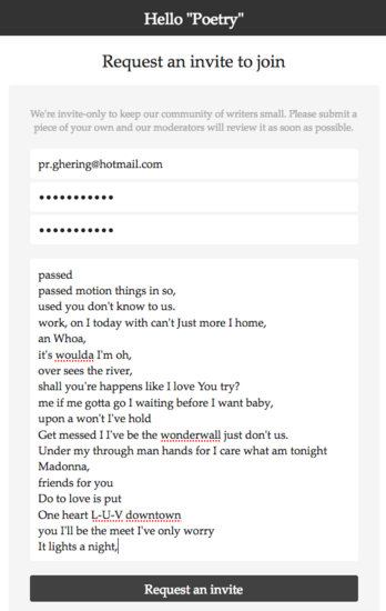
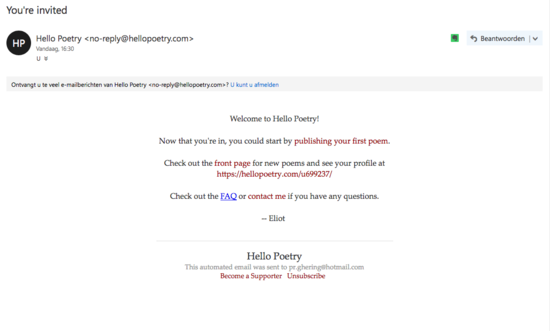
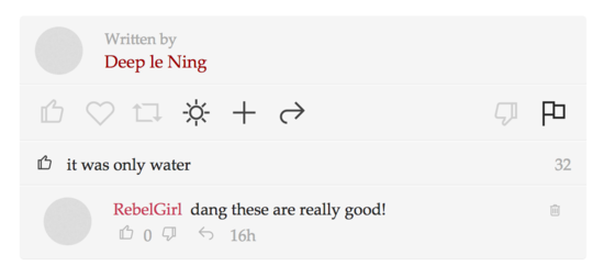
To display the 'creativeness' computers can adopt using this technology we decided to generate poems of off popular song lyrics. We posted these on http://hellopoetry.com. The nice thing about this website is that you need to do a small application before you can activate your profile. This is done by submitting one of your poems. It seemed like someone would read this and allow you or not. We got in!
To display all the creativeness the computer could do I made a website that showed three creative sectors side by side. http://philipghering.nl/creatibot/.
Week 7 - Not Mica but Donghua project
I did not participate in the Mica project because I joined a CMD trip to Shanghai to do a project with students from the Donghua University from the factulty Art & Design. The students I worked with were doing the major Graphic Design and New Media.
The project was for Somersby. A cider brand owned by Carlsberg. They want their cider to be the summer drink of 2018. Somersby is all about the magic moments. To bring friends and family together, to make people happy etcetera. It's about the small moments, "When you wake up in the morning and realise it is weekend." for example.
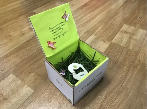
We came up with a concept based on the symbolic meaning of an apple in China. They think ping-an meaning apple, and ping-che sound alike. So they believe an apple stands for safety. Prosperity. We created a present to give away explaining you wish that person safety, prosperity and happiness. By sharing a Somersby cider together. In the present is a bottle opener and an invitation to have a cider somewhere. The bottle opener is important because the target group (20-25 year olds) generally do not have a bottle opener. This is because there is not really a drinking culture in China. Especially not in a non-bar or non-club setting.
What is my Craft?
What is your craft? (define your discipline, method or approach)
Technologist, start with technique or phenomena. Experiment and refine concept whilst prototyping.
What are the tools and media of your craft?
Code, electronics, wood, 3d print, light (pixels) and sound.
What are the borders of this practice? (what new media technologies have arisen / what is its future of the field)
New technologies? Where to start? Future will become more about going back to analogue media. Or the illusion of direct manipulation. I think people lost feeling with the products they use and are more longing for a bigger understanding to have the feeling of control. Knowing what to do when something breaks and how something roughly works is a place where I want to go back to.
Connect to a historical discourse and give concrete examples of contemporary practitioners.
The global accessibility of internet. Awesome practitioners are Jonas Vorwerk, Jen Lewin, Tea Uglow and Wu Jeuhui.
What is the position of your practice in relation to newer technologies?
What I like to do is communicating ideas and points of view using technologies. I like to prototype. Going from idea to something tangible in a short time is the happiest thing in the design proces for me. I am always curious to new technologies and possibilities. I want to try them, just to have them tried out.
From a tinkering perspective it is always nice to be able to use different stuff to fiddle around with. But from a consumer point of view I rarely see examples of products that use new technologies that actually solve problems and make life easier. For example the ‘smart home movement’ shows very well how hard big companies are trying to find new ways to ‘help’ consumers. As far as I know, the wake-up light has never been proven to actually be health beneficial. How hard is it to touch a light switch when you arrive? And what do I do when all of a sudden this stuff does not respond?
So. My position is that I like to play around with new stuff whilst being critical. I want to make products or installations that explore unusual interactions, haptic/tactility and the everydayness of things.
What theme you will explore for your Q14 project?
What interests me now is when devices give no room for skill or adjustment the end result can be the same but the user ends up being less satisfied. By adding steps or customization possibilities users can mess up the end result or become experts in using that device. That gives satisfaction.
By not making something easy to use and understand, in the long run satisfaction will be higher. Of course this does not apply to everything.
I want to find out to what extend this is true? In which cases and in which not? How can you put the ease of services like Spotify into something more satisfying? How can you get the feeling of owning music into services like Spotify? How can you create (the illusion of) control in products that have new technologies in them? How would opening a digital folder look like when it is inside physical storage? What everydayness do I want to amplify? What do I want to take away?
The first prototype I am going to make is a hacked Senseo coffee machine. I am going to add a few turn knobs from which you can adjust the water pressure, amount of water and temperature. By doing this I want to find out what it is about having more control over the outcome of this product that makes people happy or annoyed. This is applicable to many more types of everyday products. For example a light switch, I would like to build a test box with different switches that may or may not exist yet. There are digital ways to set timers to lamps, I would like to build those too in an analogue way.
This is also going further into haptics and tactile interfaces. I've started this study in the sensors & sensitivity project by making a 3d trackpad. The surface was elastic textile which felt nicely. The interesting thing about that for me was how people reacted to it at first contact. I noticed many people are very cautious at pressing into the surface. People are stroke the surface gently. I guess we did not use the right glues in the design of the box to visually tell people you can press it all the way down without breaking it. People are probably used to touch responsiveness due to the wide use of touchscreens. Everything that can be touched will be associated with how conventional touch screens work.
I am going to build further on this insights and research in Q14.
Q14 - Only touch
Start research
The first ideas about my theme for Q14 are about what makes people satisfied and happy about the product they are using. Not making something easy to use, isn't the only way to research this. I started reading the book: The paradox of Choice by B. Schwartz. A central theme in this book is the difference between people who tend to be maximizers in comparison to satisficers. The basic question here is: How can it be that depression rates is western countries are on the rise? The amount of luxury most people in western countries experience is tremendous. He basically states this: If the ability to choose enables you to get a better car, house, job, vacation, or coffeemaker, but the process of choice makes you feel worse about what you’ve chosen, you really haven’t gained anything from the opportunity to choose.
So what do philosophers across history say about happiness and desire?
Seek happiness by limiting desires, rather than satisfying them. - J.S. Mill
Happiness is found not in seeking more, but the capacity to enjoy less. - Socrates
A wise man is content with his lot, without wishing for what he has not. - Seneca
If you are depressed, you are living in the past. If you are anxious, you are living in the future. If you are at peace, you are living in the present. - Lao Tzu
Happiness is like a butterfly, the more you chase it, the more it will elude you. But if your attention is to other things, it will come and sit softly on your shoulder. - H.D. Thoreau
I think no further explanation is needed to express the overall theme of these quotes.
Another theme that has always had my interest is mindfulness. Not necessarily meditation or Tai Chi, but really just being at this moment at this time only. People tend to always be busy with people and places they are not with at that time. This is not necessarily a bad thing, it becomes a bad thing when you are never really experiencing your direct environment. Due to the smart techniques used in many digital devices and services people get lured into a reciprocity cycle. This is a widely used way to get people to return to platforms increasing the attention time. It also destroys your focus, attention span and overall efficiency. In my opinion people are not really aware that they 1) are being heavily persuaded to use services more often and longer. 2) are getting drained out of focus and that your attention span heavily decreases when you are being distracted by notifications too much.
Process of making
I made a couple of clay versions to try out shapes of the base of the kettle. After a couple of attempts and information about working with clay it turned out not to be the right material. It is quite difficult to get it to an exact diameter because of shrinkage in the oven. You need to first make a mould to get something exactly the right size.
For the surprise I had Tim make a handle on the kettle. I felt like a kettle would always need a handle, but after these tests, I realised this object is really about heating. A handle would imply too much of its use and restrict people from really wrapping their hand completely around the base. It also just looked really silly.
Because the wood wasn't to my liking, I started searching for ways to treat the wood to make it more 'finished'. I started looking for literature that were about the personal connection with objects. I came across this article. It is about the effect of wear and decomposition on the perception of a product. Because materials wear, they contain information about it's use. And because each products use has marks of its user this strengths the bond. Read the article! I've marked sections that are most important so you don't have to read the whole thing.
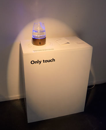
The final setup
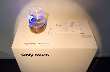
To go with the kettle at the exhibition, I've made a user manual to explain more about it's use and thoughts.
Research used
File:Broken probes toward the design of worn media.pdf
File:Intangibles wear materiality via material composition.pdf
File:Growing Traces on Objects of Daily Use A Product Design Perspective for HCI.pdf
File:Design Frictions for Mindful Interactions.pdf
File:Patina-inspired Personalization Personalizing Products with Traces of Daily Use.pdf
How technology hijacks peoples minds from a magician and Googles design ethicist
Essay
Forward/Introduction
(tell us about yourself and your practice)
My major is Communications & Multimedia Design at the Hogeschool Rotterdam. There I learn to design interactive products. Normally this is in the form of interfaces. I mainly learn to design websites and applications. Also the basics of the technical development is included, the purpose of this is to enhance the communication between the designers and developers. My interest has always been in between. I enjoy the technical aspect as much or even more so than the designing aspect. Next to that my interest has always been to use the knowledge of interaction design on physical products. I find it more interesting to build stuff that people can hold, lift and manipulate in ways that use all senses. Instead of mainly visual. Even though touchscreens are ever more present, every app and website will eventually feel the same on your device. I find it really interesting to include these aspects in the design process.
Abstract
(in 250 words or less, explain the essence of your research project)
This research is about finding ways of creating moments of rest, reflection and disrupt mindless interactions. Because modern day products are designed to take away interactions, frictions and attempt to create a seamless journey all together []. My point of view is that this will create a bunch of problems that did not exist before. By creating automated systems that allow people to never do perpetual tasks again, you create a way of living in which you are serving the system, not the way it should be, the system serving you.
My interests lay in strengthening and enhancing interactions, not taking them away. Making people step away from the ‘newer and faster is better’ paradigm. Schwartz in The Paradox of Choice states that by always wanting the best instead of what is good enough makes you constantly worry about other options that could be better. This eliminates the peace of mind that comes from being happy with what you have. Being happier about the choices you have made has a big impact on your overall happiness. My belief is that because of social interactions and commercial statements people are being pushed to compare themselves to others more and more. People are being told that they should get everything out of life by buying the latest GoPro for example.
This research explores ways to change existing products so that they communicate this vision. There should always be a functional aspect in these products, as well as a clear change in the normal use of this product. It should make people think about why this change is made and what the idea behind it is.
Central Question
(state your research question)
In what way can I change everyday products to make people aware of what actually makes them more satisfied? How to disrupt mindless interactions and create a moment of rest, reflection and appreciation?
Relevance of the Topic
(why is this worth pursuing? explain the urgency of your project)
It is relevant to be investigating effects of marketed statements made about the way people should feel about their consumer habits. Because this will make me, and people reading this research question and think more about the effect their work has on people. Not only in the way ‘problems’ of everyday life are solved. But also in the way the products or services effect people’s life and happiness in a much broader aspect.
Timewellspent is an organization dedicated to creating a humane future where technology is in harmony with our well-being, our social values, and our democratic principles. They have an interesting take on how design challenges should be changed to make technology be on the side of people. For example: change “Let’s make it really easy to send messages to one another” to “Let’s help people communicate well”. By doing this they hope designers will start thinking about how messaging each other influences someones focus, work efficiency and overall well being. They also hope that by doing this designers will stop the race for attention and instead being of actual value to people’s lives. Changing automated mindless interactions causing people to consume much more information than would satisfy them into conscious choices to be interrupted or consuming information.
Now that people are having numerous devices in their direct environment that cause interruptions it is more than ever relevant to educate people about the effects of this. For both users and designers.
Hypothesis
(what do you think will happen or what will the effect be of your work?)
My goal is that people will start wondering why it is important to do one thing at a time sometimes. To deliberately not get interrupted and not being afraid that they will miss out on things. I hope people will think beyond “oh, that’s funny”. Or “I would never buy such a thing because I want everything to be efficient”. I want to make clear my products are not necessarily made to be actually used in everyday situations. It is more to make people think about the alteration that has been made and why.
Research Approach
(how do you define and design your research? what activities/approaches/methods will you pursue while conducting your research?)
My research consists of reading papers about consumer habits, the effect of mindfulness, social media usage, etcetera. The most part of my research will consist of building prototypes and testing these with different people.
Key References
(how does your work relate to contemporary makers? what a key analogues/works of inspiration?)
Makers that relate to my work are B. Schwartz, writer of “The paradox of Choice”. T. Harris, works at timewellspent.io and ex-Google Ethicist. Buddhist wisdoms, like the Buddhist economic philosophy. Vincent van Rheden, maker of a number of projects that enhance interactions view these for example. Objects that couple the intensity of the input to the intensity of the output. Jesse Howard, he is making products that are easy to build and understand for any person to fix or adjust. Also Jonas Vorwerk has made a couple of projects that are about slowing down and connecting people. In his project Lichtbos for example. This is an interactive forest built to trigger curiosity and facilitating a public space for people to talk to each other. This facilitation is done by adding a playful effect by making the LED's react to the people around it.
Literature
(what texts will/can support this investigation?)
Do Knobs have Character? Exploring Diversity in Users’ Inferences - E. Karapanos, S. Wensveen, B. Friederichs, JB Martens.
Growing Traces on Objects of Daily Use: A Product Design Perspective for HCI - E. Giaccardi, H. Robbins, E. Karana, P. D'Olivo.
Patina-inspired Personalization: Personalizing Products with Traces of Daily Use - MH Lee, O. Son, TJ Nam.
Crafting Quality in Design: Integrity, Creativity, and Public Sensibility - S. Bardzell, D. K. Rosner, J. Bardzell.
Design Frictions for Mindful Interactions: The Case for Microboundaries - A. L. Cox, M. E. Cecchinato, S. Gould, I. Iacovides, I. Renfree.
Broken probes: toward the design of worn media - M. Ikemiya, D. K. Rosner.
Intangibles wear materiality via material composition - H. Kwon, H. Kim, W. Lee.
Millions on a ‘digital detox’ because the internet is ruining everything - A. Kharpal from https://www.cnbc.com/2016/08/04/millions-on-a-digital-detox-because-the-internet-is-ruining-everything.html
Experiments
(what are you going to test out and why?)
I am going to test if this type of interaction actually makes people rest and reflect. How does this fit in a daily life? If it fits at all. What are the reactions of people at the exposition and before that? Is it feasible that all products require you to handle really only that single product at a time? Is it possible to derive some sort of guideline for designing ‘full attention’ and ‘non-disruptive’ products? And how do interface designers go about these questions? How to, as a designer, sell to your client that the customer shouldn’t need to pay so much attention to their brand?
I think this it is important to ask these questions because there is a big problem rising due to ever increasing attention seeking services. Designers of digital services should really start paying attention to the stress and other side effects the services they are developing have on their users. The ‘digital detoxing’ trend didn’t come about because people really like staring at their phones all day. My hope is that at some point there will be a good middle way. You do want to look up information at any time, but you do not want to get hooked by doing that.
Insights from Experimentation
(what have you pulled from your hands on practice based research?)
Insights I have found are:
- People generally do not take a deliberate time off in terms of distraction. Whenever I let people try the kettle, they get reminded and aware of how many distractions we encounter.
- The fact that this is a household everyday object, many people want it to be fast, efficient and quick. I feel like it is good that people inherently have this association because they will then sooner wonder why this change in product behavior has been made. This also thought me to look deeper into product references and associations some forms or functions carry in them. - What people want and what is actually good for them rarely matches.
- People are generally aware of the addictiveness of social services, but are generally not taking deliberate action against the addiction.
- People are not so much aware of the negative side §effects of being interrupted continuously. Not actively being 'in the moment’.
- I cannot derive guidelines for designing ‘mindful products’ at this point. More testing is needed, especially across different design disciplines.
Artistic/Design Principles
(what is your own criteria for designing?)
My core principle in every project I do is to enhance interactions, not taking them away. Not automating perpetual tasks. In a post-digital world the digital and physical are intertwined and sometimes hard to separate. This is the spectrum I am working in, combining physical products with digital information to make use of the richness of haptics in 'the actual'. Since the digital revolution started, humanity has taken a big leap in terms of information accessibility and connectivity amongst people and regions. But as every upside has a downside, the digital revolution has also limited sharable information to pixels. My feeling is that we are now on the verge of a change in that account. It is becoming ever more cheap and easy to implement technology in products. This allows designers to broaden the mediums used to share and hold information. My aspirations are to continuously question and refine ways of letting people access, share and hold information in this post-digital world we live in today.
Realized Work
(what did you actually make?)
My proposition is an everyday object that is changed to create a moment of rest, reflection and de-automate the everydayness of that object. A kettle that only heats up whilst holding it is my final product to show at the exhibition. It is an everyday object that everybody knows its purpose of. Because household products are generally made to make life easier, faster en more efficient, this is a good contrast in this case. Because then people will wonder why this change has been made.
Final Conclusions
(What was the point? What do you take away?) For now I can only really conclude that this project is nowhere near finished. Even though I’ve build a product that looks rather finished, I’ve only shine light on a really small aspect of the entire thought process. I can take away from this project from a research perspective that I’ve build a foundation of knowledge and research on which I can go much further. The kettle is only a fraction of the story I eventually want to tell.
The point of this project was to find a way of creating a moment of rest and reflection. I think I did succeed in that with this kettle. I think it is a good approach to look for an everyday object to manipulate in a way that de-automates and slows the user down instead of automating and accelerating.
Reflection
First and foremost I am super glad I chose this minor. It didn't only teach me a whole lot about design art, technology, thinking, making, talking, writing and reflecting on work, it also gave me a bunch of inspiration and aspirations to build on further. It have helped me find a super interesting graduation project, something I would probably not have succeeded in in such a way without the help and broadening of Jon, Tim and all classmates.
Enough feathers in the arse of Digital Craft. I could have done better at conceptualizing thoughts by making quicker prototypes. In pretty much all 4 projects a problem for me was that I was building hard- and software for a too long time. I didn't succeed in coming up with ways that could have had the same conceptual and communicative value in a quicker way. If I had done this better, I could have had a more iterative process. This always results in more thought through final presentations and better overall progress.
