Difference between revisions of "User:Noemiino/RESEARCH DOCUMENT"
| (10 intermediate revisions by the same user not shown) | |||
| Line 103: | Line 103: | ||
<!--(what is your own criteria for designing?)--> | <!--(what is your own criteria for designing?)--> | ||
<span style='width:60em;display:block;'> | <span style='width:60em;display:block;'> | ||
| − | I usually | + | I usually consider a user in regard to my designs. A user that has the power to change something in the context/conditions that I created. It is almost as if I would want to share that moment of joy when I am creating by making something that in its own encourages creation, interaction. I started this project with this principle in mind: How am I going to make the pixel, the tiny fragment noticeable. How is it going to be about the detail instead of the full picture? How could this turn into an experiment? Through making the experiments, however, I started to realize that I was taking the wrong approach. For me, it was really important to have a form that would be possible to interact with and it was limiting me to always come back to this thought. |
| − | <br> | + | <br><br> |
The idea that I had about human identity also lost my interest because the details were less interesting. I find more awe in the abstract, in the shapes. When I was working with bitmaps in the portrait that was very interesting but because of the portrait format also limiting. | The idea that I had about human identity also lost my interest because the details were less interesting. I find more awe in the abstract, in the shapes. When I was working with bitmaps in the portrait that was very interesting but because of the portrait format also limiting. | ||
| − | <br> | + | <br><br> |
As a principle, I would say I tried to free myself as much as possible from my own constraints. Not always knowing what the end result would be gave me more interest to continue researching and experimenting with the small components until I found my medium. Once I let go of the big expectations I was free to do everything and I had to realize this way I saw more potential in simpler experiments which in the end gave me greater satisfaction. | As a principle, I would say I tried to free myself as much as possible from my own constraints. Not always knowing what the end result would be gave me more interest to continue researching and experimenting with the small components until I found my medium. Once I let go of the big expectations I was free to do everything and I had to realize this way I saw more potential in simpler experiments which in the end gave me greater satisfaction. | ||
| − | <br> | + | <br><br> |
I discovered a new way of making. A making that is not finished... | I discovered a new way of making. A making that is not finished... | ||
</span> | </span> | ||
| Line 114: | Line 114: | ||
=Artistic/Design Proposal= | =Artistic/Design Proposal= | ||
| − | (what do you propose to make) | + | <!--(what do you propose to make)--> |
| + | <span style="width:60em;display:block;"> | ||
| + | So...this was my original proposal: | ||
| + | AN installation where a Kinect traces you as an ASCII code in 3d space- so when you move close up you zoom into one pixel. | ||
| + | <br><br> | ||
| + | Which I still like but the complexity of this proposal was stopping me from really digging into research and just doing. Once I let go of the outcome it was a lot easier to focus on what I really wanted to do. Zoom into the pixel. | ||
| + | </span> | ||
| + | |||
| + | =Realised work= | ||
| + | |||
| + | <!--(what did you actually make)--> | ||
| − | + | <span style='width:60em;display:block;'> | |
| + | I made a new way of looking at a letter.<br><br> | ||
| + | Bold as this statement is, Pix-celling was about looking at shapes, colors, positions, deformations and readability of letters. | ||
| + | What something is recognized as a letter by a computer on the screen, for us it might seem like a blob of nothing from close view (printed and digital version as well). In Pix-celling I explored a font on a 100-pixel width artboard in ten different sizes. From its smallest form of 1 point till 10 points. | ||
| + | <br><br> | ||
| + | [[File:pix-cell1.jpg|700px]]<br><br> | ||
| + | In the process of printing the result in a similar pixelated form, I explored different saving methods, resulting in different printed outcomes.<br><br> | ||
| + | [[File:pix-cell2.jpg|700px]]<br><br> | ||
| + | [[File:pix-celll2.jpg|700px]]<br><br> | ||
| + | As part of the research on the pixel, I came across subpixel rendering - when the pixel of the screen is further divided into Red, Green & Blue for an even sharper look of the text. I thought this division would be also interesting to try to do manually aimed at printing. What the beauty of this color separation is that once the Red Green and Blue layers are on top of each other one can find different visibility options for them thus creating whole new spectrums of colors that are being displayed instead of the previous black.<br><br> | ||
| + | [[File:pix-cell3.png|700px]]<br><br> | ||
| + | [[File:pix-cell4.gif|700px]]<br><br> | ||
| + | I made prints and an embroidery to show the difference of the perceived pixel over multiple materials. <br><br> | ||
| + | [[File:pix-cell5.jpg|700px]]<br><br> | ||
| + | As another step I took the 2 pt "A" letter and blew it up to 20 cm width while leaving the programme to automatically fill in the gaps between the created pixels. <br><br> | ||
| + | [[File:pix-cell6.jpg|700px]]<br><br><br><br> | ||
| + | [[File:pix-cell7.png|700px]]<br><br> | ||
| − | + | So as I said, this making is not finished. I really think that only at the end of this project I got really excited about what I discovered but I do not mind because it holds so much potential for future exploration that I am pretty sure I will develop it further. I discovered a tool to make new visuals while using the intelligence of the programmes in sync with my fascination for shapes, layers and letters. | |
| − | + | </span> | |
=Final Conclusions= | =Final Conclusions= | ||
Latest revision as of 00:37, 15 January 2018
Contents
Forward/Introduction
(tell us about yourself and your practice)
As a graphic designer I am trained to look at small visual details and make adjustments to them. I am interested in these details not just from a human perspective but how our new technologies enable us new ways of exploration. I want to include technology in my work as much as possible in form of interactions, new layers or as research experiments.
I look at digital craft and see the opportunity to work with my combined interests: analog + digital in one hybrid and that excited me. I am curious about how technology enables machines to recognize, think, design (?) and how humans can create conditions for these interactions to happen. In my opinion when technology is used interaction is already created, left for the designer is to make sure the conditions are the framework in which they happen.
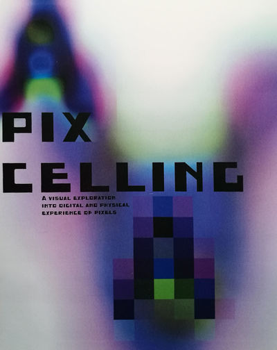
In Pix-celling I look at the difference between human and computer interpretations of pixels and I try to find a new viewpoint or perhaps a starting point for something bigger.
Abstract
Pix-celling started off from restrictions of big high-quality formats on websites - this wiki allows a maximum of 2MB per item, in case of a gif this either has to be very short or the quality of it has to be reduced.
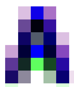
When I reduced the following gif to 378 KB and displayed it at 800 px width it evolved beyond the image that it originally was. The pixels of the image came alive and became interesting in themselves.

This made me think in ways pixels can be exposed. I gathered materials which displayed a bigger image made out of smaller components.
My interest lay in the craft of making these images but also the difference in displaying them on separate surfaces as print and digital images.
I wanted to explore the information pixels carry for machines and people and how they can be interpreted and reinterpreted.
Central Question
Do we loose or gain information by distortion?
- Defining lost -- To define lost first I would have to define what is *found*.
found -- Looking at an image the is information to be found. Specifically in a portrait there is information about the person that makes them specific. Facial features that make them recognisable.
lost -- Manipulating part of the "found" information would lead to changing the specific features and making them unrecognisable.
part -- The part that is being manipulated are the pixels making up the digital image. The pixels contain information on the most zoomed in level.
digital image -- Capturing the digital image with a camera or webcam or kinect?
pixels -- What information does a pixel really contain? It is a block of color. What distortion can be made to a pixel?
-- Pixel has x & y position. Can you add it a z position? What happens when you start changing up one of these variables? Or 2? Or all three of them?
-- Can the information change from a color block to a graphic element? ASCII .
Relevance of the Topic
Understanding the quality of an image is essential as a visual designer working in the digital sphere. One has to understand the specifications required for each device to display the image correctly without distortion. And same goes for printing processes. Exporting the right quality image is part of the design practice.
However, usually, this process happens in achieving better quality for an image than it is and not the other way around. I wanted to explore the opposite of this and give value to the smallest component of the image.
DECOMPOSING & RECOMPOSING
I explored the small component of a visual from various perspectives from ASCII to pixel art in combination to Kinect, Unity designed 3D experiences to the RGB composition of a pixel. In all these examples I was looking at a way to visualize the smallest particle in relation to the whole image while maintaining the focus on it and not the whole. Again, usually this is done the other way around and sometimes I caught myself falling into the danger of wanting to do something for the bigger picture but through reflection an feedback I managed to stay focused.
Again it is paradoxically technology that demands better quality but is at the same time able to display low-quality image in an interesting way. Pix-celling is about exploring typography from a different perspective where these new high definitions allow very intricate details and maximum zoom-in power. How does a graphic designer still relevant in experimenting with typography in this era? I believe is by using the technology and setting new innovative conditions.
Hypothesis
I think the research will bring me many new ideas on how to further to explore the theme. I want to make the differences/similarities between digital image and print visibly next to each other and create experiences around them.
What I did part
Research Approach
I kept a wiki on my process which can be found here:[[1]] Pixels away
![]()
Artistic/Design Principles
I usually consider a user in regard to my designs. A user that has the power to change something in the context/conditions that I created. It is almost as if I would want to share that moment of joy when I am creating by making something that in its own encourages creation, interaction. I started this project with this principle in mind: How am I going to make the pixel, the tiny fragment noticeable. How is it going to be about the detail instead of the full picture? How could this turn into an experiment? Through making the experiments, however, I started to realize that I was taking the wrong approach. For me, it was really important to have a form that would be possible to interact with and it was limiting me to always come back to this thought.
The idea that I had about human identity also lost my interest because the details were less interesting. I find more awe in the abstract, in the shapes. When I was working with bitmaps in the portrait that was very interesting but because of the portrait format also limiting.
As a principle, I would say I tried to free myself as much as possible from my own constraints. Not always knowing what the end result would be gave me more interest to continue researching and experimenting with the small components until I found my medium. Once I let go of the big expectations I was free to do everything and I had to realize this way I saw more potential in simpler experiments which in the end gave me greater satisfaction.
I discovered a new way of making. A making that is not finished...
Artistic/Design Proposal
So...this was my original proposal:
AN installation where a Kinect traces you as an ASCII code in 3d space- so when you move close up you zoom into one pixel.
Which I still like but the complexity of this proposal was stopping me from really digging into research and just doing. Once I let go of the outcome it was a lot easier to focus on what I really wanted to do. Zoom into the pixel.
Realised work
I made a new way of looking at a letter.
Bold as this statement is, Pix-celling was about looking at shapes, colors, positions, deformations and readability of letters.
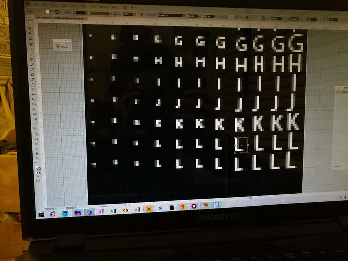
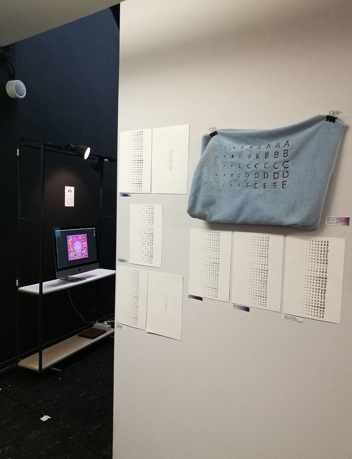
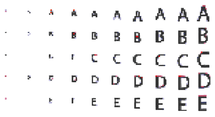
What something is recognized as a letter by a computer on the screen, for us it might seem like a blob of nothing from close view (printed and digital version as well). In Pix-celling I explored a font on a 100-pixel width artboard in ten different sizes. From its smallest form of 1 point till 10 points.
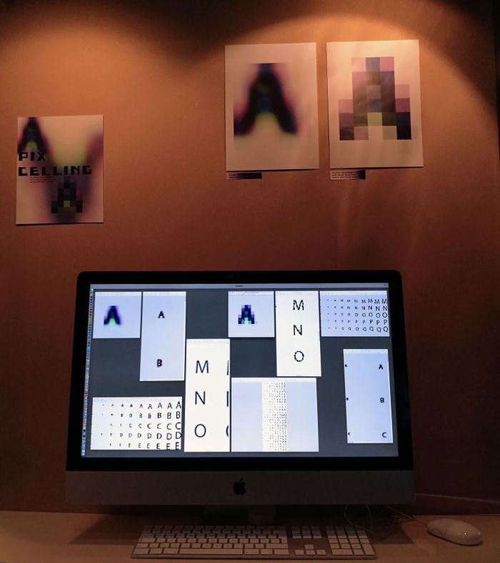
In the process of printing the result in a similar pixelated form, I explored different saving methods, resulting in different printed outcomes.
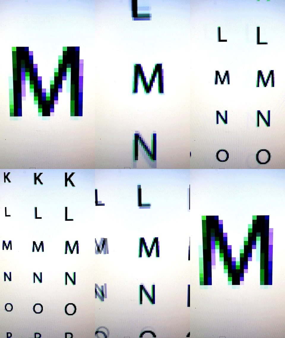
As part of the research on the pixel, I came across subpixel rendering - when the pixel of the screen is further divided into Red, Green & Blue for an even sharper look of the text. I thought this division would be also interesting to try to do manually aimed at printing. What the beauty of this color separation is that once the Red Green and Blue layers are on top of each other one can find different visibility options for them thus creating whole new spectrums of colors that are being displayed instead of the previous black.
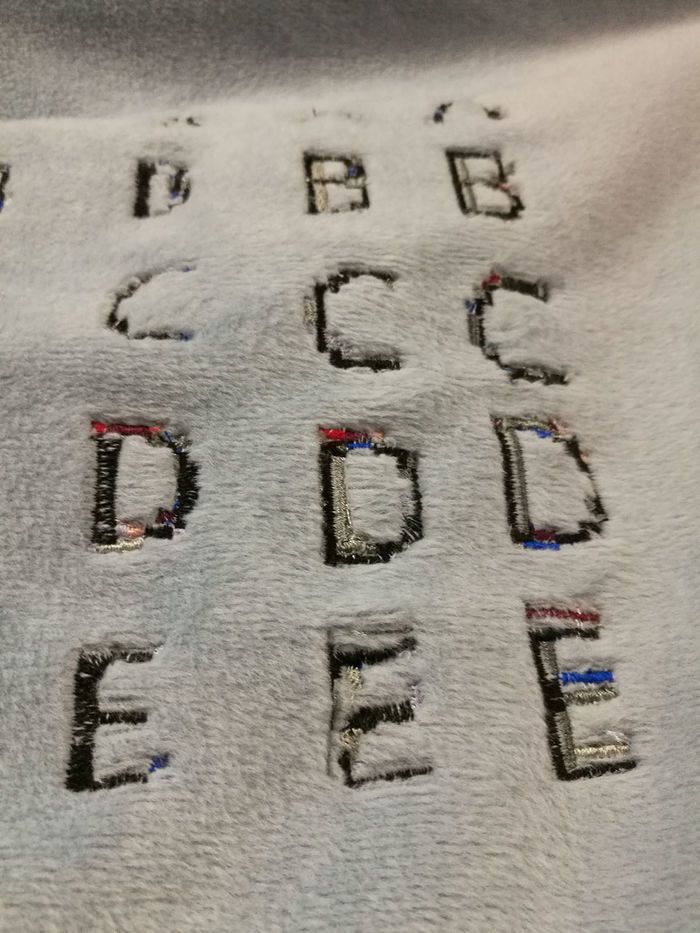
I made prints and an embroidery to show the difference of the perceived pixel over multiple materials.
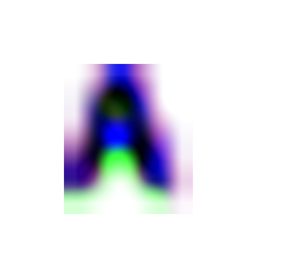
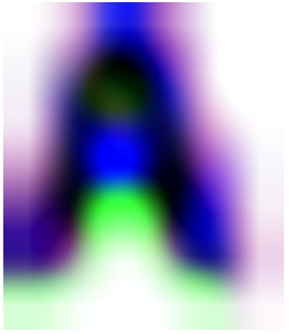
As another step I took the 2 pt "A" letter and blew it up to 20 cm width while leaving the programme to automatically fill in the gaps between the created pixels.
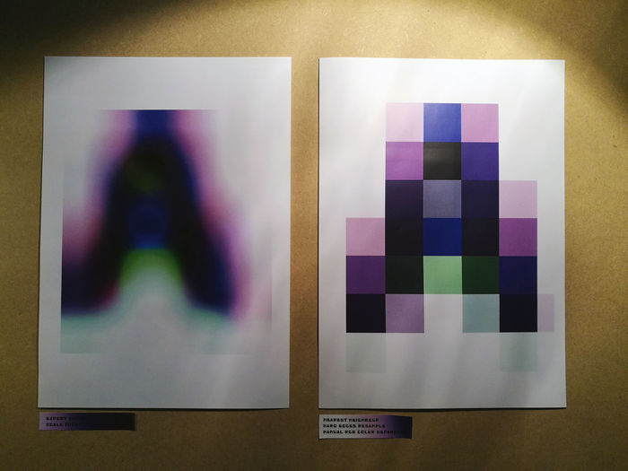
So as I said, this making is not finished. I really think that only at the end of this project I got really excited about what I discovered but I do not mind because it holds so much potential for future exploration that I am pretty sure I will develop it further. I discovered a tool to make new visuals while using the intelligence of the programmes in sync with my fascination for shapes, layers and letters.
Final Conclusions
(what was the point? what do you take away?)
Bibliography
(what did you reference in this text (other texts, images, films, exhibitions)? Remember to use proper in-text citing!!!!!!!!!!
Body as interface!
http://www.presenttensejournal.org/volume-3/from-gui-to-nui-microsofts-kinect-and-the-politics-of-the-body-as-interface/
emBody(text) {
http://www4.ncsu.edu/~dmrieder/embodytext/
