Difference between revisions of "User:Terazeit"
| Line 44: | Line 44: | ||
However, there are still many issues I must tackle such as the choice of presentation, the information I will provide on the website and the finalized style that the audience will see. These are issues I'm sure that will be resolved shortly. | However, there are still many issues I must tackle such as the choice of presentation, the information I will provide on the website and the finalized style that the audience will see. These are issues I'm sure that will be resolved shortly. | ||
| − | [[File:No.155.jpeg| | + | [[File:No.155.jpeg|1000px|]] |
http://digitalcraft.wdka.nl/mediawiki/images/a/a6/No.155.jpeg | http://digitalcraft.wdka.nl/mediawiki/images/a/a6/No.155.jpeg | ||
Revision as of 12:11, 8 May 2018
| Speculative Future by Rik |
Visualization of code example 2aLines, perspective, all things that we have to consider while programming the virtual world. To keep not only the mind, but also the physical human in contact with the program we make an artificial stage, where the tactile connection correlates with the mental image of the program. [VR Crossdimension] Combining these parameters makes us able to guide people the right way and happy in their Lifepod: Giving them the feeling of mobility.
Keep in mind to strictly use our code as the person will feel confused and/or become aware of the simulation. When this happens serious actions will be taken to prevent this event recurring, and thus disqualifying the responsibles from their position. |
Cutting edge of the Present
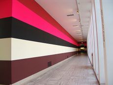
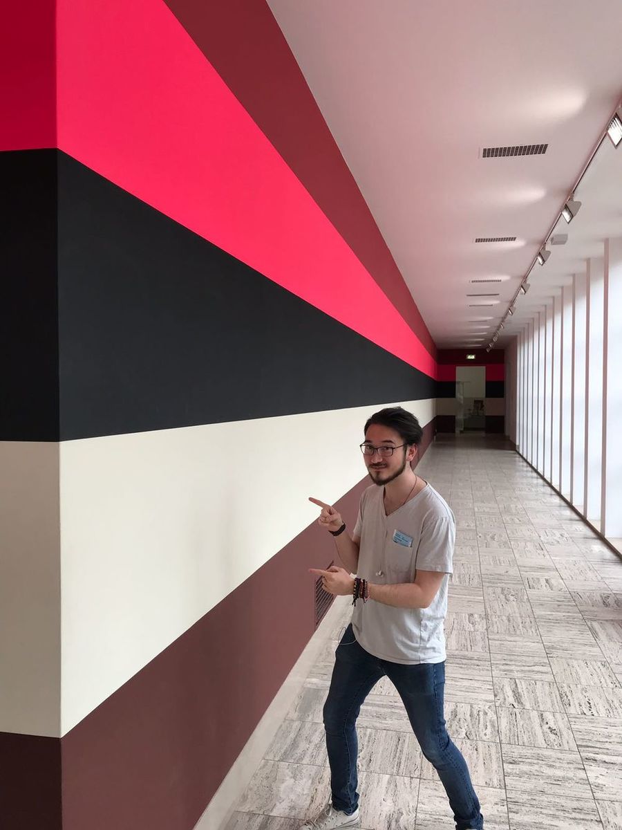
Against popular opinion, I have decided to appropriate this work of art by Jan van der Ploeg called "wall painting no.155" (2006).
Although there were many different pieces to appropriate in the Boimans collection, the wall painting was the only one that truly struck me. As a result of this, I have decided to focus on creating a similar experience to the one I had through digital craft. What I aim to appropriate are the colors and sense of depth that occurred to me as I walked past this work of art. I went through many ideas ranging from VR to AR to sculptures and finally to gyroscopic however I wish to do this through an HTML canvas. Using the various crafted code I will write a website that will portray the sense of depth held provided by the original painting and allow the user to easily navigate through it. The website's purpose will be to create a sense of travel between pieces of information just like as it did in the museum but in this case, it will be doing so in the digital realm.
However, there are still many issues I must tackle such as the choice of presentation, the information I will provide on the website and the finalized style that the audience will see. These are issues I'm sure that will be resolved shortly.
Process
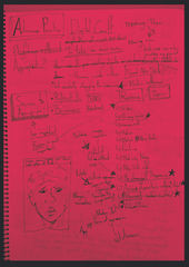
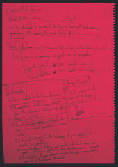
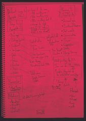
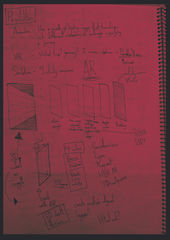
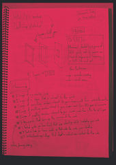
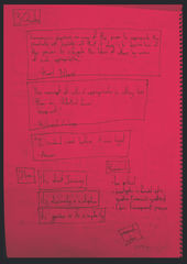
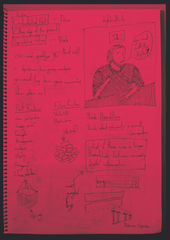
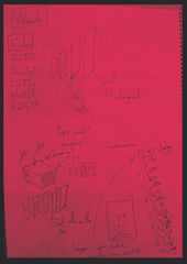
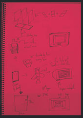
The meticulous notes from my process book. They discuss my previous plans, other possibilities I considered and the routes taken to my current position.
Statement
When searching for information online we are presented with an abundant amount of information straight away. However in an age when information is so suddenly supplied there is no longer any room for a journey of discovering information. This might not be the same thing that comes into mind when viewing “wall painting 155” however what it provided for me was a breathing space between exhibitions. I felt that this sense of space between exhibitions could be used in a digital sense. Much like a loading screen, this digital hallway would act as a passage towards information which the user would “walk” down as they discover the information they wish to acquire or that the designer wishes to provide.
It was from this idea that my design question was born, “What if there was a longer threshold between accessing digital information?”. I believe that websites are the new museums of the future and for me to be able to paint what Jan van Der Ploeg created through a line of code is the next step towards digitalisation of museums. Like any gallery space there must be a balance of space and art but there must also be the journey that is taken through them. But I’m not just talking about a 3D rendered building with a google maps interface, I mean the space and time taken between viewing art. We don’t appreciate this time in the modern age and instead we decide that information must be provided faster than we can process it. But then the question how we provide this information. Websites are but pixels on a screen, two dimensional and filled with hyperlinks to bring us as quickly as possible to the information we desire. What I wish to make is a website that doesn’t scroll up or down but that scrolls inward like a hallway that you walk down. This way the reader will fall slowly into the information provided having each section of information hidden behind the next like the frames in a movie preventing you from seeing what happens next till you get to it. Arguably this can be seen as more of a scrollable movie rather than a hallway due to the designing method and purpose of the interface. Rather than letting a user have their way as they would normally do with a website interface, this hallway would constrict the viewer to selected amounts of information at a time allowing for them to breathe between pieces of information.
