Difference between revisions of "QUARTER 10 - JULIA RAHLFF"
Julia Rahlff (talk | contribs) |
Julia Rahlff (talk | contribs) |
||
| Line 226: | Line 226: | ||
Before I started on the video, I did a test to see if I could substitute the hairdryer with something else, but it did turn out very well, and I believe by making a movie is much better way to present my project. | Before I started on the video, I did a test to see if I could substitute the hairdryer with something else, but it did turn out very well, and I believe by making a movie is much better way to present my project. | ||
The video is around 2 minutes, and I think it speaks for itself. | The video is around 2 minutes, and I think it speaks for itself. | ||
| + | |||
| + | I have really steps out of my comfort zone in many ways during this project. I have learn about and tried out many new techniques, materials, programs, and also directed and acted in a movie. | ||
Latest revision as of 11:07, 4 February 2016
Reseach question:
How can I make social identity visible on people?
I want to take starting point in what I did in graphic design in quarter 9, where I worked with social identity and made "The Social Passport". This is a relevant topic because social media is becoming more and more important. People use it to brand themselves, and people judge you by your social media profile. For example its really normal for people to google you when you apply for a job, want to rent a room etc. to see who you "really" are. I think this in general is a negative thing, because its takes a lot of time to appear perfect online, it also creates a lot of pressure and a lot more of negative things, but that is a total other discussion. But on the other hand I think its positive that people can be judged by something else than their nationality, and on social media you have the ability to decide how you want to present yourself.
I want to try out different ways to transform a social medium into a pattern/fabric, and then decide for one method that I will use to make the final product. I imagine that it could either be translated into something really visual and clear (that its easy to see where the pattern comes from) or more diffuse, using for example html codes or a plotter.
I think this will be a project where I expose my own social media/online life. I will be critical about whats happening now with the increasing importance of social media, and my goal with this project will be to create reactions, conversation, and make people think.
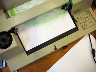
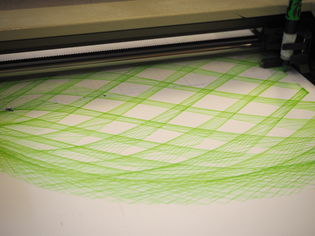
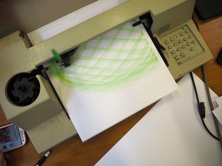
Exploring the plotter:
Contents
PROJECT QUARTER 10
Last quarter I worked with social identity in my Graphic Design class, where I made "The Social Passport". I wanted to work further with this, because I think it is very interesting how people use social media to create a image of themselves, and "promote" their personality and looks. But also how people are getting judged by their social media profile. That people are looking at what you post online, to find out "who you really are" is a phenomenon that is getting more and more normal, for example when you are applying for a job or want to rent a room. I think this is not completely positive or negative, its positive because you have a chance to choose how you want to represent yourself, and be the "best" version of your self, and therefore purposely decide how people perceive you. You also have the opportunity to not post anything online and therefore only give an impression of who you are by meeting people in real life. But there is also a negative side to this, because your social media profile does not show how you behave in real life, and is very often carefully edited to show only your best qualities. How people perceive you online is also often depending on other people, not only you, for example on how many friends/followers you have and how many likes and comments you get. I think judging people by their social media profile is like judging people by the first impression, often based on how you look, and this impression can very easily change when you get to know people in person.
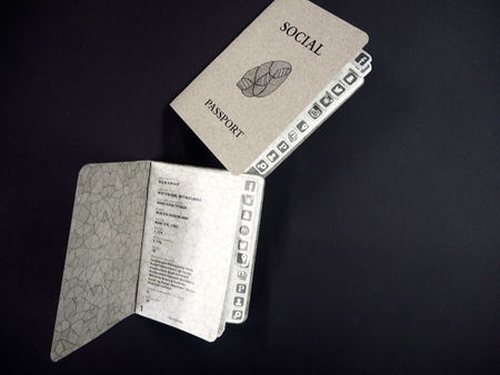
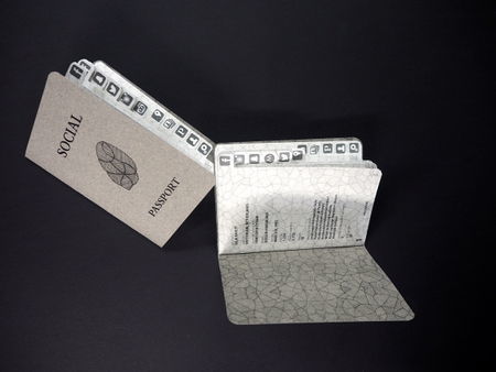
Pictures of The Social Passport, based on social media profiles and what you share about yourself online. I made these in quarter 9:
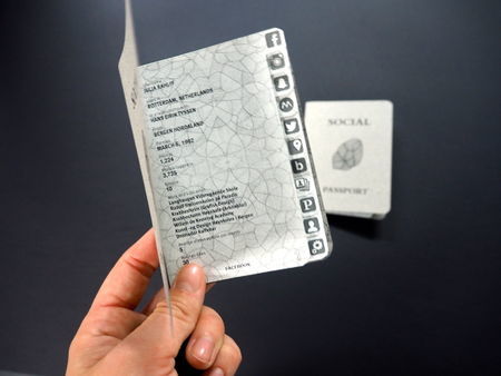
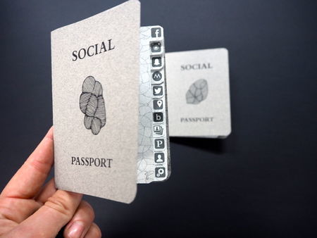
These passports makes it easier for people to see how you behave online, with these people can look browse through your social identity in a short time. To take this even further I think it would be interesting to make something wearable that people immediately see when they meet you, to intensify the feeling of being judged by your social media profile.
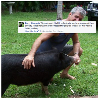
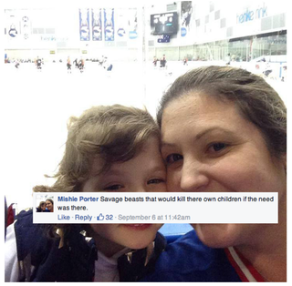
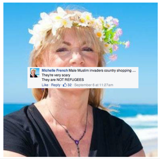
To press the like button or give a comment to someone or something is a relatively easy thing to do online. Since its so easy to do, posting, commenting and liking has become a part of our normal everyday life. To some extent people tend to think that they are anonymous online, and are posting things without even considering what they are saying and that it stays online forever. This has resulted in serious bullying and hatred spreading around the world. I really discovered this when I was working on the meme project last quarter, Face It. When I looked for racist meanings and horrible things people have been writing about refugees online, I was surprised to find out how big the amount of these gruesome comments are, and how easy they are found. This brought up a question: "Would people dare to say these things face to face to the people they are talking about?"
Some of the pictures from the "Face It" project:
These comments also get a lot of likes. Liking a comment, or a pictures, is even more easily done, because its just a tiny click and you don't have to write anything. I know that I tend to like a lot of pictures, because its a nice gesture and doesn't take any effort. Liking has become more effortless that actually giving someone a compliment. So then I come to the question: "Would you "like" a person in real life?" Actually go to a person and say: "Hey, I like you!"
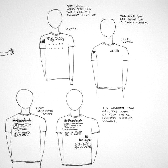
To visualize social identity on people, I have desided to make a "like-T-shirt". I wanted to make something that you wear and walk around with, this could have been an accessorize, but I feel that a T-shirt is a good way to symbolize something you normally wear. My first idea was to make a like-button on the T-shirt, and with a little screen that counts how many likes you have, and people would also immediately see how many like you have, and then they would make up an impression of who (how popular) you are. idealistically it would only be possible for one person to press the button one time, just like on social media, where you can only like one thing once. But a screen implemented in a T-shirt is not something we would normally wear, and it may appear too weird. And just pressing a bottom may also be quite easy, so to make this more personal and intimate, I think I would like to make something that also remember how long people are touching you. I think that the longer people touch you, is a sign of how much they like you. This led me to think of another idea. To make a T-shirt that you have to like in real life, to be able to see their social identity. The social identity will appear when people like like it.
You have to like a person in real life before you get to see their social identity. So actually it is something that prevent people from judging you on your social media profile.
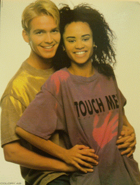
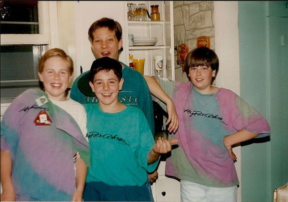
Researching clothing that changes color by touch:
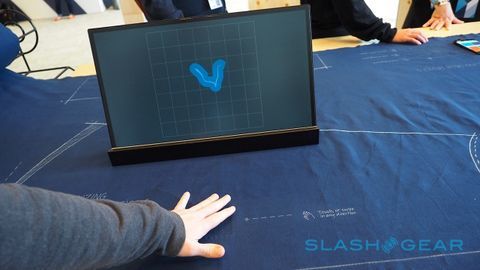
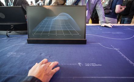
Fabric that reacts to touch, with implemented sensors:
Sketches for the like-T-shirt:
The like-T-shirt is a t-shirt that connects the physical person to their online life.
And what you get to see is determined by the people who are around you in real life.
Notes of feedback, and what I have to think about:
Start testing with thermo ink, the T-Shirt have to be in one of the colors of the thermo ink.
What if its the opposite way around, the social id disappearing when you are hugging, because then the social identity maybe doesn't matter anymore.
Maybe have more approaches to this, make for instance 3 different T-shirt which works differently. Quantity may strengthen my project.
Make scenarios, in which situations will this work. How will people use this.
Have a plan B. If it doesn't work, at least make scenarios and prototypes.
Heat sensitive sensors exists, maybe I can use this in stead of the ink, because it takes a long time to warm up thermo ink (longer than a hug).
Intersting mixing social media (online social identity) with your real life social identity.
Aram Bartholl
STARTING TO TEST
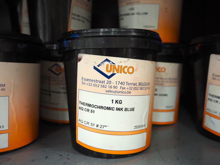
I started experimenting and doing test with thermo ink. I chose the color blue because I think it relates to social media, obviously to Facebook, but also to other social mediums like Instagram. I also chose a thermo ink that reacts to heat by getting invisible, because I wanted to have the opportunity to make my pattern disappear, but also make it reveal a pattern behind it.
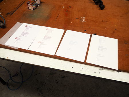
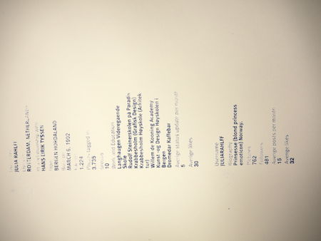
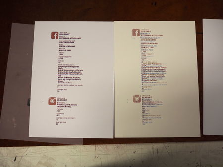
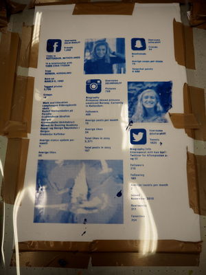
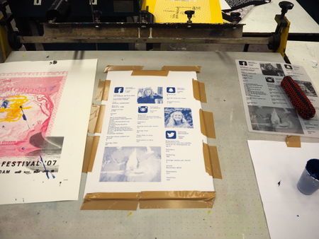
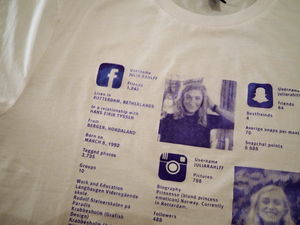
I made a test print with information I gathered on my own social media profile from Facebook and Instagram. It is quite small because I wanted to see how small letters I could make, and it would still work. I haven't decided yet if I want to have only text or images or both.
TESTS ON PAPER:
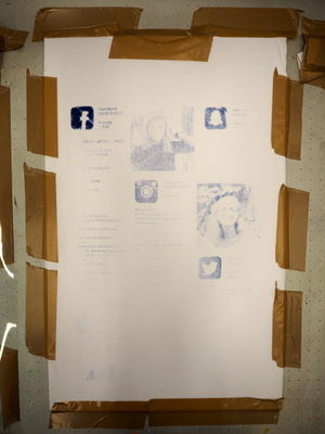
What I discovered with this test is that the heat sensitive paint is very thick, and not so easy to silkscreen print, because it gets stuck in the screen. Even though it dries very quickly, it does not react or change only by touching it. I need more heat that that. But when I used a hair dyer it worked perfectly! It was really nice to see that the text disappeared and then slowly became visible again, even though it did not react only using regular body heat.
TESTS ON FABRIC:
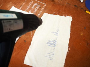
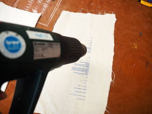
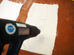
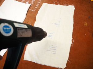
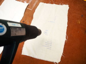
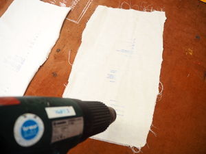
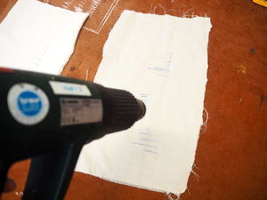
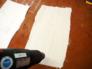
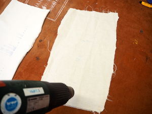
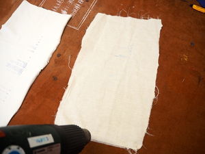
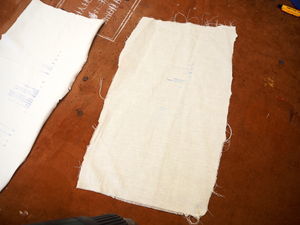
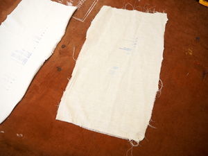
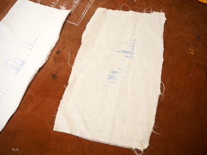
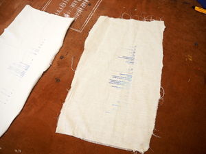
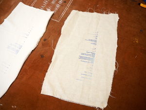
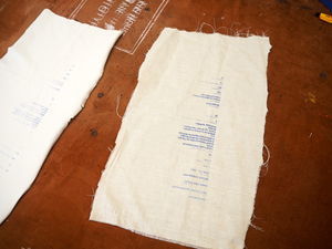
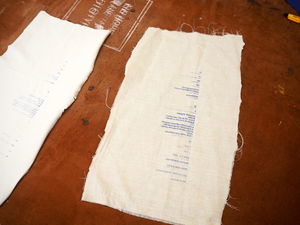
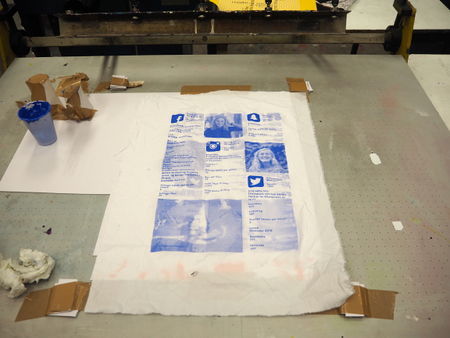
My idea is that my final product is going to be a "like-T-shit", so naturally I had to test the ink on fabric. I tried two different types of fabric to see how good the ink would stick to it, and how the fabrics would react to the paint. One of the fabrics definitely worked better than the other. The smoothest and most stratchy fabric didn't accept the ink that well, and the pattern became very weak. Anyway, both of them reacted perfectly to heat, even better than it did on paper. I have a lot of videos where I use heat on these tests, but I find it hard to upload here, so I will show it underneath by using photos.
My ideas after doing this experiment is that I want to make two t-shirts, one where the the pattern disappears and one where it become visible. One white and one blue. On the blue one I have to first silkscreen the pattern in another color, and then cover it with the thermo ink, so that when it becomes warm, the thermo ink will become transparent and you will se whats underneath it. If this is going to work I also need a t-shirt in the same blue color. I will also have to find a solution for how the heat will interact with the garments, since regular body temperature is not warm enough to create a change with the ink.
REFLECTION AND MORE TESTING
After thinking about my project and looking back on what my idea originally was, I have decided not no make to different T-Shirts that work the opposite way, because then I will have two different results. Instead I will continue to work on one of the approaches, and make two of the same T-Shirt, but for two different people. Because Social/Online identity looks different to different people, and by making two I can show how that would look like. And give people a broader picture of what my project is about.
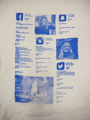
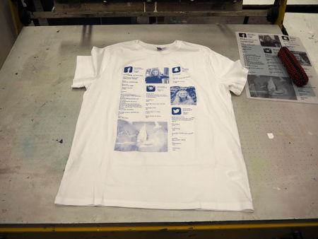
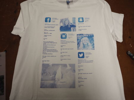
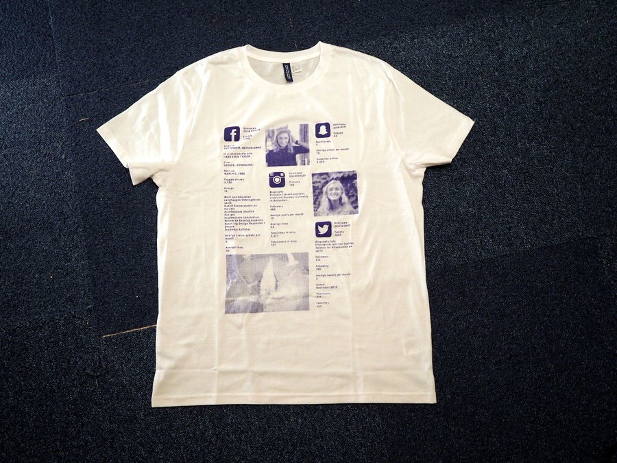
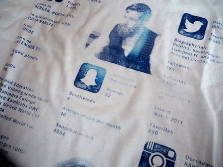
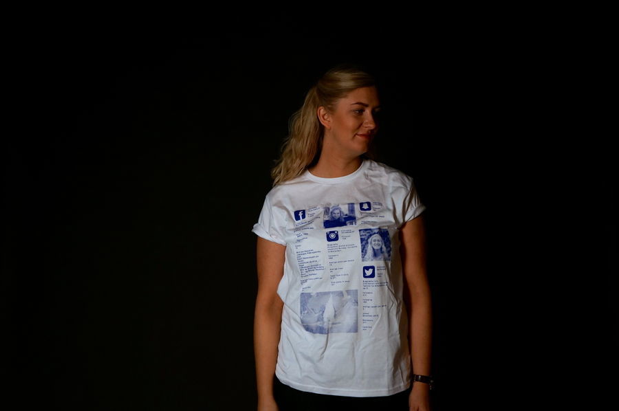
To continue experimenting I had to visualize social identity in a printable pattern. I have had an image in my head how this would look like, but when I had to really make it, and decide how it would look like, it was harder than I thought. For the first T-Shirt I chose to use myself as an example, because it is easy to collect information about what I post about myself online. I also collected and calculated a lot about my own social media habits when I worked on the social passport so I was able to use some of that information. When making what was going to be on the T-Shirt I had to make decisions about what to focus on, what information that defines I social identity, which pictures to use and how this information should be displayed.
I chose the information that I think is the reason behind what people judge you by; Which Social media platforms you use, I selected the top 4, how many friends and followers you have, how active you are on these platforms, how often you posts something, how many likes you get, which pictures you chose to posts, how many you follow. I also wanted to include the icons for the different social medias, because they are very "known" and easily to see from a distance. I put everything in a square for the simple reason that social media is on screens that is square.
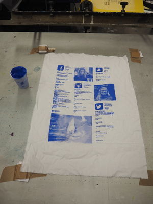
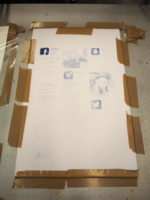
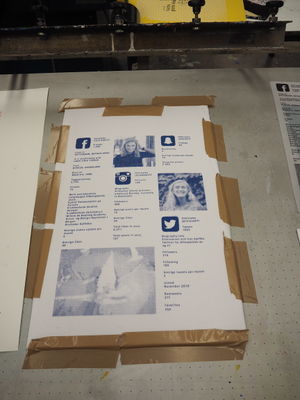
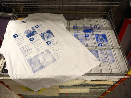
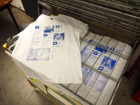
I did some tests with this pattern where I used normal paint, because I had to see if the pictures would be understandable, and also how it was to screen print this on fabric. Some of the tests turned out nice, and some of them failed, but however I continued to try with the thermo ink, and afterwords print it on the T-shirt.
Like I experienced before the thermo ink was really thick and when I first tried using it on the T-shit, almost nothing of the paint went through the screen. I struggled with this for a while, but in the end, it turned out the way I wanted.
ABOUT MY PROJECT
With this project I want to raise some questions:
HOW IMPORTANT IS SOCIAL MEDIA TO YOU?
TO WHAT EXTENT DO YOU IDENTIFY WITH YOUR SOCIAL MEDIA PROFILE?
DO YOU YOU JUDGE OR MAKE UP YOUR MIND ABOUT A PERSON, ONLY BASED ON THEIR SOCIAL MEDIA PROFILE?
ARE YOU AWARE OF HOW MUCH INFORMATION YOU SHARE ABOUT YOURSELF?
Social media has become a part of existence. We get bombarded by pictures and information in every aspect of our life, both in the physical world and in the online world. In this digital age information is spread to all parts of the world, at the click of a mouse or a tap on a screen. Internet and social media follows us around everywhere, and it has no borders or limits. Here people have several huge platforms where they are able to choose how they want to represent themselves, and therefore also how people perceive them. To many people being successful online is so important that it controls how they life their life, but I believe Social media has an impact on everyone. Social media has fundamentally changed the way we life, not only is it important to be successful in real life, you also have to be successful online. Everyone nowadays can easily expose themselves online, and it seems like people are doing this without thinking about where it can lead to. However it has become so usual to google people to see "who they really are", it is just a fact we can´t ignore. In some cases Social media can be the determining factor whether you will get a job or a room in a shared apartment.
"Social media is contrived images and edited clips ranked against each other. It’s a system based on social approval, likes, validation, in views, success in followers. it’s perfectly orchestrated self-absorbed judgement.” - Essena O´Neill
What O´Neill says is very relevant for my project. The Like-T-Shirt has clearly been affected by, and connected to my previous works; "Face It", "Text Neck Remover"(How technology is affecting our everyday life), "Haptic memory" and "The Social Passport", and not to mention my research question from the beginning of this process; "How can I visualize social identity on people?"
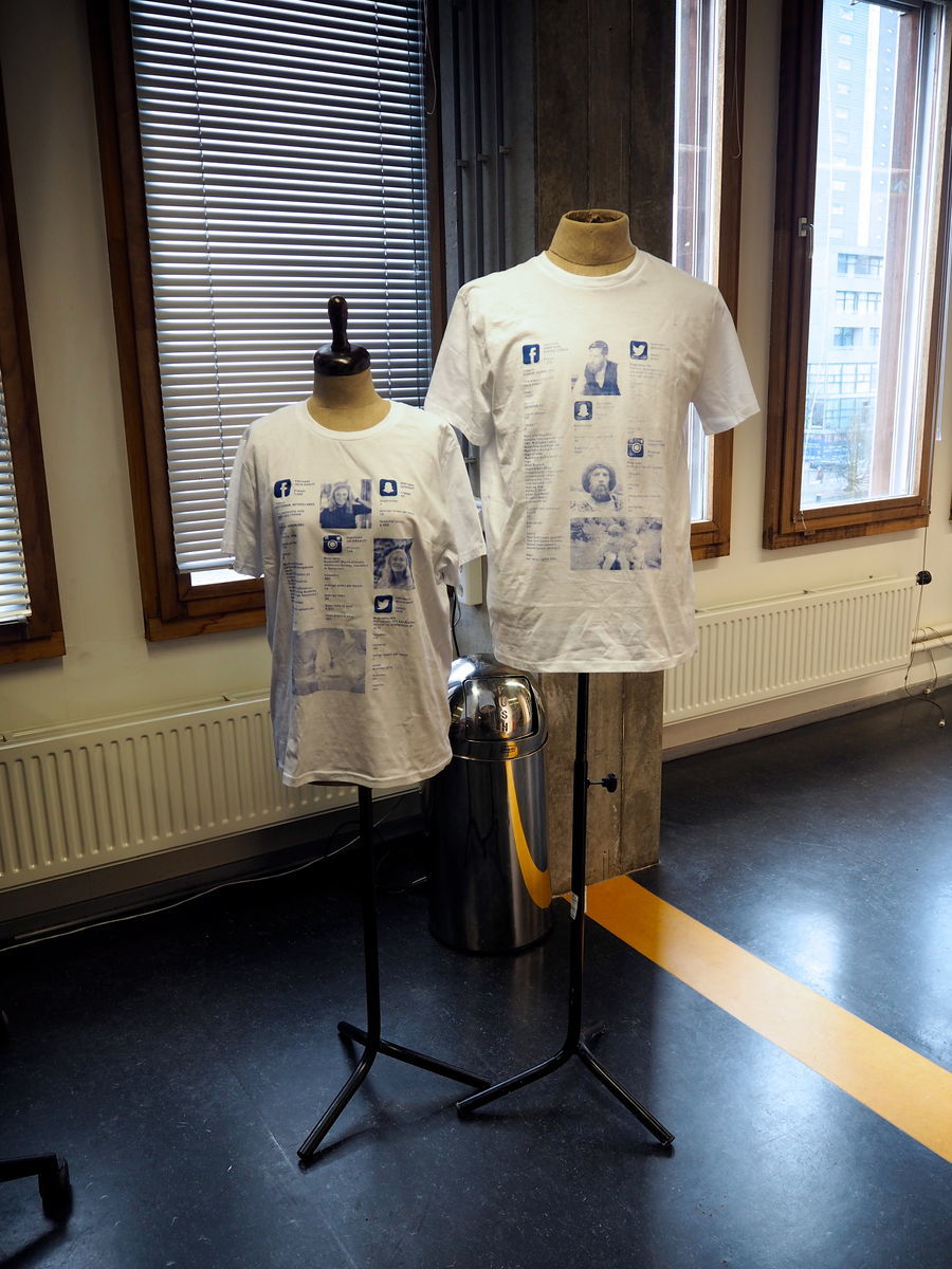
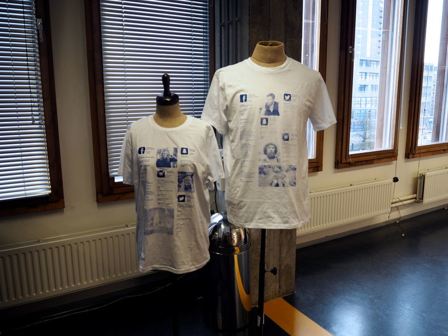
What my final result ended up being was not exactly how I imagined it to be, however I´m satisfied with my interpretation for the the "Social Media World" we life in today, and I hope it will make people think about the questions above. I also think it could work in an exhibition setting, using mannequins and the hairdryer to make people interact with my project. The design of the T-Shirt also has an clean design, where the information is easily understood, with a lot of white space, which is a hint of my style as a graphic designer.
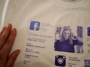
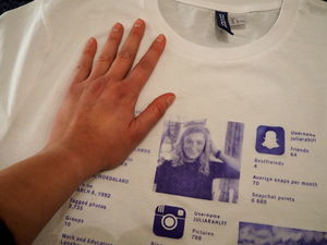
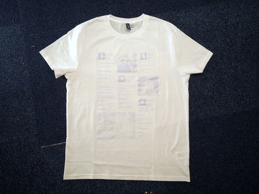
The first finished T-Shirt:
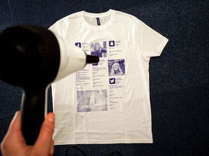
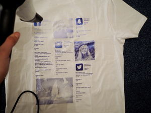
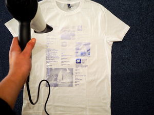
"Blowing Away" the Online Identity:
When I touch it with my cold hands it reveals it´self again:
When the Social Identity is blown away:
When I had to choose a practice for my exchange here at WdKA, I chose the one which sounded the most challenging to me. I wanted to experience and learn something I had never done before, and that I would not have the opportunity to do in my school in Norway. It has defiantly been challenging, and hard, but I also got do do something totally new, and learned so much. Working alone on this project was to me very challenging, because I had no one to brainstorm and discuss with, I found it hard whether ideas where good or bad, and questioned myself all the time. I normally don´t have this struggle when I work alone, but working alone with new techniques and topics at a new school in an unusual environment was sometimes really hard. However, I´m not complaining, this experience has been extremely educative, and this was also what I wanted to do when I came here, to be challenged and challenge myself.
PICTURES FROM THE PRESENTATION
REVISIT MY PROJECT
After getting the grade 5 I had to revisit and rethink my project. My final design was not convincing enough. I already knew that using the hairdryer did not "fit in" my project and didn't do the T-shrts justice, this I also said in my presentation. I think I did not present my work the "right" way or the way originally wanted it to be. This has two reasons; Because the final design result should be exhibited as it was a part of a real exhibition, thats why I chose to use mannequins and presented my project as an installation, even though that was not my thought in the beginning. The other reason is that I wanted to make a video that explains how I want the T-shirts to be, but if I had done this I would have had two different result of my project, which I believed would be even more confusing, but I see now that I should have done it. Also time was an issue for me, and therefore I had to decide how I was going to present, and "just go for it".
For the resit I have been thinking a lot about how I could show my project in a more convincing way, where it is more clear what I want to say with these Like-T-Shirts. I have thought about making new T-shirts using another technique, but I believe this will not make a huge difference to the meaning and message behind my project. Therefore I have decided to make the video I had been meaning to make for the first presentation.
In the feedback on my project I got critique about using information that is always changing in an analogue way, where it is not changing. This is because I think that online information gets a bigger impact when it is shown like static text. When you think about what you post online it is like its fluent, and not "real" in a way, but when you gather everything and write it down on a paper, it gets more real and you realize how much information you actually share. However, I don't see this as a big problem or part of my project, if the technology was there to change the information on the T-shirt simultaneously as it changes online, I don't see any reason for not using that, but right now, my T-shirt doesn't work like that. I also got critique about if the pictures I have chosen was the right ones. For the T-shirts I chose profile pictures and cover-photos, because these are pictures that you get associated with. I also chose the pictures that has gotten the most like, just as the rest of the information it is other people who contribute and decides your success online.
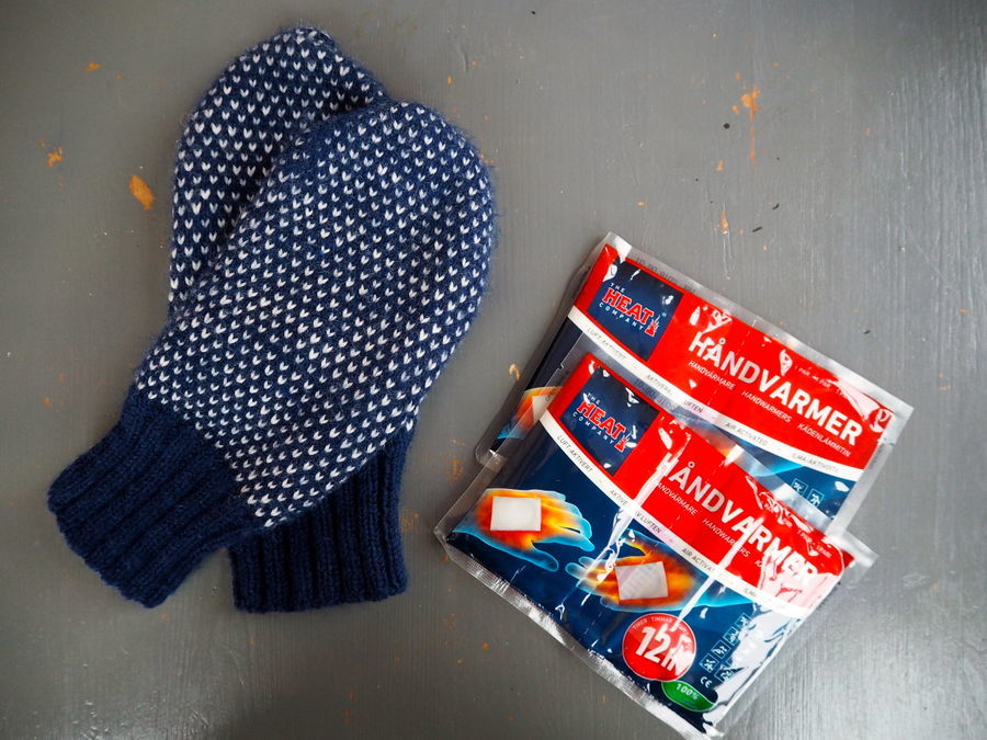
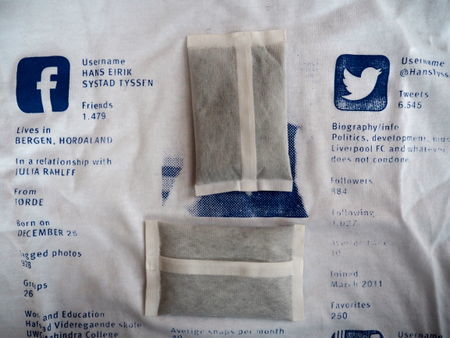
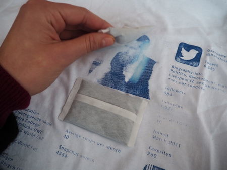
Before starting to make a movie I wanted to another test to see if it was possible to substitute the hairdryer with something else. My father sent me some hand warmers in the mail, these get the temperature of 40c and you put the in your gloves to keep your hands warm.
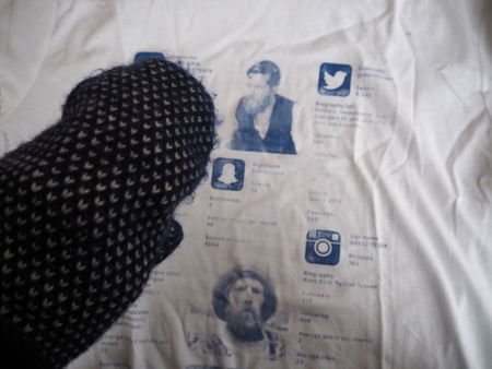
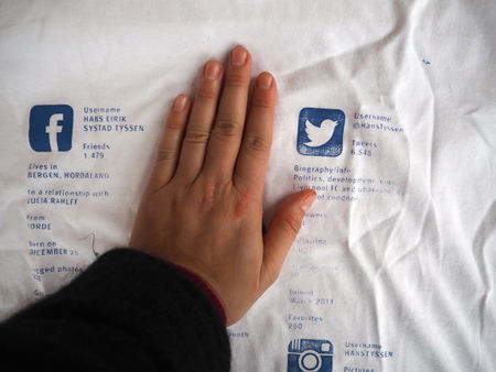
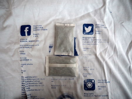
Even though the hand warmers became quite warm, they did not heat up my hands enough to make my hands react with the T-shirt. But when I laid them directly on the T-shirt the pattern started to disappear. Anyway, this was just a small test to see if it worked. And I went on working on a video.
First thing was to draw sketches. I drew scene for scene, and tried to draw as detailed as possible of how I vision the movie to be:
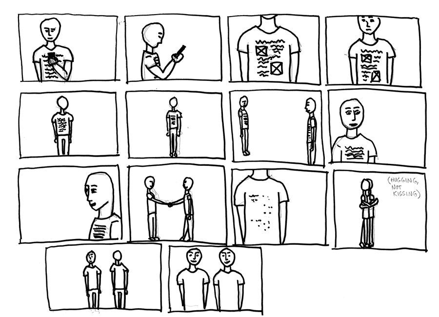
I am still a bit unsure if I want text in the video, or only images. But I think it does not need any talking, so I want to make a "still movie" with music. The point of making this video is to show people how the LIke-T-Shirt work. By making a movie I can to some editing and tricks so that it looks like it is supposed to in real life. As I discovered before the thermo ink doesn't reacting only by touch, but in the future this product might be more sensitive. In the movie I will be able to show how I imagine the T-shirt to be. I rented a studio, and ask a friend to help me with filming, because I need at least to people acting in the movie.
FILMING
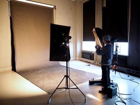
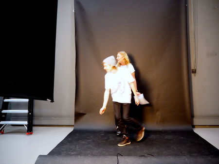
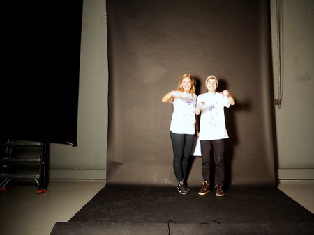
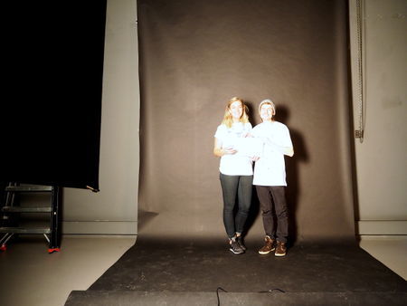
I rented a photostudio and got some help from my friend, Andreas. The planning I did before and the scene-board I drew was very helpful during the filming.
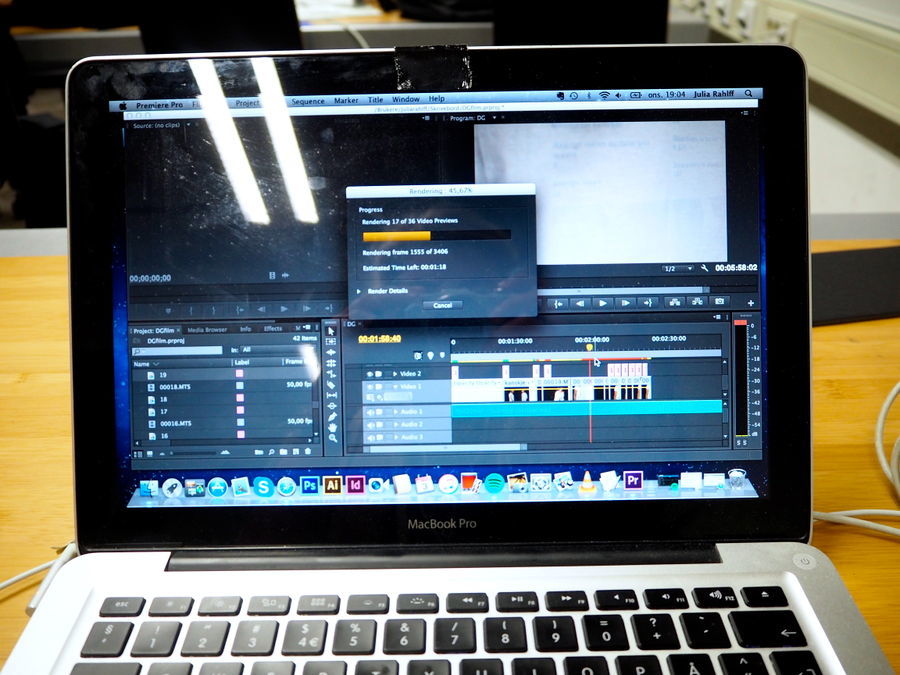
After filming the edit process begun. Because the files where in a format that was not supported my iMovie (the only movie editing program I have used before) I had to download Adobe Premiere to put the movie together. In the beginning it was a bit difficult to learn how to use this program, but after I while I understood the basics. The "movie-effects" is only made by cutting and clipping the film. I thought maybe I had to use even more editing to get the pattern to disappear, but by using the hairdryer it turned out to look the way I wanted it to look.
With this movie I show how the T-shirts are working in a more convincing way, and it clearly communicates my message. I also decided to act in it myself, this was because the T-shirt is made from my own social/online identity, and I think that the concept becomes more clear when I wear it.
Last presentation I chose to show the T-Shirts as an installation. I did that because it should be presented as a part of an exhibition. Originally this was not how I imagined my project to be, and I see now that it didn't to justice to my project. I actually wanted to make a movie as well, but I decided not to do that, because I thought that it would be a bit confusing with both the installation and a movie. But now that I had to revisit my project, I decided to make a movie, which I think communicates my concept and message more clearly. Before I started on the video, I did a test to see if I could substitute the hairdryer with something else, but it did turn out very well, and I believe by making a movie is much better way to present my project. The video is around 2 minutes, and I think it speaks for itself.
I have really steps out of my comfort zone in many ways during this project. I have learn about and tried out many new techniques, materials, programs, and also directed and acted in a movie.
