Difference between revisions of "User:Stin"
| (46 intermediate revisions by the same user not shown) | |||
| Line 1: | Line 1: | ||
| − | <div style="width:100 | + | <div style="width:900px; height:300px; background-color: #f3f3f3; padding-left: 50px; padding-top: 20px; padding-right: 50px;">[[File:Stin.jpg|thumb|Stijn Zijlstra]] |
| + | |||
| + | <b>Stijn Zijlstra</b> <br> | ||
| + | 0928745 <br> | ||
| + | Graphic Design <br> | ||
| + | 1B <br> | ||
| + | 0928745@hr.nl<br></div> | ||
| + | |||
| + | ==Mimicking Calligraphy== | ||
| + | |||
| + | <div id="intro" style="width:600px; height:auto; -webkit-column-count: 2; -moz-column-count: 2; column-count: 2; padding: 20px;"> | ||
| + | <div style="padding: 20px; font-style: italic;">Calligraphy (from Greek: καλλιγραφία) is a visual art related to writing. It is the design and execution of lettering with a broad tip instrument, brush, or other writing instruments. A contemporary calligraphic practice can be defined as, "the art of giving form to signs in an expressive, harmonious, and skillful manner" <sup>[https://en.wikipedia.org/wiki/Calligraphy]</sup></div> | ||
| + | |||
| + | The Japanese calligraphy (Shodo) is one of the most popular fine arts of Japan. Calligraphical works are appreciated not less than products of painting. But this kind of the fine arts possesses also philosophical sense. In the simplest understanding the calligraphy is an art to write beautifully. The master creates a work of art by bamboo brush and inks on the rice paper. It transfers harmony and beauty. The parity of simple and graceful is embodied in calligraphical works as one of main principles of Japanese aesthetics wabi sabi. | ||
| + | There is nothing casual in Japanese calligraphy. The beginning, the direction, the form and the ending of lines, the balance between elements are important for each line and point, and even the empty space testifies about many things. | ||
| + | The hieroglyphs are harmonious, proportional, balanced.<sup>[http://www.japancalligraphy.eu/]</sup> | ||
| + | <br><br> | ||
| + | But as technology is advancing does that mean that algorithms will be able to analyse art and replicate it? Even creating their own variants and showing a degree of originality resulting in the traditional craftsmen being superfluous? | ||
| + | </div> | ||
| + | |||
| + | <div id="paragraph1" style="margin-left: 150px; margin-top: 50px; width: 400px;"> | ||
| + | In CGP Grey's video [https://www.youtube.com/watch?v=7Pq-S557XQU Humans Need Not Apply] he talks about the revolution of mechanical muscles making human muscles less in demand. And how developers of automation are constructing mechanical minds to make human minds less in demand as well. There is a notion that mechanical minds will eventually be able to do creative work as well. Just as the fact that before people assumed playing chess was a uniquely human thing that computers couldn't do, we might be surprised by the development in this field. | ||
| + | <br><br> | ||
| + | <b>Just like [https://www.youtube.com/watch?v=QEjdiE0AoCU Emily Howell.]</b> | ||
| + | <br><br> | ||
| + | Emily Howell is a computer program created by David Cope during the 1990s. Emily consists of an interactive interface that allows both musical and language communication. By encouraging and discouraging the program, Cope attempts to "teach" it to compose music more to his liking. The program uses only the output of a previous composing program called Experiments in Musical Intelligence (Emmy) as a source database for its musical choices. | ||
| + | |||
| + | |||
| + | </div> | ||
| + | |||
| + | <div id="breakcaption" style="width: 400px; font-family: serif; font-style: italic; font-size: 30px; font-weight: bold; line-height: 30px;">How would it be possible to emulate calligraphy, an art form requiring years of experience, by a mere robot?</div> | ||
| + | |||
| + | |||
| + | <div id="paragraph1" style="margin-left: 150px; margin-top: 50px; width: 400px;"> | ||
| + | |||
| + | In order to achieve a varying line weight within the calligraphy the pen used had to be lowered and raised during the drawing process to simulate pressure. The pen used in this case is a Pentel Pocket Brush Pen. It's a pen with a brush nib with ink cartridges to supply the ink which are positioned inside the barrel. It's a compact solution for calligraphy as it has the form factor of a regular pen. <br><br> | ||
| + | [[File:pentel.jpg|200px|center]] | ||
| + | <i>Pentel Pocket Brush Pen</i><br><br><br> | ||
| + | |||
| + | <b>Defining sensitivity</b> | ||
| + | [[File:Strokewidth.jpg|400px]] | ||
| + | These strokes were drawn by using the 4xidraw and a gcode file going in a straight line, using:<br> | ||
| + | <br> | ||
| + | <div id="formula" style="padding-left: 20px; font-style: italic; font-family: serif;"> | ||
| + | M3 Sα | ||
| + | |||
| + | α = Variable that defines the height of the pen, operating a servo. Ranges from 100 to 0 | ||
| + | </div> | ||
| + | <br> | ||
| + | And seperating the line into 10 segments, lowering the pen along the line from 90 to 0.<br> | ||
| + | As you can see the line doesn't start to change pressure sensitivity until it reaches about 7/10th, depending on the initial distance of pen to paper at 100 and weight on the pen. The effective range was defined as 40–100. | ||
| + | <br><br> | ||
| + | <b>Stroke Order</b> | ||
| + | [[File:Nin-01.jpg|300px|center]] | ||
| + | <i>Stroke Order</i><br> | ||
| + | <br> | ||
| + | Chinese and Japanese characters have a specific stroke order for writing out the character. To simulate brush pressure I had to separate the strokes and export each one via InkScape's plugin <div title="Turkey Laser Exporter">Turnkey Laser Exporter</div> | ||
| + | <br> | ||
| + | The text I decided to use is "人間失格" pronounced "Ningen Shikkaku", which is the title of the book <i>No Longer Human</i> by Osamu Dazai and is one of Japan's most famous novels. But it was moreof used as a filler text to try whether it would work. | ||
| + | <br><br> | ||
| + | |||
| + | </div> | ||
| + | |||
| + | <div id="breakcaption" style="width: 400px; font-family: serif; font-style: italic; font-size: 30px; font-weight: bold; line-height: 30px;">Ningen Shikkaku</div> | ||
| + | [[File:Ninfinal.jpg|600px]] | ||
| + | <div id="resultcaption" style="text-align: right; width:300px; margin-left: 300px; font-size: 14px;"> | ||
| + | The result ended being more abstract than expected initially. But there's a certain beauty in it's roughness and unexpectedness. With some characters it completely loses it's legibility, but especially the first, the simplest character reads very well. But the second character really has a nice variety in lineweight. | ||
| + | </div> | ||
| + | |||
| + | <div id="paragraph1" style="margin-left: 150px; margin-top: 50px; width: 400px;"> | ||
| + | |||
| + | <b>Difficulties</b> | ||
| + | <li>There has to be a fixed height for the brush pen, as a difference in height as few as 1 mm would change the outcome of the end result rather drastically.<br><br> | ||
| + | <li>The various single file method turns it slightly into a performance art. As people watch the words slowly being written down, waiting in anticipation for the next file to load. In a certain sense this can be considered a difficulty because it's more strainous for the "performer". This could be countered by compiling the individual gcode coordinates into one bigger file.<br><br> | ||
| + | <li>During the writing the pen's position also shifted further upward. The pen should have been fastened tighter.<br><br> | ||
| + | <br> | ||
| + | <b>What will it prove for the future?</b><br> | ||
| + | |||
| + | So far it's still abstract, which has it's own charms | ||
| + | The next step would be creating a script or application that could automatically detect linewidth involved. And in turn generate the gcode for the 4xidraw themselves removing the strain of doing everything by hand. Nevertheless, after having went through the process once the file(s) would be ready to create an unlimited amount of reproductions if the circumstances are consistent. | ||
| + | <br><br> | ||
| + | Preferably there'd be an add-on that would also be able to simulate brush tilt as well. I assume it would involve a second servo and variable. But in this case it'd be handy to also study the way a calligrapher's hand moves to more accurately apply the movement to the end result. | ||
| + | </div> | ||
| + | |||
| + | <br><br> | ||
| + | I will leave you with my final reflection in the project, in which I feel it contains a certain beauty in it's boldness. | ||
| + | <div id="breakcaption" style="width: 400px; font-family: serif; font-style: italic; font-size: 30px; font-weight: bold; line-height: 30px;">In a certain sense it's an insult to the art form, which is practiced with great discipline and intuition.</div> | ||
Latest revision as of 14:44, 28 June 2017
Mimicking Calligraphy
The Japanese calligraphy (Shodo) is one of the most popular fine arts of Japan. Calligraphical works are appreciated not less than products of painting. But this kind of the fine arts possesses also philosophical sense. In the simplest understanding the calligraphy is an art to write beautifully. The master creates a work of art by bamboo brush and inks on the rice paper. It transfers harmony and beauty. The parity of simple and graceful is embodied in calligraphical works as one of main principles of Japanese aesthetics wabi sabi.
There is nothing casual in Japanese calligraphy. The beginning, the direction, the form and the ending of lines, the balance between elements are important for each line and point, and even the empty space testifies about many things.
The hieroglyphs are harmonious, proportional, balanced.[2]
But as technology is advancing does that mean that algorithms will be able to analyse art and replicate it? Even creating their own variants and showing a degree of originality resulting in the traditional craftsmen being superfluous?
In CGP Grey's video Humans Need Not Apply he talks about the revolution of mechanical muscles making human muscles less in demand. And how developers of automation are constructing mechanical minds to make human minds less in demand as well. There is a notion that mechanical minds will eventually be able to do creative work as well. Just as the fact that before people assumed playing chess was a uniquely human thing that computers couldn't do, we might be surprised by the development in this field.
Just like Emily Howell.
Emily Howell is a computer program created by David Cope during the 1990s. Emily consists of an interactive interface that allows both musical and language communication. By encouraging and discouraging the program, Cope attempts to "teach" it to compose music more to his liking. The program uses only the output of a previous composing program called Experiments in Musical Intelligence (Emmy) as a source database for its musical choices.
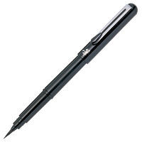
In order to achieve a varying line weight within the calligraphy the pen used had to be lowered and raised during the drawing process to simulate pressure. The pen used in this case is a Pentel Pocket Brush Pen. It's a pen with a brush nib with ink cartridges to supply the ink which are positioned inside the barrel. It's a compact solution for calligraphy as it has the form factor of a regular pen.
Pentel Pocket Brush Pen
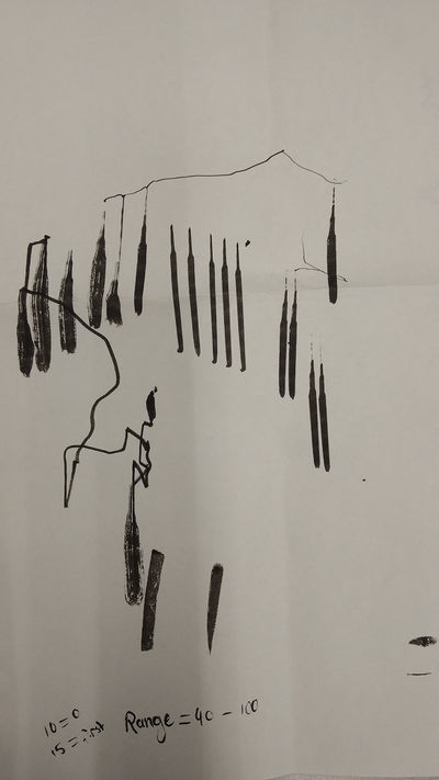
Defining sensitivity
 These strokes were drawn by using the 4xidraw and a gcode file going in a straight line, using:
M3 Sα
α = Variable that defines the height of the pen, operating a servo. Ranges from 100 to 0
And seperating the line into 10 segments, lowering the pen along the line from 90 to 0.
As you can see the line doesn't start to change pressure sensitivity until it reaches about 7/10th, depending on the initial distance of pen to paper at 100 and weight on the pen. The effective range was defined as 40–100.
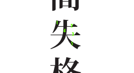
Stroke Order
Stroke Order
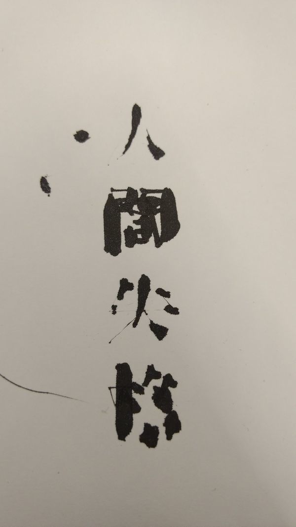
The text I decided to use is "人間失格" pronounced "Ningen Shikkaku", which is the title of the book No Longer Human by Osamu Dazai and is one of Japan's most famous novels. But it was moreof used as a filler text to try whether it would work.
The result ended being more abstract than expected initially. But there's a certain beauty in it's roughness and unexpectedness. With some characters it completely loses it's legibility, but especially the first, the simplest character reads very well. But the second character really has a nice variety in lineweight.
Difficulties
What will it prove for the future?
So far it's still abstract, which has it's own charms The next step would be creating a script or application that could automatically detect linewidth involved. And in turn generate the gcode for the 4xidraw themselves removing the strain of doing everything by hand. Nevertheless, after having went through the process once the file(s) would be ready to create an unlimited amount of reproductions if the circumstances are consistent.
Preferably there'd be an add-on that would also be able to simulate brush tilt as well. I assume it would involve a second servo and variable. But in this case it'd be handy to also study the way a calligrapher's hand moves to more accurately apply the movement to the end result.
I will leave you with my final reflection in the project, in which I feel it contains a certain beauty in it's boldness.


