Difference between revisions of "User:Noemiino/year4"
| (161 intermediate revisions by the same user not shown) | |||
| Line 154: | Line 154: | ||
===TECHNICAL COMPONENTS=== | ===TECHNICAL COMPONENTS=== | ||
| + | <span style='width:60em;display:block;'> | ||
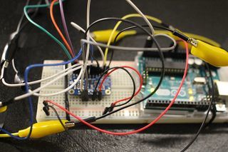
| + | [[File:MIDAS_electro_3.jpg|thumb|320px|right|Overview of prototype of the electronics]]For the technical working for the prototype, we used an Arduino Uno and the MPR121 Breakout to measure the capacitive values of the graphite strips. The Arduino was solely the interpreter of the sensor and the intermediate chip to talk to the visualisation we made for Processing. To make this work, we rebuilt the library that was provided on the Adafruit Github ([https://github.com/adafruit/Adafruit_MPR121 link to their Github]) to be able to calibrate the baseline-values ourselves and lock them. We also built-in a communicative system for Processing to understand. These serial messages could then be decoded by Processing and be displayed on the screen (as shown in the 'Exhibition' tab). | ||
| + | |||
| + | To give a proper look into the programs that we wrote, we want to publish our Arduino Capacitive Touch Interpreter and the auto-connecting Processing script to visualise the values the MPR121 sensor provides.<br> | ||
| + | ====Files==== | ||
| + | <div style="padding: 5px 10px; font-family: Courier, monospace; background-color: #F3F3F3; border: 1px solid #C0C0C0;"> | ||
| + | [[Media:Rippleecho_for_cts.zip]] (bestandgrootte: 485Kb)<br/> | ||
| + | [[Media:Capacitive-touch-skin.ino.zip]] (bestandsgrootte: 3Kb) | ||
| + | </div><br/> | ||
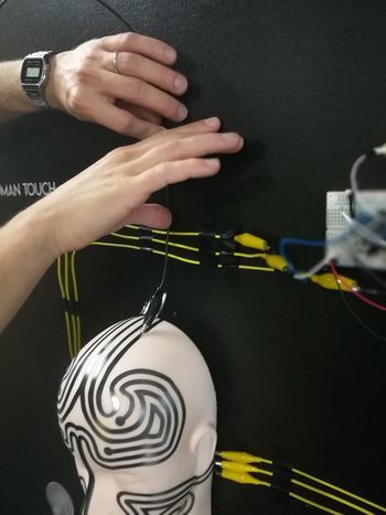
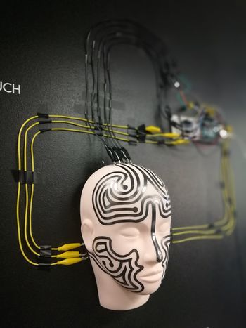
[[File:MIDAS_electro_1.jpg|frameless|350px|Attaching crocodile clips to Midas]] [[File:MIDAS_electro_2.jpg|frameless|350px|Crocodile clips]] <br><br> | [[File:MIDAS_electro_1.jpg|frameless|350px|Attaching crocodile clips to Midas]] [[File:MIDAS_electro_2.jpg|frameless|350px|Crocodile clips]] <br><br> | ||
| Line 413: | Line 422: | ||
=FINAL MINOR PROJECT = | =FINAL MINOR PROJECT = | ||
==Forward/Introduction== | ==Forward/Introduction== | ||
| + | <span style='width:60em;display:block;'> | ||
| + | <br> | ||
| + | In the traditional sense I see graphic design as visual communication built upon final decisions through typography, geometrical shapes, photography and notions such as color, contrast and balance. The creation is concluded when every decision has been made final by the creator. In my practice I try to find ways to '''free graphic design from it`s immobile state''' and I explore technology to do so.<br><br> | ||
| + | Digital technology already allows graphic design to be present in different forms on multiple devices that makes interaction a daily activity. The online visual communication can constantly change its form based on a set of predefined conditions by the designer. A creation has countless options to manifest itself in the predefined function. The area that intrigues me about creating these conditions is '''how much of what is going to happen is staged and who has control over what.'''<br><br> | ||
| + | Digital craft is my tool in exploring the '''duality of a digital creator''' while referencing a tradition embedded in a static result. In my craft I explore the platform where the visual communication can happen. I try to focus not only on the primary sense linked to graphic design, but question the added benefit of the other senses too, especially touch and hearing. Touch is intriguing for me because it is so present in our current world together with the digital interfaces. The motions and gestures are very specific to the devices and we have learned to use them in the way they were staged to be used. We came to associate a certain kind of touch with a specific reaction and behavior. Digital touch is a new language capable of expressing feelings.<br><br> | ||
| + | '''I am fascinated by creating experiences where multiple use of senses simultaneously plays an important role in achieving the non-static.''' | ||
| + | |||
| + | <br> | ||
| + | ==Abstract & Questions== | ||
| + | <span style='width:60em;display:block;'> | ||
| + | <br> | ||
| + | '''Our senses create our perception of the world'''<br><br> | ||
| + | The human body is brilliant at receiving information from different senses and translating them into one complete experience. Looking at the act of visual communication how can setting the right stage influence perception? How can light become a condition in communication? When light is illuminating our small screens and the interaction happens by touch, we already know how our gestures influence the reaction. But, are we so used to these behaviors that we expect the same response from other settings as well? Is touch a predefined condition in itself or the predefined condition is the visual message? In this project I was curious to create a stage where the the perception of a viewer is directed and influenced by predefined conditions. | ||
| + | Is perception via senses a choice? How is a hybrid non-static visual perceived? Is it a screen or is it a print? What is expected from an object when it is perceived as a screen? Is the message the most important part of the project? What is expected of something interactive? | ||
| + | <br> | ||
| + | '''This project aims to explore our expectation and reinterpretation of senses in relation to technology.''' | ||
| + | <br><br> | ||
| + | ==Relevance of the Topic== | ||
| + | <span style='width:60em;display:block;'> | ||
| + | <br> | ||
| + | In our current world new technologies enter the consumer market daily. Technology is undeniably making a difference in how we perceive the world. We perceive not only through our eyes but also through the limitation of a camera screen. Touching is getting more and more resumed as a daily activity regarding smartphones and we developed a special way to handle different interactions on these devices. The human behavior expanded and got reduced at the same time in a very short period of time. Adapting new behavior resulted in the spread of Artificial Intelligence in commonly used tools available in one form or another almost seamlessly in the daily life. Our expectation of new tools is concerning convenience, user friendliness and smart communication. Where information is bombarding us everywhere we look, is there space for an alternative, is a hidden meaning still relevant? | ||
| + | <br> | ||
| + | ==Research Approach== | ||
| + | <span style='width:60em;display:block;'> | ||
| + | <br> | ||
| + | In the theme of this years Digital Craft Minor, Cybernetics I was especially intrigued by the notion of feedback loops. In the second project during the Minor, as a group we worked with the theme of senses as part of the human feedback loop and I was really intrigued by the influence I discovered technology has brought into our behavior. For this project I wanted to focus on feedback loops that we unconsciously experience in form of processing information through our senses and our responses to them. To begin with collecting and assembling relevant sources I first searched a word to overarch the meaning of dealing with multiple senses: HYPERSENSITIVITY. | ||
| − | HYPERSENSITIVITY | + | To have an even more concrete starting point I mapped out the immediate word group that I could relate to hypersensitivity.<br> |
| − | WORD GROUP: | + | HYPERSENSITIVITY WORD GROUP: |
* multisensory processing | * multisensory processing | ||
* sensory perception | * sensory perception | ||
| Line 423: | Line 458: | ||
* blurring out | * blurring out | ||
* mathematical angle | * mathematical angle | ||
| − | *geometry | + | * geometry |
| − | *mono processing | + | * mono processing |
| − | + | <span style='width:60em;display:block;'> | |
| + | I first started with a systematic investigation of related topics and relevant references to gather a gallery of interesting projects, ideas and facts. All these helped me identify what I found interesting about my topic and better restrict my focus. During this project I focused a lot on material research regarding 3D printing. | ||
| + | </span> | ||
<br> | <br> | ||
| − | + | ===Exploring meanings=== | |
| − | |||
| − | |||
| − | == | ||
<span style='width:60em;display:block;'> | <span style='width:60em;display:block;'> | ||
| + | To gain a basic understanding over how the human feedback loop works in relation to senses I started to dig into what '''sensory perception''' meant in the biological term.<br> | ||
''The neocortex is the part of the human brain that is involved in higher-order functions such as conscious thought, spatial reasoning, language, generation of motor commands, and sensory perception'' --> [https://www.psychologytoday.com/intl/blog/the-future-brain/201810/new-theory-intelligence-may-disrupt-ai-and-neuroscience Research on intelligence]<br><br> | ''The neocortex is the part of the human brain that is involved in higher-order functions such as conscious thought, spatial reasoning, language, generation of motor commands, and sensory perception'' --> [https://www.psychologytoday.com/intl/blog/the-future-brain/201810/new-theory-intelligence-may-disrupt-ai-and-neuroscience Research on intelligence]<br><br> | ||
| − | ''According to the number of senses working at a time, the person can be classified into ‘multi-track’ versus mono-processing (Williams 1996). Most people use their senses simultaneously, so when they are hearing something, they are still aware of what they see and feel emotionally and physically.'' --> [http://integratedtreatmentservices.co.uk/blog/autism-olga-bogdashina/mono-processing-one-sense-at-a-time/ Mono processing one sense at a time] | + | ''According to the number of senses working at a time, the person can be classified into ‘multi-track’ versus mono-processing (Williams 1996). Most people use their senses simultaneously, so when they are hearing something, they are still aware of what they see and feel emotionally and physically.'' --> [http://integratedtreatmentservices.co.uk/blog/autism-olga-bogdashina/mono-processing-one-sense-at-a-time/ Mono processing one sense at a time] I started to question if this happens consciously and if we are aware that we need multiple senses playing together to decipher something we are presented with. |
<br><br> | <br><br> | ||
| − | The smell we feel is influenced by the text we read that explains what the smell is. Brain decides based on these two information points if the smell is pleasant or unpleasant. How we label a scent affects how we see it.<br> | + | ''The smell we feel is influenced by the text we read that explains what the smell is. Brain decides based on these two information points if the smell is pleasant or unpleasant. How we label a scent affects how we see it.''<br> |
[https://www.youtube.com/watch?v=nM2MMhMjtVI documentary link here]<br> | [https://www.youtube.com/watch?v=nM2MMhMjtVI documentary link here]<br> | ||
[[File:types_syn_2.png|frameless|650px|types]]<br> | [[File:types_syn_2.png|frameless|650px|types]]<br> | ||
Visual information transformed into a tactile sensation. Images of ants and mosquitoes crawling on hands makes people who experience the pictures visually feel itchiness in their body. Brain is '''predicting''' the action of being bitten and then developing itchiness on the skin.<br> | Visual information transformed into a tactile sensation. Images of ants and mosquitoes crawling on hands makes people who experience the pictures visually feel itchiness in their body. Brain is '''predicting''' the action of being bitten and then developing itchiness on the skin.<br> | ||
| − | The McGurk Effect bah-vah "seeing" the letter on the lips<br> | + | The McGurk Effect bah-vah "seeing" the letter on the lips confuses our hearing.<br> |
| − | <br> | + | <br> Through this research I started to question if the perception of senses happens unconsciously if it is possible to create an experience where the user can become aware of the different ways we perceive through our senses. <br><br> |
| − | + | ===References from literature=== | |
| + | <span style='width:60em;display:block;'> | ||
'''Umberto Eco The Open Work''' - "The author offers the interpreter, the performer, the adressé a work to be completed"<br> | '''Umberto Eco The Open Work''' - "The author offers the interpreter, the performer, the adressé a work to be completed"<br> | ||
| − | ''"The Open Work remains significant for its powerful concept of “openness”—the artist’s decision to leave arrangements of some constituents of a work to the public or to chance—and for its striking anticipation of two major themes of contemporary literary theory: the element of multiplicity and plurality in art, and the insistence on literary response as an interactive process between reader and text. The questions Umberto Eco raises, and the answers he suggests, are intertwined in the continuing debate on literature, art, and culture in general"''[http://www.hup.harvard.edu/catalog.php?isbn=9780674639768 source]<br><br> | + | ''"The Open Work remains significant for its powerful concept of “openness”—the artist’s decision to leave arrangements of some constituents of a work to the public or to chance—and for its striking anticipation of two major themes of contemporary literary theory: the element of multiplicity and plurality in art, and the insistence on literary response as an interactive process between reader and text. The questions Umberto Eco raises, and the answers he suggests, are intertwined in the continuing debate on literature, art, and culture in general"''[http://www.hup.harvard.edu/catalog.php?isbn=9780674639768 source]<br><br> |
| − | + | I was inspired by Umberto Eco and his approach to initiate a new perceptional reality for the spectator. Regarding art as a communication system where the interpretation and perception is open ended. I started to question what would happen in a system where the communication system has a closed, predefined end but an open beginning. Can that still be considered under the concept of “openness”? When does something become fully staged and when does the viewer feel a sense of independent influence?<br><br> | |
| − | ''"a classical composition,posits an assemblage of sound units which the composer arranged in a closed, well-defined manner before presenting it to the listener. He converted his idea into conventional symbols which more or less oblige the eventual performer to reproduce the format devised by the composer himself"''<br> | + | ''"Eco writes that a classical composition,posits an assemblage of sound units which the composer arranged in a closed, well-defined manner before presenting it to the listener. He converted his idea into conventional symbols which more or less oblige the eventual performer to reproduce the format devised by the composer himself"''(Undisciplined Theory by Gary Genosko, p.78)<br> I interpreted this as following regarding my own practice: I do not want to oblige the viewer to interact with the work presented but I want to intrigue to explore and this I shall consider open. |
</span> | </span> | ||
| − | + | ||
| − | |||
| − | |||
| − | |||
<br> | <br> | ||
| − | ==Synesthesia== | + | ===Synesthesia=== |
<span style='width:60em;display:block;'> | <span style='width:60em;display:block;'> | ||
| − | + | During the first part of my research when I was gathering knowledge around perception I came across the condition synesthesia and I started to research it`s manifestation. What intrigued me most about it is how it served as an extra layer on the existing world to help someone perceive the reality and I started to question if creating a work around these principles would be a possibility while referencing my research question about expectations in sensory perception. | |
<br><br> | <br><br> | ||
| − | [https://www.youtube.com/watch?v=6vs-ez62DVc old | + | [https://www.youtube.com/watch?v=6vs-ez62DVc old documentary ''Red Mondays and Gemstone Jalapenos: The Synesthetic World |
'' on synsesthesia] | '' on synsesthesia] | ||
<br> | <br> | ||
''Yet another recently identified type, visual motion sound synesthesia, involves hearing sounds in response to visual motion and flicker.'' --> [http://bodyadaptation.weebly.com/synaesthesia-as-a-condition.html Synesthesia as a condition]<br> | ''Yet another recently identified type, visual motion sound synesthesia, involves hearing sounds in response to visual motion and flicker.'' --> [http://bodyadaptation.weebly.com/synaesthesia-as-a-condition.html Synesthesia as a condition]<br> | ||
[[File:types_syn_1.png|frameless|650px|types]]<br> | [[File:types_syn_1.png|frameless|650px|types]]<br> | ||
| + | |||
===Synsesthesia in the arts=== | ===Synsesthesia in the arts=== | ||
<span style='width:60em;display:block;'> | <span style='width:60em;display:block;'> | ||
| − | [https://www.youtube.com/watch?v=IpmR1brxWjg The synesthesia exhibition] The Synesthesia exhibition would like to actuate blind and partially sighted to perceive fine art with art pieces, which are producing "compassion", by the operation of one sense activating another. The installations are inviting blind and visually impaired as well as sighted to extend their own perception. <br> | + | [https://www.youtube.com/watch?v=IpmR1brxWjg The synesthesia exhibition] The Synesthesia exhibition would like to actuate blind and partially sighted to perceive fine art with art pieces, which are producing "compassion", by the operation of one sense activating another. The installations are inviting blind and visually impaired as well as sighted to extend their own perception. - I found it interesting that the same work of art was aiming to bring awareness to perception while providing one setting. This work made me question whether what I was trying to build could have an outside the arts use for blind and partially sighted.↓<br> |
| − | [[File:types_syn_10.png|frameless|650px|syn]]<br> | + | [[File:types_syn_10.png|frameless|650px|syn]]<br><br> |
Spenceroni - ''"When I discovered the concept of synesthesia I was fascinated by the idea of senses getting crossed and how this could present a reality that is different but still very truthful on a personal level. | Spenceroni - ''"When I discovered the concept of synesthesia I was fascinated by the idea of senses getting crossed and how this could present a reality that is different but still very truthful on a personal level. | ||
| − | In this exhibition I’ve focussed on Sight, looking at how the subelements of this sense (shape, colour, pattern recognition) may become warped and crossed."'' <br> | + | In this exhibition I’ve focussed on Sight, looking at how the subelements of this sense (shape, colour, pattern recognition) may become warped and crossed."'' - The description given by Spenceroni regarding a single focus on a sense helped me to define the primary senses I wanted to focus on, which was also Sight. Thinking of the subelements of Sight and the conditions that are necessary for these to manifest inspired me to choose simplicity of colors and focus on light as the condition.↓<br> |
[[File:types_syn_11.jpg|frameless|350px|syn]]<br> | [[File:types_syn_11.jpg|frameless|350px|syn]]<br> | ||
| − | World of Synesthesia — Experience Website and VR experience. I | + | World of Synesthesia — Experience Website and VR experience by Denkwerk. I was still searching for a medium where a synesthetic exeprience could manifest when I found this VR Experience. After I tried it my impression was that the VR experience does not show the reality of the sensations inside our world. By isolating the experiences inside this black box it becomes incomparable to an experience where you are still able to see you're surroundings while experiencing the extra layer. This reflection helped me to restrict myself at creating an analog or a hybrid experience without the use of computer screens as a focus point.↓ <br> |
[https://vimeo.com/233814217 video] | [https://vimeo.com/233814217 video] | ||
[https://www.synesthesia.world/en website here]<br> | [https://www.synesthesia.world/en website here]<br> | ||
| − | [[File:types_syn_12.png|frameless|650px|syn]]<br> | + | [[File:types_syn_12.png|frameless|650px|syn]]<br><br> |
| − | + | "I am Sound" Interactive video/music installation, 2016 By Tamiko Thiel (image) and Christoph Reiserer (sound)↓--> [https://www.youtube.com/watch?v=3GEqYphtLWk video here]<br></span> | |
| − | |||
| − | "I am Sound" Interactive installation --> [https://www.youtube.com/watch?v=3GEqYphtLWk video here]<br></span> | ||
[[File:types_syn_14.png|frameless|650px|types]] [[File:types_syn_15.png|frameless|650px|types]] | [[File:types_syn_14.png|frameless|650px|types]] [[File:types_syn_15.png|frameless|650px|types]] | ||
<span style='width:60em;display:block;'> | <span style='width:60em;display:block;'> | ||
| + | |||
===Synsesthesia as a digital translation? Tool?=== | ===Synsesthesia as a digital translation? Tool?=== | ||
<span style='width:60em;display:block;'> | <span style='width:60em;display:block;'> | ||
| Line 483: | Line 516: | ||
[[File:types_syn_16.png|frameless|650px|syn]]<br> | [[File:types_syn_16.png|frameless|650px|syn]]<br> | ||
[https://www.youtube.com/watch?v=pzmdOETnhI0 here is a video] and [https://www.youtube.com/watch?v=31PWjb7Do1s here] | [https://www.youtube.com/watch?v=pzmdOETnhI0 here is a video] and [https://www.youtube.com/watch?v=31PWjb7Do1s here] | ||
| − | |||
| + | ===Perception of our own reality=== | ||
| + | <span style='width:60em;display:block;'> | ||
| + | My investigation about synesthesia and relevant projects around this perception was very interesting but it was not personal enough. I could not relate to it since I never experienced the condition. I had to take a step back and find a personal experience that I found intriguing in regard to perception. Taking a personal experience that I found fascinating as a starting point made me question its relevance to others and if it would have the same awe effect. Light has been fascinating for me for it`s diversity, magic and effect on the environment. I am always fascinated by light installations but in relation to change of perception I remembered my experience with monochromatic light. | ||
===LIGHT - monochromatic beam === | ===LIGHT - monochromatic beam === | ||
<span style='width:60em;display:block;'> | <span style='width:60em;display:block;'> | ||
[[File:types_syn_1x.gif|frameless|650px|syn]]<br> | [[File:types_syn_1x.gif|frameless|650px|syn]]<br> | ||
| − | This is an installation I saw and took video of at Museum Boijmans Van Beuningen on 14th of January 2018 as part of the 'Change the System' curated exhibition. I was fascinated then by how my perception was thrown over by light. One could play around with the shapes and make different compositions in the lights that changed automatically. <br> | + | This is an installation I saw and took video of at Museum Boijmans Van Beuningen on 14th of January 2018 as part of the 'Change the System' curated exhibition. I was fascinated then by how my perception was thrown over by light. One could play around with the shapes and make different compositions in the lights that changed automatically. ↑ <br> |
| − | In 2017 I visited the Graphic Design festival in Breda and there was an exhibition curated by a photographer (???) about an island. He set up an isolated room where one person could enter at a time choose black and white photograph from the table and with the given crayons, watercolor and pens color it in. The trick was that the light was changing from familiar white light to red and yellow thus the perception of colors got lost.<br></span> | + | In 2017 I visited the Graphic Design festival in Breda and there was an exhibition curated by a photographer (???) about an island. He set up an isolated room where one person could enter at a time, choose a black and white photograph from the table and with the given crayons, watercolor and pens color it in. The trick was that the light was changing from familiar white light to red and yellow thus the perception of colors got lost. ↓<br></span> |
[[File:types_syn_1x1.jpg|frameless|350px|syn]] [[File:types_syn_1x2.jpg|frameless|350px|syn]] | [[File:types_syn_1x1.jpg|frameless|350px|syn]] [[File:types_syn_1x2.jpg|frameless|350px|syn]] | ||
<span style='width:60em;display:block;'> | <span style='width:60em;display:block;'> | ||
| − | A few weeks back I had a similar experience walking in a very industrial part of Rotterdam at night - around 3 in the morning- without any traffic only the street lamps that shined a very yellow light. In this light, I had a very strange experience where I saw myself and everything around me in grey. My very bright red scarf was grey same as the faces of the people I was with, my skin color on my hand. The effect lasted for a couple of meters until we got to an intersection with different light sources too. The perception of the world returned to "normal". But what is normal perception anyway? How does light influence it? | + | A few weeks back I had a similar experience walking in a very industrial part of Rotterdam at night - around 3 in the morning- without any traffic only the street lamps that shined a very yellow light. In this light, I had a very strange experience where I saw myself and everything around me in grey. My very bright red scarf was grey same as the faces of the people I was with, my skin color on my hand. The effect lasted for a couple of meters until we got to an intersection with different light sources too. The perception of the world returned to "normal". But what is normal perception anyway? How does light influence it? And how would a computer or algorithm experience the same through sensors?<br><br> |
| − | Kunsthal Reaction. 100 Years of Kinetic Art. Carlos Cruz-Diez - under green fluorescent bulb light - ''"The artificial light spaces in the work ‘Chromosaturation’ from 1965 by Carlos Cruz-Diez immerse the viewer in an environment that consists of only three colours and enables our eyes – used to perceiving a broad range of colours – to transform the idea of colour to an almost physical experience."''[http://www.cruz-diez.com/exhibitions/current/action-reaction-100-years-of-kinetic-art_1.html 1]<br> | + | Kunsthal Reaction. 100 Years of Kinetic Art. Carlos Cruz-Diez - under green fluorescent bulb light - ''"The artificial light spaces in the work ‘Chromosaturation’ from 1965 by Carlos Cruz-Diez immerse the viewer in an environment that consists of only three colours and enables our eyes – used to perceiving a broad range of colours – to transform the idea of colour to an almost physical experience. ↓"''[http://www.cruz-diez.com/exhibitions/current/action-reaction-100-years-of-kinetic-art_1.html 1]<br> |
[[File:types_syn_1x3.jpg|frameless|350px|syn]]<br> | [[File:types_syn_1x3.jpg|frameless|350px|syn]]<br> | ||
| − | [[File:types_syn_1x4.jpg|frameless| | + | [[File:types_syn_1x4.jpg|frameless|350px|syn]]<br> |
| − | |||
| − | |||
| − | |||
===PROTEST === | ===PROTEST === | ||
| Line 507: | Line 539: | ||
/prəˈtɛst/ | /prəˈtɛst/ | ||
express an objection to what someone has said or done.'''<br><br> | express an objection to what someone has said or done.'''<br><br> | ||
| − | The notion of protesting is so human. ''"We all have intuitions about the effectiveness of protests, and protesters certainly have those intuitions as well"''[https://www.npr.org/2017/04/18/524473948/researchers-examine-the-psychology-of-protest-movements source]. Will an AI ever have an intuition to protest? | + | While thinking about perception I started to ask the question if it is possible to consciously change it. In a sense, can one protest its own perception? The notion of protesting is so human. We protest situations, environments, own feelings but can we protest our perception too?''"We all have intuitions about the effectiveness of protests, and protesters certainly have those intuitions as well"''[https://www.npr.org/2017/04/18/524473948/researchers-examine-the-psychology-of-protest-movements source]. Will an AI ever have an intuition to protest? Sometimes the information around us gets too much. We get too distracted from our basic tasks and malfunction: we stop thinking in the activity we are and we do errors. Is this what protesting perception looks like? <br><br> |
| − | '''How would a synesthetic view of an algorithm/ computer look like from a peaceful state of mind to a protester? How would the perception change by play of colors and sound? Color by the means of controllable RGB lights and projection mapping & sound by amplifying the surrounding sounds, the presence of the visitor perhaps. What experience does this offer to a visitor? | + | '''How would a synesthetic view of an algorithm/ computer look like from a peaceful state of mind to a protester? How would the perception change by play of colors and sound? Color by the means of controllable RGB lights and projection mapping & sound by amplifying the surrounding sounds, the presence of the visitor perhaps. What experience does this offer to a visitor? Can one influence their own perception through the lens of a machine...'''<br><br> |
| − | + | In this sketch for the project I was very focused on embedding an AI instance into the project but after reflecting on the necessity of it I realized that it would have lead my project into a different direction that I wanted to focus on. The aspect of showing the same elements under different light made me question what are the constants of the project and what are the elements that I should leave open. What are the elements that a person will have control over through interaction and what is precomposed? During this stage of the project I started to separate the composition layers and the two senses I have chosen to work with: touch and sight. In this phase I arrived at the research question: Can light be a condition in creating a synesthetic experience? | |
| − | + | <br><br> | |
| − | |||
MAYA principle by Raymond Loewy - ''"The adult public's taste is not necessarily ready to accept the logical solutions to their requirements if the solution implies too vast a departure from what they have been conditioned into accepting as the norm."'' [https://www.interaction-design.org/literature/article/design-for-the-future-but-balance-it-with-your-users-present it`s application today].<br><br> | MAYA principle by Raymond Loewy - ''"The adult public's taste is not necessarily ready to accept the logical solutions to their requirements if the solution implies too vast a departure from what they have been conditioned into accepting as the norm."'' [https://www.interaction-design.org/literature/article/design-for-the-future-but-balance-it-with-your-users-present it`s application today].<br><br> | ||
''"evaluate new foods under red lighting, so that their powers of discrimination are not thrown off by traditional color-flavor expectations."''[http://nautil.us/issue/26/color/the-colors-we-eat The colors we eat article]<br> | ''"evaluate new foods under red lighting, so that their powers of discrimination are not thrown off by traditional color-flavor expectations."''[http://nautil.us/issue/26/color/the-colors-we-eat The colors we eat article]<br> | ||
''An Anthropologist on Mars, Oliver Sacks tells the story of “Mr. I,” a painter who lost the ability to distinguish colors after a car crash. While he knew the color of things from memory, he no longer saw them. “Tomato juice is black,” he wrote. Over time, these new associations took hold. When he ate, he closed his eyes, “but this did not help very much,” wrote Sacks, “for the mental image of a tomato was as black as its appearance.” In desperation, he began to eat only black and white foods—black olives, yogurt—because these at least looked as they should.(...)Vision, argue the philosophers Dustin Stokes and Stephen Biggs, has an unparalleled, “asymmetric” power over other senses, not least because we seem to rely on mental imagery—“visual cortical processing”—to know what things feel like: “We often invoke visual imagery to learn about certain tactile stimuli, but we rarely, if ever, invoke tactile imagery to learn about visual stimuli.”''[http://nautil.us/issue/26/color/the-colors-we-eat The colors we eat article]<br> | ''An Anthropologist on Mars, Oliver Sacks tells the story of “Mr. I,” a painter who lost the ability to distinguish colors after a car crash. While he knew the color of things from memory, he no longer saw them. “Tomato juice is black,” he wrote. Over time, these new associations took hold. When he ate, he closed his eyes, “but this did not help very much,” wrote Sacks, “for the mental image of a tomato was as black as its appearance.” In desperation, he began to eat only black and white foods—black olives, yogurt—because these at least looked as they should.(...)Vision, argue the philosophers Dustin Stokes and Stephen Biggs, has an unparalleled, “asymmetric” power over other senses, not least because we seem to rely on mental imagery—“visual cortical processing”—to know what things feel like: “We often invoke visual imagery to learn about certain tactile stimuli, but we rarely, if ever, invoke tactile imagery to learn about visual stimuli.”''[http://nautil.us/issue/26/color/the-colors-we-eat The colors we eat article]<br> | ||
| − | |||
| − | |||
| − | |||
| − | |||
<br> | <br> | ||
''"The hard part about assigning certain emotions to certain colors is that color never exists on its own. It always appears with other colors around it. It’s hard – impossible, really – to isolate a color as an emotional trigger."(...)"You never perceive pure color. Your brain is constantly filtering it through your sense of taste, touch, smell, and – most importantly – your memories."''[https://whyy.org/segments/how-emotions-ideas-and-senses-affect-our-perception-of-color/ On perception of colors]. Mohan Mathan, a philosopher of perception at the University of Toronto - “The color that we perceive doesn’t correspond – at all – with the colors that are in the world.”<br><br> | ''"The hard part about assigning certain emotions to certain colors is that color never exists on its own. It always appears with other colors around it. It’s hard – impossible, really – to isolate a color as an emotional trigger."(...)"You never perceive pure color. Your brain is constantly filtering it through your sense of taste, touch, smell, and – most importantly – your memories."''[https://whyy.org/segments/how-emotions-ideas-and-senses-affect-our-perception-of-color/ On perception of colors]. Mohan Mathan, a philosopher of perception at the University of Toronto - “The color that we perceive doesn’t correspond – at all – with the colors that are in the world.”<br><br> | ||
| − | |||
| − | ==Process== | + | ==Experiments== |
| − | [[File:3d_poster_1.png|frameless| | + | <span style='width:60em;display:block;'> |
| − | [[File: | + | <br> |
| + | My first tests consisted of arriving to a material that I could use as a conductor for light. I bought an RGB LED strip that was controllable remotely and could reproduce different light environments and I started to look at familiar objects in my room under monochrome light. I have seen videos with holographic effect by beaming light on mosquito mesh and I wanted to try this so I bought some of this mesh to experiment with. <br> | ||
| + | [[File:sketching_out_1.png]]<br> | ||
| + | [[File:sketching_out_2.png|950px]] | ||
| + | [[File:types_syn_1x5.png|frameless|950px|syn]]<br> | ||
| + | After feedback regarding the initial sketch I entered a very hands-on experimentation phase of my project where decisions were drawn from the experiments I did and what I found fascinating and thought would better translate into an experience.<br> | ||
| + | I tried the RGB LED strip with the mesh material and the result was not as I expected. The intensity of the light was not spreading well enough on the length of the material and the light source was too visible and disrupting from the overall material. On picture the way the light was diffracting was more interesting than in real life. I also tried to insert a small graphical element to see what the effect of such disruption in the mesh would create but the effect did not create an experience. <br> | ||
| + | [[File:types_ref_1.jpg|frameless|350px|syn]] | ||
| + | [[File:types_ref_2.jpg|frameless|350px|syn]]<br> | ||
| + | [[File:types_ref_3.jpg|frameless|350px|syn]] | ||
| + | [[File:types_ref_4.jpg|frameless|350px|syn]]<br> | ||
| + | Through these experiments I realized that a more solid material is needed to be able to also convey information with the light. I was searching for a material that could be an alternative to a printed poster to carry a message but would have the quality of interesting touch and light interaction. With a traditional graphic designer approach I started to look into poster frames and alternative materials that had anything to do with light. Light boxes and light advertisements were the first things that came into my mind. What excited me about this search is that I felt it was close to my interest of exploring the boundaries of graphic design. In this new search of material I came across a lithophane made of the likeness of Samuel Colt. What fascinated me about this is that a lithophane presents a three-dimensional image when lit with a light source from behind. When the light source is not present the image appears two dimensional.<br> | ||
| + | [[File:types_ref_5.jpg|frameless|350px|syn]]<br> | ||
| + | ===Lithophane=== | ||
| + | <span style='width:60em;display:block;'> | ||
| + | <br> | ||
| + | Traditional lithophanes were etched or molded atrworks in thin porcelain. In the 19th century specialized European craftmen were using the technique for comissions.''"Many historians argue that the inspiration for the idea came originally from China nearly a thousand years before in the Tang Dynasty. According to the scholar R. L. Hobson during the Ming Dynasty the Chinese produced bowls "as thin as paper" with secret decorations in them."'' [https://en.wikipedia.org/wiki/Lithophane#cite_ref-carney49_2-33 Lithophane] Modern lithophanes are made with CNC milling or 3D printing still mainly depicting portraits or photographs. One of the relevant artists that I stumbled upon who works with modern lithophanes is Ben Malouf. His depictions of recognizable characters stand out because he pushed the boundaries of the technique by increasing the thickness of his models. He explains the process behind his creations and the simplicity by which such a lithophane can be recreated in [https://3dprint.com/60238/3d-lithophanes-lulzbot/ an interview given to 3dprint.com] Mona Lisa recreated as a lithophane with a thickness of 40mm. ↓<br> | ||
| + | [[File:types_ref_6.jpg|frameless|350px|syn]]<br> | ||
| + | Malouf explains that all is needed to create such a work is a photograph, Cura software that will determine based on the lightness of the photo the height-map of the 3D model and a 3D printer to print it. To link back this technique to my graphic design background I wanted to experiment with printing typography in such way. Typography is personally interesting to me because it is one of the most basic elements a graphic designer will use for visual communication. Typography is always composed. Even if the creator of a typeface is not the graphic designer using it one has freedom to stretch, position, achieve contrast by visually playing around with shapes of letters. This raises questions when is something legible and when is it readable? I asked myself the '''question how can typography morph between representing a shape or a legible structure?''' Once the letters are printed using the 3D printer this layer becomes a constant once again. How can then light still maintain the change between legible and non-legible? <br> | ||
| + | |||
| + | ===Typography=== | ||
| + | <span style='width:60em;display:block;'> | ||
| + | <br> | ||
| + | I asked myself what is the boundary between perceiving a structure as a letter and perceiving it as a meaningless shape. Our prior knowledge allows us to search for something familiar even in the most abstract shapes. How does an ai perceive letters? Objectively classifying typography only based on x and y coordinates without attached knowledge about meaning? I searched the internet for a research that was dealing with typography in such a way and found the work of Erik Bernhardsson. He analyzed 50k fonts using deep neural networks. Once the model had learned the original data he started to generate new fonts based on the originals. [https://erikbern.com/2016/01/21/analyzing-50k-fonts-using-deep-neural-networks.html Erik Bernhardsson`s research can be found here]. I thought it very interesting how the model blurred the outlines of the letters where it was not certain and created a foggy interpolation between two generated fonts: ↓(on the left) <br> | ||
| + | [[File:types_ref_7.gif|frameless|350px|syn]][[File:types_ref_8.png|frameless|350px|syn]]<br> | ||
| + | <br> | ||
| + | Another inspiration was the Average font, [https://process.studio/works/average-font/ a generative typography project by Process studio]. ''"A new “ghostly” typeface by overlaying each letter of the alphabet from over 900 existing font families. The Average Font, combined every individual letter of the alphabet from more than 900 typefaces that were installed on his computer system."''Resl, the creator saw the result as typographic poetry rather than an actual font, because the result is so "ghostly" that it would compromise the legibility of something written with it. ↑ (on the right)<br><br> | ||
| + | I decided to restrict myself at using a basic font such as Avenir and play around with effects in Illustrator. During this process it was important for me to give myself freedom to experiment just based on the visuals while relating to the above mentioned research. For this purpose I was looking at blurring effects. I explored radial blur on the letter A and then duplicated the A and applied the same radial blur but from the opposite direction. The effect created was satifying. To forther play into the "ghostlyness" of the Average font I applied a Gaussian blur effect and adjusted the brightness and contrast. Because lithophanes are usually depicting pictures the background is a solved issue, but to achieve a similar effect with a letter I had to add a background. I adjusted the background to be a slightly light shade of grey that I also blurred with the Gaussian effect. The challenge was to get rid of the harsh edges between what was the letter and what was a background. To do so I started experiementing with pixelation effect, namely the halftone effect. The process was familiar from printing with silkscreen where an image must be converted into small dots to be printed. I liked this link between such a traditional printing method and what I was trying to achieve with the 3D printer. After rasterizing the letter and applying the halftone effect the harsh edge between the background and letter was not visible anymore and I had saved the file as a png. <br> The instances below show the Avenir font; applying radial blur on the letters separately in a word; blurring the background with the blurred letters; radial blur letters on the background without the Gaussian blur; final halftone image ready to be imported into Cura.<br> | ||
| + | [[File:types_ref_9.gif|frameless|250px|syn]][[File:types_ref_10.jpg|frameless|250px|syn]][[File:types_ref_11.jpg|frameless|250px|syn]]<br> | ||
| + | [[File:types_ref_12.jpg|frameless|250px|syn]][[File:types_ref_13.png|frameless|250px|syn]]<br> | ||
| + | In Cura the process of creating the lithophane is rather simple. On a blank document one has to specify the height, base, width, height and the setting by which Cura will look at the darker region of the image and assign it the highest value or the lowest. Then drag and drop the ready made halftone png image. Cura starts looking at the color pixels of an image and assign every pixel a height value in a process called slicing. Depending on the computer model and software this process can take from a couple of minutes to a few hours. I had experimented with this and different software produced different results so in the end I had to confine at using the same computer and software for slicing all my designs separatelly. Due to the limitation of the Ultimaker original and Ultimaker 2 available at the academy I refined myself at printing first smaller prototypes like the initial "A" that measured 90 x 120 x 4 mm and took almost 3 hours to print on the Ultimaker 2. <br> | ||
| + | [[File:types_ref_14.png|frameless|450px|syn]][[File:types_ref_15.jpg|frameless|250px|syn]]<br><br> | ||
| + | [[File:types_ref_16.jpg|frameless|250px|syn]] [[File:types_ref_17.jpg|frameless|250px|syn]] [[File:types_ref_18.jpg|frameless|250px|syn]]<br> | ||
| + | The "A" in the above picture exceeded my expectations in terms of the legibility and tangibility. Both senses that I had wanted to focus on had an interesting perceptory function. The letter in an average room lighting was invisible but when touched the slight changes in depth were to be sensed. When the letter was placed in front of a light source the legible A appeared. The first light source I wanted to use was the RGB LED strip. I made a few tests with monochromatic light and white light and concluded that the effect of the legibility is not influenced by the color of the light. I decided to rather than control the color of light to control the shape and radius of it. Light was the non-constant element, the key to see the hidden elements in the print.<br><br> | ||
| + | To have control over light and implement the interaction I decided to use the light source of a beamer. I kept thinking about this work as a framed self standing image. The references that I had in mind were the light-advertising boxes found on the streets and the posters hanging in frames. Because I was limited by the printing size and time of the 3D printer I decided to confine myself to a poster size of A3. Referring to it from now on as a poster I was in need of a content. <br><br> | ||
| + | ===Steganography=== | ||
| + | <span style='width:60em;display:block;'> | ||
| + | <br> | ||
| + | Deciding on a content for the Poster was influenced by the finding that my letter A was not visible under general light conditions. This technique allows me to encrypt hidden messages in plain sight and control what becomes visible. The term used for it is steganography. The very act of communication is undetectable to an outside viewer. I was referred to look at the work of Amy Wu, who uses physical encryption technologies in her work. The artists work is a critique on modern technology and privacy and through her steganographic performances she invites the visitors to discover a new layer of information embedded in the originally presented canvas. The medium of invisible ink and the right chemical reactions that uncover the second layer transform the process into a moment perhaps more valuable than the uncovered information. This aspect of the process of decryption inspired me to leave an open-end to the message. I decided to encrypt two languages saying MESSAGE. Because of my bilingual background I first worked with Hungarian - ÜZENET and Romanian - MESAJ. From a graphic design perspective I think it is very challenging to work with bilingual text and give both word structures the same hierarchy. From my material 3D print experiments I concluded that the effect of the letters blending into the background works best when the letters are as big as possible. With the A3 size limitation and the size limitation of the letters I decided to use a grille cipher-like dispersion of the individual letters. In this structure the letters from the languages got preconstructed on a four row grid. The light then acted as the grille cipher to show only the necessary letters for the construction of a word. I was curious if people would try to read the letters together and try to find a meaning in the sequence of the letters or if letters would remain isolated and become shapes.<br> | ||
| + | [[File:types_ref_22.jpg|frameless|450px|syn]]<br>[[File:types_ref_20.jpg|frameless|250px|syn]] [[File:types_ref_21.png|frameless|250px|syn]][[File:3d_poster_2.png|frameless|250px|syn]] <br> | ||
| + | I decided to stage three instances of the poster. | ||
| + | * Instance one assumed that there was no visitor around and it only lit up parts of the assembly that did not have letters. The elements incorporated into the print were geographical spheres. | ||
| + | * Instance two assumed interaction with a visitor and slowly started to illuminate the specific letters to highlight one of the langguages | ||
| + | * Instance three assumed interaction with a visitor and started to illuminate the other language | ||
| + | <span style='width:60em;display:block;'> | ||
| + | I was asking myself if I wanted to give control to the visitor to be able to toggle between the languages and decided that I would give this control to the computer and let it randomly decide which language to show when it is triggered. For the final instance of the poster I was reconsidering the context in which i was going to present the work. Even though the Hungarian - Romanian language combination was personally interesting for me and something that I have been wanting to engage in a project the immediate context her was different. I was reflecting on my own experience of encountering Dutch and English communication in my daily life. I started to ask myself if language could be considered an encryption method in itself. Relating certain letters together as a group that holds meaning is an encryption of a certain language. Are dutch words encrypted for me as an outsider? Are non-dutch speaking visitors of the exhibition able to decipher the letters as words? | ||
| + | </span> | ||
| + | |||
| + | ===Settings and materials=== | ||
| + | <span style='width:60em;display:block;'> | ||
| + | <br> | ||
| + | Arriving at the right settings and materials for the project required a lot of experimentation. I worked with PLA fillament. For the 3d printed lithophane the advised color is semi-transparent white or neutral. I tried the variables and arrived to the conclusion that the transparent fillament does not work for this light-related project. I decided to use White PLA. Besides Cura software giving a different slicing result on my computer and the one from the academy the version of the programme also mattered. With the newer software the slicing time was above one hour but the old software would accomplish it in a few minutes. I printed the same gcode generated by Cura on both the Ultimaker original and the Ultimaker 2 and saw a significant difference in how the two machines interpreted my file. The Ultimaker Original was better at precisely building up dots in height without the PLA material being dragged around. The Ultimaker 2 would drag the material to the next dot even with manually adjusting the temperature at which the nozzle is heated. For the best result I decided to work only with the Ultimaker Original.<br> | ||
| + | [[File:types_ref_24.jpg|frameless|350px|syn]] [[File:types_ref_25.jpg|frameless|350px|syn]] [[File:types_ref_26.jpg|frameless|350px|syn]] [[File:types_ref_27.jpg|frameless|350px|syn]]<br><br> | ||
| + | Arriving at the best settings for the letters in Illustrator also required printing multiple samples. The most important aspects were the background color and amount of blur and the halftone size. | ||
| + | <br> | ||
| + | [[File:types_ref_28.jpg|frameless|350px|syn]] | ||
| + | [[File:types_ref_23.jpg|frameless|350px|syn]] | ||
| + | [[File:3d_poster_1.png|frameless|950px|syn]] <br> | ||
| + | The final settings were as following in Illustrator: | ||
| + | * The background is a rectangle filled with a radial gradient of the same color as the letters on the front | ||
| + | * a Gaussian blur filter of 65% is applied on the rectangle and a 25% default opacity | ||
| + | * each letter is duplicated - apply radial gradient on both of them but with a different direction | ||
| + | * apply same Gaussian blur filter of 65% on the letters | ||
| + | * convert color mode to Grayscale | ||
| + | * rasterize image | ||
| + | * apply color halftone effect of maximum radius 14 | ||
| + | * slice the artwork into desired size tiles | ||
| + | * in a new document copy each tile to a new artboard | ||
| + | * export all artboards with a 300 dpi as png <br> | ||
| + | [[File:types_ref_30.jpg|frameless|550px|syn]]<br> | ||
| + | [[File:types_ref_32.jpg|frameless|350px|syn]] | ||
| + | [[File:types_ref_31.jpg|frameless|320px|syn]]<br> | ||
| + | The following setting were set in Cura when opening the new project and the convert image window appears: | ||
| + | * height - the maxiumun distance of each pixel from base - 2,5 mm | ||
| + | * base - thickness of the base layer of print - 0,5 mm | ||
| + | * width - the width of the tile - (6X)90 mm and (3X)98 mm | ||
| + | * depth - the height of the tile - 123 mm | ||
| + | * darker is higher setting <br> | ||
| + | [[File:types_ref_33.png|frameless|350px|syn]]<br> | ||
| + | Drag and drop a png into Cura. The following setting were used for slicing the models and exporting them for print: <br> | ||
| + | [[File:types_ref_34.png|frameless|650px|syn]]<br> | ||
| + | [[File:types_ref_35.jpg|frameless|650px|syn]]<br> | ||
| + | ==Interaction== | ||
| + | ===Arduino=== | ||
| + | <span style='width:60em;display:block;'> | ||
| + | <br> | ||
| + | My own criteria for designing the interaction was to enable the visitor to initialize the phase when the letters become visible. I contemplated on giving more freedom to the visitor through touching different points of the composition and engaging only those triggered points but due to my technical knowledge I could not implement this change. I created a grid structure made out of wire for the back of the composition. This was attached to the CAP1188 Breakout with an Arduino UNO [https://learn.adafruit.com/adafruit-cap1188-breakout/using-with-arduino adafruit reference here]. I followed the wiring described in the adafruit reference: | ||
| + | * SDA == Analog 4, SCL == Analog 5 | ||
| + | * VIN pin to 5V and GND pin to ground | ||
| + | * RST to digital 9<br> | ||
| + | <span style='width:60em;display:block;'> | ||
| + | The first test I made was with an aluminium sheet to see if the capacitive sensor was powerful enough to sense the touch through the 3D printed material. The test worked and it was quite straight forward to make it work for the final exhibition since I was using the whole composition as one touch button. <br> | ||
| + | [[File:types_ref_36.jpg|frameless|350px|syn]] [[File:types_ref_37.jpg|frameless|350px|syn]]<br> | ||
| + | While I was testing the interaction with people at school I realised that people had a different expectation from the interaction. In my composition the poster worked as one entity and once any part of it was touch it triggered the embedded steganographic layer to be reviled. But once I presented my test subject with the opportunity to touch the poster 90% of the people expected the interaction to happen immediately at the point they touched. This was unexpected and made me question if I should keep the touch aspect of the composition or if I should use the capacity sensor as a proximity sensor. I choose to work with touch because I wanted to link back to synesthesia and my discoveries about multiple senses working towards one perception. If I would have gotten rid of it the only actively engaged sense would have been vision. The 3d printed tiles themselves had such an interesting tangible construction that I really wanted to embed the experience of discovering typography through touch not only by vision so I decided to focus on the different expectations people had regarding the interaction. I decided to go forward with the touch interface and pay attention to how people were using it and engage in conversations to find out what they had to say about the experience. <br> | ||
| + | To interpret the sensor data coming from the CAP1188 Breakout I used the Adafruit_CAP1188 library with minor changes.<br> | ||
| + | The final ino can be found here: [[Media:ino_touch_cap.zip]]<br> | ||
| + | |||
| + | ===Processing=== | ||
| + | <span style='width:60em;display:block;'> | ||
| + | <br> | ||
| + | I used Processing to interpret the data that the Arduino was receiving throught the sensor. When the sensor was detecting the presence of electromagnetic radiation it would send a signal to Processing via serial communication. Once a signal was received the programme decided which language layer to show. Each language layer had its own svg component that the programme was reading and reinterpreting the coordinates as new visual elements. The user was the trigger to initialize one or the other layer but the "animation" that happened after the initial touch was not related to any further interaction between the user and the poster. The animation of the layers consisted of big "blobs" of layered ellipses that animated between sizes and shapes. Initially I was using an extra library to export the visuals to Madmapper to be able to map correctly my visuals onto the composition but after testing it a few times I realized this setting was not different from running my processing code in fullscreen mode and adjusting the size of my svg-s. To decrease the chance of something not working I decided not to use Madmapper for my final presentation. <br> | ||
| + | [[File:types_ref_38.jpg|frameless|350px|syn]] [[File:types_ref_39.jpg|frameless|350px|syn]] <br> | ||
| + | The final processing folder with data can be found here: [[Media:processing_code_int.zip]] <br> | ||
| + | |||
| + | ==Realized work and reflection== | ||
| + | <span style='width:60em;display:block;'> | ||
| + | <br> | ||
| + | The realized work was an interactive installation. My setting consisted of an interactive A3 size composition inside a frame, a light source in form of a beamer and a computer running the communication between the trigger of the interaction and the change in the visuals. At the time of the exhibition because of my previous tests my focus has changed to look at the expectation of people and to better understand through this work what is expected from an interactive installation. I was already aware that my project does not comply to the expected behavior of something triggered by touch. The notion of triggering has lost it`s one time meaning in relation to technology. I had staged the interaction and gave the visitor little freedom to really interact with the digital. In this hybrid exhibition I was hoping that once people loose their control over the digital interface they will focus on the physically present, the embedded typography in the 3D print. It was very confronting to notice that it was quite easy to engage people to touch the composition but instead of touching it once and really waiting for what happens they kept on touching different points of it and expecting an immediate response. <br><br> | ||
| + | What really happened when someone touched the interface was that processing started animating one of the language layers the important letters of the layer got lit up with a rather big threshold. The light that was illuminating the letters was composed of multiple ellipses animating on top of each other and constantly decreasing in size. This reduction in size of the beam continued until it reached the outlines of the letter. Then the animation faded out and regained it`s idle state when the little ellipses were changing their size on the elements outside the letters.<br><br> | ||
| + | It was very insightful to see the different way people perceived my composition and how their perception changed mine about the work I did. For me the project became a stage where I and a programme were in a dialog to decide what happens. I was happy that from this collaboration I could achieve a working installation and gained experience with it. During the process I questioned multiple times the threshold of immobility. My role in the collaboration was setting the stage, but almost all things I set up were static and defined. The importance of working together with a machine in my process became more obvious during this project because such divided roles. The programme had the task to animate and bring to life the static. This artistic approach is something I am very interested in and it will surely be a working method in the future as well. <br><br> | ||
| + | In the composition that I presented in the installation I had the vision that the static and non-static elements would be of similar importance. The static elements staged as the encripted 3D prints were supposed to be the most interesting part of the project. The awe that a message is present and a change in the light condition unveils it was supposed to be focal, yet some people did not even notice that the letters were embedded in the material. Had the discovery through multiple senses failed us? Is it only the visual we trust? Even though people could touch the interface and feel the difference in depth it seems that their perception was so focused on a visual response in the same space that the focus on what was already there got lost. I realized that my composition was a screen. A touch screen not confined to the norms of technology of today. Not confined to the timing of modern interfaces. The screen became a critique on other screens. Even though this screen had tangible physical elements embedded in it it was '''felt''' as the touchscreens we carry around. What was supposed to bring into focus the physically present brought into focus the digitally present. Expectations were challenged of what the focus should be. Why is message message and bericht bericht and why does it still have an importance what is embedded in the physical when the digital is overpowering it anyway? I achieved the non static, but I cannot claim it fully mine as it was a dialog with the machine.<br><br> | ||
| + | I was set to create an experience with the project but the more I reflect the more I realise that the experience had been in fact mine. To work with a programme in such collaboration and to explore the different segments of staging an installation had been something that I wanted to work on. Defining the role of the programme in my work helps me reflect on the position I can take in becoming a designer. My urge to incorporate graphic design and question its boundaries in my projects inspire me to try different approaches to do so. They also limit me to think in a broader artistic perspective and position myself as an artist. This Minor challenged me to find a position and a statement in what I have done and showed me inspiring references at how broad an artistic practice can be. I hope through this project and the experiments we had done in the previous small assignments i have gained a more critical perspective and will be able to use digital craft as a tool and a thinking process for the final project.<br> | ||
| + | [[File:types_ref_40.jpg|frameless|350px|syn]] [[File:types_ref_41.jpg|frameless|350px|syn]] <br><br> | ||
| + | [[File:types_ref_42.jpg|frameless|350px|syn]] [[File:types_ref_43.jpg|frameless|362px|syn]] <br><br> | ||
| + | [[File:types_ref_44.jpg|frameless|450px|syn]] [[File:types_ref_45.jpg|frameless|255px|syn]] <br><br> | ||
| + | [[File:types_ref_46.jpg|frameless|450px|syn]]<br><br> [[File:types_ref_47.jpg|frameless|450px|syn]] <br><br> | ||
=Interesting projects, Inpsiration, Technology, Things= | =Interesting projects, Inpsiration, Technology, Things= | ||
| Line 545: | Line 686: | ||
[[File:inspi_sense_5.png|600px]]<br> | [[File:inspi_sense_5.png|600px]]<br> | ||
[https://youtu.be/I79Y8cNUvAo video on sign letter with led]<br> | [https://youtu.be/I79Y8cNUvAo video on sign letter with led]<br> | ||
| − | [https://www.are.na/search/halftone ARe.na visual research platform] | + | [https://www.are.na/search/halftone ARe.na visual research platform]<br> |
| + | [[File:types_um_1.jpg|frameless|950px|types]] [[File:types_um_2.jpg|frameless|250px|types]]<br><br> | ||
| + | Appeel - ephemeral vandalism,untraceable mark-making by Studio TheGreenEyl --> [http://thegreeneyl.com/unresolved-image studio website here]<br></span> | ||
| + | [[File:types_syn_3.jpg|frameless|650px|types]] [[File:types_syn_4.png|frameless|650px|types]] | ||
| + | <span style='width:60em;display:block;'> | ||
| + | Feel the beat with this synesthesia suit<br> | ||
| + | [[File:types_syn_13.jpg|frameless|650px|syn]]<br> | ||
=Project 4= | =Project 4= | ||
Latest revision as of 20:58, 7 January 2019
Contents
- 1 Info
- 2 Introduction
- 3 Project 1_Critical Making exercise_Treeincarnate
- 4 Project 2 _ Cybernetic Prosthetics
- 5 Project 3 _ From Devices to systems _ The mouse
- 6 Self-initiated learning: Machine learning for musicians and artists _ Online course
- 7 FINAL MINOR PROJECT
- 8 Interesting projects, Inpsiration, Technology, Things
- 9 Project 4
Info
NOEMI BIRO

 0919394@hr.nl

 Graphic Design
Introduction
As a graphic designer I am trained to look at small visual details and make adjustments to them. I am interested in these details not just from a human perspective but how our new technologies enable us new ways of exploration. I want to include technology in my work as much as possible in form of interactions, new layers or as research experiments.
I look at digital craft and see the opportunity to work with my combined interests: analog + digital in one hybrid and that excited me. I am curious about how technology enables machines to recognize, think, design (?) and how humans can create conditions for these interactions to happen. In my opinion when technology is used interaction is already created, left for the designer is to make sure the conditions are the framework in which they happen.
Project 1_Critical Making exercise_Treeincarnate
Reimagine an existing technology or platform using the provided sets of cards. In the first lesson of this project, our group used the cards provided by Shailoh to choose a theme, method and presentation technique. Picking the cards randomly gave us a combination of cards that spelled 'Make an object designed for a tree to use Youtube Comments and use the format of a company and a business model to present your idea'.
Group project realised by Sjoerd Legue, Tom Schouw, Emiel Gilijamse, Manou, Iris and Noemi Biro
RESEARCH
We used this randomly picked cards to set up our project and brainstorm about the potential theme. Almost immediately several ideas popped up in our mind, the one becoming the base of our concept being the writings of Peter Wohlleben, a German forester who is interested in the scientific side of trees communication with each other. The book he wrote, The Hidden Life of Trees became our main source of information. Basically what Wohlleben is researching is the connection between trees to trade nutrients and minerals in order for their fellow trees, mostly family, to survive. For example the fact that older, bigger trees send down nutrients to the smaller trees closer to the surface which have less ability to generate energy through photosynthesis.
Examples
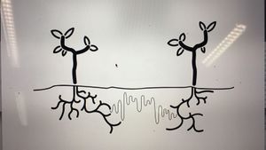
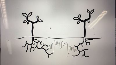
Using their root network to send and receive nutrients. But not completely by themselves, the communication system, also known as the 'Wood Wide Web', is a symbiosis of the trees root network and the mycelium networks that grow between the roots, connecting one tree to another. The mycelium network, also known as Mycorysol, is responsible for the successful communication between trees.
Other scientists are also working on this subject. Suzanne Simard from Canada is also researching the communicative networks in forests. She is mapping the communication taking place between natural forests. Proving the nurturing abilities of trees, working together to create a sustainable living environment. A network where the so-called 'mother-trees' take extra care for their offspring but also other species, by sharing her nutrition for those in need.
Artist, scientists and designers are also intrigued by this phenomenon. For example Barbara Mazzolai from the University in Pisa has had her work published in the book 'Biomimicry for Designers" by Veronika Kapsali. She developed a robot inspired by the communicative abilities of trees and mimicking their movements in the search for nutrition in the soil.
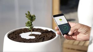
Bios pot
The idea of presenting this project within a business model introduced us the company Bios. A Californian based company which produces biodegradable urn which can become a tree after planting the urn in the soil. We wanted to use this concept and embed this in our project. The promotional video could provide us with interesting video material for our own video. Besides the material, we were inspired by their application that was part of their product.
CONCEPT
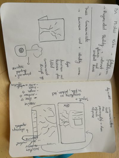
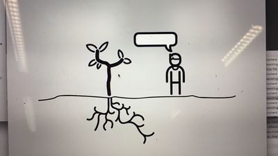
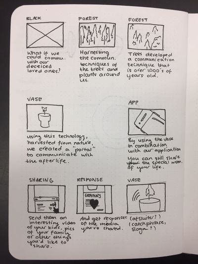
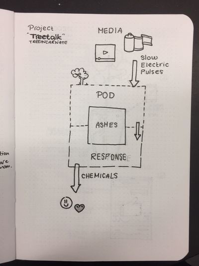
Using the research about the Wood Wide Web and the ability of trees to communicate with each other. We wanted to make the tree able to communicate with us. Using the same principle of sending different kinds of nutrition depending on what the tree wants to communicate, such as 'danger' or 'help me out'. We wanted to let the trees talk to us. Using a digital interface logged into the root network of the tree and communicate with each other.
At first, we wanted to give the tree a voice with giving it the ability to post likes using its youtube account. Where in- and output would take place in the same root network. But is a tree able to receive information we can? And if so, what will it do with it? We wanted to stay in touch with the scientific evidence of the talking trees and decided to focus on the other application within the field of human-tree communication.
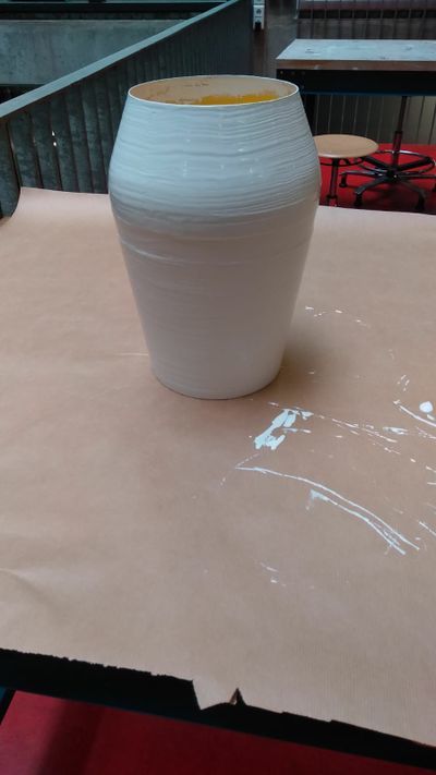
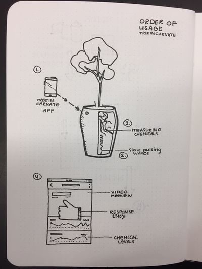
An other desire of our team was the fact that we wanted to present a consumer product taking the role as a company trying to sell our product for the global market. After researching other products concerning plants and trees, we found the biodegradable Bios urn. An urn which use as a pot to plant a tree or plant, which can later be buried in the ground somewhere. This product inspired us to use this example as our physical part of the project. So we wanted to construct a smart vase which had the technical ability to sense the chemical secretion from the roots and convert these to a positive or negative output. The input would also take place using the built-in sensors in the vase using a wireless internet connection.
PROCESS
Project 2 _ Cybernetic Prosthetics
In small groups, you will present a cluster of self-directed works as a prototype of a new relationships between a biological organism- and a machine, relating to our explorations on reimagining technology in the posthuman age. The prototypes should be materialized in 3D form, and simulate interactive feedback loops that generate emergent forms.
Group project realised by Sjoerd Legue, Tom Schouw, Emiel Gilijamse and Noemi Biro
RESEARCH
We started this project with a big brainstorm around different human senses. Looking at researches and recent publications, this article from the guardian << No hugging: are we living through a crisis of touch? >> raised the question of touching in our current state of society. What we found intriguing about this sense is how it is becoming more and more repressed to the technological interfaces of our daily life. It is becoming a taboo to touch a stranger but it is considered normal to walk around the streets holding our idle phone. Institutions are also putting regulations on what is considered appropriate contact between professionals and patients. For example, if a reaction to a bad news used to be a hug, nowadays it is more likely to pat somebody on the shoulders than to have such a large area connection with each other.
Based on the above-mentioned article we started to search for more scientific research and projects around touch and technological surfaces to gain insight into how we treat our closest gadgets.
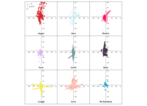
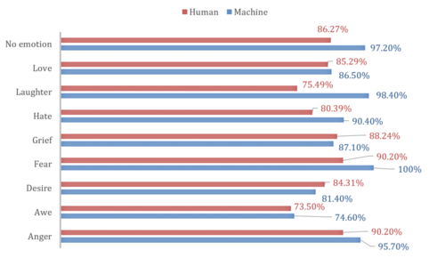
This recent article from Forbes magazine relates the research of Alicia Heraz from the Brain Mining Lab in Montreal << This AI Can Recognize Anger, Awe, Desire, Fear, Hate, Grief, Love ... By How You Touch Your Phone >> who trained an algorithm to recognize humans emotional pattern from the way we touch our phone. In her official research document << Recognition of Emotions Conveyed by Touch Through Force-Sensitive Screens >> Alicia reaches the conclusion:
- "Emotions modulate our touches on force-sensitive screens, and humans have a natural ability to recognize other people’s emotions by watching prerecorded videos of their expressive touches. Machines can learn the same emotion recognition ability and do better than humans if they are allowed to continue learning on new data. It is possible to enable force-sensitive screens to recognize users’ emotions and share this emotional insight with users, increasing users’ emotional awareness and allowing researchers to design better technologies for well-being."
We looked at current artificial intelligence models trained on senses and we recognized the pattern that Alicia also mentioned: there is not enough focus on touch. Most of the emotional processing focuses on facial expressions through computer vision. There is an interesting distinction about how private we are about somebody touching our faces but the same body part has become a public domain through security cameras and shared pictures.
With further research into the state of current artificial intelligence on the market and in our surroundings, this quote from the documentary << More Human than Human >> captured our attention
- " We need to make it as human as possible "
Looking into the future of AI technology the documentary imagines a world where in order for human and machine to coexist they need to evolve together under the values of compassion and equality. We, humans, are receptive to our surroundings by touch thus we started to imagine how we could introduce AI into this circle to make the first step towards equality. Even though the project is about the extension of AI on an emotional level we recognized this attempt as a humanity-saving mission. Once AI is capable of autonomous thoughts and it can collect all the information from the internet our superiority as a species is being questioned and many specialists even argue that it will be overthrown. That is why it is essential to think of this new relationship in terms of equality and feed our empathetical information into the robots so they can function under the same ethical codes as we do.
OBJECTIVE
From this premise, we first started to think of a first AID kit for robots from where they could learn about our gestures towards each other expressing different emotions. The best manifestation of this kit we saw as an ever-growing database which by traveling around the world could categorize not only the emotion deducted from the touch but also a cultural background linked to geographical location.
For the first prototype, our objective was to realize a working interface where we could make the process of gathering data feel natural and give real-time feedback to the contributor.
MATERIAL RESEARCH
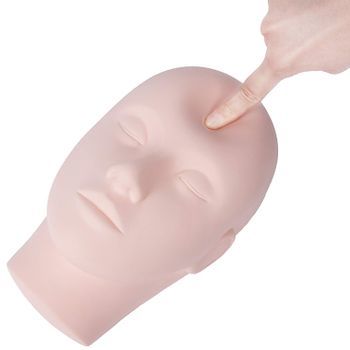
We decided to focus on the human head as a base for our data collection because, on one hand, it is an intimate surface for touch with an assumption for truthful connection, on the other hand, the nervous system of the face can be a base for the visual circuit reacting to the touch.
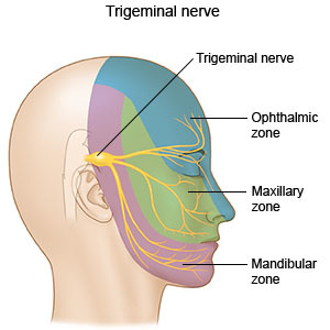
The first idea was to buy a mannequin head and cast it ourselves from a softer more skin-like material that has a soft memory foam aspect. Searching on the internet and in stores for a base for the cast was already asking so much time from us that we decided on the alternative of searching for the mannequin head in the right material. We found such a head in the makeup industry, used for practicing makeup and eyelash extensions.
Once we had the head we could get on to experiment with the circuits to be used on the head not only as conductors of touch but also as the visual center points of the project.
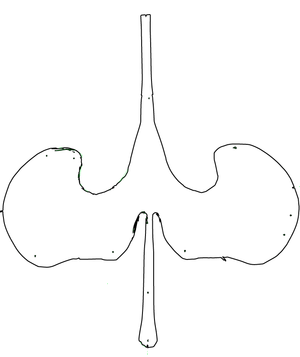
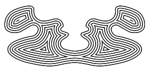
First based on the nervous system we divided the face into forehead and cheeks as different mapping sites. Then with a white paper, we looked at the curves and what the optimal shape on the face looks like folded out. From a rough outline of the shape, we worked toward a smooth outline and then we used offset to get concentric lines inside the shape.
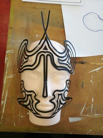
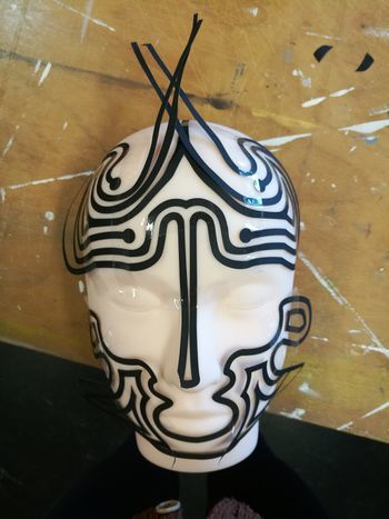
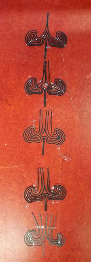
To get to the final circuit shapes we decided on the connection points with the crocodile clips to be on the end of the head and underneath the ears. With 5 touchpoints on the forehead and 3 on each side of the face, the design followed the original concentric sketch but added open endings in form of dots to the face.
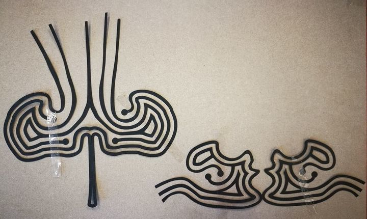
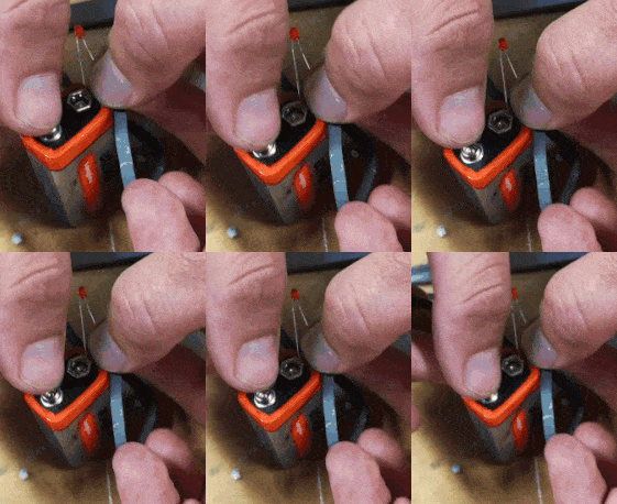
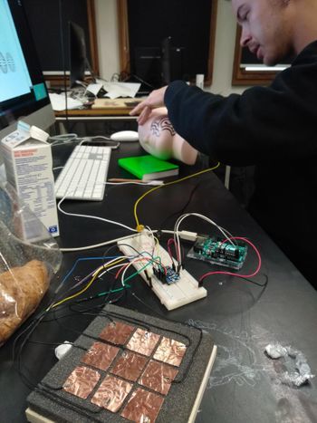 Not only the design was challenging for the circuits but also the use of the material. For the first technical prototype in which we used a grid of 3x3 to test the capacitive sensor, we used copper tape. Although this would have been the best material to use in terms of conduciveness and instead sticking surface the price for copper sheets big enough for our designs exceeded our budget and using copper tape would have meant assembling the circuit from multiple parts. The alternative material was gold ($$$$), aluminum ($) or graphite ($). Luckily Tom had two cans of graphite spray and we tried it on paper and it worked. We tested it with an LED - it is blinking by the way.
We cut the designs out with a plotter from a matte white foil and then sprayed the designs with the graphite spray. After we read into how to make the graphite a more efficient conductor we tried the tip to rub the surface with a cloth or cotton buns. The result was a shiny metalic surface that added even more character to the visual of the mannequin head.
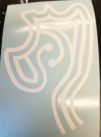
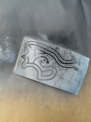
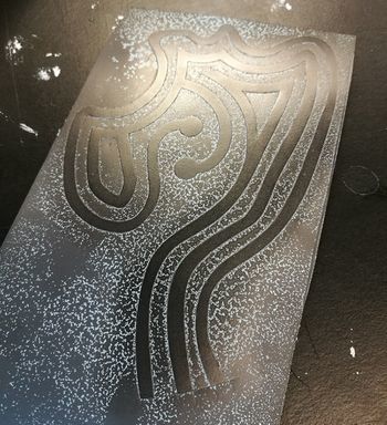
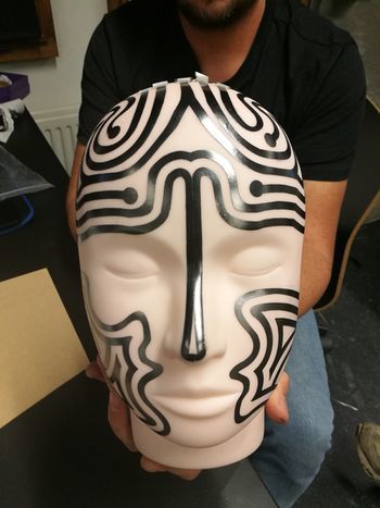
TECHNICAL COMPONENTS
For the technical working for the prototype, we used an Arduino Uno and the MPR121 Breakout to measure the capacitive values of the graphite strips. The Arduino was solely the interpreter of the sensor and the intermediate chip to talk to the visualisation we made for Processing. To make this work, we rebuilt the library that was provided on the Adafruit Github (link to their Github) to be able to calibrate the baseline-values ourselves and lock them. We also built-in a communicative system for Processing to understand. These serial messages could then be decoded by Processing and be displayed on the screen (as shown in the 'Exhibition' tab).
To give a proper look into the programs that we wrote, we want to publish our Arduino Capacitive Touch Interpreter and the auto-connecting Processing script to visualise the values the MPR121 sensor provides.
Files
Media:Rippleecho_for_cts.zip (bestandgrootte: 485Kb)
Media:Capacitive-touch-skin.ino.zip (bestandsgrootte: 3Kb)
Adafruit MPR121 12-Key Capacitive Touch Sensor
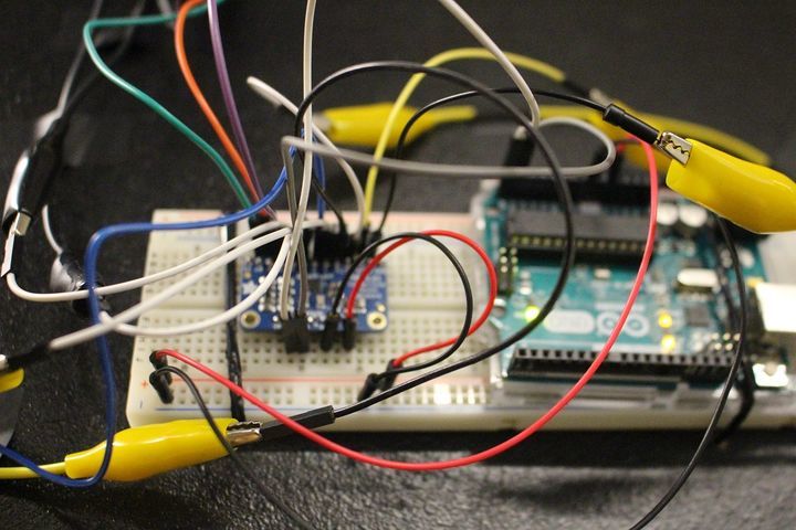
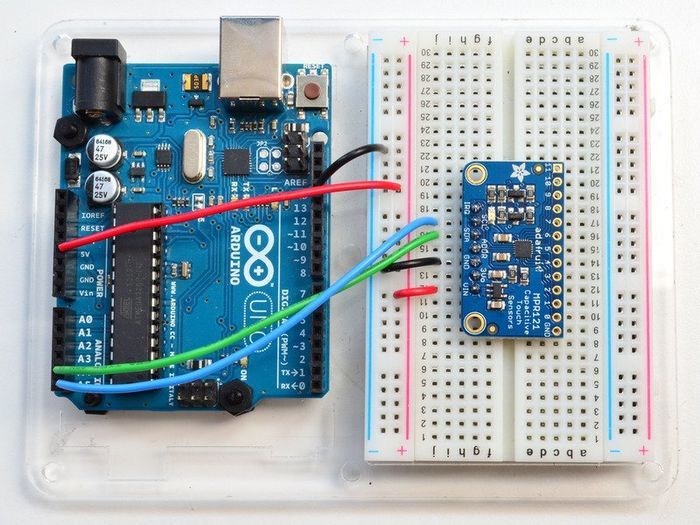
EXHIBITION
It has been scientifically proven that humans have the ability to recognize and communicate emotions through an expressive touch. A new research proved that force-sensitive screens through machine learning are also able to recognize the users` emotions.
From this starting point, we created Midas.
Midas is designed to harvest a global database of human emotions expressed through touch. By giving up our unique emotional movement machines can gain emotional intelligence leading to an equal communicational platform.
Through adding touch as an emotional receptor to Artificial Intelligence we upload our unspoken ethical code into this new lifeform. This action is the starting point for a compassionate cohabitant.
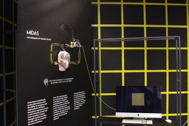
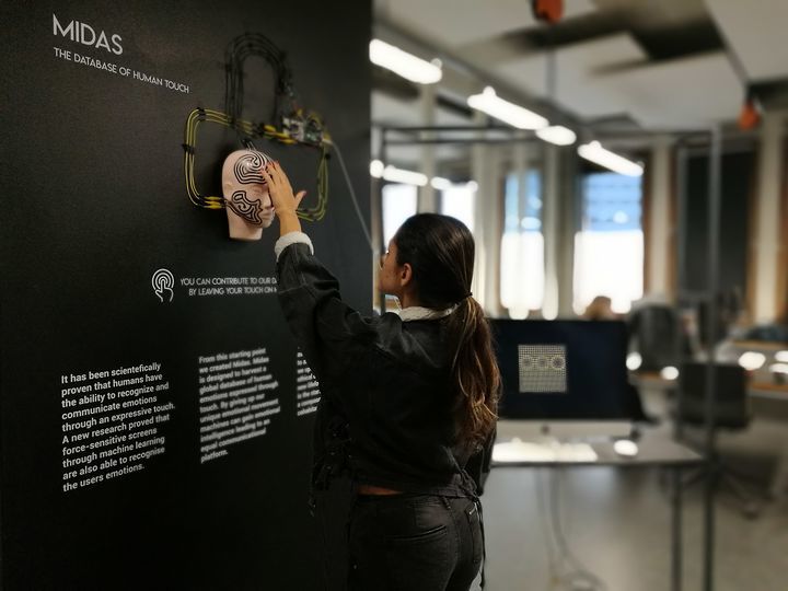
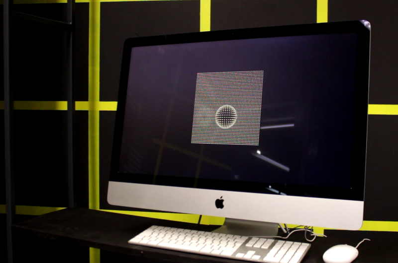
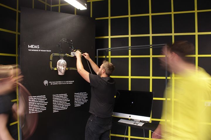
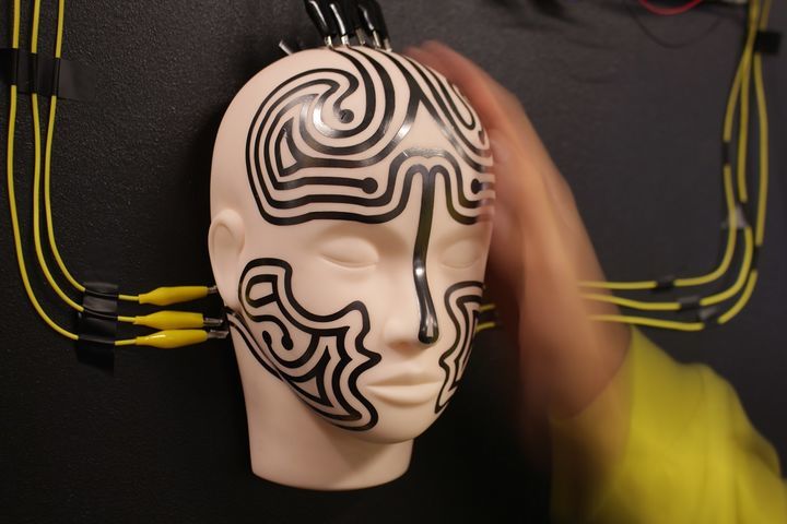
Project 3 _ From Devices to systems _ The mouse
sensors and sensitivity training. You will open the 'black box' of a technical device in an anatomical machine learning lesson, and you will also dissect and analyse a concrete instance of a complex system at work. How do devices and networked systems interact? Document and research all of the parts, how they work, where they come from. Redesign and add new circuits. Put it back together with a new function and added sensor feedback loops. The basic electronics should be fully functional.
RESEARCH
An article published on Fri, Apr 28, 2000, 01:00 by The Irish Times claims that << IBM's latest mouse can understand mood swings >> These were the quotes that grabbed my attention:
- After sensing the physiological attributes of the user, the information is related to emotions by using a correlation model. Your computer may then be able to use the information to adjust its settings or interface to reduce your frustration.
- Human understanding and interpretation of the world around us depends to a great extent on our ability to perceive, integrate and interpret visual, auditory and tactile information.
- IBM believes that computers would be much more powerful if they had even a fraction of the perceptual ability of humans or animals.
- The incorporation of such abilities into computers would enable humans and machines to work together as partners, in a more complimentary way than ever before, it is argued.
- However the field of "affective" technology, of which the emotion mouse is a part, embraces all parts of human expression of feelings and aims to make computers more compatible with the human condition.''
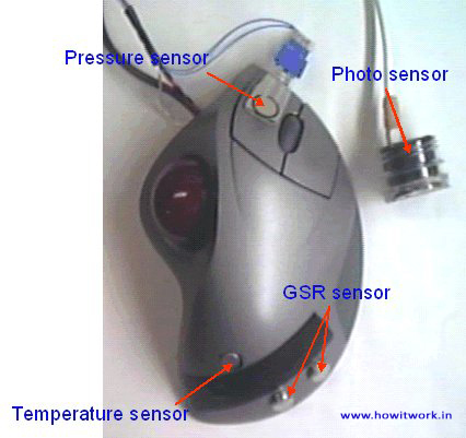
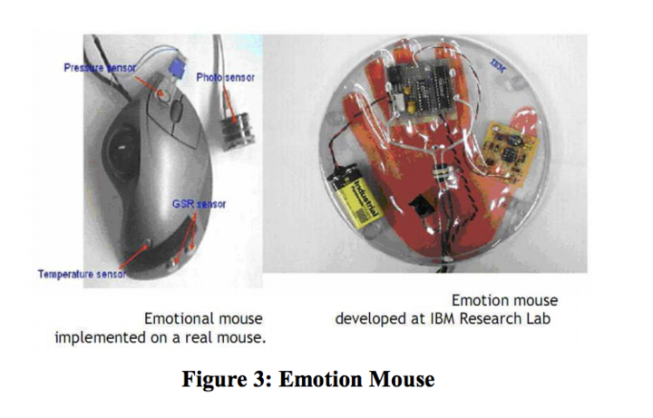
<< The Emotion Mouse Research document >> published on for the Conference on Human-Computer Interaction: Ergonomics and User Interfaces, Proceedings of HCI International '99 (the 8th International Conference on Human-Computer Interaction), Munich, Germany, August 22-26, 1999, reaches the conclusion that the theory is valid:
- giving the computer a longitudinal understanding of the emotional state of its user, the computer could adapt a working style which fits with its user’s personality. By matching a person’s emotional state and the context of the expressed emotion, over a period of time the person’s personality is being exhibited
Fuzzy Model on Human Emotions Recognition, a more recent << [study] >>(2014) done by KAVEH BAKHTIYARI &HAFIZAH HUSAIN at the Department of Electrical, Electronics and Systems Engineering Faculty of Engineering and Built Environment, Universiti Kebangsaan Malaysia discusses a fuzzy model for multi-level human emotions recognition by computer systems through keyboard keystrokes, mouse and touch-screen interactions. The system was tested on 130 participants and the conclusion was that this model represents a closer similarity between human brain detection of emotions and computer systems. This model also detects more emotions compared to the non-fuzzy human emotions detection methods, but for some of emotions a lower accuracy was obtained.
Optical mouse learn to hack - how you can handle the optical sensor inside a cheap optical-mouse for your next microcontroller project
Optical mouse cam
Optical Mouse Cam long description
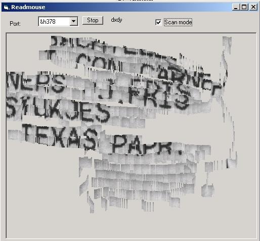
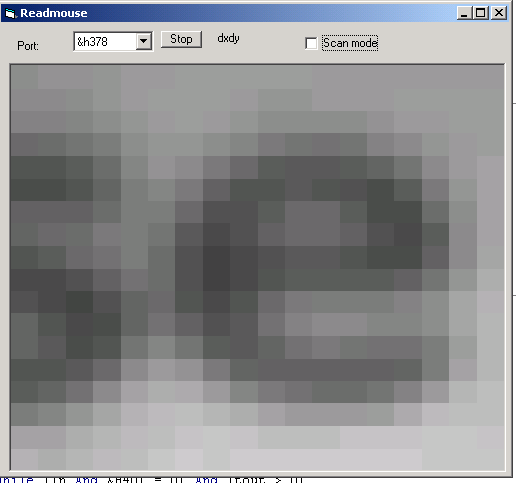
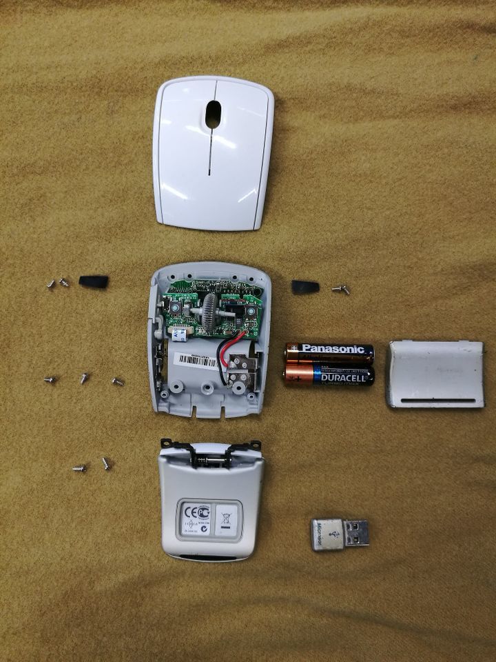 I had a USB mouse that I disassembled to have a look inside. Since it is a fairly new mouse the technical components are made not to be messed with so there is a lot of components to it that i don`t understand what they do. This mouse hsa 3 buttons - left click, right click and what usually is the scroll button when pressed this one has that button on the left side. I found intriguing the emotional mouse examples where the hack would be attaching an extra sensor to measure the depth of the touch.
However, I started to think more about the meaning of the black box for me. Our computer screens are black boxes and we use the mouse to navigate inside of it.
What if I created a new interface for the mouse outside this black box? What if moving the mouse would control something outside the screen?
TECH
FRS SENSOR
info courtesy of adafruit << Force Sensitive Resistor >>
FSRs are sensors that allow you to detect physical pressure, squeezing and weight. They are simple to use and low cost. This is a photo of an FSR, specifically the Interlink 402 model. The 1/2" diameter round part is the sensitive bit.
The FSR is made of 2 layers separated by a spacer. The more one presses, the more of those Active Element dots touch the semiconductor and that makes the resistance go down.
FSRs are basically a resistor that changes its resistive value (in ohms Ω) depending on how much it is pressed. These sensors are fairly low cost, and easy to use but they're rarely accurate. They also vary some from sensor to sensor perhaps 10%. So basically when you use FSRs you should only expect to get ranges of response. While FSRs can detect weight, they're a bad choice for detecting exactly how many pounds of weight are on them.
FSRs are often a polymer with conductive material silk-screened on. That means they're plastic and the connection tab is crimped on somewhat delicate material. The best way to connect to these is to simply plug them into a breadboard.
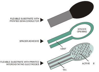
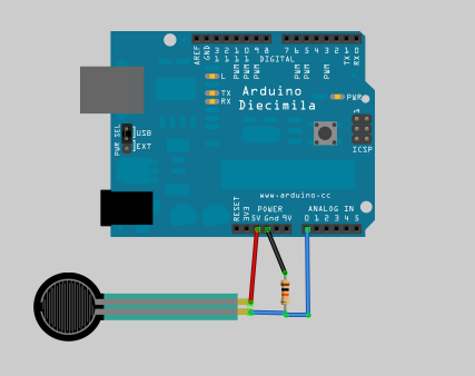
http://protolab.pbworks.com/w/page/19403657/TutorialSensors#ForceSensitiveResistorFSRThumbWrestling
MOTORS
To visualize the mouse movement within space I though of using motors to control their speed or angle movement based on the mouseX and mouseY positions.
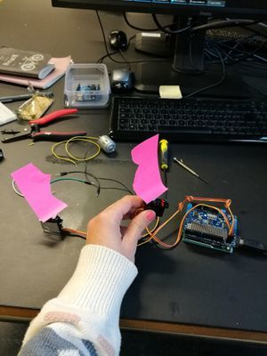
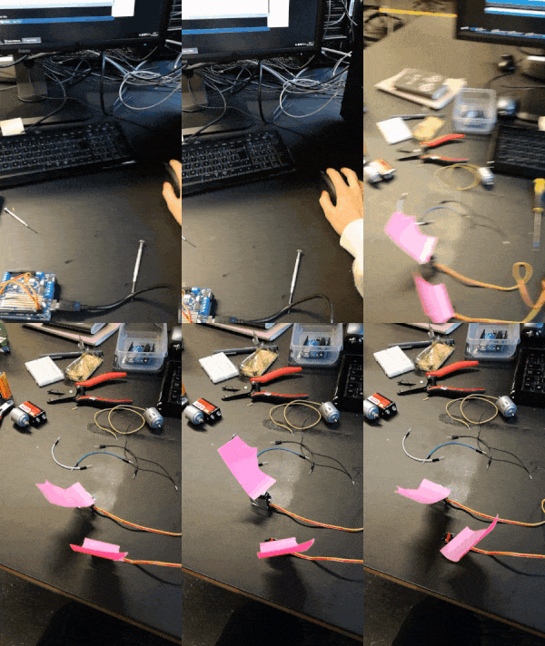
Arduino code used for experiment
//Arduino code:
#include <Servo.h>
Servo yservo;  Servo xservo; // servos for x and y
//set initial values for x and y
int ypos = 0;
int xpos= 0;
void setup(){
 xservo.attach(10); //(analog pin 0) for the x servo
 yservo.attach(9);  //(analog pin 1) for the y server

 Serial.begin(19200); // 19200 is the rate of communication
 Serial.println("Rolling"); // some output for debug purposes.

}

void loop() {
 static int v = 0; // value to be sent to the servo (0-180)
 if ( Serial.available()) {
   char ch = Serial.read(); // read in a character from the serial port and assign to ch
   switch(ch) { // switch based on the value of ch
     case '0'...'9': // if it's numeric
       v = v * 10 + ch - '0';
       /*
          so if the chars sent are 45x (turn x servo to 45 degs)..
          v is the value we want to send to the servo and it is currently 0
          The first char (ch) is 4 so
          0*10 = 0 + 4 - 0 = 4;
          Second char is 4;
          4*10 = 40 + 5 = 45 - 0 = 45;
          Third char is not a number(0-9) so we  drop through...
       */
       break;
     case 'x': // if it's x
     /*
      ....and land here
      where we send the value of v which is now 45 to the x servo
      and then reset v to 0
     */
       xservo.write(v);
       v = 0;
       break;
     case 'y':
       yservo.write(v);
       v = 0;
       break;
   }
 }
}
Processing code used for experiment
//Processing code:
import processing.serial.*;
int xpos=90; // set x servo's value to mid point (0-180);
int ypos=90; // and the same here
Serial port; // The serial port we will be using
void setup()
{
 size(360, 360);
 frameRate(100);
 println(Serial.list()); // List COM-ports
 //select second com-port from the list (COM3 for my device)
 // You will want to change the [1] to select the correct device
 // Remember the list starts at [0] for the first option.
 port = new Serial(this, Serial.list()[1], 19200);
}
void draw()
{
 fill(175);
 rect(0,0,360,360);
 fill(255,0,0); //rgb value so RED
 rect(180, 175, mouseX-180, 10); //xpos, ypos, width, height
 fill(0,255,0); // and GREEN
 rect(175, 180, 10, mouseY-180);
 update(mouseX, mouseY);
}
void update(int x, int y)
{
 //Calculate servo postion from mouseX
 xpos= x/2;
 ypos = y/2;
 //Output the servo position ( from 0 to 180)
 port.write(xpos+"x");
 port.write(ypos+"y");
}
MOTORS USED BY OTHERS
Servo motors and DC motors moving arm joints
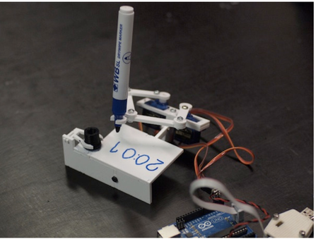
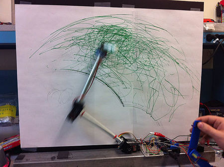
link to working animation example in middle
Robotic arm walk through here

Zimoun : Compilation --> [1]
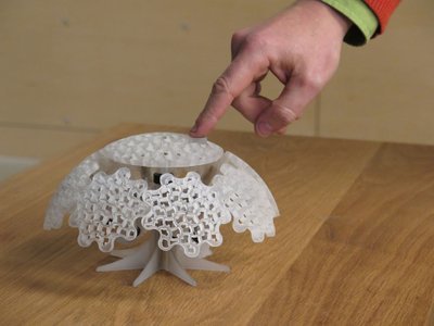
mechanical joint reaction, gear reaction --> instructables
Kinetic gear arm - video here - [2]
Tools: 10x gear wheels(hole in middle), 5x gear joint (2 holes), min 10 joint holders - round what?
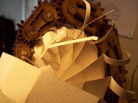
Kinetic log psiral sculture --> video here
more info here --> kinetic paper sculptures
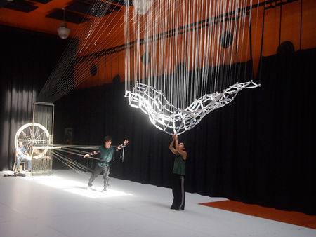
Ruben Margolin- Kinetic artist video on kinetic art
WHAT & WHY
The mouse fascinates me as a touch object. I still use it everytime I use my laptop and I carry it me everywhere but I see more and more people around me working just with the touchpad or they have a touch screen laptop. The mouse has an industry for gamers but for the rest we can ask the question that has been also asked on quora Is the mouse bout to go extinct?. The interest for me about the mouse lays in the touching aspect and the intuitive, natural and “familiar, all generally referring to what is known, well acquainted, often seen, or to what becomes known and usual due to repeated exposure and habituation "- article about Human motion characteristics in relation to feeling familiar.
WHAT
My intention is to break away from the computer screen and bring the mouse into a position where relying on people`s familiarity with it, the mouse becomes a new interface for generating interaction.
By connecting the mouse movements to 2 motors the interaction becomes non virtual. The motors rotate a parent gear that unleashes a chain reaction with the other attached gears to it leading to a kinetic movement.
WHY
To learn about spatial interaction and structures outside of a computer screen.
To trade algorithms for mechanics for a change.
Self-initiated learning: Machine learning for musicians and artists _ Online course
Because of my interest in harvesting data sets, artificial intelligence and computer collaboration I decided to follow the course given online by the Goldsmith University of London << Machine learning for musicians and artists >>
I am hoping to get out of this course a better understanding of machine learning and its application for interactive exhibitions and graphical interfaces. I will be using this space to document my notes and interests found in the course.
Mentioned computer creative programming languages one might want to check:
- ChucK - A computer music programming language for real-time sound synthesis and music creation
- openFrameworks - an open source C++ toolkit designed to assist the creative process by providing a simple and intuitive framework for experimentation. openFrameworks is designed to work as a general purpose glue, and wraps together several commonly used libraries, including:
- OpenGL, GLEW, GLUT, libtess2 and cairo for graphics
- rtAudio, PortAudio, OpenAL and Kiss FFT or FMOD for audio input, output and analysis
- FreeType for fonts
- FreeImage for image saving and loading
- Quicktime, GStreamer and videoInput for video playback and grabbing
- Poco for a variety of utilities
- OpenCV for computer vision
- Assimp for 3D model loading
3 aproaches to machine learning:
- CLASSIFICATION - position controlled drum machine
- REGRESSION - hand cntrolled syntehsis
- TEMPORAL ANALYSIS - speech controlled game
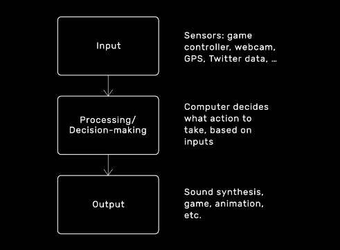
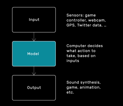
Supervised learning algorithm as a tool that computes output values from input values. Algorithm to build it from data instead of human writing the code --> MODEL--> compute output values from input values
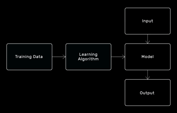
WHAT IS OSC?
"Open Sound Control (OSC) is a protocol for communication among computers, sound synthesizers, and other multimedia devices that is optimized for modern networking technology."OSC INTRO--> basically, it enables channels between different applications to listen to inputs and accordigly change their output.
You can sen OSC messages to different computers via their IP adress/host name. Localhost= this computer.
Multiple senders can send to the same port but only one programme is allowed to receive on a port at once
CLASSIFICATION
REGRESSION
- least-squares linear regression
- neural networks
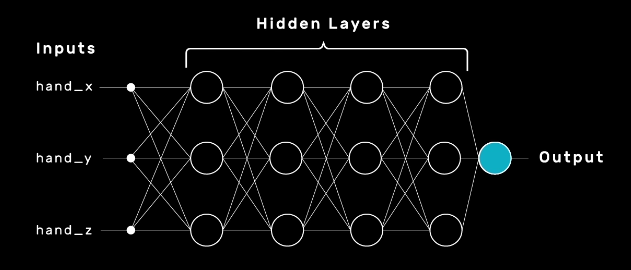

Model vs Mappings
One to one mapping in music is not desirable
Interfaces in which each output value is controlled by exactly one input value are often considered harder to use, less engaging and more frustrating than interfaces in which inputs and outputs are related in more complicated ways.
FINAL MINOR PROJECT
Forward/Introduction
In the traditional sense I see graphic design as visual communication built upon final decisions through typography, geometrical shapes, photography and notions such as color, contrast and balance. The creation is concluded when every decision has been made final by the creator. In my practice I try to find ways to free graphic design from it`s immobile state and I explore technology to do so.
Digital technology already allows graphic design to be present in different forms on multiple devices that makes interaction a daily activity. The online visual communication can constantly change its form based on a set of predefined conditions by the designer. A creation has countless options to manifest itself in the predefined function. The area that intrigues me about creating these conditions is how much of what is going to happen is staged and who has control over what.
Digital craft is my tool in exploring the duality of a digital creator while referencing a tradition embedded in a static result. In my craft I explore the platform where the visual communication can happen. I try to focus not only on the primary sense linked to graphic design, but question the added benefit of the other senses too, especially touch and hearing. Touch is intriguing for me because it is so present in our current world together with the digital interfaces. The motions and gestures are very specific to the devices and we have learned to use them in the way they were staged to be used. We came to associate a certain kind of touch with a specific reaction and behavior. Digital touch is a new language capable of expressing feelings.
I am fascinated by creating experiences where multiple use of senses simultaneously plays an important role in achieving the non-static.
Abstract & Questions
Our senses create our perception of the world
The human body is brilliant at receiving information from different senses and translating them into one complete experience. Looking at the act of visual communication how can setting the right stage influence perception? How can light become a condition in communication? When light is illuminating our small screens and the interaction happens by touch, we already know how our gestures influence the reaction. But, are we so used to these behaviors that we expect the same response from other settings as well? Is touch a predefined condition in itself or the predefined condition is the visual message? In this project I was curious to create a stage where the the perception of a viewer is directed and influenced by predefined conditions.
Is perception via senses a choice? How is a hybrid non-static visual perceived? Is it a screen or is it a print? What is expected from an object when it is perceived as a screen? Is the message the most important part of the project? What is expected of something interactive?
This project aims to explore our expectation and reinterpretation of senses in relation to technology.
Relevance of the Topic
In our current world new technologies enter the consumer market daily. Technology is undeniably making a difference in how we perceive the world. We perceive not only through our eyes but also through the limitation of a camera screen. Touching is getting more and more resumed as a daily activity regarding smartphones and we developed a special way to handle different interactions on these devices. The human behavior expanded and got reduced at the same time in a very short period of time. Adapting new behavior resulted in the spread of Artificial Intelligence in commonly used tools available in one form or another almost seamlessly in the daily life. Our expectation of new tools is concerning convenience, user friendliness and smart communication. Where information is bombarding us everywhere we look, is there space for an alternative, is a hidden meaning still relevant?
Research Approach
In the theme of this years Digital Craft Minor, Cybernetics I was especially intrigued by the notion of feedback loops. In the second project during the Minor, as a group we worked with the theme of senses as part of the human feedback loop and I was really intrigued by the influence I discovered technology has brought into our behavior. For this project I wanted to focus on feedback loops that we unconsciously experience in form of processing information through our senses and our responses to them. To begin with collecting and assembling relevant sources I first searched a word to overarch the meaning of dealing with multiple senses: HYPERSENSITIVITY.
To have an even more concrete starting point I mapped out the immediate word group that I could relate to hypersensitivity.
HYPERSENSITIVITY WORD GROUP:
- multisensory processing
- sensory perception
- sensations
- focus
- deactivation
- blurring out
- mathematical angle
- geometry
- mono processing
I first started with a systematic investigation of related topics and relevant references to gather a gallery of interesting projects, ideas and facts. All these helped me identify what I found interesting about my topic and better restrict my focus. During this project I focused a lot on material research regarding 3D printing.
Exploring meanings
To gain a basic understanding over how the human feedback loop works in relation to senses I started to dig into what sensory perception meant in the biological term.
The neocortex is the part of the human brain that is involved in higher-order functions such as conscious thought, spatial reasoning, language, generation of motor commands, and sensory perception --> Research on intelligence
According to the number of senses working at a time, the person can be classified into ‘multi-track’ versus mono-processing (Williams 1996). Most people use their senses simultaneously, so when they are hearing something, they are still aware of what they see and feel emotionally and physically. --> Mono processing one sense at a time I started to question if this happens consciously and if we are aware that we need multiple senses playing together to decipher something we are presented with.
The smell we feel is influenced by the text we read that explains what the smell is. Brain decides based on these two information points if the smell is pleasant or unpleasant. How we label a scent affects how we see it.
documentary link here
Visual information transformed into a tactile sensation. Images of ants and mosquitoes crawling on hands makes people who experience the pictures visually feel itchiness in their body. Brain is predicting the action of being bitten and then developing itchiness on the skin.
The McGurk Effect bah-vah "seeing" the letter on the lips confuses our hearing.
Through this research I started to question if the perception of senses happens unconsciously if it is possible to create an experience where the user can become aware of the different ways we perceive through our senses.
References from literature
Umberto Eco The Open Work - "The author offers the interpreter, the performer, the adressé a work to be completed"
"The Open Work remains significant for its powerful concept of “openness”—the artist’s decision to leave arrangements of some constituents of a work to the public or to chance—and for its striking anticipation of two major themes of contemporary literary theory: the element of multiplicity and plurality in art, and the insistence on literary response as an interactive process between reader and text. The questions Umberto Eco raises, and the answers he suggests, are intertwined in the continuing debate on literature, art, and culture in general"source
I was inspired by Umberto Eco and his approach to initiate a new perceptional reality for the spectator. Regarding art as a communication system where the interpretation and perception is open ended. I started to question what would happen in a system where the communication system has a closed, predefined end but an open beginning. Can that still be considered under the concept of “openness”? When does something become fully staged and when does the viewer feel a sense of independent influence?
"Eco writes that a classical composition,posits an assemblage of sound units which the composer arranged in a closed, well-defined manner before presenting it to the listener. He converted his idea into conventional symbols which more or less oblige the eventual performer to reproduce the format devised by the composer himself"(Undisciplined Theory by Gary Genosko, p.78)
I interpreted this as following regarding my own practice: I do not want to oblige the viewer to interact with the work presented but I want to intrigue to explore and this I shall consider open.
Synesthesia
During the first part of my research when I was gathering knowledge around perception I came across the condition synesthesia and I started to research it`s manifestation. What intrigued me most about it is how it served as an extra layer on the existing world to help someone perceive the reality and I started to question if creating a work around these principles would be a possibility while referencing my research question about expectations in sensory perception.
[https://www.youtube.com/watch?v=6vs-ez62DVc old documentary Red Mondays and Gemstone Jalapenos: The Synesthetic World
on synsesthesia]
Yet another recently identified type, visual motion sound synesthesia, involves hearing sounds in response to visual motion and flicker. --> Synesthesia as a condition
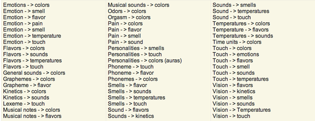
Synsesthesia in the arts
The synesthesia exhibition The Synesthesia exhibition would like to actuate blind and partially sighted to perceive fine art with art pieces, which are producing "compassion", by the operation of one sense activating another. The installations are inviting blind and visually impaired as well as sighted to extend their own perception. - I found it interesting that the same work of art was aiming to bring awareness to perception while providing one setting. This work made me question whether what I was trying to build could have an outside the arts use for blind and partially sighted.↓
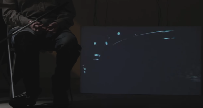
Spenceroni - "When I discovered the concept of synesthesia I was fascinated by the idea of senses getting crossed and how this could present a reality that is different but still very truthful on a personal level.
In this exhibition I’ve focussed on Sight, looking at how the subelements of this sense (shape, colour, pattern recognition) may become warped and crossed." - The description given by Spenceroni regarding a single focus on a sense helped me to define the primary senses I wanted to focus on, which was also Sight. Thinking of the subelements of Sight and the conditions that are necessary for these to manifest inspired me to choose simplicity of colors and focus on light as the condition.↓
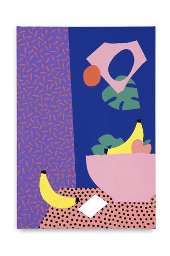
World of Synesthesia — Experience Website and VR experience by Denkwerk. I was still searching for a medium where a synesthetic exeprience could manifest when I found this VR Experience. After I tried it my impression was that the VR experience does not show the reality of the sensations inside our world. By isolating the experiences inside this black box it becomes incomparable to an experience where you are still able to see you're surroundings while experiencing the extra layer. This reflection helped me to restrict myself at creating an analog or a hybrid experience without the use of computer screens as a focus point.↓
video
website here
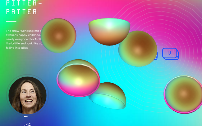
"I am Sound" Interactive video/music installation, 2016 By Tamiko Thiel (image) and Christoph Reiserer (sound)↓--> video here
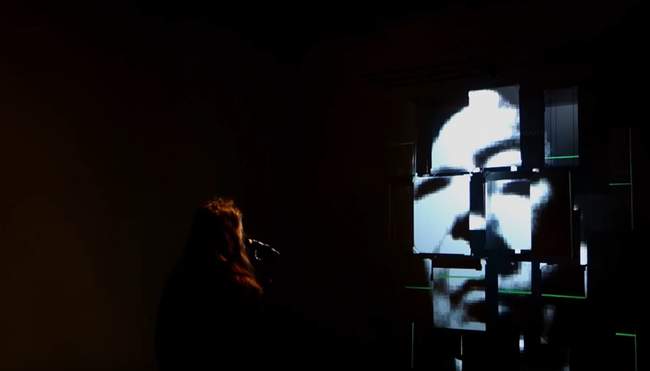
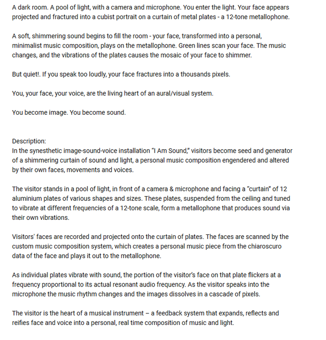
Synsesthesia as a digital translation? Tool?
People with synesthesia are capable of processing data(the world around them) differently. They are insanely good in making unconscious categories and linking similar information together based on criteria that they find fitting or unfitting as a composition. They are composers who are visualizing data. Can we assume that a machine learning algorithm has a similar experience when fed two sensorial datasets? The algorithm would not work intuitively but through analysis of sample. The categories would either have to be defined by a pre-composer - bringing back this idea of Eco Umberto, The Open Work, where the composer is giving input that opens possibilities for interpretation or have an algorithm look at the selections without knowing what they are analyzing. --> tensorflow.js Bird sound classification google developers
here is a video and here
Perception of our own reality
My investigation about synesthesia and relevant projects around this perception was very interesting but it was not personal enough. I could not relate to it since I never experienced the condition. I had to take a step back and find a personal experience that I found intriguing in regard to perception. Taking a personal experience that I found fascinating as a starting point made me question its relevance to others and if it would have the same awe effect. Light has been fascinating for me for it`s diversity, magic and effect on the environment. I am always fascinated by light installations but in relation to change of perception I remembered my experience with monochromatic light.
LIGHT - monochromatic beam
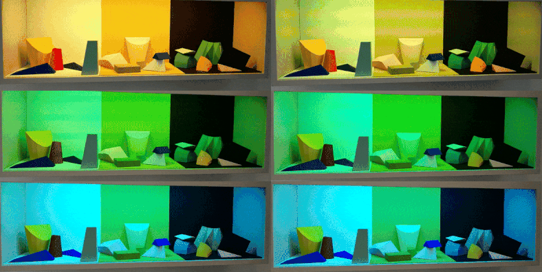
This is an installation I saw and took video of at Museum Boijmans Van Beuningen on 14th of January 2018 as part of the 'Change the System' curated exhibition. I was fascinated then by how my perception was thrown over by light. One could play around with the shapes and make different compositions in the lights that changed automatically. ↑
In 2017 I visited the Graphic Design festival in Breda and there was an exhibition curated by a photographer (???) about an island. He set up an isolated room where one person could enter at a time, choose a black and white photograph from the table and with the given crayons, watercolor and pens color it in. The trick was that the light was changing from familiar white light to red and yellow thus the perception of colors got lost. ↓
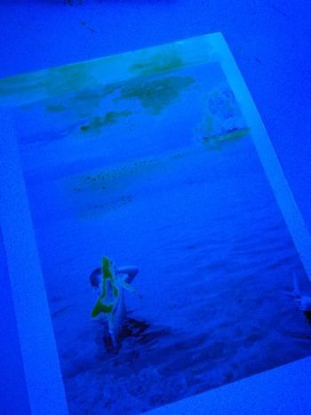
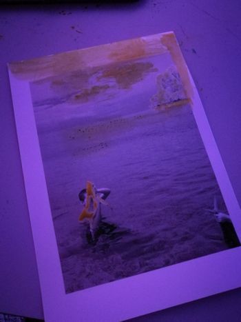 A few weeks back I had a similar experience walking in a very industrial part of Rotterdam at night - around 3 in the morning- without any traffic only the street lamps that shined a very yellow light. In this light, I had a very strange experience where I saw myself and everything around me in grey. My very bright red scarf was grey same as the faces of the people I was with, my skin color on my hand. The effect lasted for a couple of meters until we got to an intersection with different light sources too. The perception of the world returned to "normal". But what is normal perception anyway? How does light influence it? And how would a computer or algorithm experience the same through sensors?
Kunsthal Reaction. 100 Years of Kinetic Art. Carlos Cruz-Diez - under green fluorescent bulb light - "The artificial light spaces in the work ‘Chromosaturation’ from 1965 by Carlos Cruz-Diez immerse the viewer in an environment that consists of only three colours and enables our eyes – used to perceiving a broad range of colours – to transform the idea of colour to an almost physical experience. ↓"1
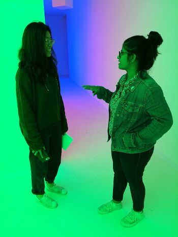
PROTEST
verb
gerund or present participle: protesting
/prəˈtɛst/
express an objection to what someone has said or done.
While thinking about perception I started to ask the question if it is possible to consciously change it. In a sense, can one protest its own perception? The notion of protesting is so human. We protest situations, environments, own feelings but can we protest our perception too?"We all have intuitions about the effectiveness of protests, and protesters certainly have those intuitions as well"source. Will an AI ever have an intuition to protest? Sometimes the information around us gets too much. We get too distracted from our basic tasks and malfunction: we stop thinking in the activity we are and we do errors. Is this what protesting perception looks like?
How would a synesthetic view of an algorithm/ computer look like from a peaceful state of mind to a protester? How would the perception change by play of colors and sound? Color by the means of controllable RGB lights and projection mapping & sound by amplifying the surrounding sounds, the presence of the visitor perhaps. What experience does this offer to a visitor? Can one influence their own perception through the lens of a machine...
In this sketch for the project I was very focused on embedding an AI instance into the project but after reflecting on the necessity of it I realized that it would have lead my project into a different direction that I wanted to focus on. The aspect of showing the same elements under different light made me question what are the constants of the project and what are the elements that I should leave open. What are the elements that a person will have control over through interaction and what is precomposed? During this stage of the project I started to separate the composition layers and the two senses I have chosen to work with: touch and sight. In this phase I arrived at the research question: Can light be a condition in creating a synesthetic experience?
MAYA principle by Raymond Loewy - "The adult public's taste is not necessarily ready to accept the logical solutions to their requirements if the solution implies too vast a departure from what they have been conditioned into accepting as the norm." it`s application today.
"evaluate new foods under red lighting, so that their powers of discrimination are not thrown off by traditional color-flavor expectations."The colors we eat article
An Anthropologist on Mars, Oliver Sacks tells the story of “Mr. I,” a painter who lost the ability to distinguish colors after a car crash. While he knew the color of things from memory, he no longer saw them. “Tomato juice is black,” he wrote. Over time, these new associations took hold. When he ate, he closed his eyes, “but this did not help very much,” wrote Sacks, “for the mental image of a tomato was as black as its appearance.” In desperation, he began to eat only black and white foods—black olives, yogurt—because these at least looked as they should.(...)Vision, argue the philosophers Dustin Stokes and Stephen Biggs, has an unparalleled, “asymmetric” power over other senses, not least because we seem to rely on mental imagery—“visual cortical processing”—to know what things feel like: “We often invoke visual imagery to learn about certain tactile stimuli, but we rarely, if ever, invoke tactile imagery to learn about visual stimuli.”The colors we eat article
"The hard part about assigning certain emotions to certain colors is that color never exists on its own. It always appears with other colors around it. It’s hard – impossible, really – to isolate a color as an emotional trigger."(...)"You never perceive pure color. Your brain is constantly filtering it through your sense of taste, touch, smell, and – most importantly – your memories."On perception of colors. Mohan Mathan, a philosopher of perception at the University of Toronto - “The color that we perceive doesn’t correspond – at all – with the colors that are in the world.”
Experiments
My first tests consisted of arriving to a material that I could use as a conductor for light. I bought an RGB LED strip that was controllable remotely and could reproduce different light environments and I started to look at familiar objects in my room under monochrome light. I have seen videos with holographic effect by beaming light on mosquito mesh and I wanted to try this so I bought some of this mesh to experiment with.
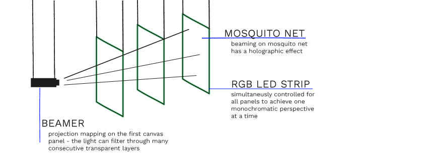
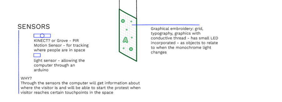
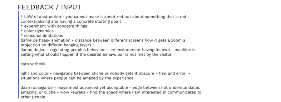
After feedback regarding the initial sketch I entered a very hands-on experimentation phase of my project where decisions were drawn from the experiments I did and what I found fascinating and thought would better translate into an experience.
I tried the RGB LED strip with the mesh material and the result was not as I expected. The intensity of the light was not spreading well enough on the length of the material and the light source was too visible and disrupting from the overall material. On picture the way the light was diffracting was more interesting than in real life. I also tried to insert a small graphical element to see what the effect of such disruption in the mesh would create but the effect did not create an experience.
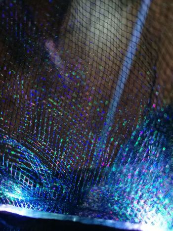
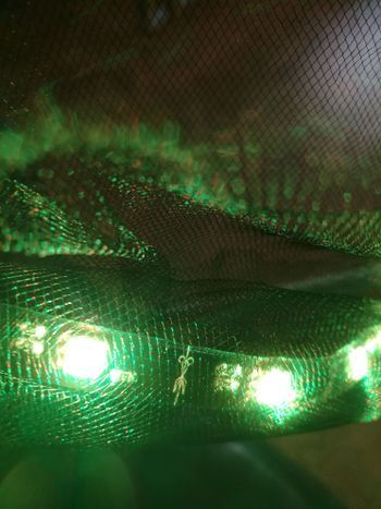
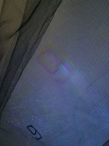
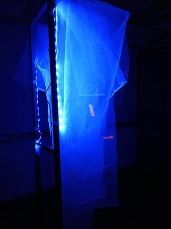
Through these experiments I realized that a more solid material is needed to be able to also convey information with the light. I was searching for a material that could be an alternative to a printed poster to carry a message but would have the quality of interesting touch and light interaction. With a traditional graphic designer approach I started to look into poster frames and alternative materials that had anything to do with light. Light boxes and light advertisements were the first things that came into my mind. What excited me about this search is that I felt it was close to my interest of exploring the boundaries of graphic design. In this new search of material I came across a lithophane made of the likeness of Samuel Colt. What fascinated me about this is that a lithophane presents a three-dimensional image when lit with a light source from behind. When the light source is not present the image appears two dimensional.
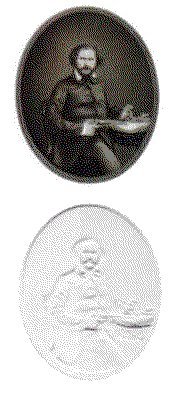
Lithophane
Traditional lithophanes were etched or molded atrworks in thin porcelain. In the 19th century specialized European craftmen were using the technique for comissions."Many historians argue that the inspiration for the idea came originally from China nearly a thousand years before in the Tang Dynasty. According to the scholar R. L. Hobson during the Ming Dynasty the Chinese produced bowls "as thin as paper" with secret decorations in them." Lithophane Modern lithophanes are made with CNC milling or 3D printing still mainly depicting portraits or photographs. One of the relevant artists that I stumbled upon who works with modern lithophanes is Ben Malouf. His depictions of recognizable characters stand out because he pushed the boundaries of the technique by increasing the thickness of his models. He explains the process behind his creations and the simplicity by which such a lithophane can be recreated in an interview given to 3dprint.com Mona Lisa recreated as a lithophane with a thickness of 40mm. ↓
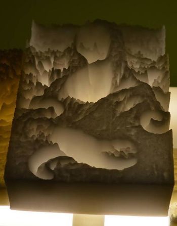
Malouf explains that all is needed to create such a work is a photograph, Cura software that will determine based on the lightness of the photo the height-map of the 3D model and a 3D printer to print it. To link back this technique to my graphic design background I wanted to experiment with printing typography in such way. Typography is personally interesting to me because it is one of the most basic elements a graphic designer will use for visual communication. Typography is always composed. Even if the creator of a typeface is not the graphic designer using it one has freedom to stretch, position, achieve contrast by visually playing around with shapes of letters. This raises questions when is something legible and when is it readable? I asked myself the question how can typography morph between representing a shape or a legible structure? Once the letters are printed using the 3D printer this layer becomes a constant once again. How can then light still maintain the change between legible and non-legible?
Typography
I asked myself what is the boundary between perceiving a structure as a letter and perceiving it as a meaningless shape. Our prior knowledge allows us to search for something familiar even in the most abstract shapes. How does an ai perceive letters? Objectively classifying typography only based on x and y coordinates without attached knowledge about meaning? I searched the internet for a research that was dealing with typography in such a way and found the work of Erik Bernhardsson. He analyzed 50k fonts using deep neural networks. Once the model had learned the original data he started to generate new fonts based on the originals. Erik Bernhardsson`s research can be found here. I thought it very interesting how the model blurred the outlines of the letters where it was not certain and created a foggy interpolation between two generated fonts: ↓(on the left)
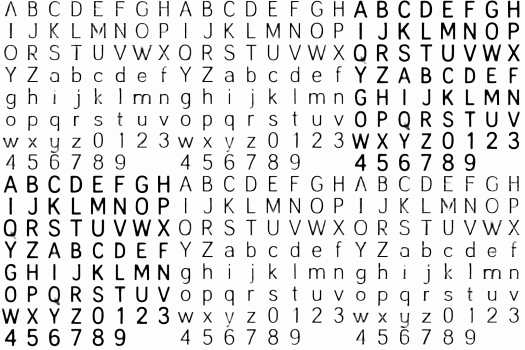
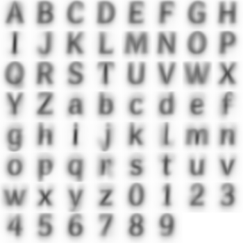
Another inspiration was the Average font, a generative typography project by Process studio. "A new “ghostly” typeface by overlaying each letter of the alphabet from over 900 existing font families. The Average Font, combined every individual letter of the alphabet from more than 900 typefaces that were installed on his computer system."Resl, the creator saw the result as typographic poetry rather than an actual font, because the result is so "ghostly" that it would compromise the legibility of something written with it. ↑ (on the right)
I decided to restrict myself at using a basic font such as Avenir and play around with effects in Illustrator. During this process it was important for me to give myself freedom to experiment just based on the visuals while relating to the above mentioned research. For this purpose I was looking at blurring effects. I explored radial blur on the letter A and then duplicated the A and applied the same radial blur but from the opposite direction. The effect created was satifying. To forther play into the "ghostlyness" of the Average font I applied a Gaussian blur effect and adjusted the brightness and contrast. Because lithophanes are usually depicting pictures the background is a solved issue, but to achieve a similar effect with a letter I had to add a background. I adjusted the background to be a slightly light shade of grey that I also blurred with the Gaussian effect. The challenge was to get rid of the harsh edges between what was the letter and what was a background. To do so I started experiementing with pixelation effect, namely the halftone effect. The process was familiar from printing with silkscreen where an image must be converted into small dots to be printed. I liked this link between such a traditional printing method and what I was trying to achieve with the 3D printer. After rasterizing the letter and applying the halftone effect the harsh edge between the background and letter was not visible anymore and I had saved the file as a png.
The instances below show the Avenir font; applying radial blur on the letters separately in a word; blurring the background with the blurred letters; radial blur letters on the background without the Gaussian blur; final halftone image ready to be imported into Cura.
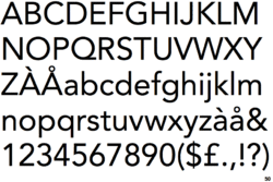
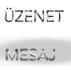
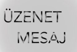
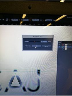

In Cura the process of creating the lithophane is rather simple. On a blank document one has to specify the height, base, width, height and the setting by which Cura will look at the darker region of the image and assign it the highest value or the lowest. Then drag and drop the ready made halftone png image. Cura starts looking at the color pixels of an image and assign every pixel a height value in a process called slicing. Depending on the computer model and software this process can take from a couple of minutes to a few hours. I had experimented with this and different software produced different results so in the end I had to confine at using the same computer and software for slicing all my designs separatelly. Due to the limitation of the Ultimaker original and Ultimaker 2 available at the academy I refined myself at printing first smaller prototypes like the initial "A" that measured 90 x 120 x 4 mm and took almost 3 hours to print on the Ultimaker 2.
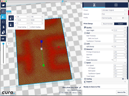
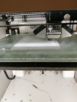
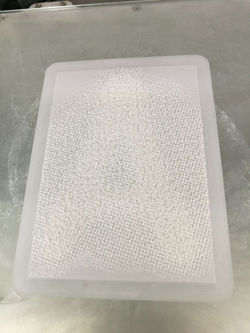
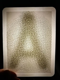
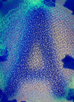
The "A" in the above picture exceeded my expectations in terms of the legibility and tangibility. Both senses that I had wanted to focus on had an interesting perceptory function. The letter in an average room lighting was invisible but when touched the slight changes in depth were to be sensed. When the letter was placed in front of a light source the legible A appeared. The first light source I wanted to use was the RGB LED strip. I made a few tests with monochromatic light and white light and concluded that the effect of the legibility is not influenced by the color of the light. I decided to rather than control the color of light to control the shape and radius of it. Light was the non-constant element, the key to see the hidden elements in the print.
To have control over light and implement the interaction I decided to use the light source of a beamer. I kept thinking about this work as a framed self standing image. The references that I had in mind were the light-advertising boxes found on the streets and the posters hanging in frames. Because I was limited by the printing size and time of the 3D printer I decided to confine myself to a poster size of A3. Referring to it from now on as a poster I was in need of a content.
Steganography
Deciding on a content for the Poster was influenced by the finding that my letter A was not visible under general light conditions. This technique allows me to encrypt hidden messages in plain sight and control what becomes visible. The term used for it is steganography. The very act of communication is undetectable to an outside viewer. I was referred to look at the work of Amy Wu, who uses physical encryption technologies in her work. The artists work is a critique on modern technology and privacy and through her steganographic performances she invites the visitors to discover a new layer of information embedded in the originally presented canvas. The medium of invisible ink and the right chemical reactions that uncover the second layer transform the process into a moment perhaps more valuable than the uncovered information. This aspect of the process of decryption inspired me to leave an open-end to the message. I decided to encrypt two languages saying MESSAGE. Because of my bilingual background I first worked with Hungarian - ÜZENET and Romanian - MESAJ. From a graphic design perspective I think it is very challenging to work with bilingual text and give both word structures the same hierarchy. From my material 3D print experiments I concluded that the effect of the letters blending into the background works best when the letters are as big as possible. With the A3 size limitation and the size limitation of the letters I decided to use a grille cipher-like dispersion of the individual letters. In this structure the letters from the languages got preconstructed on a four row grid. The light then acted as the grille cipher to show only the necessary letters for the construction of a word. I was curious if people would try to read the letters together and try to find a meaning in the sequence of the letters or if letters would remain isolated and become shapes.
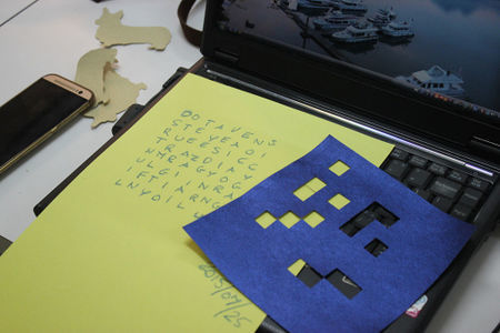
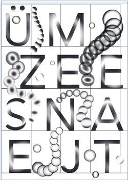
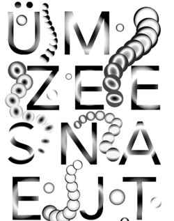
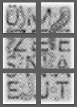
I decided to stage three instances of the poster.
- Instance one assumed that there was no visitor around and it only lit up parts of the assembly that did not have letters. The elements incorporated into the print were geographical spheres.
- Instance two assumed interaction with a visitor and slowly started to illuminate the specific letters to highlight one of the langguages
- Instance three assumed interaction with a visitor and started to illuminate the other language
I was asking myself if I wanted to give control to the visitor to be able to toggle between the languages and decided that I would give this control to the computer and let it randomly decide which language to show when it is triggered. For the final instance of the poster I was reconsidering the context in which i was going to present the work. Even though the Hungarian - Romanian language combination was personally interesting for me and something that I have been wanting to engage in a project the immediate context her was different. I was reflecting on my own experience of encountering Dutch and English communication in my daily life. I started to ask myself if language could be considered an encryption method in itself. Relating certain letters together as a group that holds meaning is an encryption of a certain language. Are dutch words encrypted for me as an outsider? Are non-dutch speaking visitors of the exhibition able to decipher the letters as words?
Settings and materials
Arriving at the right settings and materials for the project required a lot of experimentation. I worked with PLA fillament. For the 3d printed lithophane the advised color is semi-transparent white or neutral. I tried the variables and arrived to the conclusion that the transparent fillament does not work for this light-related project. I decided to use White PLA. Besides Cura software giving a different slicing result on my computer and the one from the academy the version of the programme also mattered. With the newer software the slicing time was above one hour but the old software would accomplish it in a few minutes. I printed the same gcode generated by Cura on both the Ultimaker original and the Ultimaker 2 and saw a significant difference in how the two machines interpreted my file. The Ultimaker Original was better at precisely building up dots in height without the PLA material being dragged around. The Ultimaker 2 would drag the material to the next dot even with manually adjusting the temperature at which the nozzle is heated. For the best result I decided to work only with the Ultimaker Original.
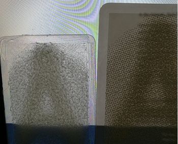
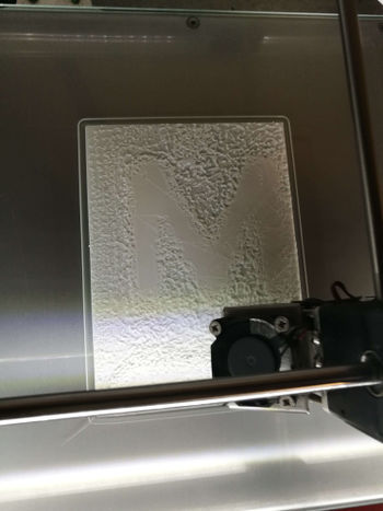
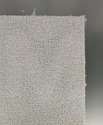
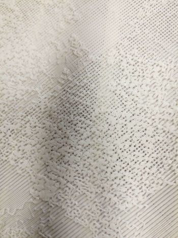
Arriving at the best settings for the letters in Illustrator also required printing multiple samples. The most important aspects were the background color and amount of blur and the halftone size.
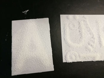
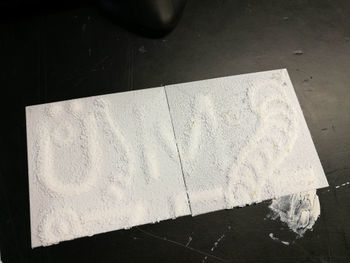
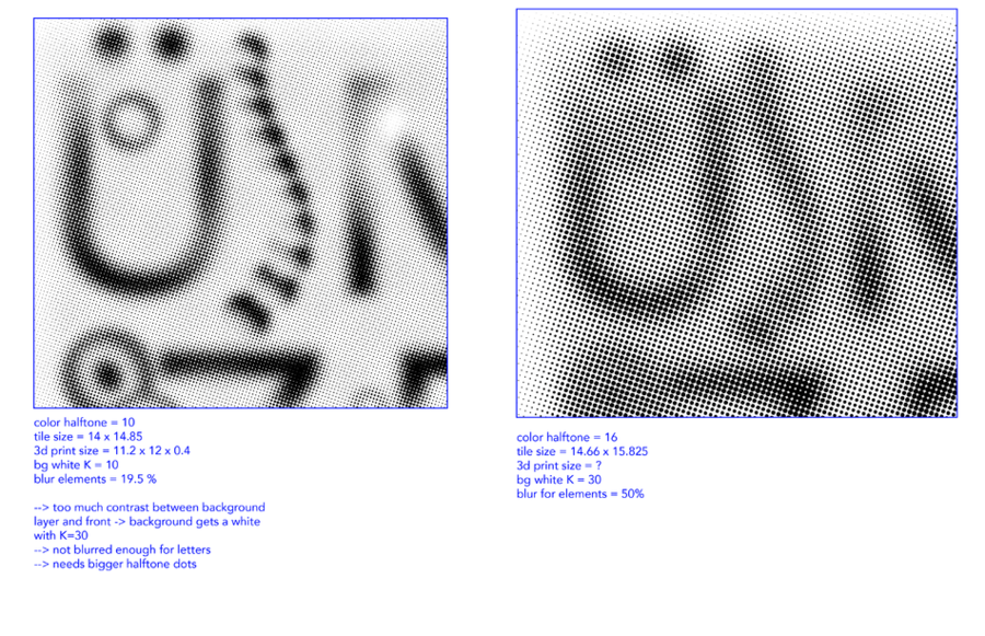
The final settings were as following in Illustrator:
- The background is a rectangle filled with a radial gradient of the same color as the letters on the front
- a Gaussian blur filter of 65% is applied on the rectangle and a 25% default opacity
- each letter is duplicated - apply radial gradient on both of them but with a different direction
- apply same Gaussian blur filter of 65% on the letters
- convert color mode to Grayscale
- rasterize image
- apply color halftone effect of maximum radius 14
- slice the artwork into desired size tiles
- in a new document copy each tile to a new artboard
- export all artboards with a 300 dpi as png



The following setting were set in Cura when opening the new project and the convert image window appears:
- height - the maxiumun distance of each pixel from base - 2,5 mm
- base - thickness of the base layer of print - 0,5 mm
- width - the width of the tile - (6X)90 mm and (3X)98 mm
- depth - the height of the tile - 123 mm
- darker is higher setting
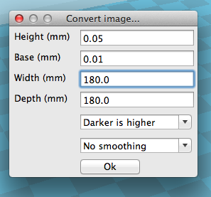
Drag and drop a png into Cura. The following setting were used for slicing the models and exporting them for print:
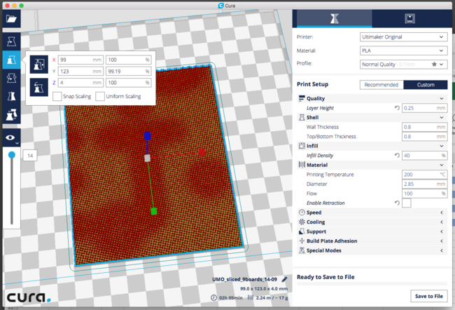

Interaction
Arduino
My own criteria for designing the interaction was to enable the visitor to initialize the phase when the letters become visible. I contemplated on giving more freedom to the visitor through touching different points of the composition and engaging only those triggered points but due to my technical knowledge I could not implement this change. I created a grid structure made out of wire for the back of the composition. This was attached to the CAP1188 Breakout with an Arduino UNO adafruit reference here. I followed the wiring described in the adafruit reference:
- SDA == Analog 4, SCL == Analog 5
- VIN pin to 5V and GND pin to ground
- RST to digital 9
The first test I made was with an aluminium sheet to see if the capacitive sensor was powerful enough to sense the touch through the 3D printed material. The test worked and it was quite straight forward to make it work for the final exhibition since I was using the whole composition as one touch button.
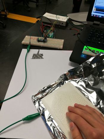
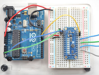
While I was testing the interaction with people at school I realised that people had a different expectation from the interaction. In my composition the poster worked as one entity and once any part of it was touch it triggered the embedded steganographic layer to be reviled. But once I presented my test subject with the opportunity to touch the poster 90% of the people expected the interaction to happen immediately at the point they touched. This was unexpected and made me question if I should keep the touch aspect of the composition or if I should use the capacity sensor as a proximity sensor. I choose to work with touch because I wanted to link back to synesthesia and my discoveries about multiple senses working towards one perception. If I would have gotten rid of it the only actively engaged sense would have been vision. The 3d printed tiles themselves had such an interesting tangible construction that I really wanted to embed the experience of discovering typography through touch not only by vision so I decided to focus on the different expectations people had regarding the interaction. I decided to go forward with the touch interface and pay attention to how people were using it and engage in conversations to find out what they had to say about the experience.
To interpret the sensor data coming from the CAP1188 Breakout I used the Adafruit_CAP1188 library with minor changes.

The final ino can be found here: Media:ino_touch_cap.zip
Processing
I used Processing to interpret the data that the Arduino was receiving throught the sensor. When the sensor was detecting the presence of electromagnetic radiation it would send a signal to Processing via serial communication. Once a signal was received the programme decided which language layer to show. Each language layer had its own svg component that the programme was reading and reinterpreting the coordinates as new visual elements. The user was the trigger to initialize one or the other layer but the "animation" that happened after the initial touch was not related to any further interaction between the user and the poster. The animation of the layers consisted of big "blobs" of layered ellipses that animated between sizes and shapes. Initially I was using an extra library to export the visuals to Madmapper to be able to map correctly my visuals onto the composition but after testing it a few times I realized this setting was not different from running my processing code in fullscreen mode and adjusting the size of my svg-s. To decrease the chance of something not working I decided not to use Madmapper for my final presentation.
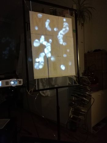
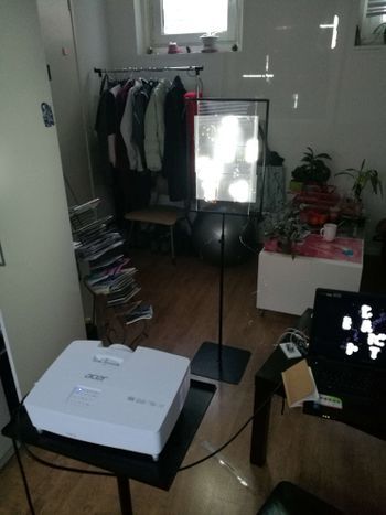
The final processing folder with data can be found here: Media:processing_code_int.zip
Realized work and reflection
The realized work was an interactive installation. My setting consisted of an interactive A3 size composition inside a frame, a light source in form of a beamer and a computer running the communication between the trigger of the interaction and the change in the visuals. At the time of the exhibition because of my previous tests my focus has changed to look at the expectation of people and to better understand through this work what is expected from an interactive installation. I was already aware that my project does not comply to the expected behavior of something triggered by touch. The notion of triggering has lost it`s one time meaning in relation to technology. I had staged the interaction and gave the visitor little freedom to really interact with the digital. In this hybrid exhibition I was hoping that once people loose their control over the digital interface they will focus on the physically present, the embedded typography in the 3D print. It was very confronting to notice that it was quite easy to engage people to touch the composition but instead of touching it once and really waiting for what happens they kept on touching different points of it and expecting an immediate response.
What really happened when someone touched the interface was that processing started animating one of the language layers the important letters of the layer got lit up with a rather big threshold. The light that was illuminating the letters was composed of multiple ellipses animating on top of each other and constantly decreasing in size. This reduction in size of the beam continued until it reached the outlines of the letter. Then the animation faded out and regained it`s idle state when the little ellipses were changing their size on the elements outside the letters.
It was very insightful to see the different way people perceived my composition and how their perception changed mine about the work I did. For me the project became a stage where I and a programme were in a dialog to decide what happens. I was happy that from this collaboration I could achieve a working installation and gained experience with it. During the process I questioned multiple times the threshold of immobility. My role in the collaboration was setting the stage, but almost all things I set up were static and defined. The importance of working together with a machine in my process became more obvious during this project because such divided roles. The programme had the task to animate and bring to life the static. This artistic approach is something I am very interested in and it will surely be a working method in the future as well.
In the composition that I presented in the installation I had the vision that the static and non-static elements would be of similar importance. The static elements staged as the encripted 3D prints were supposed to be the most interesting part of the project. The awe that a message is present and a change in the light condition unveils it was supposed to be focal, yet some people did not even notice that the letters were embedded in the material. Had the discovery through multiple senses failed us? Is it only the visual we trust? Even though people could touch the interface and feel the difference in depth it seems that their perception was so focused on a visual response in the same space that the focus on what was already there got lost. I realized that my composition was a screen. A touch screen not confined to the norms of technology of today. Not confined to the timing of modern interfaces. The screen became a critique on other screens. Even though this screen had tangible physical elements embedded in it it was felt as the touchscreens we carry around. What was supposed to bring into focus the physically present brought into focus the digitally present. Expectations were challenged of what the focus should be. Why is message message and bericht bericht and why does it still have an importance what is embedded in the physical when the digital is overpowering it anyway? I achieved the non static, but I cannot claim it fully mine as it was a dialog with the machine.
I was set to create an experience with the project but the more I reflect the more I realise that the experience had been in fact mine. To work with a programme in such collaboration and to explore the different segments of staging an installation had been something that I wanted to work on. Defining the role of the programme in my work helps me reflect on the position I can take in becoming a designer. My urge to incorporate graphic design and question its boundaries in my projects inspire me to try different approaches to do so. They also limit me to think in a broader artistic perspective and position myself as an artist. This Minor challenged me to find a position and a statement in what I have done and showed me inspiring references at how broad an artistic practice can be. I hope through this project and the experiments we had done in the previous small assignments i have gained a more critical perspective and will be able to use digital craft as a tool and a thinking process for the final project.
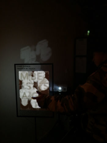
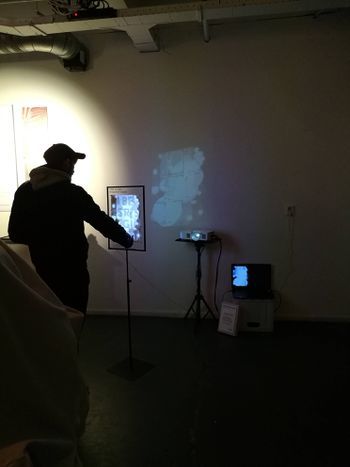
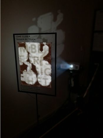
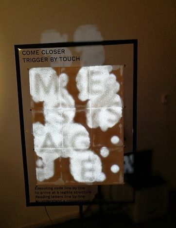
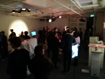
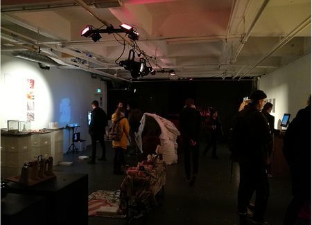
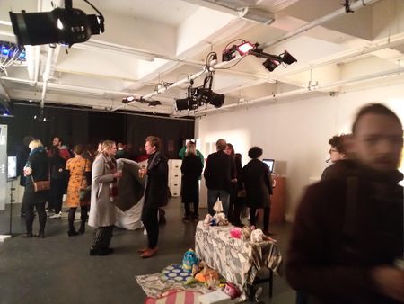
Interesting projects, Inpsiration, Technology, Things
Arduino powered exhibition
Stelarc
Neil Harbisson
Acoustic holograms -->video here
and Goldsmith academy project of holographic audio visualization --> article, source code here
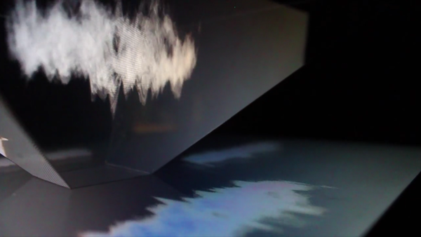
Modern zoetrope with controlled water drops and motion capture -->video here
Has Artificial Intelligence Brought Us the Next Great Art Movement? Here Are 9 Pioneering Artists Who Are Exploring AI’s Creative Potential full article and examples here
video on sign letter with led
ARe.na visual research platform
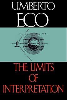
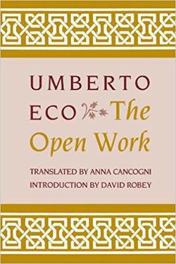
Appeel - ephemeral vandalism,untraceable mark-making by Studio TheGreenEyl --> studio website here
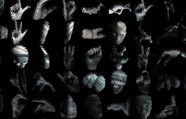
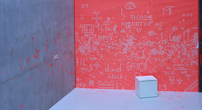 Feel the beat with this synesthesia suit
