Difference between revisions of "User:Vilius"
| Line 64: | Line 64: | ||
==Mapping== | ==Mapping== | ||
[[File:rotary dial mapping.jpg|1300px|]] | [[File:rotary dial mapping.jpg|1300px|]] | ||
| + | |||
| + | ==Position paper== | ||
| + | I chose to study product design, because of my eager to create new things. I am not only studying that, I also think like a product designer now. It all started from my early childhood and my love for drawing, sculpting and assembling model planes. I tend to use solid colors and shapes, avoiding unnecessary details, trying to make my design as simple as possible. Every project I approach, I try to use different material. It is not only for design’s aesthetics, but also for myself education and knowledge improvement. But it doesn’t mean that I don’t care about the looks of the project, in fact it’s vice versa, I would rather scrap the project if it doesn’t achieve the looks I am looking for, than exhibit filthy version of it. I am a perfectionist person, not only for the others, but myself as well. I tend to think critically of my projects, trying to create only necessary things with function, to improve peoples’ lives. <br><br> | ||
| + | Some of my designs came to life by handcrafting and only few of them using digital tools. I believe that a real designer should handcraft his design trying to avoid digital interventions as much as possible. Product design is very similar to sculpting. An artist has to become whole with the object that he is creating, and only then, by trial and error he can achieve the best shape, color, and function balance for that piece. Even though I have a quite long list of different skills in handcrafting, there are still a lot to learn. As far as my digital skills go, they are pretty limited to basic vector and 3D modelling software. <br><br> | ||
| + | Since coming here to Rotterdam, my projects didn’t have working electronic parts. I was always fascinated by electronics and their ingenuity. I wished that someday I will learn more about electronics to add to my skills list and here, in digital crafts lessons I got the opportunity to learn about it. By getting a kick-start for learning basic electronics, I can now improve furthermore and create new things I haven’t created before, for example — art installations. In fact, I have already tested my electronic abilities doing a project for my major — I created a fully working inhaler for stressed out people who are trying to quit smoking. To execute this project, I have learned to use a new digital tool — a 3D printer. Though, I didn’t leave 3D printed parts as they were because of their lifeless sloppy appearance — I finished them the old way, by hand, adding unintentional asymmetry and curves. By using 3D printer, I saved relatively a lot of time and hard technical work, but I still managed to finish my project the way I like it — with a little bit of accidental human made errors. <br><br> | ||
| + | Expanding my knowledge in such fields and merging it with information I already knew, shapes my style and me as a designer, who values hand crafting skills. Bauhaus movement also valued craftsmanship as a real necessity for art to thrive. Bauhaus movement was started by a German architect Walter Gropius, who stated that “The ultimate goal of all art is the building!”. He wanted to recreate craftsmanship and erase the artificial barrier between ‘noble’ artists and ‘working’ craftsmen. For the aim of future building, he claimed that every art discipline should unite as one. That is exactly what he was doing with Bauhaus. It was an ambitious program aimed at freeing the art world of its own isolation. Eventually, it became one of the most influential art movements in the history of art. I often feel inspired by this movement, his founder W. Gropius, other great artists who worked there, their ideas and designs. I believe in many of their statements and apply them to my work as a designer. <br><br> | ||
| + | The idea of integration of different spheres and disciplines into one piece of contemporary design can be extended further to integration of digital technology. This years Red Dots: Best of Best awards winner well-known “Google Home” is a perfect example. Red Dot is a world-famous product design competition. The “Google Home” is awarded as a product design project, although we often think of it just as a computer. This device has many working high end electronic parts, working as a digital assistant and a smart speaker, but it has no visible keys or buttons. This reflects as a new trend in product design, that hides the electronics, letting them disappear into the background, letting the design to shine. It is a new way of design, where it can benefit from the new technology, while making it invisible. I like this concept of integration between two components, two mediums together and would like to try to apply the idea to my future projects. <br><br> | ||
| + | One of the most fascinating and inspiring contemporary installations, that are my new interest, is called Impulse, and it was located in Montreal’s Place des Festivals in 2015. The project was fulfilled by Lateral Office and CS Design collaborative work. This installation merges product design and digital thinking giving an experience, which only digital tools can offer. Installation contained 30 interactive seesaws that emitted radiant light and sweet sounds. Visitors using the seesaws were given a chance to participate in a real time composing with those one-of-a-kind instruments. Moving seesaws created unique sounds and inspired matching projections on nearby building, creating playful original atmosphere. This project and contemporary installations overall, interest me of being interactive. The ability to use digital tools allows to interact and communicate with a viewer and get them involved. It lets the visitor to be involved, encouraging them to be a part of the project, experiencing it to the fullest. <br><br> | ||
| + | Before arriving to Rotterdam and studying Digital Crafts as my practice, I didn’t think product designer would need to have knowledge of electronics or coding. And after a few weeks, my view changed completely. I now understand how important this information provided during lessons really is and how it opens new possibilities creating new designs. Installations, that previously looked frightening and unclear like from other dimension, now seem to be my new challenging interest. <br><br> | ||
| + | |||
==Final Project== | ==Final Project== | ||
Revision as of 22:53, 6 January 2019
Contents
Contact
    Vilius Vaura

    0975637@hr.nl

    Product Design
Project 1
Disobedient comments' jacket
This project started with me, Monika Sumauskaite, Sol Chadwick, Sterre van der Helm and Doortje Hogesteeger getting together into one group. We had to choose 3 cards which we wanted from a big list, but to make this project more interesting, we chose to select them randomly. These cards indicated what kind of thing/object we were supposed to make. They formulated our assignment- "Make YouTube comments disobedient using fabric to design this object as a wearable or soft thing".
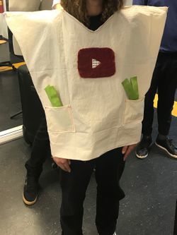
We started by researching how could YouTube comments be disobedient. At first, we were thinking of making a big squishy foam wall with all kinds of negative YouTube comments taken from the website itself. But this idea lacked disobedience and we couldn’t agree in the group if this idea was the best we could think of. After some arguing and discussing we ended up with a concept of wearable poncho representing YouTube and interactive comment section on the back of it.
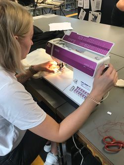
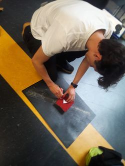
Making of it wasn’t hard, rather enjoyable and fun. Everybody had their own task in this project. This jacket was made by sewing main poncho and gluing on details with glue gun. We worked in Fabric station for the whole time. Poncho itself has zippers on its sides, which restrains movements of the person wearing it. On the back of the wearable we made comment section. We mimicked layout of YouTube comment section and instead of actual comments we glued Velcro strips. Following that we created fabric strips with Velcro, which were made by stiffening fabric with cornstarch. Those fabric strips represent comments which you should put on comment section and imitate commenting. To make these comments disobedient, we made all Velcro strips the same, with only the soft side of it, so no matter how hard you try, you would never be able to stick it on.
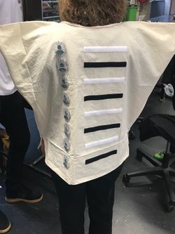
To make the YouTube comments disobedient you have to remove their main purpose - the expression of free will, positive or negative, so the ability to comment itself. The media itself is neutral. Comments make it positive or negative.
Project 2
CalmCat
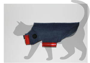
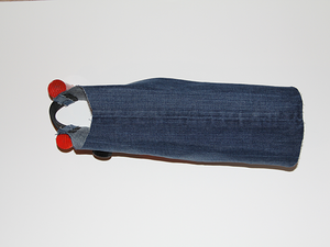
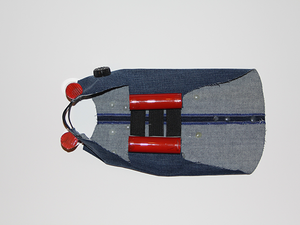
Calm cat project was a collaborative group work of me, Monika Sumauskaite and Sol Chadwick. With this project we focused on feedback loops. We created a stress relieving jacket for cats. This jacket is just a conceptual idea, and our project didn’t contain any working electronic parts.
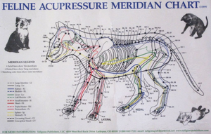
We came up this idea while thinking of feedback loops. Our jacket is based on cat’s acupressure points.It is known that acupressure techniques can help to relax and overcome stress in humans and animals, like cats. The inside of this jacket have small hot glue bumps in acupressure sensitive areas. Jacket is supposed to have a self-tightening feature, which would allow jacket to be pressed firmly against the cat, therefore acupressure points would be massaged. We imagine that sound and heart rhythm change sensors could control when the jacket is tightened. After cat’s rhythm states that it is calm again, jacket would loosen up again. When cat is left unintended in the house and there is no one to pet them, the jacket could calm it down. We care about ourselves so much, why we shouldn’t care about our pets equally?
This jacket, or as we call it, prop, is made from denim fabric. Two sides are connected with stretchy rubber strips. Red tubes, which are made from plastic, mimic tightening mechanism. Black bump on the neck area represents microphone and sound recognition sensor.
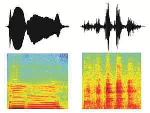

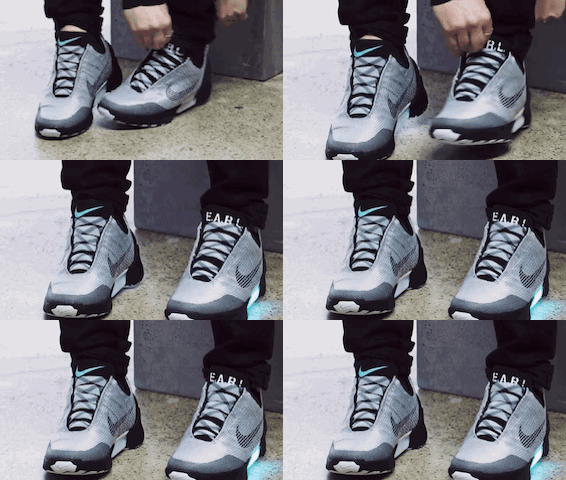
The technology could work on similar principles as Nikes or Back to the Futures self-lacing shoes and as far as voice recognition- technology similar to Apple's voice assistant Siri.
Project 3
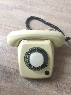
Rotary dial phone dissection
I chose to dissect rotary dial phone because I was very curious how dial mechanism works. At first glance, it looked complicated, but after further investigation, electronic part of it appeared quite simple. This whole mechanism acts as a button in phone's circuit, generating pulses according to the number you choose.
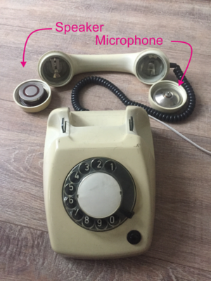
Microphone This part creates electrical signals from sound waves. When membrane starts to vibrate from sound waves, with the help of electromagnet it generates electrical signal.
Speaker: This part creates sound from electrical signals with electromagnet and vibrating membrane.
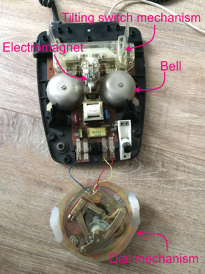
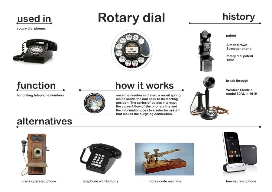
Dial mechanism: As the dial rotates, it interrupts the circuit running through dial mechanism, like a button, creating dialing pulses. For example, if you dial number "8" you create eight pulses, dial "0" and you make ten pulses.
Bells: These half sphere metal objects are used to create sound to indicate an incoming call.
Electromagnet: When the phone rings, this electrically controlled magnet switches on and off rapidly, moving a clapper in between the bells and making them ring.
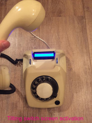
Tilting switch mechanism: This detects when the handset is lifted or put back. If the handset rests on the switch, it cuts off the connection between the phone and the local exchange. The circuit is opened only when you lift the handset.
Remake
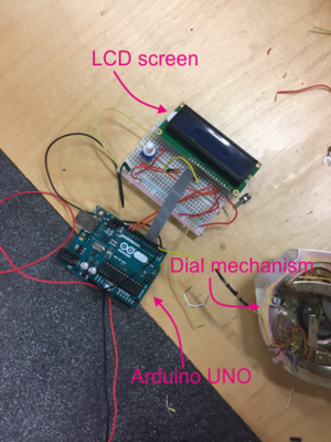
After thinking for a bit about what could I create new from this phone, I realized, that instead of creating something new, I should upgrade it. I came up with idea to solve this phone's biggest flaw - forgetting what you have dialed. I tried to eliminate this problem using Arduino UNO and LCD screen.
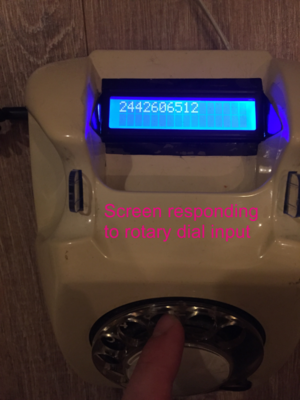
First of all, I connected Arduino to the dial mechanism and uploaded a code. That gave me access to rotary dial's generated pulses. After making that pulses could be read by Arduino, I added an LCD display. Upgrading the code did the trick, and after a week of trial and error I managed to make the screen show dialed numbers. To make this upgrade work more naturally I connected microcontroller's circuit to tilting switch mechanism.
After putting everything inside phone's case I had successfully created upgraded rotary dial phone's version. When person lifts the handset from the phone's dock, tilting switch mechanism turns on LCD display. Numbers dialed by rotary dial are displayed on LCD. Once you put down the handset back on the dock, screen restarts and turns off ready for another session.
Mapping
Position paper
I chose to study product design, because of my eager to create new things. I am not only studying that, I also think like a product designer now. It all started from my early childhood and my love for drawing, sculpting and assembling model planes. I tend to use solid colors and shapes, avoiding unnecessary details, trying to make my design as simple as possible. Every project I approach, I try to use different material. It is not only for design’s aesthetics, but also for myself education and knowledge improvement. But it doesn’t mean that I don’t care about the looks of the project, in fact it’s vice versa, I would rather scrap the project if it doesn’t achieve the looks I am looking for, than exhibit filthy version of it. I am a perfectionist person, not only for the others, but myself as well. I tend to think critically of my projects, trying to create only necessary things with function, to improve peoples’ lives.
Some of my designs came to life by handcrafting and only few of them using digital tools. I believe that a real designer should handcraft his design trying to avoid digital interventions as much as possible. Product design is very similar to sculpting. An artist has to become whole with the object that he is creating, and only then, by trial and error he can achieve the best shape, color, and function balance for that piece. Even though I have a quite long list of different skills in handcrafting, there are still a lot to learn. As far as my digital skills go, they are pretty limited to basic vector and 3D modelling software.
Since coming here to Rotterdam, my projects didn’t have working electronic parts. I was always fascinated by electronics and their ingenuity. I wished that someday I will learn more about electronics to add to my skills list and here, in digital crafts lessons I got the opportunity to learn about it. By getting a kick-start for learning basic electronics, I can now improve furthermore and create new things I haven’t created before, for example — art installations. In fact, I have already tested my electronic abilities doing a project for my major — I created a fully working inhaler for stressed out people who are trying to quit smoking. To execute this project, I have learned to use a new digital tool — a 3D printer. Though, I didn’t leave 3D printed parts as they were because of their lifeless sloppy appearance — I finished them the old way, by hand, adding unintentional asymmetry and curves. By using 3D printer, I saved relatively a lot of time and hard technical work, but I still managed to finish my project the way I like it — with a little bit of accidental human made errors.
Expanding my knowledge in such fields and merging it with information I already knew, shapes my style and me as a designer, who values hand crafting skills. Bauhaus movement also valued craftsmanship as a real necessity for art to thrive. Bauhaus movement was started by a German architect Walter Gropius, who stated that “The ultimate goal of all art is the building!”. He wanted to recreate craftsmanship and erase the artificial barrier between ‘noble’ artists and ‘working’ craftsmen. For the aim of future building, he claimed that every art discipline should unite as one. That is exactly what he was doing with Bauhaus. It was an ambitious program aimed at freeing the art world of its own isolation. Eventually, it became one of the most influential art movements in the history of art. I often feel inspired by this movement, his founder W. Gropius, other great artists who worked there, their ideas and designs. I believe in many of their statements and apply them to my work as a designer.
The idea of integration of different spheres and disciplines into one piece of contemporary design can be extended further to integration of digital technology. This years Red Dots: Best of Best awards winner well-known “Google Home” is a perfect example. Red Dot is a world-famous product design competition. The “Google Home” is awarded as a product design project, although we often think of it just as a computer. This device has many working high end electronic parts, working as a digital assistant and a smart speaker, but it has no visible keys or buttons. This reflects as a new trend in product design, that hides the electronics, letting them disappear into the background, letting the design to shine. It is a new way of design, where it can benefit from the new technology, while making it invisible. I like this concept of integration between two components, two mediums together and would like to try to apply the idea to my future projects.
One of the most fascinating and inspiring contemporary installations, that are my new interest, is called Impulse, and it was located in Montreal’s Place des Festivals in 2015. The project was fulfilled by Lateral Office and CS Design collaborative work. This installation merges product design and digital thinking giving an experience, which only digital tools can offer. Installation contained 30 interactive seesaws that emitted radiant light and sweet sounds. Visitors using the seesaws were given a chance to participate in a real time composing with those one-of-a-kind instruments. Moving seesaws created unique sounds and inspired matching projections on nearby building, creating playful original atmosphere. This project and contemporary installations overall, interest me of being interactive. The ability to use digital tools allows to interact and communicate with a viewer and get them involved. It lets the visitor to be involved, encouraging them to be a part of the project, experiencing it to the fullest.
Before arriving to Rotterdam and studying Digital Crafts as my practice, I didn’t think product designer would need to have knowledge of electronics or coding. And after a few weeks, my view changed completely. I now understand how important this information provided during lessons really is and how it opens new possibilities creating new designs. Installations, that previously looked frightening and unclear like from other dimension, now seem to be my new challenging interest.
Final Project
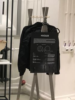
HUGLUX jackets
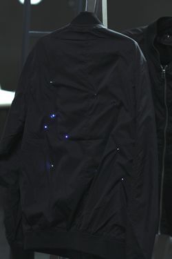
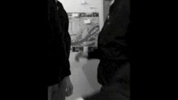
For my final assignment I collaborated with Monika Sumauskaite to create HUGLUX jacket. This jacket has tiny white LED lights on the front and the back to mimic stars in the night sky. When two people wearing these jackets hug each other, wearable turns on for a couple of seconds and LEDs light up embracing the beauty of physical human contact. For this project we created two working jackets.
Elevator pitch
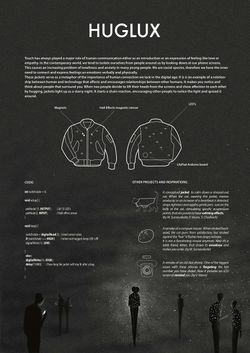
Touch has always played a major role in human communication either as an introduction or an expression of feeling like love or empathy. In the contemporary world, we tend to isolate ourselves from people around us by looking down at our phone screens. This causes an increasing problem of loneliness and anxiety in many young people. We are social species, therefore we have the inner need to connect and express feelings an emotions verbally and physically. These jackets serve as a metaphor for the importance of human connection we lack in the digital age. It is is an example of a relationship between human and technology that affects and encourages relationships between other humans. It makes you notice and think about people that surround you. When two people decide to lift their heads from the screens and show affection to each other by hugging, jackets light up like a starry night. It starts a chain reaction, encouraging other people to notice the light and spread it around.
Concept of the project
The idea behind this project is to bring awareness to surrounding people that lack physical connection to other people and rather stay lurking in their phones or laptops. Jackets are used as a metaphor for the importance of physical contact in people’s life. Electronic technologies nowadays are so advanced that many people find it easier to connect with others via these technologies than meeting them eye to eye. Lack of real conversations and live communication can make a person less social and outgoing leading to depression. Me and Monika decided to create a different type of technology that in contrary to most of today’s electronic communication devices encourages people to use a physical contact more, put their phones back to their pockets and enjoy eye to eye conversation. This idea came to our heads after we experienced this problem ourselves. Being far from hometown and family, even in a different country, we didn’t have any other way to communicate with our families than via our phones and laptops. Though video calls helped us to see them and talk with them, the experience is far too artificial. Each time after call ended, we missed that feeling of real honest conversations, since we were seen through small device camera and nobody could now what we were doing outside that frame or even if we were lying about something. You can’t shake hands or give a hug via phone and that reminded us that our family is not here. This experience sparked our HUGLUX idea. These jackets that we created are not particularly to encourage hugging, they are for people to stop hiding behind their screens, go out and be more social. This project was a big challenge both for me and for Monika. In my opinion we have different knowledge, skills and understanding of the term “design”, but that is the reason why it was so easy to work together. Since we wanted to make this project interesting for us, we decided to learn as much as possible during it’s making. None of us previously had any experience sewing or working with Arduino LilyPad before, also it was our first personal circuit and code, which weren’t copied of the internet and that was a big deal for us, because before these past four months we didn’t know anything about Arduino or basic electronic circuits.
The making
The process of making these jackets started with buying “bomber” jackets and ordering electronic parts. We did a brief research of electronic components and decided that we going to use hall effect sensors for triggering LEDs when jackets hug. This sensor works by sensing magnetic fields around it, so it looked as a good choice for this project. Though, after we got our sensor and tested it, it didn’t work as we expected. We hoped that this sensor would trigger when the magnet comes close enough to it and when magnet is further away, it would shut down. But it wasn’t the case with this one. Shortly after that we learned of existence of variety of different hall effect sensors and in our case, it was self-latching one. We corrected our mistake by ordering non-latching one, which worked as we hoped it would. After dealing with sensors, we started prototyping the circuit, writing the code, poking holes in the jacket for LEDs and sewing them in. On paper it seemed like a quite straight forward thing, but we shortly learned that it wasn’t. The conductive thread was a nightmare to work with and lack of sewing skills didn’t help ether. Our plan was to hide electronic components inside the jacket’s inlay and then the conductive thread problem appeared. Since LEDs were placed both on the front and the back of the jacket in random places, jacket’s inlay containing all the conductive thread paths started shorting out LEDs when inlay and jacket’s outside fabric layer with LEDs touched. Till this point we were really focusing also on aesthetic part of the project, but this problem caused us to rip everything apart once again. We had to isolate all the thread with electrical tape to prevent it from shorting out. This wasn’t a perfect solution and in some places on some occasions LEDs still were flickering. Now, that we know what kind of problems could acquire, I believe we could do electronically flawless and better-looking jacket. Though throughout this project we encountered a lot of issues I am happy that we succeeded in making these jackets. Failing to order correct electronic parts led to us realizing that there are different kinds of sensors. Working with conductive thread widen our knowledge and understanding of electronics, that these parts doesn’t have to be placed inside shiny plastic shells and they can be adapted for variety of uses and situations.
Conclusion and further development
Overall this project opened my mind and let me think more conceptual. I, as a product designer, imagine, that HUGLUX jackets could be further developed into a real product. After solving aesthetic questions and rerouting electronic circuits, jackets could be even sold for fashion industries. Maybe, HUGLUX could have an app, in which the owners of the jackets could track their virtual scores for meeting new people and going out to public. I know this concept will not change the world, but at least it can spark a thought and awareness in some people’s heads, that could start a chain reaction of affection and real eye to eye conversations.

