User:R. zegelaar
Robin Zegelaar
Chosen work
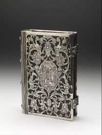
After studying the online collection of the Boijmans museum and visiting it, I was drawn to a tiny book cover. The thing I found interesting at first glance was the detail and craftsmanship of the work, that despite its size still drew attention, and the intrigue of what the relation is with the content.
Information about the work
The Boijmans museum did not have a lot of information about the book cover except that it was made around 1600, its dimensions of 12 by 9,2 cm and the material used being silver.
My first starting point was to research more similar books around that time. While browsing I saw the ‘’same’’ book as the one I was researching except it is part of the MET museum. I quickly unraveled this mystery as the MET museum did have more information about the cover. It turns out it is part of a series (three books) and the one from Boijmans is the biggest one. The one in the MET is the smallest and the third one is around the same size as the MET one with the addition of being converted into a box.
Furthermore I discovered the book cover is from 1610-1620 and contains a Nineteenth-century text, Solide Dévotion, sanctifiée par la prière (Turnhout, 1805). It has no hallmarks but there are similar book covers, presumably from the same master. The high quality and style have been determined to originate from Amsterdam. Also the contents of the book in the MET museum are original and printed by Abraham Huijbrecht’s in his Amsterdam workshop called In Den Dortsen Bijbel. This was also an indicator for the time and place of its origin.
Research
What do i find interesting about the object and what can i compare it too?
The amount of detail and craftsmanship is what drew me to the object but also the value of the cover intrigues me. And I don’t mean the monetary value rather the meaning of the value.
Digging deeper in the value, does an object that holds another object within value? Is it more or less than the content or does it give more value to the content.
One of the things I thought about was treasure and the relation with the treasure chest.
Treasure chest. The inside is valuable but it is signified with the treasure chest surrounding it. Also if you put something in a treasure chest it gains value because it is inside a treasure chest so it must be important. A time capsule, filled with keepsakes, memories etc. can also be considered a treasure chest but is in stark contrast with the typical pirate treasure filled with gold.
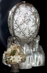
The other thing that popped in my mind was Faberge eggs. I have always admired the eggs and feel they have a similar feeling to the book cover, they however really have an important connection to the inside, the treasure. And even though they have a more symbiotic relationship they can be viewed from different perspectives. Is the egg surrounding the treasure just a pretty empty vessel or an important messenger, maybe even equals?
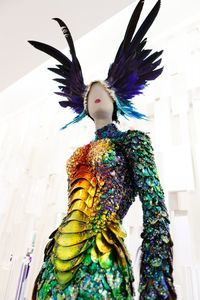
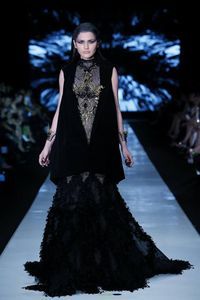
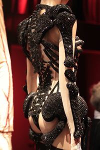
If I relate it to fashion you can see clothes as the object that holds another object inside, namely the person wearing it. And clothes have the same diverse effect that the book cover does. It can provide protection, it can be practical, it can enhance the value of the inside or decrease depending how you look at it. It can transform the person wearing it.
So to answer the question why the book cover is in a museum depends on the person you ask, it is in the eye of the beholder. Does it signify wealth? An important moment in time? Is it of religious value or is it a mockery? Craftsmanship or art or both?
Approach
I want to emphasize the cover and its importance. Using techniques to create a feeling of craftsmanship and value.
My first test was planned to be with fabric but after using photos of the object, which I enhanced in photoshop to create a higher contrast and make the details more visible, the process gave me insight in the use of the image. I could not reproduce the image in fabric as I planned to as the fabric would fall into pieces if I cut it through the entire material. I had the option to try it on a thicker fabric but my first idea was to have it translucent and a thicker fabric would eliminate that aspect. Therefore I looked for other suitable media and quickly came to acrylic sheets (perspex). It would retain the translucency, give it a breakable appearance but still retain the rigidness the original object has. I made three different versions of the image; a line image, a detailed engraving that would engrave the black parts of the image and a less detailed version in case the laser did could not get the detailed one as I wanted it to be.
I got the basic instructions with the laser printer in the digital lab and got started.
My findings were that the image although very clear it did not have the value I was looking for it was just an engraved image. I was very impressed with the level of detail the laser can put out though, even the smallest of details were clear. I transported the enhanced image into illustrator and using the trace option and playing with the settings to get the highest detailed version without too much unnecessary noise (fixing the last details by hand to get it as close as I could to the original.
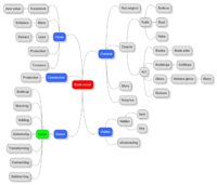
My next steps are to create layers that together form the cover. Looking back at the mindmap I created at the beginning there are various words that can be inspiration for the layers.
