User:Koen
Contents
- 1 Digital Craft 2017: How to be human
- 1.1 Project 1: On The Body
- 1.2 Project 2: Sensitivity Training
- 1.3 Project 3: Mind of the Machine
- 1.4 End Reflection
- 1.5 Sketch
- 1.6 Quarter 10
- 1.6.1 Forward/Introduction
- 1.6.2 Abstract
- 1.6.3 Central Question
- 1.6.4 Relevance of the Topic
- 1.6.5 Hypothesis
- 1.6.6 Research Approach
- 1.6.7 Key References
- 1.6.8 Literature
- 1.6.9 Experiments
- 1.6.10 Insights from Experimentation
- 1.6.11 Artistic/Design Principles
- 1.6.12 Artistic/Design Proposal
- 1.6.13 Realised work
- 1.6.14 Final Conclusions
- 1.6.15 Bibliography
- 2 Digital Craft 2018: Cybernetics
Digital Craft 2017: How to be human
Project 1: On The Body
'Exploring bespoke technologies as remediation, adaptions or extensions of the human body: Each third year will produce a new work inspired by one of the minor projects, but in an explicitly different medium or approach.'
Context
We spend the first week of this project helping the minors. They had their own groups with their own projects: my group had the idea to raise awareness for the 'terms and service' and careful you need to be when reading them. If you read them at all, that is. Be careful of what you agree with, it might be used against you. In the installation they secretly take a picture of you and spread it to computer screens across the room to show you how fast it can spread.
Project
My task in the first week was to make the wiki in order. I had to record important parts of the minors' research with either writing text or showing pictures. I also had to show the result of their work, pictures that were unexpectedly taken of you and shown on a giant screen in the next room.
The wiki page: http://digitalcraft.wdka.nl/wiki/Introweek2017 (the project is called 'I agree')
For my second project, I had the idea to visually show you how fast one of those pictures could spread across the world with the help of animation (my department). You would see an animation of the globe and the picture being spread across it in the form of tiny dots of light. It starts with one dot and over time more dots start to appear all across the globe until it's covered with dots.
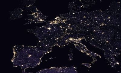
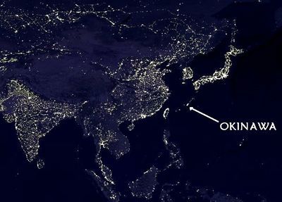
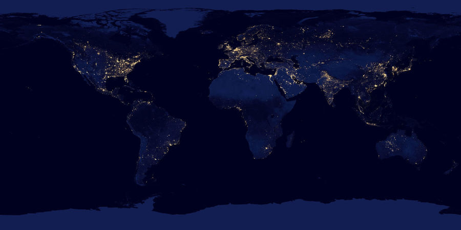
I used a lot of pictures of the earth at night as a reference on which area's on the world have a large population. Here are a few:
The result is the following video:
Reflection
The first week was great, even if it was pretty sudden. I had to adapt really fast to the group I was placed in and understand where they were coming from with their project. I was also happy to know that my help was appreciated in the group, as I had the task to make sure the wiki was in order.
The second project was honestly not a fun project to work on, mainly because I was making it really difficult for myself. Drawing all the dots on the globe for multiple frames drove me insane. And it doesn't really look all that good in my opinion. I needed too many dots and I couldn't give them all my attention or this project would take up too much time. There was probably an easier way to make the animation, but I don't know how and by the time I started questioning my methods I was already half-way in my project. I see it as an extension of the human body to properly see what happens to your data.
Project 2: Sensitivity Training
This project is all about exploring the effects of external inputs on the human body.
Context
The class is divided in groups and each of them explores a different input. There is light, magnetism, voltage, heat and stretch. I have formed a group with Tutu and we have chosen voltage. The first week we were supposed to make three very short (10 seconds) video's. Each of these video's should display a different effect that voltage has on the human body. In the second week we thought it would be fun to show how voltage is being presented and what kinds of effects it has in the world of cinema. As such, we wanted to make a compilation of all kinds of movieclips showing off what voltage can do in the world of fiction.
Project
The three video's we made each had its own theme:
In the first video we tried to measure my body voltage using a power source, some cables and a multimeter, to show that voltage naturally runs through a human body. We connected the power source to the multimeter and the multimeter to me, but we didn't really get a measureable result. Though, as I started moving my body, with the electrode of the multimeter in my hand, the multimeter suddenly started to measure something. When I stopped moving, the measuring stopped. It really was my body that triggered it, if I only moved the electrode around nothing happens. We thought it was really interesting, so we decided to just record this instead of what we had originally planned.
Video #1 (voltage measure):
In the second video I rubbed my hair with a balloon to show the effects of static electricity on human hair. It makes your hair stick to the balloon. I sped up the rubbing so that the video's length still fit in the ten second range and because it is funny.
Video #2 (shock):
The third and final video shows me shocking my fingers with an electric flyswatter. The goal of this is to record the reaction of my body to the shock that I get, particularly the facial reaction. I used a zoom and a slow down on the face to clarify this and also for comedic effect.
Video #3 (balloon):
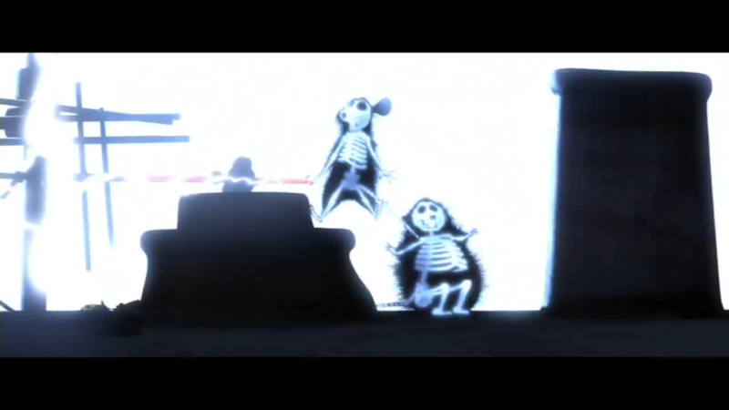
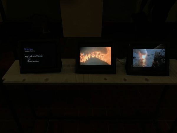
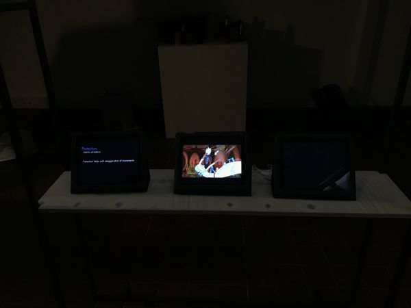
Our compilation consists of various clips from for example 'Back to the Future', 'Frankenstein', 'Ernest goes to jail', 'Finding Nemo' etc. We collected all kinds of clips and piled them together in a GoogleDoc. We decided to order these clips into specific categories in an effort to bring some order to our list of clips. We used the categories: Torture, Protection, Science, Accidents, Magical and Treatment. The last two were ultimately scrapped for our compilation, because we would end up with far too many clips to show. We're planning to use three different screens, one for the main shockin', one for text and one for some supporting footage/images. The left text screen displays information about the category and/or the clip displayed on the middle screen. The right supporting screen displays either some of the main clips' shots at the same time or some interesting images to build on information from the left screen.
Reflection
Finding creative ideas to show the effects of voltage on the human body was not that hard. The more interesting part is how to show these ideas in video form. Luckily it was all easy and fun to do.
The shock compilation wasn't hard either, just really tedious, as Tutu and me wanted to improve our editing skills (learning more about all these video effects) along with this project. I'm really happy that we were able to do that and that it isn't just a sequence of movie clips. I mean it is, but we used some sort of structure and also some glitchy transitions between clips to show that we put a bit more work in it. And it shows, considering this project also took a little longer to make than I wanted. But unlike project 1, I really enjoyed working on this compilation.
Project 3: Mind of the Machine
'Exploring the consequences of a machine learning of the human mind.'
Context
In this project Dieke and I were studying the definition of 'cute'. In nature cuteness is a way of survival. What kind of parent would abandon something so adorable? But a machine is not like that. A machine is cold, calculative and most of all emotionless. That's why we are certain that recognising and acknowledging cuteness is what makes us human. How can a machine be able to understand what cute is?
Project
For our Study of [...] assignment, we chose Study of Cute Things. We had to:
- Gather (find/collect/curate/generate) a set of at least 100+ images that fit within a chosen classification/category, which in someway can be considered quintessentially human.
- Write a 250+ reflection on the chosen category and the method of collecting images/data set.
- Study the images, order, and make a selection into a visual essay (add a caption to each image.
- Run the data set through the image generator algorithm and produce a few machine generated images to your essay.
The end result has to be a professionally crafted booklet containing all of the above.
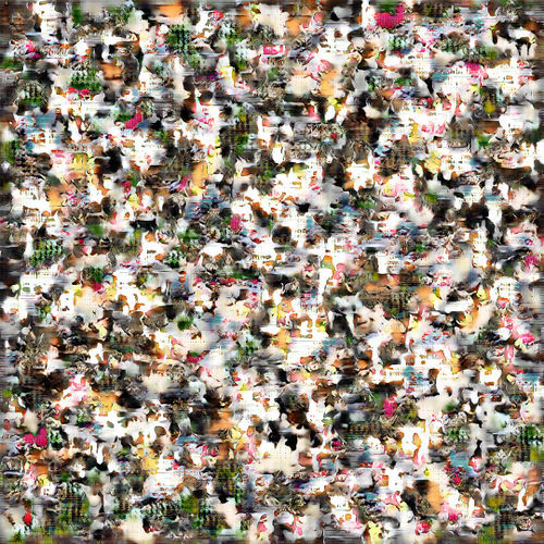
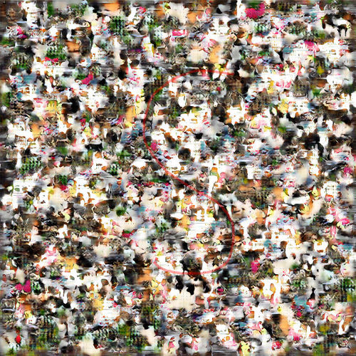
Dieke almost immediately knew that she wanted to make her booklet about cute things and I guess I just went along with it. We used Google Images and Pinterest to find our images using the word 'cute' and we took the pictures that to us personally invoked a feeling of cuteness. When we found 100+ images, we gave them to Boris and we let his algorithm determine its own definition of cute. The result was this:
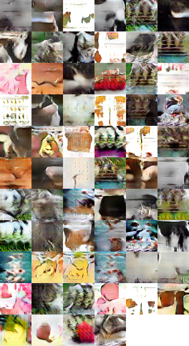
We also got a bunch of separate images, also made by the algorithm forming and mixing images:
In the booklet itself we decided to start with what drove us to investigate cuteness. We talk about cuteness being a subjective thing (what you find cute, might not be cute to others) while at the same time, cuteness has an aura of objectivity to it. After all, there are a ton of character traits that are often used by character designers to make the audience think that what they're seeing is adorable. After that we picked our personal favorites from our collection, with captions explaining why we chose these particular pics.
Then we tried to make sense of the mixture of cute picture. As I suspected, the end result is not cute at all and the computer doesn't seem te understand what cute means. Although I did spot the 'S' for 'Schattig' (which means cute in dutch), there isn't a single thing in this picture that invokes the feeling of cute for me. Some of the cute colors, white and pink, are present, but the machine seems to randomly generate something without knowing what the emotion in these pictures is. But maybe that's the point. Maybe it does understand, but we don't understand it.
Reflection
It was really fun to overthink the concept of cute. Although I do mean a lot of what I wrote in the booklet, at its core, we just wanted to use cute things, nothing more, nothing less. Cute things is quite a broad concept though. I think that's why the image of the algorithm is so mixed up. If we had defined our search term a bit more, I think we would have a more stable and cute end picture. Using 'anything' that we personally found cute was the cause of so many different pictures ending up in the end project. I learned a lot as well. I didn't know how to make a booklet before this assignment. I don't think it looks as professional as it could have been but I learned the basics of it, so I at least got that.
End Reflection
Because my study is animation, I am quick to say that animation is my craft, as it is the way I tell stories, convey ideas and what I do for fun. I always go back to 2D animation, with programs like TV-Paint and After Effects, because it is the area I wish to improve upon and it is what I am the most interested in. My interest lies with video’s, cartoons, drawing, giving life to things. When a project stands before me, my immediate reaction is: ‘How can I tackle this with animation?’
So when I got in Digital Craft and I had to do things with my hands, i.e. not animation, I was a bit worried. I had no idea how to do anything in Digital Craft, I have no experience with woodworking, programming, basic mechanical constructs etc. Somehow in my head I thought that I needed to learn all of that. Obviously this isn’t the case, but animation was a bit too digital for the projects that we got. If you only did ‘digital’, you wouldn’t get to the ‘crafting’.
It doesn’t mean I am not interested in Digital Craft though. A lot of the projects I was working on gave me something to think about. While the most fun project to work on was the shock compilation, the project I found most interesting was ‘the Mind of the Machine’. A machine doesn’t work on art projects with emotion or reason, but with randomness. This is what I want to explore further in quarter 10.
For next quarter I want to return to what I’m good at (animation), while also learning some of the many things that digital craft has to offer: programming. I am interested to see what the machine thinks about animation and let it animate something with the use of code.
I am by far not the first one that has made something with code. People like Sergio Albiac generate entire portraits completely from code and transcribed voice. But I think it’s important to give the machine as much creative freedom as possible, otherwise you’re just using the machine as a tool, instead of trying to understand its perception on art. Giving every line some sort of ‘random’ factor is very important for that, I think.
Sketch
Quarter 10
Forward/Introduction
My name is Koen Dekker and I study 'Animation' at the Willem de Kooning Academy in Rotterdam. I love everything about this practice and thus I am pretty interested in where my favorite medium is headed, but I'm also concerned in how little influence we artists might have on our future projects. With art like movies getting increasingly more formulaic for financial reasons, it's hard for me not to imagine art in the future completely being made by formulas, algorithms and machines. When does an artist act different from a machine and when is the line blurred?
Abstract
I want to know how the mind of a machine can help us in the future of arts/animation and if it can eventually replace artists. Machines and technology are becoming more and more prevalent in today's environment, thus I think this is quite important. I will do this by comparing differences between the choices that people make and the randomness that the machine uses. To do this, I am going to let people play a certain game and let them make certain choices. Depending on those choices they will draw a certain pattern on some paper. After that I will let the machine do the same game and compare its results with that of other people.
Central Question
What are the differences/causalities between creating by choice and creating by randomness?
Relevance of the Topic
In a world where everything is being automated, art is one of those many things that might find the same fate. Algorithms are able to create nice patterns for now, but are they going to be able to create the story and emotions behind an art piece in the future as well? https://motherboard.vice.com/en_us/article/jp5737/these-artworks-were-made-by-algorithms
And if they are able to do this, should that be considered art? Usually it's the creator of the algorithm that is considered to be the artist, but if you give an algorithm a certain amount of creative freedom, which causes a different result each time you run the algorithm, then who is the real artist here? Creating a few paintings seems harmless enough, until you think that these robots might be able to replace artists for good. One of the few things we have that robots don't, is choice. The ability to choose the best option to recreate the exact concept that we have in our minds, whether it's a physical concept or an abstract one. A machine doesn't do this. It acts according to a random set of numbers. It doesn't want anything.
Hypothesis
I hope to find some kind of difference between the creations of my algorithm and those of the participants. To be more specific, I'd like to find a consistent pattern in the creations of the participants. But I suspect them to just draw in random directions, as that is very tempting to do. But if they get bored of drawing they might just draw a straight line to the edge of the paper.
Research Approach
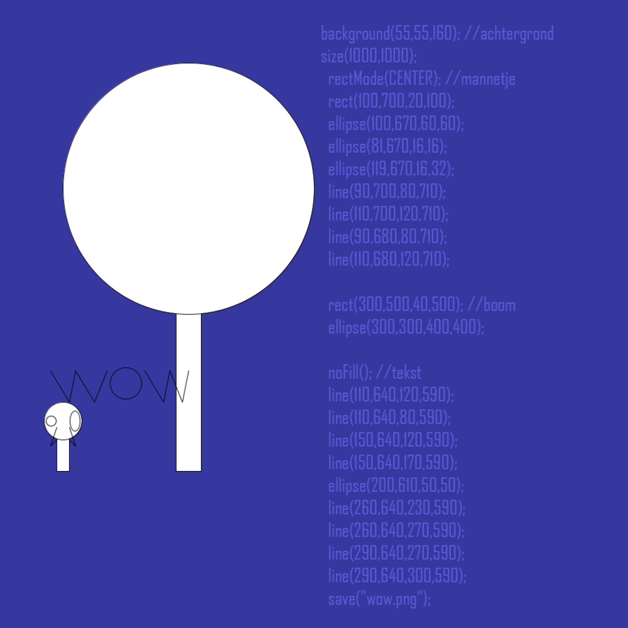
First I knew I had to make some kind of algorithm. Considering I'm an artist I decided to use a program called 'Processing' for writing my code. 'Processing' is programming software made for artists that want to get into algorithmic art. Even though it is not as nearly as difficult to use as actual programming software, it is still hard, as it requires you to learn various different terms and what they mean. But by experimenting with it, I should be able to learn enough about it. I also needed to create some kind of game, something that was easy to understand. The rules of this game needed to be exactly the same as the code in 'Processing', except of course at the point where the player needs to make a choice. This was to make the eventual comparing a lot easier and to make sure that the game was fair. It's no good comparing two results if the player had more options than the machine.
Key References
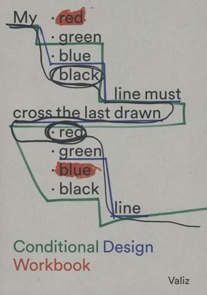
The main inspiration for this project is 'Conditional Design', which is known for its playful processes from which the product is formed. Each work has its own set of rules which the participants need to follow. It's basically a book full of games of which the eventual result is a piece of art.
Another inspiration is John Whitney, not so much for my final project, but more so for research, when I was learning 'Processing'. At that time I was more searching for what the mind of a machine could mean for animation in the future and Whitney was an artist that asked that same question years ago:
https://www.youtube.com/watch?v=5eMSPtm6u5Y
Literature
https://www.artsy.net/article/artsy-editorial-hard-painting-made-computer-human
I used the official book of 'Conditional Art' for inspiration:
https://conditionaldesign.org/
Experiments
(what are you going to test out and why)
I had to try Processing in order to git gud:
Tests:
Vintage tests (made with help: https://www.youtube.com/watch?v=LaarVR1AOvs&t=476s):
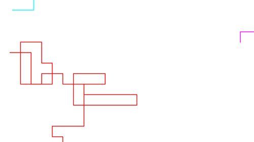
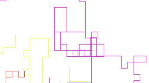
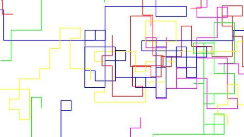
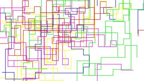
I succeeded in writing a code and it gave me these results with the respective amount of lines. Note that the starting point of these lines is entirely randomized. Thus each time you start the code up, the results will be entirely different from the previous start-up:
3 lines:
10 lines:
Live test with 10 lines:
20 lines:
40 lines:
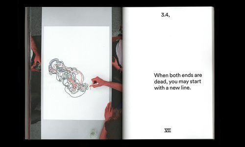
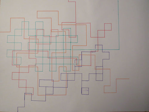
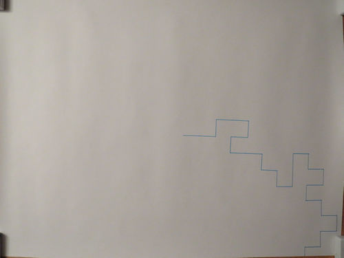
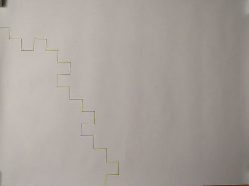
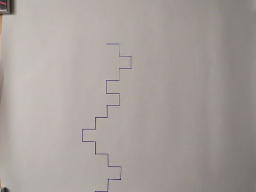
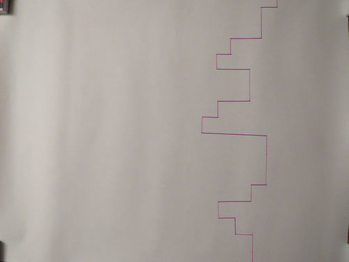
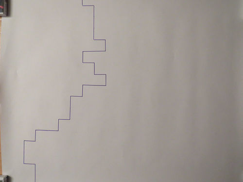
For the Sinterklaas surprise, I had someone play a game similar to Conditional Design. You need a giant sheet of paper (A2-size), some markers and a ruler (preferably a protractor). Start anywhere you want on the paper (draw a point there). From there, draw in one line whatever you want. The rule is that you have to take steps of 3 cm. When you reach 3 cm you can choose which of the three remaining directions you can continue your line: left, right or straight. You cannot draw back to where you came, but you can draw over a previously drawn line.
I have tested this same game out with various people:
Result:
Manon:
Winston:
Mats:
Sanne, Cilke, Shadriya:
Birsu:
Live
Insights from Experimentation
(what have you pulled from your hands on practice based research?)
From the game's experiments I can see that the person's choice is based on their desire to make something logical. If you compare the results of the algorithm with theirs, a lot of the choices it makes don't make any sense. For example the lines it draws sometimes start and immediately end at the edge of the paper. No person would ever do that, because that's not even remotely fun to draw. People like to make some kind of structure that is pretty and recognizable. For example Mats and Winston at the leerlingenmarkt never went straight ahead in their drawing, only left or right. I guess that's also a choice people can make: to exclude one of their options.
In most of the experiments that I did with other people, I can assume most of the people didn't have a plan in mind. They acted like the machine and just randomly chose a direction without keeping the bigger picture in mind, not trying to depict anything in particular with their drawing. I can see that when I compare the lines from the speedpaint with my family, with the lines of the algorithm that lasted more than two seconds.
Aside from the light-blue line on the first photo/video, the lines aren't made with a predetermined idea/structure in mind. And I think that's because of the limitations I have put on them. If I asked them to draw anything anywhere on the paper without the rules of the game, the person would think of the first thing that comes to mind and draw it. But because they have to draw it in one line, and in steps of a set distance and they can only stop if they reach the edge of the paper, it's much harder for them to quickly think of a structure they can draw within these rules. Ironically, in my efforts to find the difference between the actions of man and machine, I have limited the creativity of the man and thus turned him into the machine! And all I wanted was a fair analysis...
Artistic/Design Principles
(what is your own criteria for designing?)
It needs to be clear. The differences between the people and the algorithm need to be easily displayed for the public to figure them out. The drawing that the person makes needs to be simple to recognize, in contrast to the giant, entangled mess that the algorithm might draw.
Artistic/Design Proposal
(what do you propose to make)
I need to find some kind of medium that combines the results of the people with the results of the algorithm. I'm thinking of making either a book or a video. A book is a bit more clear, but I am more comfortable with making a video. I decided to make a video instead of a book, because a book can't show the decisions live being made. I can eventually add the two together so you can eventually decide if the algorithm and person contributed to each other in any way.
Realised work
I made a video of me drawing according to the rules of the game in a speeddraw. I made a recognizable surrounding with a giant flower, the sky and the sun. Later the algorithm draws over my first drawing, working with the code that has been given to him. I made this work to explore the possibilities of human thought and algorithm working together and what the result of such a collaboration might be.
Final Conclusions
(what was the point? what do you take away?)
The more rules you put on yourself, the more you are going to behave like a machine. The game does allow some leeway, but all has to go according to its rules. What separates us from machines is not really the choices we make, but the creativity behind these choices. If you're going to make a piece of art that has your name printed on it, but you're just doing the same thing that everybody else does, then how does that make you any different from a machine. It doesn't. You're just building on a formula that has been used for decades.
The point of this project was to find some differences or causalities between the work of a machine and the work of a person and to explore the theme of choice. Using a Conditional Design like game did help, because it allowed me to build a simple design for my project and that made recognizing any differences or connections between man and machine a lot easier. Eventually I found out that in my efforts to create a fair work situation between man and machine, I inadvertently suppressed the persons ability to find a creative solution.
What are the differences/causalities between creating by choice and creating by randomness?
- The differences/causalities ratio is determined by the creativity of the person, the logic in the choices made and the amount of fun that the person might have. The creativity determines if the person is going to draw a recognizable scene or aesthetically pleasing structure as opposed to the machines entangled mess. The logic determines the amount of lines that are drawn in half a second by the machine (starts at edge, ends at edge) as opposed to the common sense of the person to not do that. And the amount of fun determines if the player gets bored and just wants to end the assignment as opposed to the machine's ability to draw on and on and on.
Bibliography
An image and article from Motherboard.com about various works made by artificial intelligence in an exhibition at Borges Cultural Centre (written by Victoria Turk):
https://motherboard.vice.com/en_us/article/jp5737/these-artworks-were-made-by-algorithms
Conditional Design Workbook (written by Luna Maurer, Jonathan Puckey, Roel Wouters and Edo Paulus):
https://conditionaldesign.org/
John Whitney, video artist, showing off his machine:
https://www.youtube.com/watch?v=5eMSPtm6u5Y
A video made by Alexander Miller. Inspired by John Whitney, he made this tutorial which helped me get more familiar with Processing:
https://www.youtube.com/watch?v=LaarVR1AOvs&t=476s
Digital Craft 2018: Cybernetics
Project 1: Critical Making exercise
"Reimagine an existing technology or platform using the provided sets of cards."
Process
06/09/18 - Today we assembled our teams and received our assignments. Our team consists of Annemarie (animation), Dieke (animation), Lot (graphic design), Karlijn (graphic design) and Koen (animation). For tomorrow we have to use the cards we received today to reimagine a certain technology or platform.
07/09/18 - We started this day playing with the cards to see what kind of cool combinations we could make. After a while we settled with the idea of making an object designed for a tree. What if a tree could use a social network? We went for the following combination: "Make an object designed for a tree to use 'Social Networking'. Use folded paper to create a physical model of this new thing."
We just thought that this would be a funny thing to do, but the problem is that a tree does not give that much input to the world around him. We decided to keep it to just 'Yes' and 'No' decisions to keep it simple. This is how we arrived at Tinder, because not only is the idea of a tree on Tinder pretty funny, but it's also simple to use. You merely need to swipe to the left or the right whether you want to date a certain person or not. Maybe we could let the tree decide by letting it grow to either the left or the right...
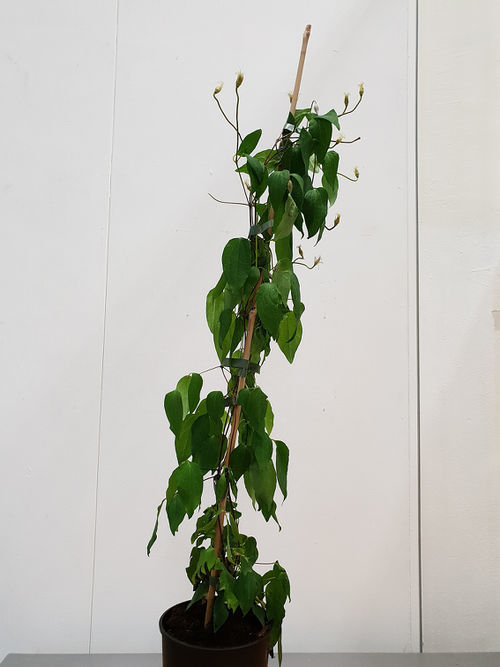
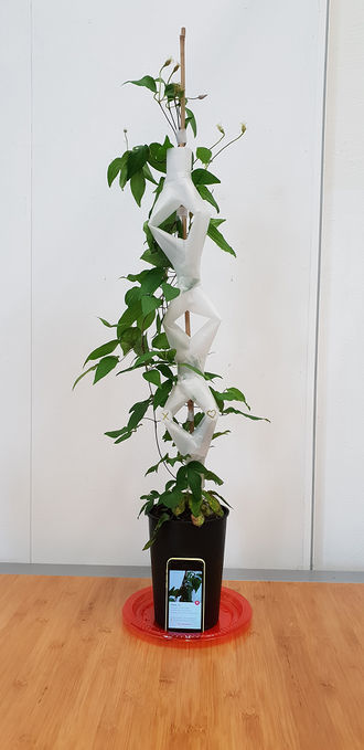
For this prototype we decided to use a smaller plant instead of a tree, because it's much easier for a smaller plant to grow and to build an object for it. Our plan is to let the plant grow in a tube-like structure and let it decide to grow further in either the left tube or the right tube. In both tubes there is a sensor that detects whether it should swipe either left or right respectively. As of now we haven't figured out how to make the object swipe just yet. Today we made a prototype of the tube system out of paper, with one of the tube ways already being taken by the plant just to show what it would look like. We also made a Facebook and Tinder account for our plant: Clovis Clematis.
13/09/18 - For today we had to present Clovis and her cyborg appendage to the rest of the class. The reception was pretty okay. The main question that was brought up was 'How can a plant know that it is using Tinder?' Obviously it doesn't, but maybe we can convert the Tinder profile picture into sound and give the plant a choice instead of letting it grow by chance.In two weeks we need to have a prototype that works as much as possible. It doesn't have to be a continuation of project 1, but it does need:
-to be somewhat related to these explorations on reimagining technology.
-to be 3D, a real thing.
-to be simulating interactive feedback loops.
Project 2: Cybernetic Prosthetics
"In a small group, you will present a prototype of a new relationship between a machine and a biological organism, relating to your explorations on reimagining technology in the posthuman age. The prototypes should be materialized in 3D form, and simulate interactive feedback loops that generate emergent forms. As the 4th years, you will need to take your project to the next level as a fully functional work."
14/09/18 - Today we were trying to figure out what our next project should be about. As we were in the mindset of plants with our previous project. First we thought about a concept relating to the habitat of trees and that affects their lifespan. For example trees in the city grow faster than trees in the forest, due to the amount of CO2 in the air around them, but they also have shorter lifespans. We thought about adding a meter to a tree for it to know the amount of CO2 around him, but it wouldn't really add some sort of feedback loop so we scrapped it. There was also the idea that we could use CO2 as a building material. But the idea that we were most excited about was about a plant that grows meat instead fruit. This could be an alternative to meat from animals.
17/09/18 - We decided to keep the project a bit more realistic and to focus back on plants making decisions. The idea was to bring the decision making more to the plants this time and present them two different kinds of music. We know that plants can detect vibrations, we want to know if they have a preference. We're also planning some experiments to see what kind of effects music has on plants. What's interesting as well is a way to record where you're touching the plant: https://www.youtube.com/watch?v=EcRSKEIucjk
We are going to do our own experiments to see how music affects plants. For my experiment, I 3D modeled a special plantpot, but was too late to 3D print it on the same day.
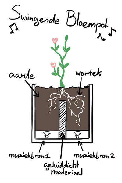
18/09/18 - I 3D-printed the special plant pot that lets me look at the bean/seed while it's growing, while also giving it two options to grow to. I am going to use two speakers with different kinds of music and I'm going to let it choose its favorite side.
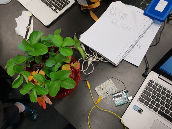
20/09/18 - Today we tried getting a reaction from the plant by touching it, like in the video of "BOTANICUS INTERACTICUS". The technology they used to do this is called Touché and we tried to replicate it with Arduino, like Nick Arner did here: https://www.youtube.com/watch?v=ZPsU6U54CRM We got pretty far with the help of Javier, but eventually we found out that for this experiment to work, Arduino needs to be communicating with a different program we didn't have. So we couldn't continue.
Javier did connect us with some very interesting and useful sites:
https://github.com/damellis/ESP/wiki/%5BExample%5D-Touch%C3%A9-swept-frequency-capacitive-sensing
https://www.bright.nl/nieuws/artikel/4034676/disney-maakt-elke-plant-aanraakgevoelig
https://www.nickarner.com/blog/2017/7/8/talking-to-plants-touch%C3%A9-experiments
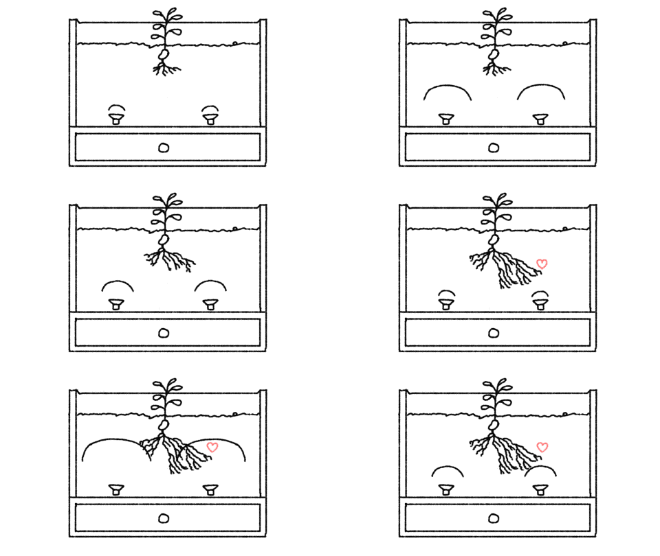
After that we looked back at our Clovis experiment, trying to find a different way of making plants react to and decide their music. We thought of a way to create a feedback loop in which the plant is searching for his favorite tracks. The pot is seperated in two halves and each halve has a speaker playing its own distinct music. A bean/seed is placed above the seperation, allowing it to grow to both sides. Using some kind of transparent soil, a webcam and MAX7, we are able to distinguish the difference in color between the two halves. Roots have some kind of white color, so if one side contains more white than the other, we assume that the plant prefers the music on the whiter side more. Therefore, the music on the part with the most roots will keep playing and the music on the other side will switch.
21/09/18 - We got together and made a list of things we need to do for next Thursday. We'll need to build a box for the plant, transparent soil to see the roots, a webcam to record the amount of white color in the transparent soil and the code to recognize the change in whiteness and to switch music tracks if necessary. We made the design for the box today as well as the majority of the code needed to build this prototype.
26/09/18 - This time we were preparing for next day's presentation, deciding who should talk about what. Karlijn and Lot were working on a powerpoint, Annemarie and me worked on some drawings and animations to show during the presentation and Dieke had finished the box.
27/09/18 - Our presentation was today and I think it went well. We got a bunch of references from Shailoh and Ivan that might be really interesting to look more into:
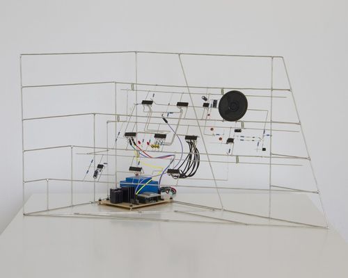
Eirik Brandal: He makes elektronic sculptures using all kinds of resistors, wires, conductors and more. His projects experiment with sound and shape, they look like sculptures trying to teach us about the anatomy of machines. Very interesting.
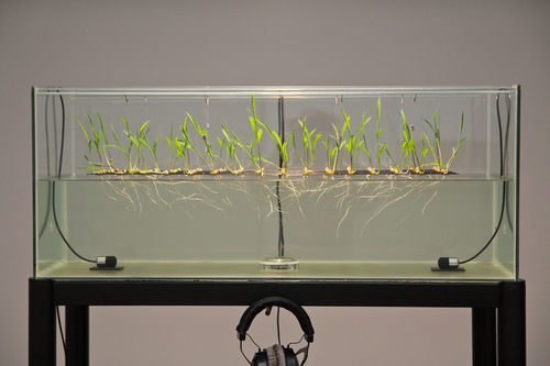
Sebastian Frisch: It's almost scary how similar his project 'Biophonic Garden' is to ours. He built a water tank with plants that are influenced by different vibrations and growing their roots towards the speaker.
Fedde ten Berge: Coin|Switch is a very atmospheric art installation in which the visitors can combine different sounds by operating various buttons.
https://www.youtube.com/watch?time_continue=113&v=nVRKXz_8Qas
Project 3: From Devices to systems
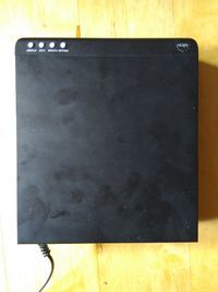
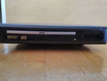
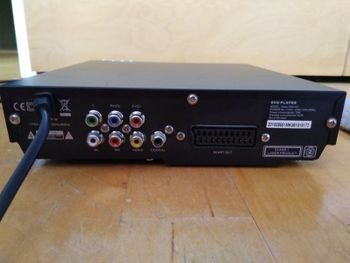
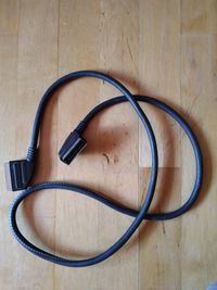
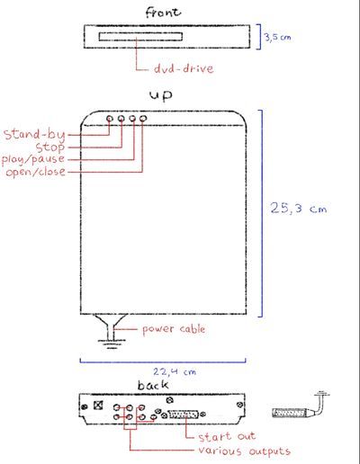
06/10/18 - I have decided to choose a dvd-drive for this assignment. We must disassemble our device and document each part to understand how it works. First I did a quick test to see if this dvd-drive still works. It did, but the video and audio it was putting out was very glitchy. RGB values jumped all over the place, video kept getting sliced and the audio was cutting out constantly. Luckily it was easily fixed by replacing the video cable with a much thicker and more stable one. After testing the dvd-drive, I started drawing the basic looks of the drive, documenting its buttons, ports and all that stuff.
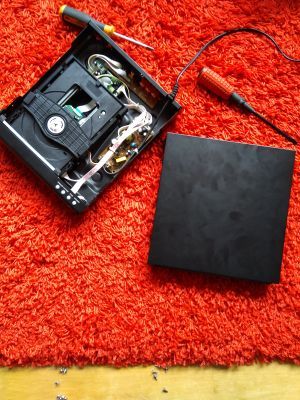
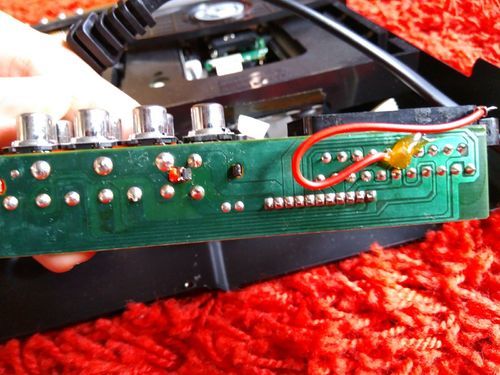
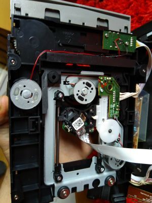
07/10/18 - Today I tried disassembling the device. Getting the thing to open was a bit harder than I thought, but when I eventually made my way inside, tring to understand the different cards was actually easier than I thought. Take the circuit board on the back for example. I had no idea how these things work until I took a closer look at the back. I knew the rest of the ports could be ignored if you just use the video cable, as this resulted in both video and audio, rendering the rest of the ports useless. Both the ports and the video cable have their inputs connected to the outputs of the rest of the device respectively. Because some of those outputs are connected to both the ports and the video cable, it can be assumed that the rest of the ports are just another, maybe an older, option to choose to stick your cables in.
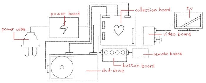
08/10/18 - The inside of the dvd-drive consists of five significant parts:
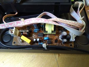
- The power board: This board has only one input and output and is also the first thing the power cable comes in contact with. This is also the input of the board. This boards purpose seems to be the regulation of the power that is used in the drive, because letting the full 220 Volts from the socket into the drive doesn't really seem like a good idea. It's also full of capacitors and resistors, which confirm that it is for regulating power. It also has an inductor and an integrated circuit (IC).
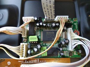
- The collection board: I call this the 'collection board', because this is the board that is connected to every other major part of the device. It is also considerably more detailed than the other boards. You can consider this the heart of the drive. It contains plenty of ICs, capacitors and resistors.
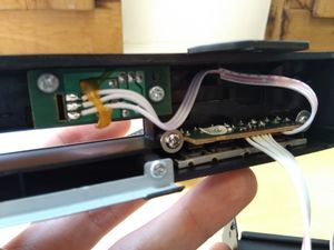
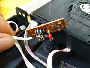
- The button boards: This part consists of two boards, one for the buttons that are present on the front of the dvd-drive and one for receiving button inputs from the remote. The boards are both small and low in detail. The board for the remote contains a LED for when the drive is turned on.
- The DVD-drive: The drive is connected to the collection board with three connections. One of these connections is to read the disc and send it back as video. I assume that the other two are for controlling the drive: be it making the disc spin or pushing the drive out when the 'open' button is pressed.
- The video board: This is the final board which contains the ports that can be connected to the cables. As mentioned before, there are two different ports to use here, an older and a newer version. Both of them are connected to the same outputs, so either of them will do the trick.
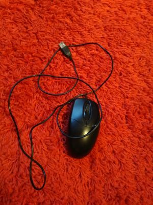
09/10/18 - Trying to understand something as complex as a dvd-drive and how to modify it without ruining it, is pretty difficult. I'm not a technical guy so maybe I should work on something simpler, with an easy input and output. Recently, my computer mouse has not been working properly, so maybe I'll be able to fix it with everything I've learned so far.
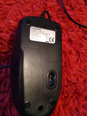
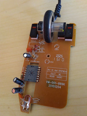
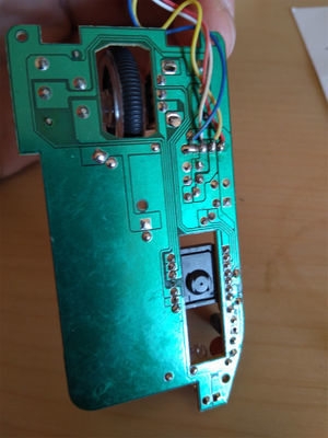
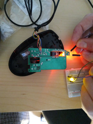
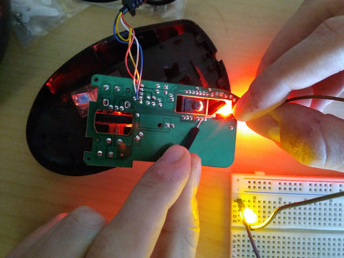
I have managed to connect an extra LED to the plus and minus of the red LED inside the mouse, which turned the LED on. If you connect the plus to pin 9 of the IC and the minus to pin 8, the LED shines even brighter.
The sensor on the bottom of the mouse makes the LED shine even brighter if it senses any activity. This made me come up with the idea that I could connect a buzzer to the mouse, which goes off if the sensor detects anything. Basically, it turns the mouse into an alarm. An extra bonus is that this broken mouse suddenly started working again, my laptop finally recognises it as a mouse. I think something was wrong with the wires that send the data to the laptop and me rummaging through the inside of the mouse made the wires work again.
10/10/18 - I've been getting closer to understanding the purpose of the different pins in the IC, but I still don't know which input/output I can use for the effect I want for the buzzer.
11/10/18 - The buzzer works the same way as the LED I tested some time ago. The noise of the buzzer is significantly increased when connected to pin 9 and pin 8. Not only is the noise louder, but if the sensor has detected anything (i.e. when the red LED shines brighter) the sound has also a higher pitch. This is also the case when the buzzer is connected to the plus and minus of the LED.
The closest that I am to creating an alarm is when the buzzer is connected to pin 9 and pin 8. When someone gets detected by the sensor, the pitch of its noise becomes a lot higher. What I truly wanted is to get rid of the continuous noise and only make it buzz when the sensor goes off, but this is the next best thing. On the other hand, I have now created a mouse that actually 'pieps' (squeaks) when you move it around :D
Project 4: Cartography of Complex Systems & the Anthropocene/Pre-Final project
01/11/18 - Apparently, no Halloween party, but we did have a good feedback round with Ivan today. I'm a bit behind on schedule, I'm suspecting that the visual mapping assignment was due today, but I'm not sure. I made a small map of what I thought was the connection between my project. I figured that the projects each tried to ascend the soul of a specific concept, if that makes sense. I classified my projects in three stages of consciousness: inanimate, alive and conscious. For example, objects and dead things are inanimate, animals and plants are alive and people are conscious. In project 1 and 2 we tried to give an organism that isn't normally conscious (a plant) the ability to choose its favorite tinder-match or his favorite music. We tried to give it more soul. In project 3 I tried to make an inanimate object (a computer mouse) seem alive.
For next week, I'm supposed to make a visual map, making connections that eventually lead me to my plan for the final project, along with 3-5 sketches of some ideas that come up along the way. When I have my final project, I should finalize that idea in one last sketch. The feedback from my classmates says that I should personalize my map, make it humorous (a key element of my work that seems to be brought up a lot) and to take a look at my final project from my previous year and see how some elements from that cross over. I was also recommended a book called 'Future cimema' by Jeffrey Shaw. It contains a lot of interesting new ways to use cinema and combining it with other elements. Later this day I borrowed this book from the library.
The plan for tomorrow is to read more from 'Future cinema' and to begin on my visual map. I will take a huge piece of paper and begin a rough sketch, starting with my projects so far and diverge more and more into different terms, while connecting these terms with eachother. If I eventually find a term/idea that interests me, I will visualize it with a sketch. With my final sketch I need to know what to show, why I am showing this and what I am trying to achieve by showing this.
Last monday I also had an SLC lesson where Robert-Jonathan Koeyers explained what he thinks is important when working on your final project and how to fill in the gap between you minor and your major. Robert won the Drempelprijs at our school for his visual poem 'Here'. His main advice was to make something you want to make/research something you're interested in, to know who you are as a maker and to keep it easy for yourself.
So, I know that I want to make the minor and major one project, or ideally to make the minor the research for my major, I know that I want to incorporate 2D-animation into my minor, I want to incorporate humour into my work and probably keep it easy to make. Let's save pushing my limits for my major.
05/11/18 - I have started drawing a huge web of words and sketches, connecting some words together, trying to find my idea. I'm getting there slowly but surely. I have sort of figured out what kind of concepts I find interesting to make my next project with and what's characteristic in my work. I have also gotten a few neat ideas from those concepts that I think are interesting. But the biggest hurdle to overcome for me so far is WHY I want to show these ideas. I have very few themes that I'd like to research and I don't know what I could provide other people with my work.
I've had several ideas for interesting expositions. The first one was inspired by projections and interactivity. The viewer would be required to stand in some kind of tent and an abstract movie would be projected onto the tent. The fabric of the tent is very thin so the projection can be modified from the inside by pulling/pushing the fabric. I also had the idea to attach all kinds of small mirrors to the inside of the tent, which reflect the projection to all kinds of directions. This could be some kind of metaphor about details and how people stand in front of them, unable to see them. Maybe. Could be nice.
Another idea was inspired by the animated short 'Mamoon'. For this short a model of a city was built and the animation was projection-mapped on top of it. I thought of doing something similar, but instead have the projection guide the audience somewhere.
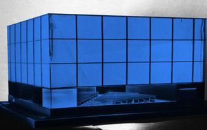
'Future Cinema' by Jeffrey Shaw is a big help though. Currently, I have found three art works that really speak to me: 'Cinema' by architect Dan Graham, 'Pepsi Pavilion' by multiple artists, engineers and architects and 'Film Guild Cinema' by Frederick Kiesler.
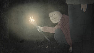
06/11/18 - It didn't really go that well today. I got completely stuck. I can't choose what I want to show, I don't know how to show it and I don't know why. Especially the why is very frustrating, because I could ask the same to some of my inspirations from the 'Future Cinema' book. Why does Dan Graham try to subvert the audience's perspectives on cinema? Why does he want to question the normalcy of everyday life? Why does he want to divert the attention from film to viewer? These questions are not answered in the book, but are presented as the why itself. My take is that Graham did this BECAUSE it was a new and interesting perspective. Let's compare this to the animated short 'Night Walks' by Lizete Upite. This short is about a girl and her dad walking through the woods at night. The girl prefers to have the torch on to feel safe, but eventually it goes out and the girl sees the beautiful stars. Why was this short made? From my perspective, it's because it wanted to teach viewers how important it is to step into the unknown, no matter how scary it may seem. And this will help us grow as human beings. It's a why that has a lot more depth than just 'it's an interesting perspective'. "The silent forest is as enchanting, as it is scary and the bright flame as protective as it is blinding."
This is the kind of why that I want to create, one that teaches and improves society and people as a whole.
07/11/18 - HOLY SHIT, I think I got it !! I have been through several themes/topics already that I was excited about, such as cybernetics, mainstream vs alternative, technology, art analysis, kid-friendly content etc. But recently I thought of a topic that is more interesting to me than all of those: speech. (Free/hate)speech is a concept that I think many people could be learning more from, especially nowadays, where people get offended very easily. I want to show people that it's not the speech that matters, but your reaction to that speech does. I need to get my act together and use this as my theme, otherwise I'm going to break my head over this for another week.
I have a very good idea for this for my major. The question is: what am I going to do for digital craft? That's something I need more time for.
- How am I going to convey this message?
- What kinds of feelings are the most important to evoke?
- What am I going to have to need to build my exposition?
- Where am I going to convey my message the best?
08/11/18 - I had a pretty useful talk with both Ivan and Shailoh today. Ivan's main advice was that I need now to filter more, like I did with my theme. I need to do the same thing for:
- What I want to say.
- How I want to show it.
- Why I want to show it like this.
- Where I want to show it.
I should probably also think about what kind of technology I want to subverse, since that's a big part of digital craft. Plus, how can I incorporate animation into this?
Ivan and Shailoh also had several artists recommended to me, the most notable one, to me at least, was Ryoji Ikeda. He makes all kinds of abstract, data-based videos, where he plays a lot with light and sound. He has an exposition in the EYE museum in Amsterdam, so I am very interested in checking that out. Another interesting fellow is Anish Kapoor. He is very intrigued by mirrors and how mirrors reflect their surroundings.
12/11/18 - Since speech is auditory, I thought sound should be a key part in my project. I've had several ideas on what my message is supposed to be:
- Where the boundaries of speech lie.
- How pushing those boundaries helped us grow as a society (This is where the concept of audio that builds on top of eachother started to pop in my head).
- What is in sound that makes us laugh.
- How speechpatterns can add to the character (How audio makes me 'see' characters)
- To show how everyone sees/hears something else in a piece of art to the point where it loses its original meaning.
The last one is something I am willing to make my 'what'. The idea of a speaker playing the recorded sounds of everyone giving his/her opinion at once is a metaphor for everyone's collective thoughts and also the internet, where people throw every little thing they think of onto. I'm not sure what these people should be reacting to, but I want some kind of implementation of a phone, as it's a device where you directly speak and give your experiences, opinions or perspective to the other person. Having it connected to the collective thought of society can give an overwhelming effect.
14/11/18 - I went to the exposition of Ryoji Ikeda today at the EYE museum in Amsterdam. I was expecting some interesting sounds and visuals, a new form of cinema and hoped to find out my 'why' as it was the only one I had left to figure out. At the very least I wanted to find out what made this man tick and what his thoughts were behind creating his work.
Apparently, his work is about math, data and the incomprehensibility of it. I continuously thought his works were trying to tell me something, but we as humans are unable to understand its true meaning. This combined with the meaninglessness of data is his 'why'. It was also a very visually beautiful experience. It's very relaxing even though the sound might give you a headache :D.
15/11/18 - I had a final feedback round with Ivan. It was very short, but the main problem with my project so far is that it's missing some content that makes it complete. He asked me to really think about what my message is supposed to be. I thought I had figured that one out already, but when he asked me what it was I found it difficult to actually put my finger on it. He advised me to actually start and experiment and that I'll probably find the missing piece by doing that. I've never really liked experimenting, I always want to jump right into the project, so that's something I really need to push myself to do. I should also talk with people about my project, ask questions and maybe I can get further that way.
16/11/18 - I decided to ask my mom for some advice on this and she thought about the personal bubbles that everyone is in. About people that don't actually listen and just keep talking. Maybe I can steer my project towards this idea of bubbles and that it's simpler to just agree with a collective rather than individual people.
19/11/18 - I disassembled the phone I got from a second hand store. I quickly found out that I find the shell of these objects a lot more interesting than the contraptions on the inside. The same happened with my previous project, where I took an old computer monitor apart for its outer parts to make a helmet out of. I also made an oscillator in Processing, so that I could understand the code behind it, which I do now.
20/11/18 - I did more experiments with Processing today. I mostly tried to find a way to make audio reactive visuals. I found multiple examples of code that achieve this and multiple ways to play around in their settings. But I have yet to combine some of it to create an ellipse that reacts to audio from my surroundings. I am trying to do this, because I need a visual that ties into my theme of speech and connects my animation to my minor. Of course, just making some shapes and colors that react to surrounding audio doesn't feel like it's enough. I think the missing content I need is connected to feedback loops in some way. I thought the sound of my surroundings, heard through my headphones can represent the sound of the bubble that we are all in. Maybe. I think.
21/11/18 - I have been researching more about what kind of exposition I could be showing. I have also been experimenting with Processing more lately. The previously mentioned audio of my surroundings through my headphones is not exactly unpleasant to listen to. The headphones are normally used to shut myself off and enter my own little bubble, however making it play audio recorded directly from your surroundings removes its primary purpose. I have subverted this technology in a very interesting way and would like to take this idea to a more extreme level. I also like the idea that its my laptop microphone that I'm using, as if my laptop is listening to where I am and what I'm doing. There is also a small delay in when the sound happens and when you hear it again through your headphones, which makes me feel like a slow person that needs a few seconds to understand what is being said in a crowd. Like me :D. I think it can be considered a critique of cybernetics, as it's not a way to enhance a body's capability, perception or effect on reality, but rather to change or perhaps even to reduce it. Maybe if I can find a way to modify this sound a bit, I can have that as my project and build an installation around it. I would like to display this installation in a semi-crowded place, that invites people in your surroundings to talk with each other, like a restaurant or a school.
Another interesting artist called Christina Kubisch, that puts her viewers inside of a bubble where you can only hear the elektromagnetic pulses everywhere you go:
https://www.sfmoma.org/publication/soundtracks/christina-kubisch/
23/11/18 - Apparently, there was a feedback lesson yesterday. When I first found that out, I freaked out. What if there was something that I missed?! Maybe I need some important feedback!! But after regaining my cool and reflecting a bit on what I found out last time, I'm glad that I came a little closer to my final project. It's not as ambitious as I would like though. As an animator, working on long projects that take a lot of time and effort is just standard. I need to get used to a workflow like this and just accept that my minor project doesn't need an enormous amount of detail. What I need to find out is how to translate my audio into a visual experience. I am listening to my surrounding audio through my headphones for at least this entire week and it really accentuates the points where for example someone shoves a chair or when I'm rummaging through my backpack or when I'm sneezing. It's ironic how it makes speech difficult to understand, but it also makes you more aware about every sound you make. But the sound itself needs something extra, I think that just using the sound of your surroundings is too easy. My plan is to make the sound more clear when it's quieter and more muffled when it's louder. I think that this should be doable for me.
24/11/18 - I did an experiment with my telephone today. I wanted to call my telephone when its microphone and speaker are very close to eachother and see what kind of result I would get. But the end result was not very exciting in my opinion as it's way too quiet for some reason.
26/11/18 - My previous plan may not be as easy as I thought. It's not so difficult to apply a lowPass filter in my code (lowPass only allow low frequencies through, causing a more muffled sound than normal) and have it being affected by the volume. But as soon as the volume reaches a certain peak the audio gets muted entirely. If I reverse it, making it more muffled when it is more quiet and sharper when it's louder, the audio works just fine. Because I really need to be working on the visuals now, I'm abandoning this audio plan for now.
I tried to come up with some visuals today, but I just couldn't think of anything. I think I need to do some experiments with a beamer first. Maybe then something will come to me. I also did an experiment, inspired by 'I am sitting in a room' by Alvin Lucier. I recorded a segment of the live recording of my surroundings, specifically a part where I was eating a Turkish Pizza, and re-recorded the video using a screen recorder. I then recorded the re-recording and repeated this process 40 times. The end result is pretty special:
Original screen capture:
Recording number 40:
