User:Arthur Vince/UTC12/RDA
Contents
RESEARCH DOCUMENT
CRAFT AND TECHNOLOGY
“Consumption makes maximum exclusion from the (real, social, historical) world the maximum index of security. It seeks the resolution of tensions – that happiness by default. But it runs up against a contradiction” between the old morality of action and the new values of passive, removed consumption."
The above quote is from the book “The Consumer Society” written by the French sociologist Jean Baudrillard — Baudrillard criticises the meaning of consumerism in our time. The quote reflects on our materialistic behaviour; played by advertising. We constantly feel the social pressure to update and evolve which leads to more consumption.
The core of my craft lays not in criticising our consumption society, my interest lays more in how companies use advertising, product design and graphic designers; to create new desires. My discipline is graphic design and there was a time that I worked in very commercial agencies; here I had to find ways to present the list of features that come with the product; to get people their attention and making them feel like they wanted the product.
The adds present the features in a stable and perfect form. They are adapted to a cultural aesthetics, wherein there is something for everyone. The promise in comparative with reality is controversial— they often appear less spectaculair; the imperfections are hidden under a layer of sales-talk and are seen as waste, but for me they are the keynote as the characteristics of the product of service. The core for my craft is to show the perfection within the imperfection. To elaborate on this by using my own work. “Translation” and “Collective Memories”; two projects I did over the last year. Both project have something relevants to the topic of my craft. I will explain them briefly.
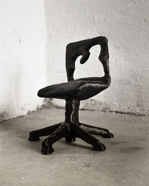
In my project “Translation”, I explored the function and disfunction of the 3d scanner. I decided to use the consumers versions because I found it important that my project could be employable by a broader audience. The promise of the different scanning tools lays (in most cases), in the creation of an 3D model that represents an real object/space or person; but in reality the scanners have a lot of flaws and imperfections. Each imperfection is an signature of the tool. In this project I created a chair collection, from a desktop chair with three different 3D scanners. These scans where all completely different, the machine became more than a tool; it became the co-creator of my collection — the leaking date became readable and each chair had it’s own characteristics; translating a product of mass production into an unique, new form.
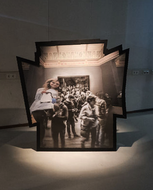
In the second project “Collective Memories” lays the focus on mobile photography. We constantly capture our life as prove of our existence and although most photographs don’t leave our phone; we spread some on platforms like Instagram. My original idea was to explore the possibilities of making a panorama with Instagram photos, from different angles. The "Image Merge" function of Photoshop became my tool. The result became something different than I expected; it became an abstract representation of our cultural relation towards our surrounding, with the focus on artefacts.
Although both projects are completely different they have something in common — in my craft I want to perfect the way of showing imperfections — show that it’s not only important to know the function of your tool but also the disfunction. Exciting results come finding mistakes, errors and bugs. Not only are they part of the tools we use; they can also give us insight of how the tool works and bring us outcomes that were not scripted, predicted or have completed designed functioning. My craft consist out of pushing tools and finding the flaws. They can generate design that we could not have thought of and tell us more about the time we live in.
"Television tortured the intellectuals for a long time... it is about time that the intellectuals torture television”
Nam June Paik quote from the 60’s is an example that can be applied to all sorts of new media. The torture just became more subtile, hidden in an overload of information streams; with the arisen of new media, we have to be the one that pushes the medium in the search of unexpected results.
DAS EXPERIMENT
2 +/-1000 words presenting/reflecting your experiments and approach in the the minor
This minor was based on exploration and experimenting — rather than assumption. Getting to the core of something in a short period of time. The first quarter of the minor consisted out of several experiments dealing with the theme: “Craft & Radiation”, to get a better understanding of the subject and to find ways to visualise something as abstract as radiation. Every week (or two), we worked with a sub-theme within this spectrum. The sub-themes consisted out of: radiation patterns, electromagnetic radiation, thermal radiation and acoustic radiation. Going through the experiments I will explain my approach and our outcomes.
A-AB-ABA
In our first assignment we explored the field of radiation patterns; with in particular the focus on the Lindenmeyer system. The project was planned to be exhibit at the Wijnhaven, Red Apple. Working together with Stan Haanappel and Meike Brand. We got fascinated by the exponential growth of living organisms such as plants, flowers, mold and bacteria. Astrid Lindenmeyer — a biologist, developed a type of formal language, that he extracted from the modelled behaviour of the cells of plants. The system is based on an alphabetic production ruleset that can create strings, each string expands afterwards into a larger set of strings.
We found it interesting how Lindenmeyer’s system is still used as a method to create 3D models with modern software. The project was planned for a short period of two weeks. We used the first week to get a basic understanding of the ruleset and what it was build on; starting of doing a serie of experiments that we based on the core formula of the L-system. The string consist out of the ruleset A=AB B=A. We connected the ruleset to instructions in different formats. Our first test was walking an algorithmic route through Rotterdam by using A=Left B=Right. It was good to experience the formula on such a large scale; the path of the route was traced and mapped so that we afterwards had an overview of the route. We ended up waling for 1 hours in loops.
The second experiment came more from a graphic design perspective. We made the connection between the L-system and conditional design, wherein the designer needs to follow a set of rules, set up to create a certain rhythm in the design that can lead to unexpected outcomes. By using the L-system as our ruleset we marked the different generations of the system with coloured tape. Later we also tried to translate them into weaving patterns.
Both experiments were based on a certain rhythm, a routine that made us thing about the way music is constructed — we found a library for processing that draws formulas out into splines. By connecting the crosspoint of the splines to sound elements we wanted to create a audible translation, strengthening the experience. In this exercise we had some difficulties with sinking them together. The composition became monotone and did not live up to the complexity the L-system can take. We had to search for new methods.
The variety of experiments gave us an insight in the matter of the L-system. The experiments that were done felt kind of random and pointless, but in the end they became the opposite. Just by doing, instead of assumption we got new ideas and it opened up our approach.
The complexity that is generated by a simple algorithm became or point of interest. The artist, Jerobeam Fenderson — worked with this. A collection of videos demonstrates the use of the oscilloscope to generate patterns composed by music. His videos give a good indication of the relation between the sound and the generated landscape. We used the second week of the project to create an experience for the visitor that worked through feeling rather than a mathematical explanation of the L-system. The outcome of our previous sound experiments in processing resulted in another experiment with Google Translate. We used the text-to-speech function to get a vocal version of the alphabetic generated strings. The rhythm that came we used as a trigger for an animation in cinema 4D. We discovered that the L-system or in cinema 4D terms the turtle spline, can be used to create an 3D object based on a formula. — the formula can shape and transform the object. The relation between the sound and the visuals became absolute and led to a video that gave a sense of the L-system algorithm and its biologic nature, surrounding us in this world.
Short, Long, Short, Long, Short, Short, Long, Short
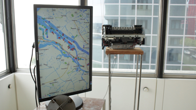
After the first exhibition we got to deal with: electromagnetic radiation. I started working with Rens van Pinxteren. We both got interested in the signal flows that are always around us. Rens started experimenting with a boat reflector, a geometric shape that reflects an incoming signal and redirects it towards it's source. We wanted to understand the actual system more and did research about the AIS system. Boats use AIS to non-stop communicate their position to other boats. Online we found a log that maps (live), the current position in the biggest harbours. This gave us a better idea of the water traffic around the biggest harbour: Rotterdam, something you are normally not aware of. We wanted to create a device, based on the radio of things; that used the standard communication methods of the sea. The machine, build from a hacked printer collects the AIS data from the server, calculating how many ships are currently in the harbour. Every ships, that comes or goes; get’s a greeting hello or goodbye transmitted over radio by a self typed morsecode. It was interesting to see how the connection went. Despite the fact that the radio waves would never reach the ships; because of our very tiny antenna and some time issues, was it still interesting to follow the conversation of the printer trying to reach the new visitors. Giving you the idea of all the machines that talk with each other, without human interference.
Disneyfication
From electromagnetic we went to thermal radiation. Preparing for our previous presentation, Stijn opened a monitor to undo it from it’s case. Without the case, the backlight became detached from the LCD screen, making the screen transparant.
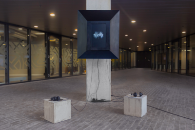
The screen became our material. We got the idea to layer a set of monitors, to work with 2D videos in a 3D setting. This way we could tell a story, working with foreground and background. Searching on Marktplaats we found a set of sixteen monitors, for a good price. To place the monitors we had to build a box; wherein we could layer the screen, rotate them and change the distance. Shaping the tool, before creating the content was an interesting approach. We had so many options that we could test afterwards.
Building the tool, a 3D screen came with it’s difficulties, every monitor was foreseen with a polarizing filter. The filter blocked a lot of the transparency of the screen; because we used multiply monitors the degrees of the filter blocked each other, making our screen unusable. We experimented with polarising the different screens and the backlight. After some time we discovered that the best way to do it is with giving the front screen a polarising filter at the front and the last screen in the row a back filter. This stopt the filters from blocking each other.
Another problem was the light source; the backlight of a monitor is build out of a plastic board surrounded by a row of white led lights. The board is made that the light is equally divided; making the LCD screen visible. Since we used a serie of monotors, we had to create a brighter light source. Yellow light and construction lights did not work, so we build our own backlight with LED strips; this way we could control the brightness and see what worked best.
Now that we had finished the 3D screen, was it time to think about the content. The layering of the screen gave us a lot of options: using it as a timeline, foreground and background or to have different scenes per monitor.
Seeking for meaning we looked back to the historical value. Storytelling through layering was seen in the early 20th century, called: cell animations. It was the first format to create cartoons. Each frame was hand-drawn on a transparant sheet. Scenes were created by stacking the sheets; this way the animation could work with a foreground, center and background. By moving and changing the sheets, movement was created.
"The Walt Disney Company” was, and still is the pioneer in (cel)animation. In the early days it was entertainment for the American people. With the millions of people watching the animations and heros as Mickey Mouse and Donald Duck playing the role of ordinary American people, Disney became more than just fiction. The characters were a reflection of the American society, maintaining the American Dream; of which I spoke earlier called this phenomenon “Disneyfication”. The characters became so influential that they became in the interest of politics. Due to their innocence; Disney became perfect as a propaganda machine. Who better to promote tax pay, American dreams, pride and warfare? The Idea that by this time, something like Disney, build up out of transparant sheets could hide another layer, a political layer. This was something we wanted to elaborate on and tell in our contemporary version of the cel animation. Thinking about making a layered story; wherein our 3D screen displayed our response to Disneyfication and the current problematics in the United States.
The end result went in many directions, using three screens with all their own version of the story. The front screen was based on Disney animations and Disneyland; the second screen displayed the relation with the American society, both visual and context content-wise. For example every character plays a certain roll within Disneyworld, in the real world, you could say the same for us. Police trying to keep control over a riot — for example. We all have and get our rolls within the system.
The last screen, shows a mixture of propaganda used in Disney, over the last century. Remixing it with the events that happening today; the hate that Trumps spreads, gun control, police violence. It all becomes this mixture of themes that step out of the fictional zone, inviting the audience to make their own connections.
Degradation
In the last experiment I had to deal again with radiation patterns. In class I spoke about Kevin Bray — a French video-artist living in The Hague. He made the music video “Glass Figures” wherein all the frames were compressed using reaction diffusion. I was intrigued by the video that only through movement become somehow recognisable. The search for the line between recognisable and abstract became something I wanted to look into.
TV TV’s — a Japanese television program from the 80’s showed an experiment with a feedback loop, that had analog a visual similar result as the previously discussed work from Kevin Bray. I rebuilt the feedback loop, with a digital video signal; working with a Handycam and a video delay; giving the result of an endless-zoom leading to a form of compression. What fascinates me is the odd relationship between our image culture and the products we use. Advertising and product design play such a big part in the iconoclasm of our century. These images are shared and remixed and their visual formats are slowly detached from the original. For this experiment I used the boy from Kinder Chocolate, as my example. By using the feedback loop as a metaphor for reproduction I wanted to play with this degradation and the idea of identity versus recognisable. This project became the starting point for my collaboration with Boris Smeenk and our shared interest in compression/degradation.
Overall the minor was based on our own initiative, this gave us the space to work as autonomous based artist/designers. It showed us that through hard work, testing and reflection you can find new outcomes within the spectrum of Radiation. The short experiments were done with time pressure and were very open, to undergo an experiment without directly trying to conceptualise it. I really liked to feel this freedom of just opening things or break them; reading in combination with trying and getting new ideas through reflecting on what is actually happening every step.
Screen Shot 2016-12-15 at 04.20.51.jpg
Screen Shot 2016-12-15 at 04.20.51.jpg
"Digital bits, compatible at last to the new generation of tools that see, hear, speak, and compute, march in precise, soldierly fashion, one figure after another. This means that any video, audio, or photographic work of art can be endlessly reproduced, without degradation, always the same, always perfect". -The work of Art in the Age of Digital Reproduction, 1995. Davis Douglas.
The video artist Davis Douglas — wrote his essay in 1995, reflecting on the technological and the revolutionair shift to digitalisation. Douglas compares analog and digital information—with the copy of analog information always resulting in an unpredictable loss of clarity, for example with copying a cassette or video tape. Douglas uses the waves at the beach as a compressive; always washing the sand slightly different. But about digital information Douglas speaks: “digital bits, compatible with the new generation of tools that see, hear, speak, and compute, march in precise, soldierly fashion, one figure after another.” Douglas idea of the future was idealistic — by now we know that digital information is transformed by uploading, downloading, sharing, reformatting and re-editing into new formats; showing the fidelity of the medium. Decay is as much part of digital culture; in some cases, digital information decays much faster, due to compression algorithms used in modern media. Degradation of the digital image was a shared interest of me and Boris Smeenk. We wanted to take on Davis Douglas essay in this project; juxtaposing his theory of digital degradation. My main interest was the shift of identity of the reproduced image, by remixing and sharing; for Boris it was mainly the poor image and it’s quality, in relation to physical images. Wherein the physical image gets a certain value over time, a digital image only losses visual quality; making the image less understandable, but on the other hand it also shows it’s sharing value. Every digital scar is the result of sharing and shows the image accessibility. The image is after all seen by a broad audience, leaving traces and marks. Our experiment started with using social media platforms as the center of our sharing culture. Instagram has its own compression algorithm. "Sitting In Stagram”, a work by Pete Ashton — demonstrates the compression algorithm of Instagram. Instagram has no mechanic for reposting, unlike other platforms (Facebook for example). Users who want to repost or in case of Instagram “regram” an image need to take a screen shot and post it as a new image. Each image is optimised for Instagram and transcoded from PNG to JPG. The compression algorithm degrades the image; every time the image is upload their will be signs of generational loss. Pete Ashton work consist of 90 images that are screen captured and regarded, showing a pattern of decay. He compares this digital degradation to the imperfections on physical media with smudge, scratches and fingerprints. The work is a modern day reaction on the work by Alvin Lucier “I Am Sitting in a Room” (1969), wherein Lucier records himselfnarrating a text and then playing the taperecorder back into the room and re-recording it again. Repeating the process; the words become unintelligible transforming into noise. The echoes of sounds bouncing through the room. During our first experiment we explored the community guidelines and workflow of Instagram. We wanted to see the step-by-step transformation of an image; working with our interest in the identity shift. We created our own framework to improve our process. Working with disposable phones and email addresses we managed to create several of account. We used a simple mouse animator to repeat or steps, this way we could do our experiments much faster. Instagram banned some of our accounts after uploading a maximum of 100 images, in a short period of time; because of this we got more interested inusing the medium itself to analyse our images. Till now we were searching for an identity shift ourself — meaning that the transformation would not have any relationship anymore with the original context. The community guidelines of Instagram are much debated in the news lately. The “Free The Nipple” movement argues global wide that women should be allowed to show their nipples in public or on social media, fighting against the sexualization of the female body. Instagram has very strict guidelines when it comes to this, deleting an enormous amount of pictures every day. Their policy was perfect for us to experiment with the identity of the image. We upload the photo of a naked body to our accounts; hoping Instagram would show us when they would still see it as a naked body when when it would become to abstract. Unfortunately the experiment resulted into nothing, we had to report our own accounts to be deleted. In the mean time we looked into the actual compression process. We were wondering what was actual happening with making the screenshots. By changing the screenshot settings to save as JPG — instead of PNG; was the image not longer lossless, but became lossy.
Lossless vs Lossy Lossless and lossy compression are terms that describe whether or not, in the compression of a file, all original data can be recovered when the file is uncompressed. With lossless compression, every single bit of data that was originally in the file remains after the file is uncompressed. All of the information is completely restored. This is generally the technique of choice for text or spreadsheet files, where losing words or financial data could pose a problem. The Graphics Interchange File (GIF) is an image format used on the Web that provides lossless compression.
This changed the screenshot dramatically over time. Completely unexpected, because the change became only visible after some time. It is hard to define what is actually happening; since we did not find something similar to compare it to. Seeing the result it seems like the effect comes from a colour compression. Every screen uses a different colour profile. The result on my Macbook Pro with a “Colour LCD" profile was very different from the result on a Mac Pro with an "Adobe RGB 1998" profile. The degradation simplifies the colour spectrum of the image; on my Macbook the blue tints were more predominant, the images became slowly cyaan, rearranging the pixels, making the image slowly fade, almost as if the image soul appeared. On the Mac Pro appeared mostly: magenta and cyaan —magenta was faster notable than cyaan especially when the image had a lot of red tints in it. Every picture resulted in an different compression outcome. The screenshot is a symbol of a modern day reproduction tool. Again we created a framework wherein the process of screenshots repetition became automated. This saved us time, since we needed around 500 screenshots per image. By using different image sources we got some interesting results. See images below: Clearly is that not only the images changes visually, but also they got extracted from their original context; shifting the identity of the image. Further does the screenshot not take any metadata from the original image — as resource, size and format. This is certainly a key element when we talk about the identity of an image. Our final work could have taken many different forms. From different compression methods, to using a Windows computers — in the future we would like to have various selectionsof work, framed in a new exhibition, book or other format. For the exhibition in Slash we choose to tell a story about destruction and fall of monuments. By creating a timeline we went through a varied formats that are prominently part of the sharing culture. From art to important events, movies and tutorials. One image relating in a way to the other.
Hieronymus_Bosch_-_Triptych_of_Garden_of_Earthly_Delights_(detail)_-_WGA2526 The first image shows the right panel of the famous painting by the Dutch artist Jeroen Bosch, "The Garden of Earthly Delight" (1480-1490). The panel displays the hell, filled with demons and humans that have fallen for evil and reap eternal damnation. You can see see ’s-Hertogenbosch burning to ashes in the background of the painting, an early example of the demolition of building through history.
independence-day-movie-1996.jpg The second image we chose is an frame out of the movie “Independence day” (1996), in the movie the world is attached by aliens, the united states is in the center of it all. Monuments as the Statue of Liberty and the White House are destroyed by alien laser-weapons. The movie is a example of how the wold sees the United States. Hollywood movies are based around the US; every bee, float, terrorist or in this case alien attack; are always focussed as the dark forces versus the good American people.
world-trade-center-terrorist-attack.jpeg The third image is a photograph capturing the attacks on the Twin Towers on 9-11-2001. An event that not only killed thousands of people but also was an symbolic destruction of American monuments. The way how the world portraits the US is also through Hollywood. This results in fictional events being in relationship with reality.
jet-plane-crashing-into-big-ben.jpg The Fourth image is a frame of a Youtube video from 2012; wherein a After Effects tutorial is made wherein whom can learn to create a plane crash in the Big Ben, followed up by an explosion. This is a internet pheromone that was inspired by 911. The Big Ben as an iconic monument destroyed by a plane, plays with this relation between something as the Big Ben being very recognisable mixed with a fictional layer.
Our underlying thoughts helped us make a selection of images. For us it was not important to tell to much about the story behind the images; it was up to the audience to make their own connections. The visual relation between the images invites the viewer to look at them and wonder about its meaning. The compression showed that the generation loss could shift the identity of the image — there isa clear conceptual distinction between the original and the reproduction. A good example of this identity-shift is the 911 image; the smoke and the explosion transform into pink clouds, changes the context of the image. It becomes as some say, almost romanticised. A full documentation of the compressed image was for us important. We wanted to include all the important data. Every screenshot became part of four publication, every image its own book. Showing the transformation of the screenshot step-by-step. The book could be viewed from both sides. On the front of the books was the metadata of the last screenshot, leaving the viewer with a abstract image; to see when the image would become recognisable. On the back of the book was the data of the original image. The book becomes the folder of the saved files included the data— such as: folder size, names, format, colour profile and file size. The file size is interesting because with every screenshot we made the size increased. This is because compressing an already compressed image can lead to more information, which results in a heavier file size. Looking back on the project in relation to my earlier work I see a lot of similarities — in my work I investigate our current digital media. By looking at the history of our image culture and artist who dealt with this matter before I can place the work on a timeline. On this timeline, as much as Alvin Lucier work tells about the medium of the 60’s our work tells about our contemporary time and our common technology.
The screenshot compression is an imperfection within the system. It could be seen as a bug, but with the context that we gave it; we shaped it in something valuable. The aesthetic of the work was not designed by us, but found by pushing the tool. We were just the designers that wrapped it together to sho its potential; as a symbol of our time.
GRADUATION
For my research I want to continue in the line of exploring the imperfection of our technological environment. The promise versus the product. In a search for finding imperfections. I don’t want to focus on
Our last project was an eyeopener. I really want to start by doing. At this point I don’t know yet what I will do but I would like to continue in this line. Using they topic of the perfect imperfection I have a lot of possibilities, as I showed in my earlier work, shows that my craft consist out of this but can take on a lot of directions.
