User:Anna.saaltink
Contents
Museum of fantastic forgeries
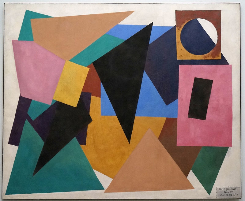
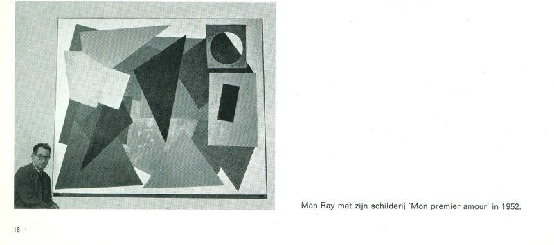
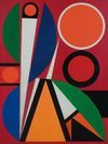
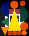
Mon Premier Amour - 1952 - Man Ray - 220 x 200 cm - Oil on canvas
When I first saw this painting I thought wooowww this is huge. I like the colorful composition, geometrical abstraction and the layering of the shapes. After I saw the titel and that it was a painting by Man Ray. I was surprised because I only knew him as a photographer. This made me curious and I started doing research about the painting but I couldn't find a lot of information on internet. Google popped up three pictures what I thought was odd and interesting at the same time.
When I continued researching I found out that there was one more painting that was also called 'Mon premier amour'. What did this mean? two first loves? Thats not possible or is it? The tittle you can interpretative in more ways; this painting was a abstract translation of his first love (a woman) or this painting was his first or this painting was his favorite or painting in general was his favorite? It gave me a lot of questions and made me more curious. I wanted to know more about this mysterious not very known painting.
Research about Mon premier amour and Man Ray
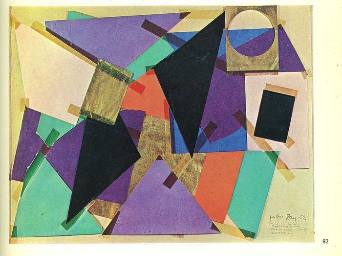
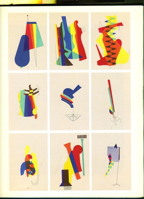
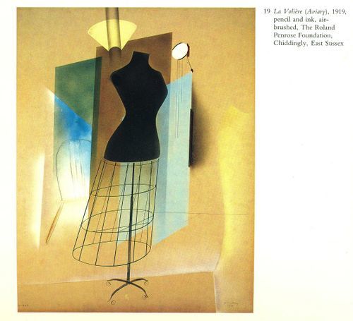
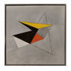
In books, on websites, and after watching a documentary I found a little bit more information about the painting. In all the books and sites I have seen there was little written about this painting and it all said the same thing: It was a rare example of geometric abstraction in his work. The painting was inspired by collages of colored paper and airbrush paintings he made between 1917 and 1920. Like that I found out that the tittle refers to his airbrush technique.
Study before creating Mon premier amour
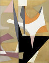
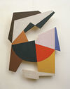
I learned doing research about his inspirations for this painting and about him and his work. What was interesting. Emmanuel Radnitzky, was born in 1890 in Philadelphia, later when he devoted his life to do art he changed his name in Man Ray. In 1915 he got inspired by Marcel du Champs and started with Cubist paintings. In 1917 he was representative for the Dadaism in America. In 1917 he worked with colored paper to made collages and after made paintings from it. Aswell he developed the airbrush technique in this year.
Oil paintings inspired on collages
Example of his developed airbrush technique
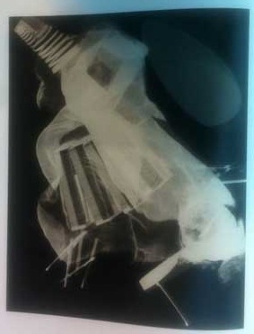
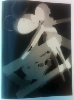
1921 he moved to paris and started photography because he wanted to made photos of his paintings. 1921 he also invented the rayography, you put objects directly on photo paper and light it. So there was no camera or negatives. I think these look also as collages and have a layers just like the painting.
Example of Rayography
He was a avant-garde, modernist for his time. Nobody understood him or bought his work. His wife says in the documentary 'you have to die first before getting famous'. What turned out to be more then true. Also she says, I quote: 'painting was his first love and photography was for earning money'. What I found interesting and inspiring to see is that this man blurred boundaries between artistic disciplines. He used so many different medium. I didn't know when I picked this object he made this painting inspired on 1917-1920 colored paper collages and after I found his collage for 'mon premier amour' it reminded me a lot about the way I work. I choose this painting on my intuition, funny that it has this resemblance.
To found out more information about the painting, why it was in the museum and more of these questions I went back to the boijmans. They told me the painting was a gift from Man Ray's foundation in 1972. Before that they had a exhibition about his work in 1971.
Research cubism and abstract art
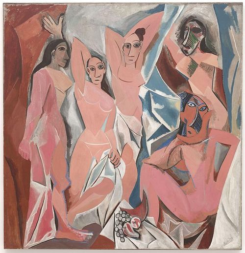
Also I decided to do research to abstracted art in general, and what influenced it. Like that I understand the painting more and that I can put it in time and context. Cubism was the art movement before abstracted art in 1907. It was the biggest influence art movement. Paul Cezanne was the precursor of cubism. He said that nature is built with primal shapes, like cubes, cones etc. But cubism really started with Picasso, he was the most important pioneer of cubism with the painting Les demoiselles d'Avignon. Characteristics of cubism are, confusing perspective, collage, reflection, construction, simplification, etc.
Les demoiselles d'Avignon - Picasso
Abstracted art is a movement in modern art starting in the begin of the 20th century (+-1910). Abstracted art was against the traditions of art schools with objective/ realistic view. They were against art where the reality is exactly pictured and through that is recognizable like a landscape painting. In an abstract artwork you can not recognize a visible reality but form, color, line and material can speak for themselves. Form, lines and color are more important with abstracted art then with other art movements.
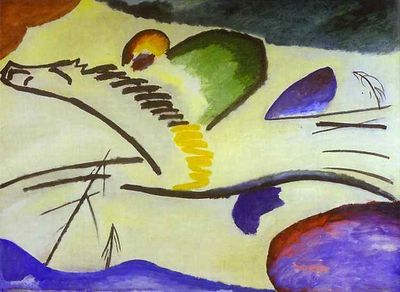
They say Kandinsky started the abstracted art with his aquarel in 1910. People saw abstracted art something without a meaning and knew it had to be appreciated for the beauty of form, line and color.
Geometrical abstracted art is abstracted art with geometrical forms like a square, triangle, rectangle etc. There are closed forms without holes and openings.
De blauwe ridder - 1907 - Kandinsky
Abstraction to The new Aesthetic
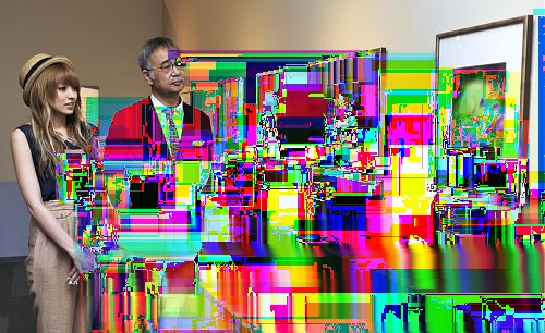
I think Mon premier amour is off course a geometrical abstracted painting but also has a cubism influence. I think it is interesting that in that time people were against the objective realistic view and I think it can be interesting to make a link with the art of today. The new Aestetic is an interesting new art movement where I can see some similarity. It is a contradiction in the same way realism is to abstract art. The new Aesthetic is a term introducted by James Bridle, what refers to the increasing appearance of visual language of digital technology and the internet in the physical world and blending of virtual and physical. It has been around some time and we see these new styles recur in our art, designs and products. The pixelation of low-resolution images, the rough yet distinct edges of 3D printing, the shifting layers of digital maps.
http://booktwo.org/notebook/waving-at-machines/
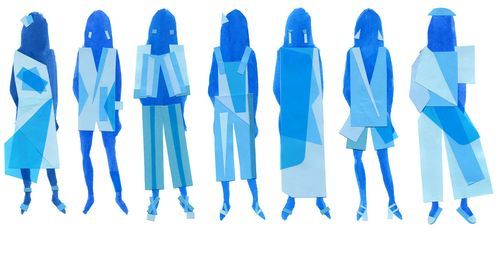
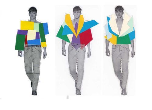
Mon premier amour pixels
Similar images
The replica
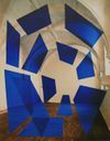
First I thought to make my copy out of glass and led but 190 by 220 cm will be to big and heavy. Also I wanted to still have the idea of the layers over each other. I thought about make the idea of a big kite but I wanted to do something more digital and 3D.
Then I got the idea to make the painting as a 3D mobile.
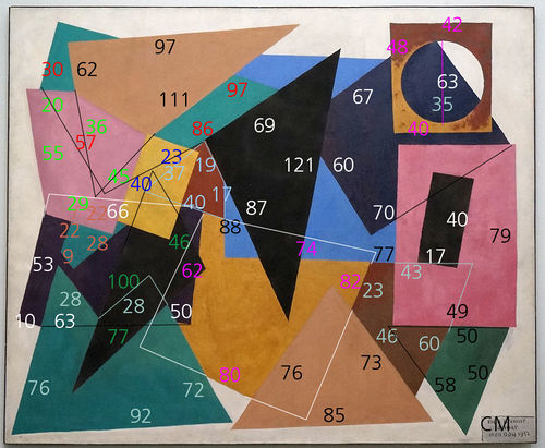
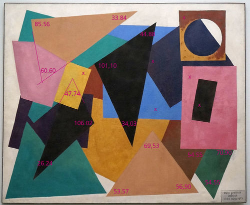
First calculate all the shapes in real size (angles, length, width) measurements.
Draw them all separately in a 3D program like sketch up or tinker cad.
I think about make the shapes all 2,5 cm deep, the same as the painting is deep.
After drawing them in the 3D program make them in the program pepakura as a paper fold construction.
Laser cut the fold construction in real size cardboard/paper.
I want to paint the shapes the same color as the painting, mix the paint to the color myself.
In the end I want to hang all the shapes from the sealing before/behind each other like that you create the layering/collage like in the painting.
If you look from the front is looks like the 2D painting but if you move a little it a 3D construction.
Lenghts & widths
Layering order
Angles
The replica part two
Make from the museum
Day one
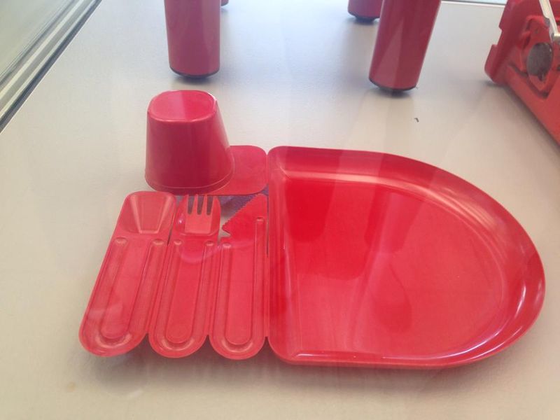
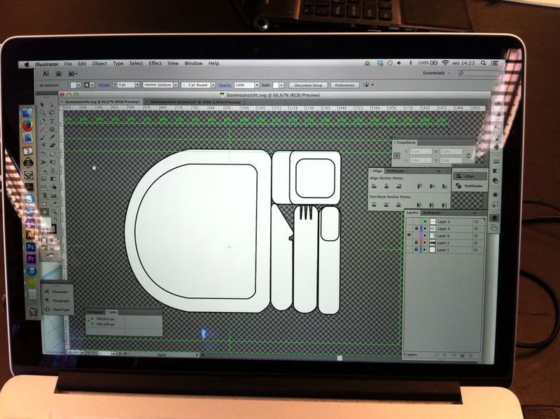
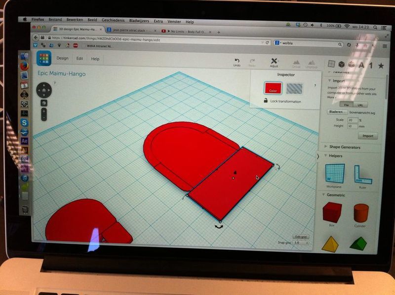
Tuesday 2nd of September As a group we decided we wanted to create a 3D object. After looking at the Boijmans collection we chose a rubber vase and we wanted to scan this with the 123 catch app. This did not work with our object because of the reflection, transparent surfaces and blurry photo's. Most objects were not easy to reach because there were behind glass so we chose a other method and an other object. We chose the picknick set of Jean Pierre Vitrac (1977). We wanted to keep the function and the idea of the set but in a different implementation. We wanted to put together our picknick set with different plates and cutlery we found in shops or at home then make pictures of it and make a good 3D scan with the 123 catch app. After a discussion with the teachers we realized, that we first need to have the data. I order to share it on the wiki page. That for we had to change our idea. We came up with the idea to trace over the photos with illustrator and then transform it into a 3D model in tinker cad.
Day two
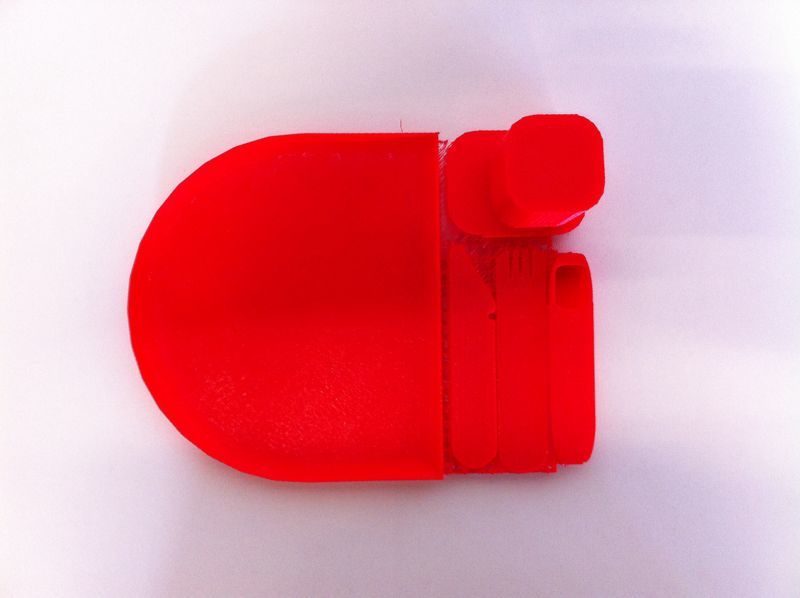
Wednesday 3rd of September We decided to make different versions for the exhibition on thursday. One 3D print model, with the same color and form but in a smaller version because with the printer the exact dimensions were not possible at the WDKA. Secondly we make our own picknick set molt with multifunction cutlery (3 in 1) and a square plate. We wanted to make a more minimalistic form but keep the original snap off idea of the pick nick set of Vitrac. We chose to use the vacuum forming technique. That we are doing tomorrow (Thursday) at the Stadsfablab in Utrecht. We want to make a couple of this object in different colors. That could work in mass production.
Day three
Thursday 4th of September Hendrick finished the 3D drawing in tinkercad and started printing it. Meanwhile our own pick nick set had some troubles. The glue was not fully dry, what may be a problem for the vacuuming. Still Fabienne and I went to Utrecht. Ovethere they told us we could not use or fork/knife/spoon construction because it was was plastic and it would melt. We still wanted to try something so we continued with the plate. This also was not working as we thought. The PET plastic they used and gave us was melting and got to thin, also it was not vacuum the whole plate. They told us it was because of the shape of the plate and we would have dug a hole into the middle so it could vacuum better. Without the result we where hoping for we had to return back to Rotterdam.
Reflection
It was interesting to see how every group approached their project and with what techniques they worked. Hendrick did the digital and 3D-printing part of our project. It was nice to get already an idea of how the 3D software works. Seeing that you can build this in a program and get a read model out of the 3D printer is amazing. We maybe failed with producing the pick nick set with the vacuum forming but we had some nice experience going to the stadsfablab in Utrecht and we learned more about the vacuum technique and we saw what is kind of other machines they have for next time.
