User:Oliscotton
Contents
Hello
I'm Oli Scotton. A graphic design student on exchange from Bristol, UK.
Email: 0923547@hr.nl
Digital Craft
The moment I knew what I wanted to do
I once attended a talk from Sandy Suffield, who was previously a Senior Art Director at Apple, and a Creative Director at Wolff Olins. She explained that she wasn't happy in these roles, and decided to quit her job, and wanted to start making work that she wanted to make, to hopefully in return get freelance work based on her ideas. After this talk, I decided that it's always important to make projects for myself alongside my study/job.
What do you make?
I like to make typography based work. Also enjoy experimenting with printing techniques. I'm also interested in photography, and would like to start incorporating this into my design work.
What is your topic of interest?
I would like to start creating work on a larger scale as I often make printed work. I'd like to create a visually/physically engaging installation.
What is your medium?
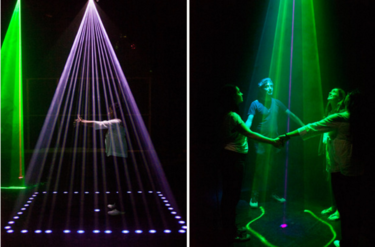
I'd like to get more familiar with 3D printing, and try to incorporate this into a large installation. I'd also like to work with lasers and light beams.
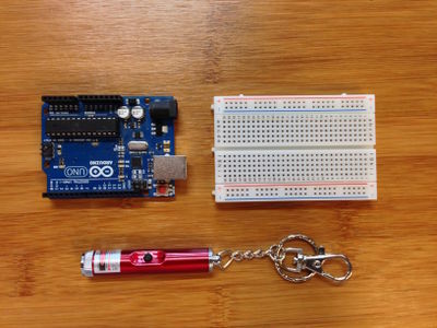
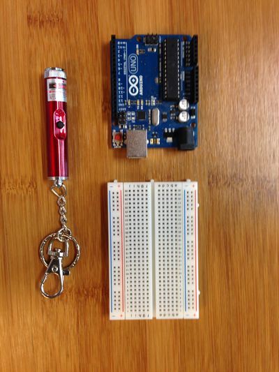
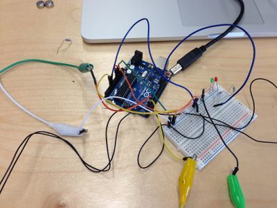
Circuit Board
Ideas
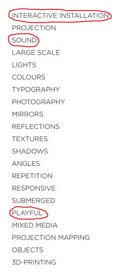
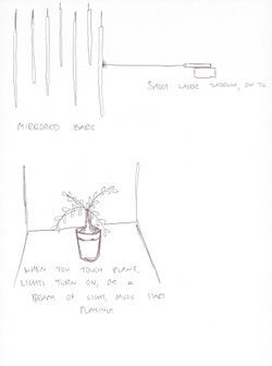
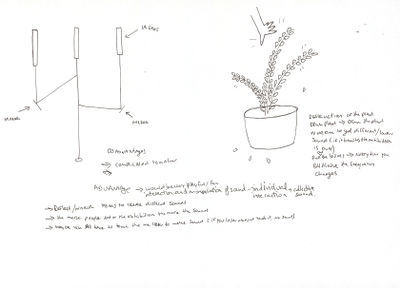
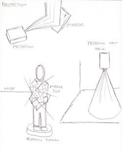
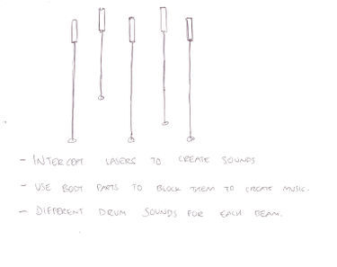
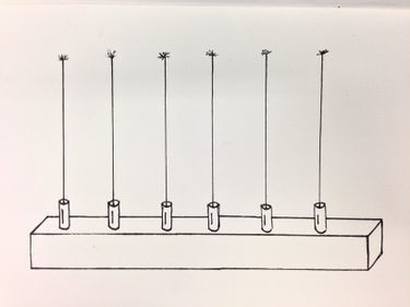
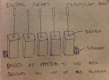
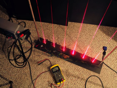
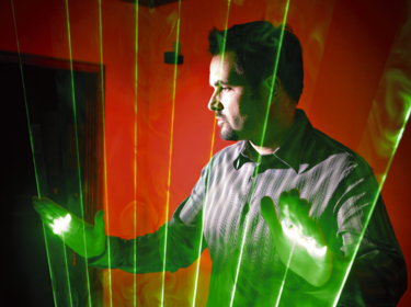
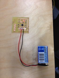
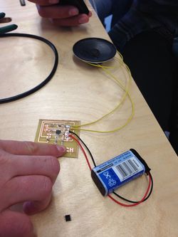
I wrote down 20 words of things I could potentially focus on for my personal project. The 3 that I chose from the 20 were 'Interactive Installation', 'Sound' & 'Playful'. Because I normally create things for print or on a screen, I've always wanted to work on a large scale, or an installation. I want to create something visual, but also interactive. Initially I thought about using a plant as an instrument, that would make a noise when you touch it (using speakers), and to have a few different plants with different sounds. But I wanted to make something a little more visually appealing. I did like the idea of using a projector and mirrors to create interesting visuals, but then it didn't require any making (circuit boards). Another idea i've had for a while was someone wearing a suit of mirrors, rotating on a platform, then shine a laser at them, resulting in it reflecting of in various ways. Again, this is just a visual outcome. I then thought about combining the two sides, and thought about using lasers/light to create sound. I then had the idea of using 5/6 lasers that each have a different drum sound assigned to them. And would make a sound if you intersect the beam. It would then be both a visual and interactive piece.
Mimicking Machines
Assignment 1
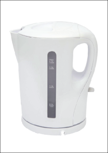
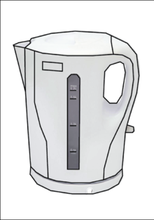
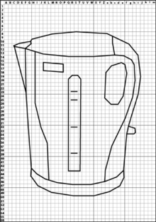
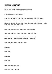
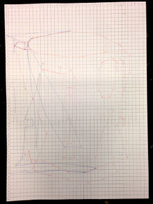
I Draw. You Draw. It Draws I decided to choose a kettle for my machine. I found an image online, then traced it using the Pen Tool on Adobe Illustrator. Once I had the vector outline, I placed a grid on top of the drawing, and then plotted indices across each side. Rather than using x & y with numbers, I decided to use letters across the top, and numbers down the side. Because the grid was wider than 26 points, I decided to use upper and lowercase letters. Although I thought it was clear enough to understand, it did cause some confusion to the user when presented with the instructions. I also decided to tell the user to 'DRAW LINE FROM CENTRE OF EACH SQUARE' because I thought it would have been too complex otherwise. The person trying to re-draw my machine got confused initially with the upper and lowercase letters, but once they had worked that out, they drew my machine just as I wanted.
Assignment 2
The Extruded Milled and Sliced Alphabet
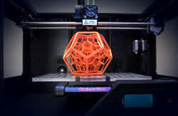
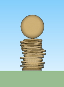
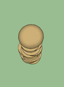
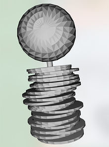
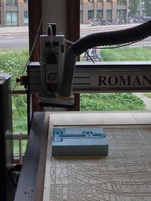
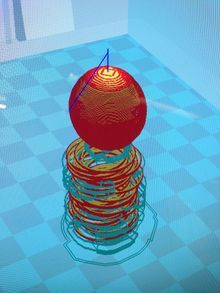
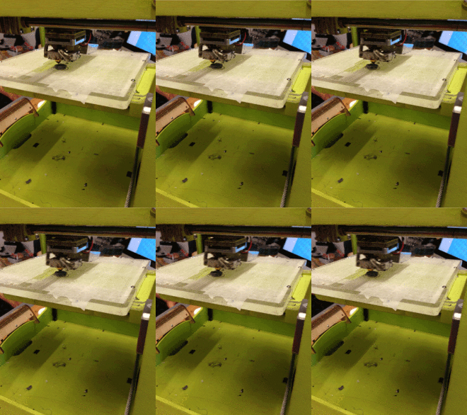
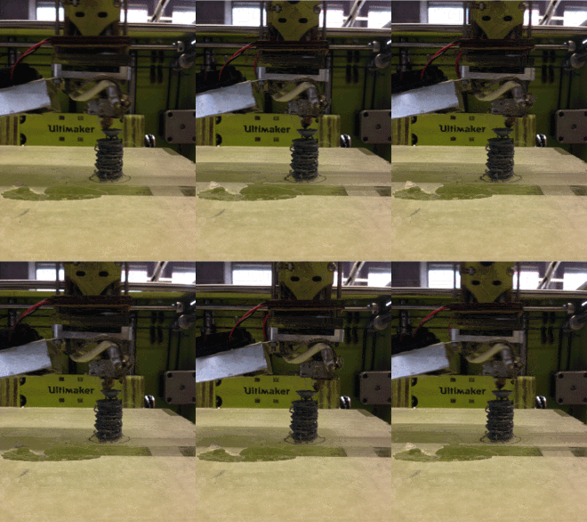
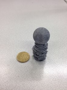
The 'I' I made was made from flat circular discs staked on top of each other, then a sphere on top attach by a small support in the centre. The shape I made was too large, so we scaled it down to 5cm in height. After this we had to decide wether it needed a support when printing, which it did. So we placed the shape vertically, because this way it needed less support material, which in return takes less time. It took a few goes to make sure the printer was calibrated correctly, and that it had enough space between the base and the extruder to print correctly. Because it's a small intricate model, it's hard to know what is the support material, and what isn't. Although it isn't exactly how I design it, I like the way the bottom half looks with the rough, pointy edges.
Assignment 3
""Human Powered Machine""

