User:Hans.Schuttenbeld Tools of the Trade
TOOLS OF THE TRADE
Introduction
Craft:
Handwriting
Theme:
The perfect script
(waarom? & wat draagt het bij aan het ambacht?)
Motivation:
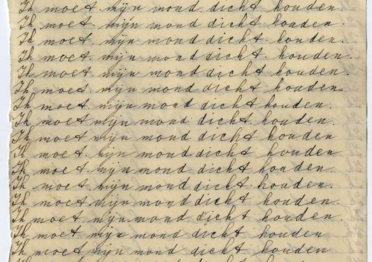
Because I was that annoying kid at school I always had to write "strafwerk" And besides annoying I was also lazy. So I searched the whole web for scriptfonts that I could use. But the teachers were always able to see the similarity in two characters.
That frustration is still some kind of trauma and is the reason why I started this project.
Concept:
Have no fear of perfection - you'll never reach it. That's what Dali once said. True. I guess. Unless you let the technology help making your end result. The possibility of reaching perfection is optional with the use of technology.
Inspiration
Interesting projects:
A23D - A 3D printed letterpress font using 3D printing to reach a higher detail in letterpress printing. [1]
Liza Pro - A intelligent script font trying to approach human handwriting LIZA PRO
Drawing Machine - A simple plotter with a high level of imperfection which makes the end results very interesting. [2]
To Do - A machines which writes an endless to do list for you. Good example of a appromximation of handwriting. [3]
Interactive calligraphy + dance performance - A combination of human movement and Chinese calligraphy. I never figured out how it exactly works (maybe because it's so hard to read Chinese) but it looks cool! [4]
Human Hands & Machine Brains - A combination of 2 very interesting elements. [5]
Storyboards
VIDEO 1 - How this tool changed my practice
It raised the question how designers need to get skilled. Learn a craft or learn programming. The gap between those two opponents did grow even bigger than today. On the one hand a huge amount of sign painter, calligraphers and other hand crafters did come up. On the other hand, the design academies changed more into programming schools which results in interesting discussions about design and its modernity.
VIDEO 2 - The cultural context
For the larger cultural context, it's not only about my tool anymore. It's about the movement of designers experimenting with the humanity of technology. Where there first was a kind of fear for technology has now become a huge interest. Proving the positive sides of technology instead of highlighting the dark sides.
VIDEO 3 - The walk through (how it's been build)
to be continued…
Proces
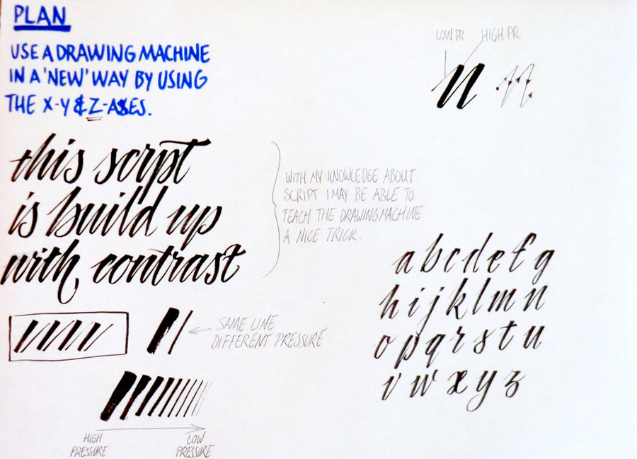
The idea.
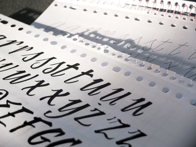
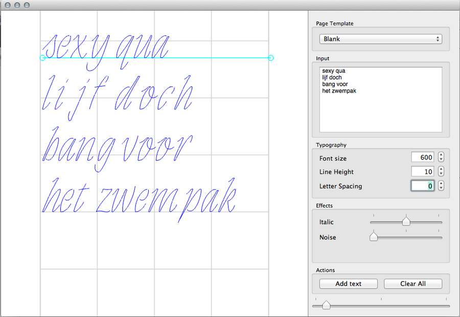
Working on the "perfect" script.
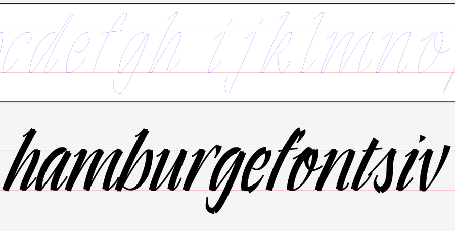
The vector including a preview how I hope it will work out.
Here is my first lowercase alphabet shown in AG TypoStation. Ready to print!
Concept
Today we live in a world which seems to go faster and faster. Your client likes to see your sketches better yesterday than tomorrow. So, we as designers are forced to change our way of working. But unfortunately my interests in handwritten typography asks more time than I actually have. Where a lot of designers have there computer as a tool to speed up their process, I build a machine which can do a part of my work. That helps me to have more time left for optimizing concepts or make up great invoices.
--
Concept changed after feedback.
--
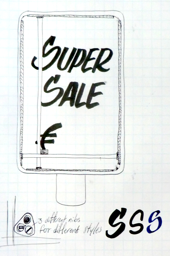
Let's go back to retro advertising, like sign painting, but then placed in today's digital age. Not only because I like those handmade sign painted advertisements, also because I hate the screaming undesigned advertisements which are destroying our daily street view. How it works? Easy. Just build a plotter in every billboard that you want to use. Make that plotter controllable from your studio with the right software so you can design the happening without being there. By choosing the right surface and markers, something like a whiteboard, you can easily remove the ad and use the same billboard for the up-to-date discounted offer that you want to promote.
By adding a few different tools or colors to the plotter you still have options for different styles but always create a visually recognizable image.
This is how it might look like
Testing
The first tests I made are on the CNC plotter that we have on the academy. By uncouple the rotating element it is easy to use for plotting drawings. By correctly adding the pen to the plotter you can make the correct lines. The software is easy to understand and because the milling machine is made for cutting in the x, y and z axes, it's perfect for the idea of script lettering where you need variation in the z-axis.
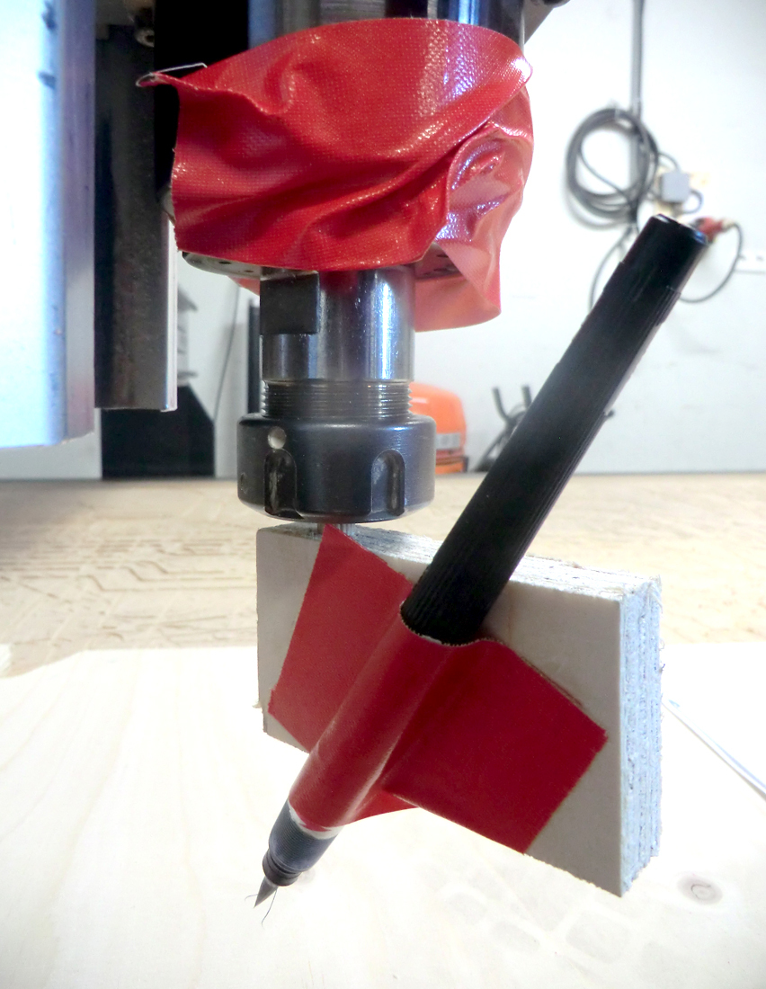 The quick solution for the right pen position.
It must be the same as how you hold it in your hand.
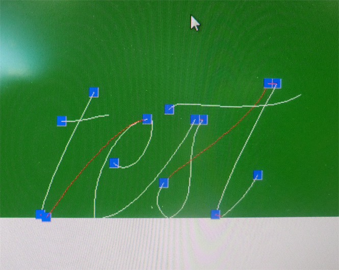 This is how the line file looks like.
The blue point is the starting point and the rest of the information is hidden behind layers.
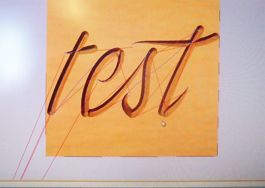 If you make a preview, it will show how it would look like if you engrave the given instructions.
Interesting to see because you already get a nice idea of where the contrast in the type will be added.
