Research/new digital reading experiences: Difference between revisions
| (33 intermediate revisions by 2 users not shown) | |||
| Line 76: | Line 76: | ||
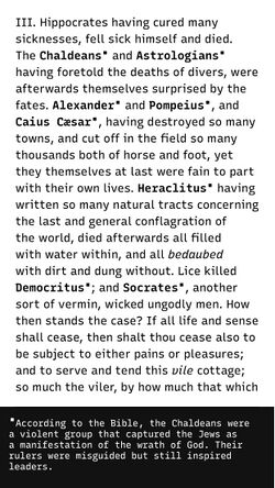
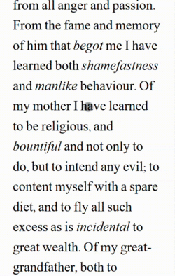
Our choice fell on the book “Meditations” by Marcus Aurelius.<br> | Our choice fell on the book “Meditations” by Marcus Aurelius.<br> | ||
[[File:Meditations. | [[File:Meditations.jpg|250px]] https://classics.mit.edu/Antoninus/meditations.html] | ||
<br> | <br> | ||
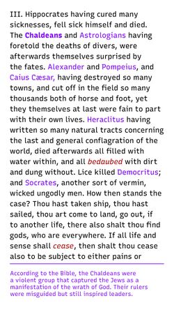
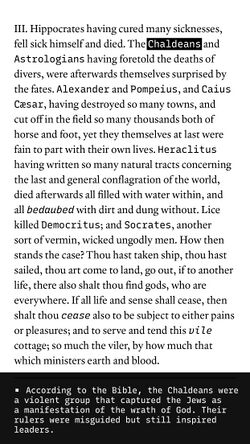
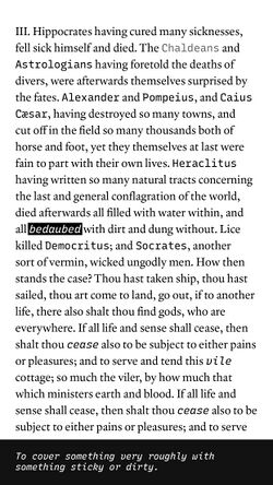
This nearly 2,000-year-old text continues to resonate with young adults due to its personal tone and its exploration of how to understand the world. It is structured in paragraphs and follows only the order of Aurelius’ thoughts. However, the old language and historically specific meanings can be challenging to understand and are sometimes misinterpreted. We therefore chose to focus the interaction for this text on defining difficult words and providing accurate, modern meanings. | This nearly 2,000-year-old text continues to resonate with young adults due to its personal tone and its exploration of how to understand the world. It is structured in paragraphs and follows only the order of Aurelius’ thoughts. However, the old language and historically specific meanings can be challenging to understand and are sometimes misinterpreted. We therefore chose to focus the interaction for this text on defining difficult words and providing accurate, modern meanings. | ||
| Line 117: | Line 117: | ||
The idea of expanding digital text possibilities and creating new forms of publications focused on digital possibilities is not new. There are designers focused more on adjusting typefaces by interacting with it. Good examples are [https://schultzschultz.com/ Mark Schultz] and [https://beatrizl.com/ Beatriz Lozano], both researchers in the field of typography and technology. Their work inquires what can happen with texts when using AR, touch functions and other forms of new media, developing tools and making them accessible for other designers to experiment with and implement in design projects. In our sources you can find an extended list of such examples. | The idea of expanding digital text possibilities and creating new forms of publications focused on digital possibilities is not new. There are designers focused more on adjusting typefaces by interacting with it. Good examples are [https://schultzschultz.com/ Mark Schultz] and [https://beatrizl.com/ Beatriz Lozano], both researchers in the field of typography and technology. Their work inquires what can happen with texts when using AR, touch functions and other forms of new media, developing tools and making them accessible for other designers to experiment with and implement in design projects. In our sources you can find an extended list of such examples. | ||
<br> | <br> | ||
[[File:LozanoType.png]][[File:schultz_sorry.gif]] | [[File:LozanoType.png|500px]] [[File:schultz_sorry.gif|250px]] | ||
<br> | <br> | ||
Next to experiments focused mainly on type behaviour, there are also projects that embrace multiple digital (we focused on web-based examples, see explanation) functions to create different forms of navigations and interactions with longer texts. One recent example is the bi-medium project [https://postdigitalgraphicdesign.com/ Post Digital Graphic Design], a series of interviews and articles. This publication was created in two media – as a printed book and an online website. It has both desktop and mobile version, which is unique to most publications that so far focused mainly on desktop version.<br /> | Next to experiments focused mainly on type behaviour, there are also projects that embrace multiple digital (we focused on web-based examples, see explanation) functions to create different forms of navigations and interactions with longer texts. One recent example is the bi-medium project [https://postdigitalgraphicdesign.com/ Post Digital Graphic Design], a series of interviews and articles. This publication was created in two media – as a printed book and an online website. It has both desktop and mobile version, which is unique to most publications that so far focused mainly on desktop version.<br /> | ||
The digital publication makes use of various digital possibilities such as the use of layers, split areas, hover effects (for desktop) and more. | The digital publication makes use of various digital possibilities such as the use of layers, split areas, hover effects (for desktop) and more. | ||
[[File: | [[File:PDGG2.png|400px]][[File:PDGG6.png|400px]]<br> | ||
[[File: | [[File:PDGG_m2.PNG|250pxpx]][[File:PDGG_m5.PNG|250pxpx]] | ||
Another mobile-based project that was initiated already in 2016 invited writers to consider writing for a non-printed medium. This attitude resulted in a series of publications under the name [https://docs.google.com/presentation/d/1_mnJdwO2apVzmKau9J4UBW5zRHzuRMecpAh-TMCAzvA/edit?slide=id.p#slide=id.p Editions At Play], creating digitally-oriented stories that used animation, AR, time sensors and more to create playful forms of presenting and experiencing texts. | Another mobile-based project that was initiated already in 2016 invited writers to consider writing for a non-printed medium. This attitude resulted in a series of publications under the name [https://docs.google.com/presentation/d/1_mnJdwO2apVzmKau9J4UBW5zRHzuRMecpAh-TMCAzvA/edit?slide=id.p#slide=id.p Editions At Play], creating digitally-oriented stories that used animation, AR, time sensors and more to create playful forms of presenting and experiencing texts. | ||
[[File:The_Truth_Abouts_Cats_n_Dogs.gif]][[File:All_This_Rotting_.gif]] | [[File:The_Truth_Abouts_Cats_n_Dogs.gif|250px]][[File:All_This_Rotting_.gif|250px]] | ||
<span id="visualizing-text-functions"></span> | <span id="visualizing-text-functions"></span> | ||
| Line 133: | Line 133: | ||
The way a text is visualised is closely connected to how it behaves and how readers interact with it. Interactive behaviours can be triggered through actions such as clicking, scrolling, hovering, or timing-based events. A click may open content in a new window or tab, reveal a new layer, expand an accordion, or cause elements to appear or change. Scrolling can be used to progressively reveal additional information or, conversely, to reduce or hide content, while timed interactions allow elements to appear or transform automatically. Hover interactions, while not applicable to mobile devices, can further support changes in appearance and provide additional cues on desktop interfaces. | The way a text is visualised is closely connected to how it behaves and how readers interact with it. Interactive behaviours can be triggered through actions such as clicking, scrolling, hovering, or timing-based events. A click may open content in a new window or tab, reveal a new layer, expand an accordion, or cause elements to appear or change. Scrolling can be used to progressively reveal additional information or, conversely, to reduce or hide content, while timed interactions allow elements to appear or transform automatically. Hover interactions, while not applicable to mobile devices, can further support changes in appearance and provide additional cues on desktop interfaces. | ||
[[File:opzet_Research_design.jpg|250px]] [[File:opzet_Research_design2.jpg|250px]][[File:opzet_Research_design4.jpg|250px]]<br> | |||
[[File:opzet_Research_design7.jpg|250px]] [[File:opzet_Research_design12.jpg|250px]] [[File:opzet_Research_design14.jpg|250px]] | |||
To make these interactions intuitive, familiar visual conventions are used to signal possible actions. Clickable elements are often indicated through underlining, background highlights, frames, or subtle animations such as blinking. Links commonly adopt the recognisable blue hyperlink style, while scroll-based interactions may be suggested through arrows or content emerging into view. Closing actions are typically communicated through universally recognised symbols such as an “X” or by allowing users to tap or click outside a layered interface element. | To make these interactions intuitive, familiar visual conventions are used to signal possible actions. Clickable elements are often indicated through underlining, background highlights, frames, or subtle animations such as blinking. Links commonly adopt the recognisable blue hyperlink style, while scroll-based interactions may be suggested through arrows or content emerging into view. Closing actions are typically communicated through universally recognised symbols such as an “X” or by allowing users to tap or click outside a layered interface element. | ||
[[File: | [[File:codepen_marcus_hover.gif|250px]] | ||
<span id="typography"></span> | <span id="typography"></span> | ||
| Line 154: | Line 157: | ||
In short: variable fonts let you do more with less. | In short: variable fonts let you do more with less. | ||
<span id="section-1"></span> | <span id="section-1"></span> | ||
=== === | === === | ||
| Line 164: | Line 167: | ||
We first experimented with ChatGPT to suggest typefaces, but the results were disappointingly generic. It proposed the typeface ‘Trajan’ for ''Marcus Aurelius''. Could it be more cliché? | We first experimented with ChatGPT to suggest typefaces, but the results were disappointingly generic. It proposed the typeface ‘Trajan’ for ''Marcus Aurelius''. Could it be more cliché? | ||
[ | [[File:MarcusAureliusTypeface.png]] | ||
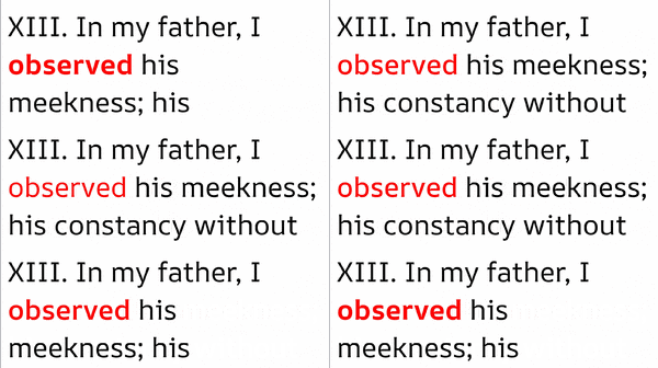
We decided to rely on our own knowledge and turn to [https://fonts.google.com/ Google Fonts], which offers high-quality typefaces that are free to use. We initially chose [https://fonts.google.com/specimen/Source+Serif+4 ''Source Serif 4''], a variable font available through the platform. Its availability on Google Fonts makes it easily accessible, simple to embed in websites, and well optimized for screen use. However, the result was not ideal: when words were emphasized, the increase in weight also caused them to expand in width. This made the text appear overly busy and ultimately reduced its readability. | We decided to rely on our own knowledge and turn to [https://fonts.google.com/ Google Fonts], which offers high-quality typefaces that are free to use. We initially chose [https://fonts.google.com/specimen/Source+Serif+4 ''Source Serif 4''], a variable font available through the platform. Its availability on Google Fonts makes it easily accessible, simple to embed in websites, and well optimized for screen use. However, the result was not ideal: when words were emphasized, the increase in weight also caused them to expand in width. This made the text appear overly busy and ultimately reduced its readability. | ||
| Line 170: | Line 173: | ||
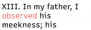
We then discovered ‘Uniwidth fonts’, sometimes also called “equal-width”, “duplexed” or “multiplexed” typefaces. Uniwidth typefaces are proportionally-spaced typefaces, but every character occupies the same space across different cuts or weights. What this means in practice is that no matter which weight you set your text in, it will never change its length or cause text to reflow. It addressed the issue by maintaining a consistent width for the words without altering the length of the sentence. This provided a dynamic and visually pleasing effect to the text. | We then discovered ‘Uniwidth fonts’, sometimes also called “equal-width”, “duplexed” or “multiplexed” typefaces. Uniwidth typefaces are proportionally-spaced typefaces, but every character occupies the same space across different cuts or weights. What this means in practice is that no matter which weight you set your text in, it will never change its length or cause text to reflow. It addressed the issue by maintaining a consistent width for the words without altering the length of the sentence. This provided a dynamic and visually pleasing effect to the text. | ||
[ | [[File:codepen-non-uniwidth.gif|300px]] [[File:codepen_uniwidth.gif|300px]] | ||
Font chosen: [https://www.recursive.design/ '''''Recursive'''''] Designed by [https://fonts.google.com/?query=Arrow%20Type Arrow Type], [https://fonts.google.com/?query=Stephen%20Nixon Stephen Nixon.] It proved to be an excellent fit. | Font chosen: [https://www.recursive.design/ '''''Recursive'''''] Designed by [https://fonts.google.com/?query=Arrow%20Type Arrow Type], [https://fonts.google.com/?query=Stephen%20Nixon Stephen Nixon.] It proved to be an excellent fit. | ||
<span id="technology"></span> | <span id="technology"></span> | ||
=== TECHNOLOGY === | === TECHNOLOGY === | ||
| Line 196: | Line 200: | ||
<span id="process"></span> | <span id="process"></span> | ||
=== Process === | === Process === | ||
We decided on the following workflow:<br /> | We decided on the following workflow:<br /> | ||
First, we make editorial choices based on the source text. An example of such a decision could be changing the text design based on the primary emotion expressed with it.<br /> | First, we make editorial choices based on the source text. An example of such a decision could be changing the text design based on the primary emotion expressed with it.<br /> | ||
| Line 202: | Line 205: | ||
The last step is to use CSS to target these emotion classes and give them a specific layout. | The last step is to use CSS to target these emotion classes and give them a specific layout. | ||
As our first test, we asked ChatGPT to add the primary ''emotion'' fitting with each paragraph as a class in the HTML. For short passages, this worked perfectly, and its ability to use subtle cues in the text to decide the appropriate emotion is impressive. When we tried to do the whole book at once, or even chapter by chapter, it refused to annotate more than a few paragraphs at a time, being very vague about why it couldn’t process more. However, after a lot of insisting, begging and cajoling it did finally process the whole book in one go.<br /> | As our first test, we asked ChatGPT to add the primary ''emotion'' fitting with each paragraph as a class in the HTML. For short passages, this worked perfectly, and its ability to use subtle cues in the text to decide the appropriate emotion is impressive. When we tried to do the whole book at once, or even chapter by chapter, it refused to annotate more than a few paragraphs at a time, being very vague about why it couldn’t process more. However, after a lot of insisting, begging and cajoling it did finally process the whole book in one go.<br /> | ||
| Line 210: | Line 212: | ||
<span id="elective-digital-typography"></span> | <span id="elective-digital-typography"></span> | ||
== ELECTIVE: DIGITAL TYPOGRAPHY == | == ELECTIVE: DIGITAL TYPOGRAPHY == | ||
| Line 237: | Line 240: | ||
Looking back, we were struck by what resonated most, for the students and for us. Their reading habits and creative choices were surprising and inspiring, showing us how Gen Z interacts with text. This Elective workshop became the starting point for the next year of our research, setting the stage for deeper exploration into digital reading, and how text can truly adapt to the ways people consume it today. | Looking back, we were struck by what resonated most, for the students and for us. Their reading habits and creative choices were surprising and inspiring, showing us how Gen Z interacts with text. This Elective workshop became the starting point for the next year of our research, setting the stage for deeper exploration into digital reading, and how text can truly adapt to the ways people consume it today. | ||
[ | [[File:Daniela_Hmelnicka_Prototype_video.gif|250px]] [[File:OmidNemalhabib_Salt.gif|250px]] [[File:RenskeElectiveRec.gif|250px]] [[File:Anastasia_Trishankova_screen recording_figma.gif|400px]] | ||
<span id="conclusions"></span> | <span id="conclusions"></span> | ||
=== Conclusions === | === Conclusions === | ||
| Line 296: | Line 300: | ||
Bionic Reading works across multiple platforms, including Apple iOS and macOS, Google Android, Microsoft Windows, Google Chrome, and the web. Its interface cleans up any text and presents it in the bold-letter format. Users can adjust settings such as Fixation and Saccade (the amount of bold letters), text size, spacing, opacity, background color, and text color, with fixed presets. In the advanced paid version, readers can also select fonts from a specific collection, though the system currently works only with the Latin alphabet. | Bionic Reading works across multiple platforms, including Apple iOS and macOS, Google Android, Microsoft Windows, Google Chrome, and the web. Its interface cleans up any text and presents it in the bold-letter format. Users can adjust settings such as Fixation and Saccade (the amount of bold letters), text size, spacing, opacity, background color, and text color, with fixed presets. In the advanced paid version, readers can also select fonts from a specific collection, though the system currently works only with the Latin alphabet. | ||
[[File:Bionic_Reading_Products_quer_02.png|300px]] | |||
Mobile reading and fragmented text<br /> | Mobile reading and fragmented text<br /> | ||
| Line 313: | Line 319: | ||
==== An Analysis of Typography in TikTok Video ==== | ==== An Analysis of Typography in TikTok Video ==== | ||
[ | [[File:tiktok_knowlaverse.png|250px]] [[File:tiktok_screen.bean3.png|250px]] [[File:tiktok_sussy.reddits.stories.png|250px]] [[File:tiktok_textospeechss.png|250px]] [[File:tiktok_textsconvo.png|250px]] [[File:tiktok_viralp0d.png|250px]] | ||
The typography used in ''TikTok'' videos follows a high-impact, attention-grabbing approach designed for speed, clarity, and engagement. Here are the key elements: | The typography used in ''TikTok'' videos follows a high-impact, attention-grabbing approach designed for speed, clarity, and engagement. Here are the key elements: | ||
| Line 341: | Line 347: | ||
<span id="an-analysis-of-typography-in-instagram-text-animations"></span> | <span id="an-analysis-of-typography-in-instagram-text-animations"></span> | ||
==== An Analysis of Typography in Instagram Text-Animations ==== | ==== An Analysis of Typography in Instagram Text-Animations ==== | ||
[ | [[File:instagram_holke79_1.png|250px]] [[File:Instagram_kiel.d.m_2.png|250px]] [[File:instagram_luftformat1.png|250px]] [[File:instagram_mnkytype.png|250px]] [[File:instagram_nigina.dsgn_1.png|250px]] [[File:instagram_nigina.dsgn_3.png|250px]] | ||
On Instagram you can find typographic experiments done by designers. These designs are closer to printed typography in spirit, but adding motion | On Instagram you can find typographic experiments done by designers. These designs are closer to printed typography in spirit, but adding motion | ||
| Line 373: | Line 380: | ||
Many of the platforms [https://www.google.com/search?q=instagram+add+captions&oq=instagram+add+captions&gs_lcrp=EgZjaHJvbWUyBggAEEUYOTIGCAEQLhhA0gEINDgzMWowajSoAgCwAgE&sourceid=chrome&ie=UTF-8 supply with their own] captions' options, that will transcribe a video and let you style the text with their own pre-designs. When designing these captions, you can choose from a variety of typefaces, colours and adjust the sizes. | Many of the platforms [https://www.google.com/search?q=instagram+add+captions&oq=instagram+add+captions&gs_lcrp=EgZjaHJvbWUyBggAEEUYOTIGCAEQLhhA0gEINDgzMWowajSoAgCwAgE&sourceid=chrome&ie=UTF-8 supply with their own] captions' options, that will transcribe a video and let you style the text with their own pre-designs. When designing these captions, you can choose from a variety of typefaces, colours and adjust the sizes. | ||
[ | [[File:AmandaGormanInsta.png|250px]] [[File:InstaCaptions1.PNG|250px]] [[File:InstaText1.PNG|250px]] | ||
''The prototypes''<br /> | ''The prototypes''<br /> | ||
| Line 398: | Line 405: | ||
<span id="technology-1"></span> | <span id="technology-1"></span> | ||
=== TECHNOLOGY === | === TECHNOLOGY === | ||
Latest revision as of 15:43, 13 February 2026
New Digital Reading Experiences
[edit]BASIC INFORMATION
Title of Research Activity: Enhancing the Reading Experience through Digital Typography
Researcher(s):
Britt Möricke, master in typography and type design
Arjen Suijker, web developer and Learning Model researcher
Maytal Huijgen, designer & researcher of Digital Publishing Experiences
Affiliation/Department: Publication Station / Digital Publishing Studio
Timeline (Start–End): 2024-2026
INTRODUCTION: 10 DAYS OF RESEARCH ON DIGITAL READING
[edit]We initiated our research in 2024, motivated by our shared curiosity about how contemporary digital technologies might open possibilities for new reading experiences. Having collaborated on numerous prior projects, we identified both the potential of this field and a notable lack of creative examples available to students engaged with digital publishing practices.
Our three aspects were Coding and AI, Digital Typography, and Interactive Reading, with Arjen focusing on Coding and AI, Britt on Digital Typography, and Maytal on Interactive Reading. These areas are distinct yet complementary. Accordingly, we chose to examine each aspect individually before integrating our findings. On each research day, we gathered insights on each aspect and then developed a prototype to test and refine our conclusions.
Attitude: Research by making
[edit]In this project, we embraced a research-by-making approach, fully in line with the spirit of the Stations at Willem de Kooning Academy. From day one, we explored our ideas through small experiments and prototypes, testing and iterating as we went. Making was our tool for thinking: each sketch, layout, and micro-experiment helped us uncover insights.
Throughout the process, we carefully documented our experiments, reflections, and discoveries. The records of our research days and the workshops that followed form the backbone of this publication/research, showing how hands-on exploration allowed us to develop and test different approaches to digital text—both within the publishing field and as part of our educational programs. By making, reflecting, and sharing, we turned the act of creation into a method for research.
Ten days of research
[edit]This summary follows our 10 days of research, brings out our findings and presents our prototypes. We have divided it into two parts, following our research structure: Part One presents the findings from our 2024 days of research and the Elective workshop that followed. Part Two presents the research days we did in 2025 and the workshop that followed.
We hope it will serve as a practical resource and a foundation for further research for students and colleagues, as well as a proposal for new publishing approaches for publishers.
Part 1:
Can digital typography enhance the enjoyability and ease of reading?
[edit]
INTRODUCTION
[edit]This project begins with a clear premise: if reading is changing, design must respond. Instead of treating digital media as a threat to long-form text, we investigate how it can actively strengthen it. Focusing on young adults and their mobile reading habits, we approach text as a functional system shaped by content, design, and technology. By working with the book Meditations by Marcus Aurelius, we test how interaction, structure, and typographic behaviour can transform a historically dense text into an accessible and engaging digital reading experience.
Functional approach
[edit]Early in our process, we decided that we wanted to focus on enhancing the functionality of text, rather than just the aesthetics. That is not to say that aesthetics was not considered, but more in a ‘form follows function’ kind of way.
Audience and devices
[edit]Our target group is young adults. At this stage of life, reading plays a critical role in developing analytical skills, supporting independent thinking, and enabling engagement with diverse perspectives and complex ideas. It also contributes to how young adults connect with and interpret the world around them.
However, multiple studies1 indicate a decline in reading within this age group, particularly in reading for pleasure. The growing integration of images, audio, video, and interactive media into everyday digital experiences has shifted attention away from long-form, sustained reading. Early efforts to digitise texts through dedicated devices such as e-readers have since expanded into the pervasive use of mobile phones, where content is accessed continuously, across contexts, in various formats and in highly personalised ways.
Rather than positioning these environments as obstacles, this project explores how the affordances of contemporary media and mobile devices can be leveraged to support and enhance reading enjoyment. By integrating multimodal elements and user-centred interaction design, we aim to reframe reading as an engaging, accessible, and meaningful experience for young adults within their existing digital habits.
CONTENT / DESIGN / TECHNOLOGY
[edit]To make our research relevant, we address three main aspects of making public and the relations between them: The content, the design and the technology. We aimed for a long-read text, the design - which covers the behavior of text and the typography, and technologies that are relevant for working with text digitally. Following is the extended explanation for each of these choices.
CONTENT
[edit]The first choice we had to make was regarding the text we will work with. The publishing world has multiple types of content – from fictional novels to poems, culinary and scientific, academic, religious, historical and more. Even though we see relevancies for all types of publications, there will be difference in the digital needs for each type of content. We therefore decided to choose a text that will answer the following requirements:
1. Written in short pieces. Even though we think digital reading could be applied on longer texts as well, we found shorter texts easier for the first prototype. We also referred to research3 regarding the attention span of young adults, indicating that people read shorter texts.
2. Non-linear. Designing for mobile phones, we wanted to examine the possibility to reconstruct the text and navigate though it differently than in a physically bound object.
3. Added value. What can we do with the text? We wanted to create an immediate interaction with the text, to make it clearly different than the passive reading in print.
Our choice fell on the book “Meditations” by Marcus Aurelius.
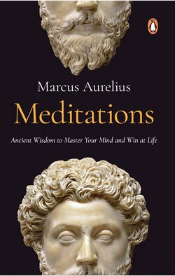 https://classics.mit.edu/Antoninus/meditations.html]
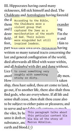
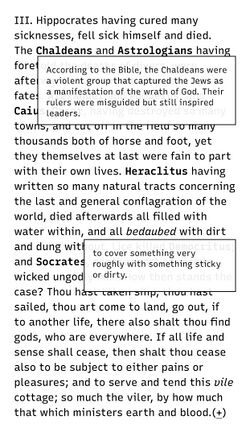
This nearly 2,000-year-old text continues to resonate with young adults due to its personal tone and its exploration of how to understand the world. It is structured in paragraphs and follows only the order of Aurelius’ thoughts. However, the old language and historically specific meanings can be challenging to understand and are sometimes misinterpreted. We therefore chose to focus the interaction for this text on defining difficult words and providing accurate, modern meanings.
DESIGN
[edit]
Editorial, Behaviour & Typography
[edit]
Introduction
[edit]Book design always reflects the connection between the story or the content and its visual design. For our research, we focused on the visualisation of text through typographic features and added the aspect of behaviour and usability for a true digital experience. We examined these different elements separately and then combined them into prototypes. Our testing and choice-making process is described in the following paragraphs.
Editorial
[edit]Editorial decisions - who will read the text and what it should achieve - come before typeface choice. Our initial focus was on identifying functions that could enrich the text of Meditations. The examples we explored included:
– Connecting the text with explanatory notes from the book itself
– Adding extra content or context to specific words, sentences, or paragraphs (initially as text, with the potential to expand to other media such as video or sound)
– Supporting skimming by highlighting core words within each paragraph
We chose to test the addition of extra content, as it offered clear added value and served as a natural extension. Our proposals for additional content included:
– Background information about Marcus Aurelius
– Historical context, particularly the period of the Roman Empire
– Explanations of controversial passages
– Reflections on leadership in the text compared to contemporary notions of leadership
– Philosophical ideas, including comparisons with other philosophers
Ultimately, we decided to focus on explaining difficult words from the original text as a first, targeted intervention.
Behaviour
[edit]The idea of expanding digital text possibilities and creating new forms of publications focused on digital possibilities is not new. There are designers focused more on adjusting typefaces by interacting with it. Good examples are Mark Schultz and Beatriz Lozano, both researchers in the field of typography and technology. Their work inquires what can happen with texts when using AR, touch functions and other forms of new media, developing tools and making them accessible for other designers to experiment with and implement in design projects. In our sources you can find an extended list of such examples.
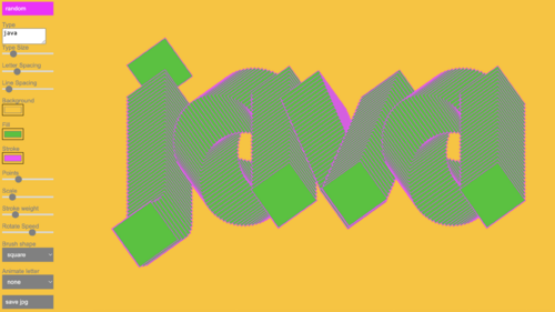
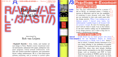
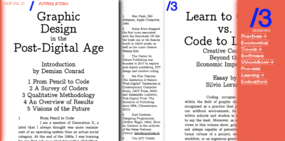
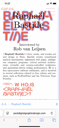
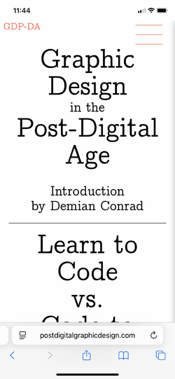
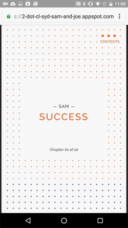
Next to experiments focused mainly on type behaviour, there are also projects that embrace multiple digital (we focused on web-based examples, see explanation) functions to create different forms of navigations and interactions with longer texts. One recent example is the bi-medium project Post Digital Graphic Design, a series of interviews and articles. This publication was created in two media – as a printed book and an online website. It has both desktop and mobile version, which is unique to most publications that so far focused mainly on desktop version.
The digital publication makes use of various digital possibilities such as the use of layers, split areas, hover effects (for desktop) and more.
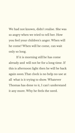
Another mobile-based project that was initiated already in 2016 invited writers to consider writing for a non-printed medium. This attitude resulted in a series of publications under the name Editions At Play, creating digitally-oriented stories that used animation, AR, time sensors and more to create playful forms of presenting and experiencing texts.
Visualizing text functions
[edit]The way a text is visualised is closely connected to how it behaves and how readers interact with it. Interactive behaviours can be triggered through actions such as clicking, scrolling, hovering, or timing-based events. A click may open content in a new window or tab, reveal a new layer, expand an accordion, or cause elements to appear or change. Scrolling can be used to progressively reveal additional information or, conversely, to reduce or hide content, while timed interactions allow elements to appear or transform automatically. Hover interactions, while not applicable to mobile devices, can further support changes in appearance and provide additional cues on desktop interfaces.
To make these interactions intuitive, familiar visual conventions are used to signal possible actions. Clickable elements are often indicated through underlining, background highlights, frames, or subtle animations such as blinking. Links commonly adopt the recognisable blue hyperlink style, while scroll-based interactions may be suggested through arrows or content emerging into view. Closing actions are typically communicated through universally recognised symbols such as an “X” or by allowing users to tap or click outside a layered interface element.
Typography
[edit]Following the idea that the way text is visualized affects how readers interact with it, we focus on how typography itself can relate to digital behaviors. This led us to an exploration of suitable typefaces who can create flexible, responsive typography that supports interaction while preserving readability.
Exploring variable fonts
We started experimenting with variable fonts. A variable font is a single font file that can behave like many fonts at once. Instead of having separate files for “bold,” “italic,” “light,” etc., a variable font contains continuous axes (like weight, width, slant, or optical size) that can be adjusted dynamically. This means you can smoothly tweak the font’s appearance anywhere along these axes.
For online use, variable fonts offer several clear advantages. Because a single variable font can replace multiple separate font files, page weight is reduced, and loading times improve. They also enable responsive and flexible typography: weight, width, or contrast can be adjusted on the fly to suit different screen sizes, devices, or user preferences, which improves readability. Designers gain finer control over details, allowing subtle changes, such as slightly heavier headings or narrower text in tight spaces, without switching typefaces, keeping the visual style cohesive. Variable fonts also make dynamic effects and interactivity possible, as type can respond to scrolling, hover states, or animations, creating richer typographic experiences. Finally, using one font file ensures consistency across browsers and devices, reducing the risk of mismatched styles.
In short: variable fonts let you do more with less.
Typeface options
[edit]We first experimented with ChatGPT to suggest typefaces, but the results were disappointingly generic. It proposed the typeface ‘Trajan’ for Marcus Aurelius. Could it be more cliché?
We decided to rely on our own knowledge and turn to Google Fonts, which offers high-quality typefaces that are free to use. We initially chose Source Serif 4, a variable font available through the platform. Its availability on Google Fonts makes it easily accessible, simple to embed in websites, and well optimized for screen use. However, the result was not ideal: when words were emphasized, the increase in weight also caused them to expand in width. This made the text appear overly busy and ultimately reduced its readability.
We then discovered ‘Uniwidth fonts’, sometimes also called “equal-width”, “duplexed” or “multiplexed” typefaces. Uniwidth typefaces are proportionally-spaced typefaces, but every character occupies the same space across different cuts or weights. What this means in practice is that no matter which weight you set your text in, it will never change its length or cause text to reflow. It addressed the issue by maintaining a consistent width for the words without altering the length of the sentence. This provided a dynamic and visually pleasing effect to the text.
Font chosen: Recursive Designed by Arrow Type, Stephen Nixon. It proved to be an excellent fit.
TECHNOLOGY
[edit]Technology plays an important role in our research, as new developments open new possibilities. We have explored such possibilities in text presentation, which we have discussed before, but new technologies can also contribute to reinterpreting content and consideration of new publishing platforms. By bringing together established technologies and cutting-edge tools, we can contribute to truly new reading experiences.
Publishing
[edit]Our aim was to make our publication easily accessible, so we decided to make it browser based. We have chosen to use HTML for the content of our text, CSS for the design and JavaScript for the interaction. No server-side scripts are used, so that the source code is easy to read and easy to deploy.
These technologies also make it possible to create a workflow where the text can be easily changed or updated without having to update the design.
(Re)Interpreting content with Large Language Models
[edit]As mentioned earlier, we decided to emphasize parts of the text based on the words’ difficulty level. However, doing this manually can take way too much time. An example of such an intervention could be to find all mentions of colours in a text and then give all these words the colour they are refer to.
In this example of marking mentions of colour, we could quite easily write a script that would find all literal occurrences in the source text of a predefined list of colors and mark them. This sort of intervention has been done before and is not particularly exciting. What we want to try instead is to find many more abstract or conceptual elements in the text and mark those. An example of such an intervention would be to mark all emotionally charged parts of a text and design them in a way that matches that emotion. This is impossible to do with a classic script, and a lot of work to do by hand.
However, LLM’s (Large Language Models, e.g. ChatGPT) appear to be a great solution for this, so we decided to try out how we can utilize it. We are using ChatGPT 3.5, since at the time this was the cutting-edge tool.
Process
[edit]We decided on the following workflow:
First, we make editorial choices based on the source text. An example of such a decision could be changing the text design based on the primary emotion expressed with it.
The next step is to set up the source text as a basic structured HTML file. Subsequently, ChatGPT is given the HTML file and asked to analyze each paragraph, analyze the content to decide on the primary emotion, and add this emotion as a class in the <p> tag.
The last step is to use CSS to target these emotion classes and give them a specific layout.
As our first test, we asked ChatGPT to add the primary emotion fitting with each paragraph as a class in the HTML. For short passages, this worked perfectly, and its ability to use subtle cues in the text to decide the appropriate emotion is impressive. When we tried to do the whole book at once, or even chapter by chapter, it refused to annotate more than a few paragraphs at a time, being very vague about why it couldn’t process more. However, after a lot of insisting, begging and cajoling it did finally process the whole book in one go.
It’s very strange to work with a tool that seems to have a will of its own. This would make it quite an unreliable tool to use in a production setting.
Our second test was to mark all verbs in the text and use CSS to style them in a specific way. Again, the annotation in HTML worked impressively. Unfortunately, it also needed a lot of persuading to actually process whole chapters at a time. We created a very basic example that can be viewed here: https://codepen.io/arjensuijker/pen/yyJEYMNhttps://codepen.io/arjensuijker/pen/yyJEYMN
ELECTIVE: DIGITAL TYPOGRAPHY
[edit]What better way to share and question the outcomes of our research than by involving the students themselves? We designed a 5-days' workshop that set out to find new ways to design text for mobile screens.
Our first question to our students was simple: “What kind of texts do you read digitally?” One student answered: “Subtitles.” Funny, unexpected, and somehow very true. From that moment, we knew the experiment would be full of surprises.
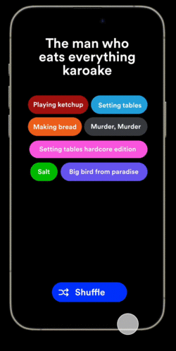
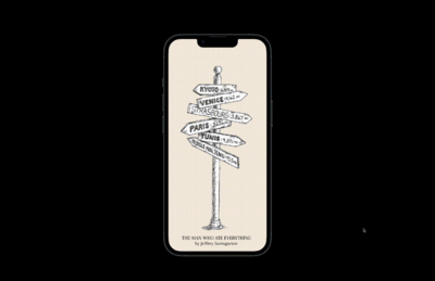
For the content of the workshop, we chose the cookbook The Man Who Ate Everything by Jeffrey Steingarten—a mix of text types including recipes, anecdotes, and quirky culinary adventures. Its variety made it perfect for the research: students could take any approach they liked, exploring new ways for visual storytelling.
Other than the change in content, we defined the assignment to follow our own research guidelines, to see how the students will approach the same design challenge and what kind of examples they will create.
The Assignment
[edit]In an era of rapid technological evolution, the design systems and habits surrounding reading experiences have remained relatively static. This project aims to explore how digital typography can revolutionize reading experiences by rethinking design systems and enhancing usability.
Choose a piece of text (at least three paragraphs) from ‘The man who ate everything’.
- Create a design system that enhances the digital reading experience, primarily aimed at smartphones. Think especially about things that are possible on smartphones that are not possible in a printed book.
- Use your chosen text to showcase the design system that you created but be aware that this design system needs to be applicable to the whole book (it’s fine if you mainly focus on specific types of content, such as recipes or diaries).
- Present your design as a mockup, or (even better) as a working prototype on the web.
The students were investigating, experimenting and prototyping for a week, guided by us throughout the whole process.
Results
The outcomes were wonderfully diverse. Some focused on clarity and readability, others on tone and personality. Every interpretation highlighted a new way of thinking about text on a small screen. We laughed and learned, and so did the students.
Looking back, we were struck by what resonated most, for the students and for us. Their reading habits and creative choices were surprising and inspiring, showing us how Gen Z interacts with text. This Elective workshop became the starting point for the next year of our research, setting the stage for deeper exploration into digital reading, and how text can truly adapt to the ways people consume it today.
Conclusions
[edit]Even though AI tools proved to be a little erratic, our workflow and designs are promising. However, our most important conclusion comes from students’ input in our Elective: Gen Z actually reads a lot but just prefers their text in formats that don’t really fit the traditional definition of reading.
The majority consume most of their text on social media, where it is presented in very different ways than traditional text design. The overall quality of the content is often debatable, and the design doesn’t look very attractive from a classic designers’ point of view, but we felt like there is a lot of unexplored potential there.
One of our main reasons for researching digital reading experiences was to attract new audiences. During the Elective it suddenly became very clear what the audience we defined as our audience actually reads and what we could do to get to it. This finding led us to refine our research question, which we will discuss in more detail in Part 2.
Part 2:
Immersive Reading
[edit]
INTRODUCTION
[edit]Looking back at the Elective, we realized that the students’ creative approaches and reading habits revealed surprising insights into how Gen Z interacts with text on screens. Their experiments highlighted the potential of design to guide attention, convey tone, and make reading more engaging — lessons that naturally informed the next phase of our research.
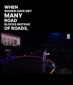
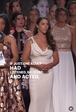
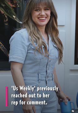
Reading today is shaped not only by traditional formats like books but increasingly by digital and social media environments, where content is short, interactive, and visually engaging. Platforms such as TikTok and Instagram have introduced new ways of presenting text—through motion, emphasis, and typographic play—that capture attention quickly and encourage performative reading. Generation Z exhibits distinctive reading behaviors that embrace such text presentations. While they may spend less time on traditional reading, they engage heavily with them, suggesting that design and presentation play a critical role in motivating engagement.
While these techniques are well-studied for short-form content, it remains unclear whether they can enhance engagement with longer texts without compromising comprehension or reading comfort.
This insight, combined with findings from our initial research project, led to the following research question:
Can Social-Media-inspired text design apply to long reads content?
CONTENT / DESIGN / TECHNOLOGY
[edit]In the second part of our research, we followed the same research structure we used for the first part, by addressing the same three main aspects of making public and the relations between them: The content, the text design and the technology. We aimed, again, for a long-read text, its design, relevant behavior of both text and the typography, and technologies to support that.
The main change was focusing on designing immersive solutions: creating a reading experience that will follow social media design elements and will include, next to digital text appearances, sound as well, specifically text spoken and written at the same time.
CONTENT
[edit]At first, we were looking to follow our initial guidelines of using short, non-linear texts. We considered short stories such as Kurt Vonnegut, ‘Look at the Birdie’, Spoken Word/ Poetry Slam pieces that has rhythm, sound and hierarchy as part of their natural structure and local stories from a Rotterdam-based writers' group ‘Sarmad Fiction Writing Club’.
Eventually, we decided to challenge the new format, by trying to juxtapose a classic novel with "TikTok” visualisation. The chosen text for this part of the research was ‘100 Years of Solitude’, a 1967 Nobel Prize winner novel by Gabriel García Márquez. For our prototype, we used the opening paragraph.
DESIGN
[edit]Behaviour & Typography
[edit]
On-screen readability
[edit]Research on digital typography and on-screen readability provides valuable guidance for designing immersive text. For example, a Read Me! article by Readymag highlight how factors such as eye movement, contrast, resolution, responsive layouts, and font choices influence reading comfort and comprehension on screens.
Similarly, studies on dyslexia and type design emphasize how specific font characteristics can improve legibility for readers with diverse needs, underlining the importance of adaptable and inclusive typographic solutions in digital environments.
Very much like e-readers, the ‘immersive reading’ function, included in software such as Microsoft Word, PDF readers and Teams, allows the reader to change the column width, page background colour, line focus, and space between text according to their needs and reading style. It also allows reading text aloud, change reading speed, switch between languages and convert text.
Blinkist is an app that offers digital summaries of thousands of books, promising users that they can get the gist of any great book in under 15 minutes. These summaries are mostly AI generated and are available both as written text and spoken text. Unfortunately, written and spoken text are not synchronized, so they don’t work very well for Immersive reading. These summaries make the content much more approachable to a wider audience, but by design they miss a lot of the depth and nuance of the original works.
Experiments like Bionic Reading demonstrate how subtle typographic interventions can guide the eye and support fluent reading. Developed by the Swiss designer Renato Casutt, Bionic Reading uses word visualization to help the brain recognize words faster. We initially recognize words by their sounds (“mama” evokes someone who cares for us) before learning to convert these sounds into written characters. Fluency in reading comes from automation, a process that is easy for some and challenging for others. Casutt’s method highlights certain letters of a word in bold, allowing the brain to fill in the rest and jump efficiently to the next set of bold letters. More information and apps can be found at Bionic Reading.
Bionic Reading works across multiple platforms, including Apple iOS and macOS, Google Android, Microsoft Windows, Google Chrome, and the web. Its interface cleans up any text and presents it in the bold-letter format. Users can adjust settings such as Fixation and Saccade (the amount of bold letters), text size, spacing, opacity, background color, and text color, with fixed presets. In the advanced paid version, readers can also select fonts from a specific collection, though the system currently works only with the Latin alphabet.
Error creating thumbnail: File with dimensions greater than 12.5 MP
Mobile reading and fragmented text
Our research focused on mobile typography, where reading increasingly happens in fragmented ways. Existing research shows that screen typography benefits from flexibility: adjustable line width, spacing, contrast, and background. As Gen Z often consumes text in fragments, combined with audio and motion, typography must remain legible while actively holding attention.
On platforms such as TikTok and Instagram, text rarely appears as continuous paragraphs. Instead, it is presented in short sequences of one to five words, revealed over time. Emphasis is created through size, colour, motion, or highlighting rather than through traditional typographic hierarchy.
(How Social media influenced fonts) https://typedrawers.com/discussion/5079/what-kind-of-impact-did-digital-social-media-have-on-fonts
Text on Social Media
[edit]During our research we investigated two leading social media platforms that were mentioned as the most popular among our audience: Instagram and TikTok. The differences between the two platforms were substantial.
An Analysis of Typography in TikTok Video
[edit]
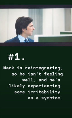 File:Tiktok sussy.reddits.stories.png
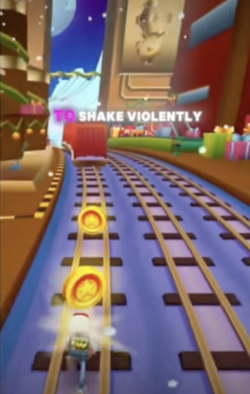
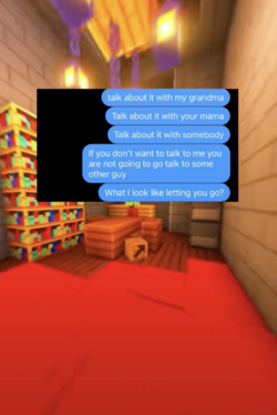
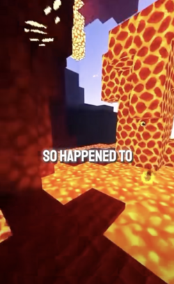
The typography used in TikTok videos follows a high-impact, attention-grabbing approach designed for speed, clarity, and engagement. Here are the key elements:
1. All-Caps Dominance & Sentence Case Variations
Most TikTok text is set in all caps, ensuring maximum visibility and urgency. This choice aligns with how people skim content quickly. However, sentence case occasionally appears, often to differentiate between key messages and supporting text.
2. Bold, High-Contrast Colour Choices
Red, yellow, black, and white dominate TikTok typography, echoing tabloid-style and meme aesthetics. These colours provide strong contrast, ensuring legibility against the fast-moving, diverse backgrounds of TikTok videos.
3. Random Placement & No Clear Composition
Text appears in a mix of placements—from centre to scattered unpredictably across the frame. This lack of traditional composition mirrors the chaotic, spontaneous nature of TikTok, reinforcing the platform's informal and raw aesthetic.
4. Sans-Serif and Monospaced Typefaces
Sans-serif fonts (like TikTok’s default Proxima Nova) are common for their clean, modern feel. Monospaced typefaces, often used in captions or for emphasis, add a slightly digital, “hacked” aesthetic that resonates with meme culture and internet-native visuals.
5. Outlined Text for Maximum Legibility
Because TikTok videos often have busy backgrounds, outlined text is a practical necessity. White text with a black outline (or vice versa) ensures readability no matter what’s happening in the video, a trick borrowed from subtitles, gaming UI, and meme typography.
6. Text Motion
Most of the transitions are a word-by-word replacement of the text. Resembling GIF animation, the text changes almost frame-by-frame in high-speed, following the AI reading rhythm. The (most of the time) fixed positioning is meant to allow the viewer to follow the text. However, both the fast replacement and the fact that there is no trace left of the text, creates a more skimming than reading effect.
What This Typography Say About TikTok’s Visual Culture
TikTok typography is designed for speed, with text meant to be understood in milliseconds before viewers scroll away. Traditional rules of composition are often set aside in favor of clarity and immediate impact.
Bold, simple type draws on meme culture, emphasizing humour, emotion, and reaction-driven communication. Overall, TikTok typography prioritizes function over finesse, evolving text for viral, high-speed consumption.
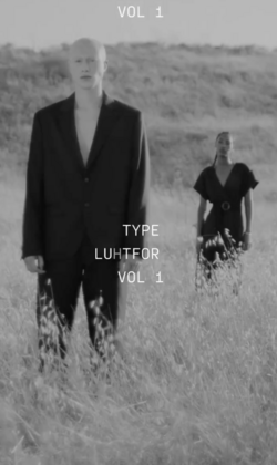
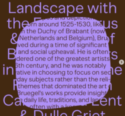
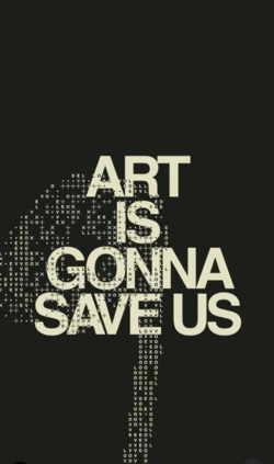
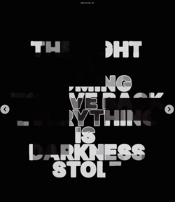
An Analysis of Typography in Instagram Text-Animations
[edit]On Instagram you can find typographic experiments done by designers. These designs are closer to printed typography in spirit, but adding motion
Here are the key elements:
1. All-Caps Dominance & Sentence Case Variations
Also on Instagram most of the text is set in all caps, presenting short, catchy sentences. When slightly longer texts are presented, they do appear in sentence case.
2. Black & White (maybe One More Colour)
The texts designed for Instagram take much more from printed publications aesthetics than the 90’s web features that are used on TikTok. There is much more diversity in the type choices and the colour combinations are softer. Black&White and the grey tones dominate; some mix one simple colour as addition/ contrast to the grey.
3. Central Placement & Clear Compositions
Most text animations have their text centred, taking a large part of the format and maximizing the small mobile space. Animations where the text is being built-up use clear structures, either grid-based or a systematic composition.
4. Sans-Serif and Trendy Typefaces
Sans-serif fonts are also common on Instagram. Next to Sans-Serif typefaces there is great use of more trending typefaces and a mixture of multiple types. This typographic approach puts more focus on enhancing legibility, making the text itself the main image and the background as supporting.
5. Harmonic Backgrounds for Maximum Legibility
The designers’ work uses much more subtle backgrounds, that work harmonically with the presented text. The background is designed to work with the text, not overpower it.
6. Text Motion
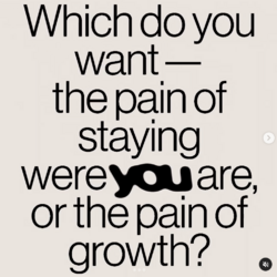
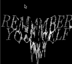
There is great diversity in the text motion. Some animations focus on changing the text’s visuality while the text itself remains fixed to its place. Other animations use the format to have text move in/out or around it. Immersive Text-style animations follow the reading rhythm, highlighting the words by changing the typeface style.
There are also tools offering the reader interaction with the text itself for web-based content, but this might be less relevant for this specific prototype.
Captions
Important part to add is the common use of text captions. There are many benefits for adding captions. As can be found in this article by the Utah State University, captions assist in comprehension and memory and help users pay attention.
There are diverse visualisations of captions - word-by-word presentation of text, text in short lines, central single-word appearance and more. These captions do not follow intonation, rather seem to have definitions of space.
Many of the platforms supply with their own captions' options, that will transcribe a video and let you style the text with their own pre-designs. When designing these captions, you can choose from a variety of typefaces, colours and adjust the sizes.
The prototypes
Building on this, we explored creating two immersive videos for the two platforms. The text was combined with motion, voice-over, and background imagery. This introduced new typographic challenges: composing layouts for small screens, maintaining clarity of typefaces, and aligning motion with reading rhythm.
Our first sketch was for the typography only. The typeface Tiempos by Klim Type Foundry was chosen for its legibility, deliberately contrasting with meme-style all-caps typography and outlined letterforms common on social media.
[IMAGE: SCREEN WITH TIEMPOS FONT]
We then moved to creating prototypes with motion. The prototypes tested our short text using different typefaces, layouts, playback speeds, and voice options. Clear differences emerged between platforms. TikTok typography is fast, high-contrast, and designed for skimming. Instagram typography is more structured and centered, supporting reading through rhythm and restrained motion.
For the ‘TikTok’ version, we chose to use background video recordings of the game ‘Minecraft’. This classic game is often used for storytelling videos on TikTok, unrelated to the story that is being told. For typeface we chose PT Mono, a monospace, code-like typeface that will work well with the pixelated esthetics of the background images. The audio was available for download online, and we found it very suitable for our video with its deep, soothing voice.
For the ‘Instagram’ version, we chose a more subtle approach. For background, we wanted to check the effect of “hypnotizing” visuals, that will keep the reader engaged. We went for a black and white looping video of water ripples. For the text we used font Merriweather, a serif typeface that resembles a printed novel typeface. We animated the text with a ‘dropping’ effect, to create motion that follows the reading rhythm.
We eventually added a third prototype, using the opening text from the novel ‘War and Peace by Leo Tolstoy. For this video we based the text visualizations on the different characters: the narrator, Anna Pavlovna Scherer and Prince Vasili Kuragin. Each character got its own visual style, mixing serif and sans serif versions of Meta Pro and Mr. Eves Sans with different colors.
Also for this prototype we found an audio version online and used it for our test, since the reader was very distinguished in the way he characterized each person. That made the connection between written and spoken text much stronger.
[2X VIDEO PROTOTYPES]
Two prototypes were created using Adobe Premiere, one with Adobe After Effects. The greatest advantage of Adobe Premiere is its ability to transcribe captions based on voice. That is an automatic process that can be generated very fast for a long audio/ video part. The automatic generation, however, does not guarantee precision. It was necessary to review the text, adjust some words (mainly names) and edit manually the connection between background images and the text and its appearance in the layout, breaking some lines to adjust screen width with readability.
Ideally, we would have an automated workflow that generates full video clips. This would allow content to be published quickly and at low cost. The technology behind this workflow should be free and open source, so anyone can use it to publish the content they choose. The video clips themselves are easily shareable and can be published both on one’s own platform and across existing platforms.
TECHNOLOGY
[edit]
Text to Speech
[edit]An important aspect of immersive reading is voiceover. Tone, infliction, rhythm, and emphasis all play an important part in how the text is experienced by the reader. In an ideal scenario, there would be a human narrating the text, but in practice this is often too expensive and time-consuming. Therefore, we have done some experiments to determine the usability of various AI Text-to-Speech (TTS) technologies that could create voiceovers from text files.
SSML
[edit]After our initial exploration of various mainstream TTS products, the conclusion was that the voices sound quite convincing and pleasant, but the intonation is unnatural and does not properly emphasize the right words. We sought the solution to this problem in Speech Synthesis Markup Language (SSML). This is a way to include markings in de source text to indicate emphasis, pauses and other things that can improve the speech. Our idea was to use ChatGPT to add these markings to the source text, so that a TTS product can use this to improve its speech pattern.
Comparing TTS
[edit]The next step was a more thorough auditing of various TTS services to determine their quality and their support for SSML.
Free option: Amazon Polly
Amazon Polly provided unnatural sounding speech. There is a higher quality version available, but that could not be accessed from the Netherlands. It claims to support SSML, but its interpretation often sounds stunted.
Free option: Crikk
Crikk works better out-of-the-box, but it does not support SSML so it can not be improved upon. In does support pauses, but nothing else.
Free option: Google TTS
https://cloud.google.com/text-to-speech
Google TTS works better than Amazon and supports SSML, but still the intonation remains very unnatural.
Paid option: Elevenlabs
Elevenlabs offers a trial of 10000 characters per month. It works much better than all the other options. It appears to do it’s own preprocessing to figure out the right intonation for each sentence. It doesn’t support SSML, but frankly it doesn’t need it.
Overall, there is more variation in quality between different TTS services than we expected, and the large players don’t necessarily seem to do best. However, looking at the pace of innovation in this area, we expect the quality to improve drastically in the coming years.
ELECTIVE: IMMERSIVE READING
[edit]To kick off the second Elective, we presented our research and our prototypes. This included findings from the first phase, but the emphasis was on the concept of immersive reading and the treatment of text on video-based social media. We asked students for two things: to do research and to create a prototype.
Research
[edit]We asked them to research along one of the following themes:
- Content
- Screen-based typography
- Voice and sounds
- Motion
- Interactivity
- Background visuals
We then provided them with a template that they could use to document their research.
[IMAGEs: research posters from students]
The students brought many interesting aspects to our attention. All the information was shared in a public folder, so all participants could lear from each other’s findings.
Prototype
[edit]Students were asked to create a digital reading experience: the prototype should include a minimum of one paragraph of text, motion and /or interactivity and a carefully considered typography.
They were free to choose a text of their own, but we also provided them with some choices. Their design choices should align with the experience they wish to create.
Most students choose to use Adobe After Effects for their prototypes, since there was less emphasis on interactivity and more on the synthesis of sound and text.
[IMAGES+LINKS TO STUDENTS PROJECTS]
Results
[edit]Like in the previous Elective, the resulting projects were diverse and surprising. Some students chose their own pieces of text and designed them in a way that engaged with the content, while others experimented with new interaction patterns or novel reading experiences that function independently of content. Their research was equally eclectic, and it was quite surprising to see what sources they were accessing, particularly on social media, that are simply invisible to us as teachers. Overall, we were very inspired by the new insights and perspectives that students were able to present in just one week.
CONCLUSION
[edit]Digital reading works according to its own logic. A screen gives typography new possibilities. Text can shift, respond, connect to sound, and direct the reader’s focus in subtle ways. Variable fonts, motion, layered media, and AI-supported analysis give designers more control over how a text is experienced. Meaning no longer depends only on layout and hierarchy; it develops through timing and interaction.
For publishers, this leads to practical opportunities. Long reads can adopt the tempo and clarity people recognize from social platforms without losing depth. Web technologies such as HTML, CSS, and JavaScript make production accessible and flexible. AI tools and advanced text-to-speech systems make synchronized audio and text increasingly achievable. Adaptive editions and immersive formats can become part of regular publishing workflows rather than isolated experiments.
Several questions still require careful study. Motion influences concentration. Pacing affects understanding. AI annotation must meet editorial standards. Inclusive typographic systems should support different reading needs while remaining coherent. Economic sustainability will determine whether immersive formats move beyond prototypes.
Further research can measure how immersive design affects comprehension and retention, improve automated production pipelines that combine structured text and audio, and test scalable applications with publishers in real contexts.
Reading continues to evolve with its medium. Designing specifically for screens opens a clear and promising direction for the future of publishing.
Sources
[edit]Reading Habits
- 2025, Gen Z is reading less, Vibhas Ratanjee, Forbes
https://www.forbes.com/sites/vibhasratanjee/2025/08/26/gen-z-is-reading-less-what-that-means-in-the-age-of-ready-answers/ - 2025, Reading for pleasure has dropped by 40%, Madeline Holcombe, CNN
https://edition.cnn.com/2025/08/20/health/reading-for-pleasure-decline-wellness - 2025, Al-Kadi. A. Towards a Digital Reading Mindset: Digital Reading Habits, Strategies, and Challenges. Electronic Journal of Foreign Language Teaching [e-FLT], 22(2), 211–223.
https://e-flt.nus.edu.sg/wp-content/uploads/al-kadi.pdf - 2024, New Trends in Students’ Reading Habits, University of Tirana, Faculty of Social Sciences, Tirana, Albania, 2,3University “Haxhi Zeka”, Faculty of Business, Pejë, Kosovo
https://www.researchgate.net/profile/Brunilda-Zenelaga/publication/379775037_New_Trends_in_Students'_Reading_Habits/links/6683a69cf3b61c4e2ca6901e/New-Trends-in-Students-Reading-Habits.pdf - ‘Immersive Reading’
https://manikapant18.medium.com/what-is-immersive-reading-and-how-it-makes-reading-fun-c71308ee1a04
This article is focused on reading and understanding by students. The title sounds more promising than the actual content.
- Book-Tok and Gen-Z Reading habbits
https://www.publishers.org.uk/wp-content/uploads/2022/11/BookTok-for-WEBSITE.pdf
The numbers show that Book Tok – promoting books on TikTok – has caused an increase in book sales withing young (16-25 yo) people. It does not, however, show that they actually read them.
In this article from The Guardian: Gen Z is choosing the physical book over the digital environment.
https://www.theguardian.com/books/2024/feb/09/reading-is-so-sexy-gen-z-turns-to-physical-books-and-libraries.
- Are books dead? Why Gen Z doesn't read
https://www.generationtechblog.com/p/are-books-dead-why-gen-z-doesnt-read - Generation z and the art of reading
https://euranetplus-inside.eu/generation-z-and-the-art-of-reading/ - How Gen Z Came to See Books as a Waste of Time
https://www.theatlantic.com/newsletters/archive/2024/11/books-briefing-gen-z-reading-books-waste-time/680586/
Use of Variable fonts
- Introduction to variable fonts https://web.dev/articles/variable-fonts
- Axis-Praxis, Playing with OpenType Variable Fonts https://www.axis-praxis.org
- Variable Fonts are Awesome for UX Design https://medium.com/staffbase-design/variable-fonts-are-awesome-for-ux-design-a4e3df68cd2
Digital Typography Tools experiments
- Mark Schultz https://www.schultzschultz.com/touchtype.html
- Beatriz Lozano https://lozanotype.github.io/Java_Sans/
- Munken Poster-making https://colab.munken.com/munkencreator
- ABC Playground https://abc-etc.com/typewriter/
Digital Publishing experiments
- Text Rain, 1999, Camille Utterback & Romy Achituv, Installation
https://www.youtube.com/watch?v=f_u3sSffS78 - Edition at Play, 2016, initiative from Visual Editions and Google’s Creative Lab in Sydney, Australia
https://editionsatplay.withgoogle.com/#!/detail/free-seed#%2F - Post Digital Graphic Design, Published by Onomatopee, HEAD-Genève & Set Margins’
https://postdigitalgraphicdesign.com - Divine Comedy, Artwork catalogue
https://divinecomedy.digital/#/
Reading Captions
- Benefits of Captions, Utha State University
https://www.usu.edu/accessibility/captions/benefits#:~:text=Adding%20captions%20to%20your%20videos,pay%20attention%20to%20the%20video
