Research/all-in-one publishing: Difference between revisions
Arjensuijker (talk | contribs) No edit summary |
Arjensuijker (talk | contribs) No edit summary |
||
| (69 intermediate revisions by 2 users not shown) | |||
| Line 1: | Line 1: | ||
== Introduction == | == Introduction == | ||
The core of our research is | The core of our research is the development of '''a workflow in which HTML and CSS''' files are used as the '''primary source for a publication'''. These technologies were originally designed for creating only websites, but in recent years many '''printing capabilities have been added'''. This results in a '''unified''' file format that can be used to publish to '''print, epub, web and mobile'''. This approach offers some unique improvements on the publication workflow: | ||
* | * '''Design and content are separate''', both can be changed at any time, fully independently of each other. | ||
* Every | * '''Every change''' in content or design can be exported to '''every available publication medium''' with the press of a button. | ||
* HTML and CSS are very widespread transparent file formats that have been used for decades without much change, and will remain this way for years to come. This makes them much more suitable for digital archiving than most proprietary formats. | * '''HTML and CSS are very widespread transparent file formats''' that have been used for decades without much change, and will remain this way for years to come. This makes them much more suitable for '''digital archiving''' than most proprietary formats. | ||
* For | * For largely the same reasons, the resulting publication is very '''suitable for (collaborative) reuse and redesign'''. | ||
=== About the process === | === About the process === | ||
For this research, we have chosen to take an existing publication and explore how it could be rebuilt from scratch using our newly developed workflow. The original publication was only designed for print. Our | For this research, we have chosen to take an existing publication and explore how it could be '''rebuilt from scratch using our newly developed workflow'''. The original publication was only designed for print (a pdf). Our goal was to replicate this design as closely as possible with our new print version, and adapt the design to also fit the other media. | ||
The global process consisted of the following steps: | The global process consisted of the following steps: | ||
# The original '''Word documents''' with the contents of the publication were converted '''to html files using Pandoc''' conversion software. | |||
# These html files were ''''cleaned up'''', deleting everything design-related and leaving only structural information. | |||
# '''Additional HTML''' was added to improve '''semantic value''' and facilitate '''CSS styling'''. | |||
# '''CSS stylesheets''' were created for every output format. | |||
# The outputs were '''created and tested''' using Pandoc (for epub), PrinceXML and Weasyprint (for pdf), Chrome (for responsive web) and Firefox (for direct browser print) and checked for consistency. PrinceXML is proprietary software, Weasyprint is not. | |||
Of course the process wasn't as | Of course the process wasn't as linear as it appears here. The process can be better described as being '''iterative, looping through the steps''' continuously. The commits list in github can be a good portrait of this iteration. Available at: https://github.com/arjensuijker/all-in-one-publishing/commits/master | ||
== Challenges == | == Challenges == | ||
| Line 27: | Line 27: | ||
=== From Word to HTML === | === From Word to HTML === | ||
At this stage, we encountered very little problems. Pandoc proved easy to install and worked flawlessly. | |||
== | === Cleaning up the HTML === | ||
In Word, there are basically two methods to style a document: '''using styles or by manually changing the font properties''' for every heading and paragraph. The first method results in html files with a better (semantic) structure, because the styles can directly translated to HTML tags. The second method creates very messy HTML files that require lots of cleaning because the HTML is littered with unnecessary styling information. The documents that we used as the source were somewhere in between: most styling was done correctly, but a lot of manual cleaning was still needed. Additionally, most '''figures had to be extracted manually'''. | |||
=== Adding semantic structure and classes === | |||
Before we started adding this information to the HTML, we walked through the publication. Together we decided what would be the correct semantic structure and added this as annotations to the file. We could then work in a parallel fashion, individually implementing the structure in the html files. An issue we encountered while defining the structure is that most semantic HTML elements are aimed at the web, so deciding on a suitable semantic structure for both print and web was often a matter of compromise. Because we knew what design we were aiming at, it was easier for us to decide what elements should have classes and which should not. If the design is not ready yet, this may be more of a challenge and will probably change during the course of the project. | |||
[[File:Pdf annotations.jpg]] | |||
=== Creating the CSS === | |||
This was by far the most challenging part of this project, so we will discuss the challenges separately for every output format. | |||
==== Web CSS ==== | |||
For the website, the whole design of the book had to be reimagined. Pages do not exist, information doesn't have to be linear and many interactive posibilities open up. We decided to keep the website largely linear because it seemed to fit the content well. Some interactivity was added: the index was redesigned to become a navigation menu and the footnotes were made into toolips. Because the font (Metric) was not licensed for online use, we had to find a font that was similar. This proved to be very difficult, so we had to compromise. We tried to avoid using javascript when possible, as this can decrease compatibility and increase the complexity of the code. The only exception we made was for the footnotes, because this was simply not possible in CSS. Numbering of figures, pages and tables was also done in CSS. This turned out to work out quite well, although browser support is somewhat limited. At a later stage we realized that this may not have been the optimal solution, since this numbering is vital information and not just a matter of styling. | |||
==== Responsive web CSS ==== | |||
Instead of creating a separate mobile output, we made the regular website responsive to screen size. The challenges we encountered while doing this were not much different from the challenges that come with all mobile websites. Even though these challenges also belong to our research topic, they do not represent the most innovative aspects of it. For this reason, documentation regarding this output seems redundant to us. | |||
==== Epub CSS ==== | |||
Epub stylesheets proved to be very badly documented. Every device has its own interpretation of CSS, and almost all of them are quite limited. Advanced CSS like numbering works on almost none of the available devices. | |||
We used Pandoc to create the epub, and one limitation was that pandoc can only add one stylesheet. We divided the stylesheet files into a global stylesheet, a print stylesheet and a specific epub stylesheet, all of which should be used for the epub. To solve this, we used a command line utility to merge these stylesheets and save them as one, so that we could use the resulting css for Pandoc. | |||
This resulted in the following command for windows: | |||
<source lang="winbatch"> | |||
type "css\style.css" "css\epub.css" "css\print.css" > "css\epub_composite.css" | |||
pandoc container.html -o book.epub --epub-cover-image=img\cover.jpg --epub-stylesheet=css\epub_composite.css | |||
</source> | |||
==== Print CSS ==== | |||
Because one of our team member had good experiences in the past with Chrome's print functionality, this was the browser we used for testing. This turned out to be a mistake, because lately Chrome's printing functionality has deteriorated (possibly caused by their change of rendering engine). Many hours were wasted on trying to get the design to work on Chrome, after which we decided to focus on firefox. This proved to be much easier, and most CSS worked correctly. | |||
==== Prince CSS ==== | |||
None of the team members had used PrinceXML before, so the process was pretty much 'trial and error' in the begining. There were issues with the CSS files being used for the web version. They had to be imported in the CSS file used for Prince (even though they were being requested in the HTML head). | |||
[[File:Prince01.png | 390px]]<br> | |||
The HTML head, where the CSS files are requested). | |||
<br><br> | |||
[[File:Prince02.png]]<br> | |||
The import command in prince.css (seems redundant but is actually necessary). | |||
<br><br> | |||
Prince has some useful features, such as retrieving content from HTML elements and assigning them to variables (useful if you need to use a Chapter's title in the page footer, for example). | |||
One possible downside is that Prince XML is proprietary software. | |||
To use Prince, a command like the one below is needed: | |||
<source lang="bash"> | |||
prince container.html -s css/prince.css book.pdf | |||
</source> | |||
Documentation on how to use and install PrinceXML can be found here: http://www.princexml.com/doc/ | |||
==== Weasyprint CSS ==== | |||
Weasyprint works similarly to PrinceXML. However, it is not proprietary software. It is trickyer to install when compared to Prince and does not have all the features that we found in PrinceXML. | |||
<source lang="bash"> | |||
weasyprint container.html -s css/weasyprint.css weasybook_final.pdf | |||
</source> | |||
Documentation: | |||
* how to install http://weasyprint.org/docs/install/#by-platform | |||
* command-line API http://weasyprint.org/docs/api/#command-line-api | |||
=== Collaboration === | |||
We worked in parallel on the different outputs, which worked well but sometimes caused little hickups. The most common problem was caused by the fact that we used multiple css stylesheet for every output. For example, when one person was working on the print stylesheet, this could accidentally break the pdf export. | |||
== Conclusion == | |||
The main problem at this moment is that a lot of software is just not standards compliant and does not provide sufficient documentation. Many things simply don't work, and other things only work when using proprietary methods. Epub proved to be the most problematic format to create, as most epub readers have very limited support for layout and styling. This may not be a problem because users are not used to their ebooks looking pretty, but it is quite disappointing for designers. The other output formats gave much better results, but the overall lack of standard compliantness made the process much more time consuming than it should be. | |||
Overall, this workflow proved to work well. We needed some time to get used to the process, but it already appears to be a viable alternative to traditional workflows. The biggest challenge is probably that every member of the development team needs a fair bit of technical skill together with an eye for design. If such a team is available, this process can streamline the entire publication process. | |||
== Future directions == | |||
Because this process is based on HTML and CSS, it can be combined with several existing technologies and platforms. For example, in the future we plan to use a wiki as the source. Wiki's allow for the collaborative creation of content, which can easily and automatically be converted to HTML. This HTML can then serve as the source file for the publication process that we just described. | |||
Another possible future research subject is the possibility of developing a WYSIWYG editor that strongly enforces a semantically and structurally correct layout. This would vastly simplify the first two steps of our process, and ideally render them obsolete. | |||
== Output previews == | |||
{| class="wikitable" | |||
|+ All-in-one Publishing | |||
|- | |||
|(RESPONSIVE) WEBSITE | |||
|EPUB | |||
|PRINCE pdf | |||
|WEASYPRINT pdf | |||
|- | |||
|[http://headroom.pzwart.wdka.hro.nl/~ldossin/all-in-one-publishing/ VISIT] | |||
|[[file:all-in-one-publishing-epub.zip]] | |||
|[[file:all-in-one-publishing-pdf.pdf]] | |||
|[[File:Weasybook_final.pdf]] | |||
|} | |||
[[Category:research]] | |||
Latest revision as of 12:36, 24 September 2015
Introduction
[edit]The core of our research is the development of a workflow in which HTML and CSS files are used as the primary source for a publication. These technologies were originally designed for creating only websites, but in recent years many printing capabilities have been added. This results in a unified file format that can be used to publish to print, epub, web and mobile. This approach offers some unique improvements on the publication workflow:
- Design and content are separate, both can be changed at any time, fully independently of each other.
- Every change in content or design can be exported to every available publication medium with the press of a button.
- HTML and CSS are very widespread transparent file formats that have been used for decades without much change, and will remain this way for years to come. This makes them much more suitable for digital archiving than most proprietary formats.
- For largely the same reasons, the resulting publication is very suitable for (collaborative) reuse and redesign.
About the process
[edit]For this research, we have chosen to take an existing publication and explore how it could be rebuilt from scratch using our newly developed workflow. The original publication was only designed for print (a pdf). Our goal was to replicate this design as closely as possible with our new print version, and adapt the design to also fit the other media.
The global process consisted of the following steps:
- The original Word documents with the contents of the publication were converted to html files using Pandoc conversion software.
- These html files were 'cleaned up', deleting everything design-related and leaving only structural information.
- Additional HTML was added to improve semantic value and facilitate CSS styling.
- CSS stylesheets were created for every output format.
- The outputs were created and tested using Pandoc (for epub), PrinceXML and Weasyprint (for pdf), Chrome (for responsive web) and Firefox (for direct browser print) and checked for consistency. PrinceXML is proprietary software, Weasyprint is not.
Of course the process wasn't as linear as it appears here. The process can be better described as being iterative, looping through the steps continuously. The commits list in github can be a good portrait of this iteration. Available at: https://github.com/arjensuijker/all-in-one-publishing/commits/master
Challenges
[edit]Because we are off the beaten tracks for the duration of this research, we encountered many challenges that didn't have readily available solutions. We will discuss the challenges for every step of our process:
From Word to HTML
[edit]At this stage, we encountered very little problems. Pandoc proved easy to install and worked flawlessly.
Cleaning up the HTML
[edit]In Word, there are basically two methods to style a document: using styles or by manually changing the font properties for every heading and paragraph. The first method results in html files with a better (semantic) structure, because the styles can directly translated to HTML tags. The second method creates very messy HTML files that require lots of cleaning because the HTML is littered with unnecessary styling information. The documents that we used as the source were somewhere in between: most styling was done correctly, but a lot of manual cleaning was still needed. Additionally, most figures had to be extracted manually.
Adding semantic structure and classes
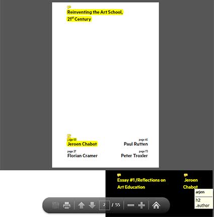
[edit]Before we started adding this information to the HTML, we walked through the publication. Together we decided what would be the correct semantic structure and added this as annotations to the file. We could then work in a parallel fashion, individually implementing the structure in the html files. An issue we encountered while defining the structure is that most semantic HTML elements are aimed at the web, so deciding on a suitable semantic structure for both print and web was often a matter of compromise. Because we knew what design we were aiming at, it was easier for us to decide what elements should have classes and which should not. If the design is not ready yet, this may be more of a challenge and will probably change during the course of the project.
Creating the CSS
[edit]This was by far the most challenging part of this project, so we will discuss the challenges separately for every output format.
Web CSS
[edit]For the website, the whole design of the book had to be reimagined. Pages do not exist, information doesn't have to be linear and many interactive posibilities open up. We decided to keep the website largely linear because it seemed to fit the content well. Some interactivity was added: the index was redesigned to become a navigation menu and the footnotes were made into toolips. Because the font (Metric) was not licensed for online use, we had to find a font that was similar. This proved to be very difficult, so we had to compromise. We tried to avoid using javascript when possible, as this can decrease compatibility and increase the complexity of the code. The only exception we made was for the footnotes, because this was simply not possible in CSS. Numbering of figures, pages and tables was also done in CSS. This turned out to work out quite well, although browser support is somewhat limited. At a later stage we realized that this may not have been the optimal solution, since this numbering is vital information and not just a matter of styling.
Responsive web CSS
[edit]Instead of creating a separate mobile output, we made the regular website responsive to screen size. The challenges we encountered while doing this were not much different from the challenges that come with all mobile websites. Even though these challenges also belong to our research topic, they do not represent the most innovative aspects of it. For this reason, documentation regarding this output seems redundant to us.
Epub CSS
[edit]Epub stylesheets proved to be very badly documented. Every device has its own interpretation of CSS, and almost all of them are quite limited. Advanced CSS like numbering works on almost none of the available devices.
We used Pandoc to create the epub, and one limitation was that pandoc can only add one stylesheet. We divided the stylesheet files into a global stylesheet, a print stylesheet and a specific epub stylesheet, all of which should be used for the epub. To solve this, we used a command line utility to merge these stylesheets and save them as one, so that we could use the resulting css for Pandoc.
This resulted in the following command for windows:
type "css\style.css" "css\epub.css" "css\print.css" > "css\epub_composite.css"
pandoc container.html -o book.epub --epub-cover-image=img\cover.jpg --epub-stylesheet=css\epub_composite.css
Print CSS
[edit]Because one of our team member had good experiences in the past with Chrome's print functionality, this was the browser we used for testing. This turned out to be a mistake, because lately Chrome's printing functionality has deteriorated (possibly caused by their change of rendering engine). Many hours were wasted on trying to get the design to work on Chrome, after which we decided to focus on firefox. This proved to be much easier, and most CSS worked correctly.
Prince CSS
[edit]None of the team members had used PrinceXML before, so the process was pretty much 'trial and error' in the begining. There were issues with the CSS files being used for the web version. They had to be imported in the CSS file used for Prince (even though they were being requested in the HTML head).
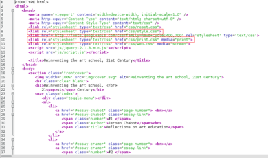
The HTML head, where the CSS files are requested).
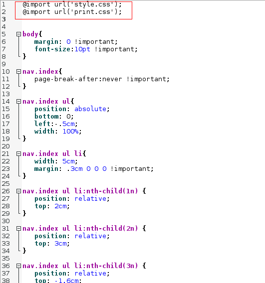
The import command in prince.css (seems redundant but is actually necessary).
Prince has some useful features, such as retrieving content from HTML elements and assigning them to variables (useful if you need to use a Chapter's title in the page footer, for example).
One possible downside is that Prince XML is proprietary software.
To use Prince, a command like the one below is needed:
prince container.html -s css/prince.css book.pdf
Documentation on how to use and install PrinceXML can be found here: http://www.princexml.com/doc/
Weasyprint CSS
[edit]Weasyprint works similarly to PrinceXML. However, it is not proprietary software. It is trickyer to install when compared to Prince and does not have all the features that we found in PrinceXML.
weasyprint container.html -s css/weasyprint.css weasybook_final.pdf
Documentation:
- how to install http://weasyprint.org/docs/install/#by-platform
- command-line API http://weasyprint.org/docs/api/#command-line-api
Collaboration
[edit]We worked in parallel on the different outputs, which worked well but sometimes caused little hickups. The most common problem was caused by the fact that we used multiple css stylesheet for every output. For example, when one person was working on the print stylesheet, this could accidentally break the pdf export.
Conclusion
[edit]The main problem at this moment is that a lot of software is just not standards compliant and does not provide sufficient documentation. Many things simply don't work, and other things only work when using proprietary methods. Epub proved to be the most problematic format to create, as most epub readers have very limited support for layout and styling. This may not be a problem because users are not used to their ebooks looking pretty, but it is quite disappointing for designers. The other output formats gave much better results, but the overall lack of standard compliantness made the process much more time consuming than it should be.
Overall, this workflow proved to work well. We needed some time to get used to the process, but it already appears to be a viable alternative to traditional workflows. The biggest challenge is probably that every member of the development team needs a fair bit of technical skill together with an eye for design. If such a team is available, this process can streamline the entire publication process.
Future directions
[edit]Because this process is based on HTML and CSS, it can be combined with several existing technologies and platforms. For example, in the future we plan to use a wiki as the source. Wiki's allow for the collaborative creation of content, which can easily and automatically be converted to HTML. This HTML can then serve as the source file for the publication process that we just described.
Another possible future research subject is the possibility of developing a WYSIWYG editor that strongly enforces a semantically and structurally correct layout. This would vastly simplify the first two steps of our process, and ideally render them obsolete.
Output previews
[edit]| (RESPONSIVE) WEBSITE | EPUB | PRINCE pdf | WEASYPRINT pdf |
| VISIT | File:All-in-one-publishing-epub.zip | 
|

|
