CSS Grid: Difference between revisions
From Publication Station
VKranendonk (talk | contribs) No edit summary |
VKranendonk (talk | contribs) No edit summary |
||
| Line 18: | Line 18: | ||
.grid-container { | .grid-container { | ||
display: grid; | display: grid; | ||
grid-template-columns: 200px 200px 200px; // | grid-template-columns: 200px 200px 200px; // 3 columns of 200px | ||
grid-template-rows: 300px 300px; // | grid-template-rows: 300px 300px; // 2 rows of 300px | ||
} | } | ||
</style> | </style> | ||
Revision as of 14:51, 2 September 2022
With CSS there are multiple ways of positioning elements such as `position: absolute` and `display: flex`. CSS grid is a really handy property to position elements on a grid layout.
This article describes the basic concepts of CSS grid and links to resources with more info on CSS grid.
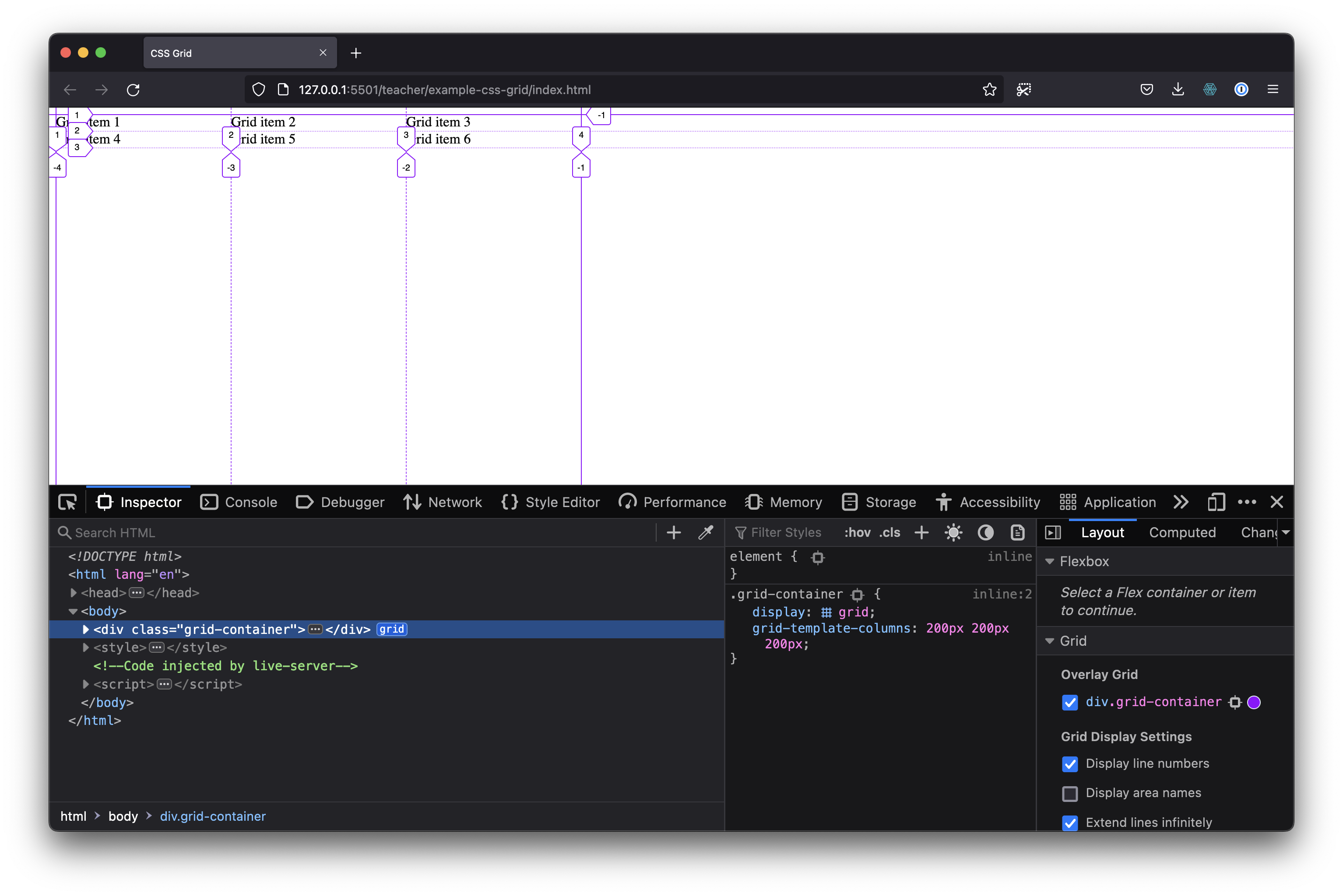
CSS grid places its direct children onto a "grid". The following code create a grid of 3 columns, each column 200px wide and 2 rows of 300px height.
<div class="grid-container>
  <div>Grid item 1</div>
  <div>Grid item 2</div>
  <div>Grid item 3</div>
  <div>Grid item 4</div>
  <div>Grid item 5</div>
  <div>Grid item 6</div>
</div>

<style>
.grid-container {
  display: grid;
  grid-template-columns: 200px 200px 200px; // 3 columns of 200px
  grid-template-rows: 300px 300px; // 2 rows of 300px
}
</style>
Resources
- CSS Grid course by Wes Bos is full-on in depth course on CSS Grid
- MDN Web Docs has a good introduction to CSS Grid
- CSS Grid Garden is a fun CSS grid game
- CSS Tricks has a good reference article on CSS Grid

