CSS Grid: Difference between revisions
VKranendonk (talk | contribs) No edit summary |
VKranendonk (talk | contribs) No edit summary |
||
| (4 intermediate revisions by the same user not shown) | |||
| Line 119: | Line 119: | ||
== Dev tool tip == | == Dev tool tip == | ||
In Firefox developer tools you can show the CSS grid by clicking on the grid icon. | In Firefox developer tools you can show the CSS grid by clicking on the grid icon between "display" and "grid". | ||
[[File:Css-grid-ff-dev-tool.gif]] | [[File:Css-grid-ff-dev-tool.gif]] | ||
In Chrome developer tools you can click the grid icon next to the HTML element. | |||
[[File:Css-grid-ff-chrome-tool.gif]] | |||
== Resources == | == Resources == | ||
* [https://www.w3schools.com/css/css_grid.asp W3 Schools] overview of basic CSS properties including visuals | |||
* [https://cssgrid.io/ CSS Grid course by Wes Bos] is full-on in depth course on CSS Grid | * [https://cssgrid.io/ CSS Grid course by Wes Bos] is full-on in depth course on CSS Grid | ||
* [https://developer.mozilla.org/en-US/docs/Web/CSS/CSS_Grid_Layout/Basic_Concepts_of_Grid_Layout MDN Web Docs] has a good introduction to CSS Grid | * [https://developer.mozilla.org/en-US/docs/Web/CSS/CSS_Grid_Layout/Basic_Concepts_of_Grid_Layout MDN Web Docs] has a good introduction to CSS Grid | ||
* [https://cssgridgarden.com/ CSS Grid Garden] is a fun CSS grid game | * [https://cssgridgarden.com/ CSS Grid Garden] is a fun CSS grid game | ||
* [https://css-tricks.com/snippets/css/complete-guide-grid/ CSS Tricks] has a good reference article on CSS Grid | * [https://css-tricks.com/snippets/css/complete-guide-grid/ CSS Tricks] has a good reference article on CSS Grid | ||
Latest revision as of 08:04, 12 September 2022
In CSS land there are multiple ways of positioning elements. The most common methods are absolute positioning position: absolute;display: flex;display: grid;
This article describes how to create a layout with CSS Grid.
Video
[edit]You can follow the video and read the steps below the video.
{{#evt: service=vimeo |id=746478143 |dimensions=x420 }}
Parent and children
[edit]CSS grid places its direct children onto a "grid". In the following HTML snippet the parent element has the class 'grid-container' and 6 children.
<div class="grid-container">
  <div>Grid item 1</div>
  <div>Grid item 2</div>
  <div>Grid item 3</div>
  <div>Grid item 4</div>
  <div>Grid item 5</div>
  <div>Grid item 6</div>
</div>
We first have to set the parent element to be displayed as a grid via the CSS property display
<style>
.grid-container {
  display: grid;
}
</style>
Columns and rows
[edit]We also have to create columns and or rows. The CSS properties grid-template-columnsgrid-template-rows
<style>
.grid-container {
  display: grid;
  grid-template-columns: 200px 200px 200px;
  grid-template-rows: 300px 300px;
}
</style>
You can set the amount of columns by adding or removing values:
grid-template-columns: 200px 200px;grid-template-columns: 200px 200px 200px;grid-template-columns: 300px 500px 500px;
The following snippet combines columns and rows to create a grid.
<div class="grid-container">
  <div>Grid item 1</div>
  <div>Grid item 2</div>
  <div>Grid item 3</div>
  <div>Grid item 4</div>
  <div>Grid item 5</div>
  <div>Grid item 6</div>
</div>

<style>
.grid-container {
  display: grid;
  grid-template-columns: 200px 200px 200px;
  grid-template-rows: 300px 300px;
}
</style>
Fractions
[edit]Instead of pixels you can also use fr
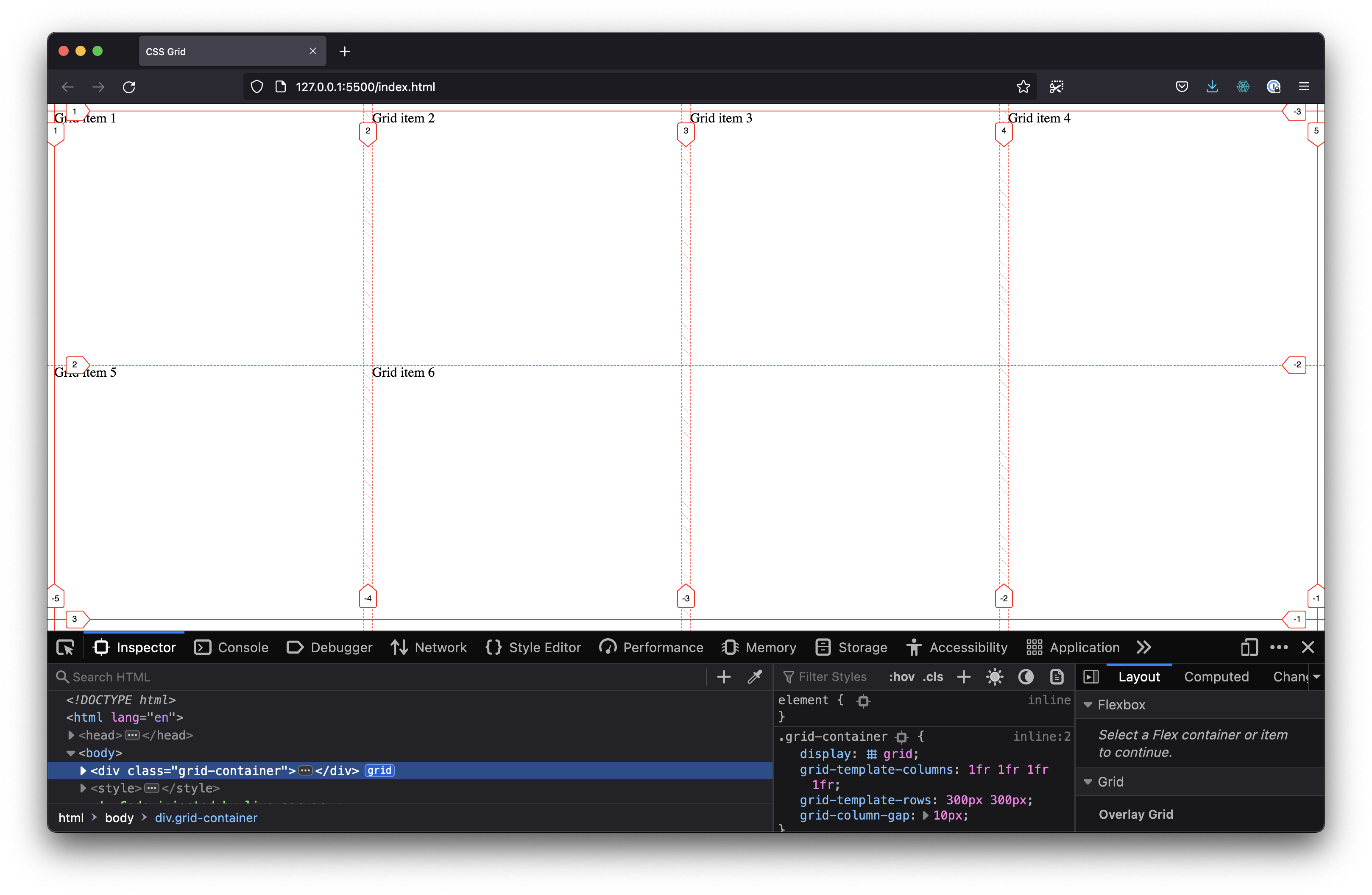
In the following snippet we set grid-template-columns: 1fr 1fr 1fr 1fr;
We also add grid-column-gap: 10px;
<div class="grid-container">
  <div>Grid item 1</div>
  <div>Grid item 2</div>
  <div>Grid item 3</div>
  <div>Grid item 4</div>
  <div>Grid item 5</div>
  <div>Grid item 6</div>
</div>

<style>
.grid-container {
  display: grid;
  grid-template-columns: 1fr 1fr 1fr 1fr;
  grid-template-rows: 300px 300px;
  grid-column-gap: 10px;
}
</style>
Dev tool tip
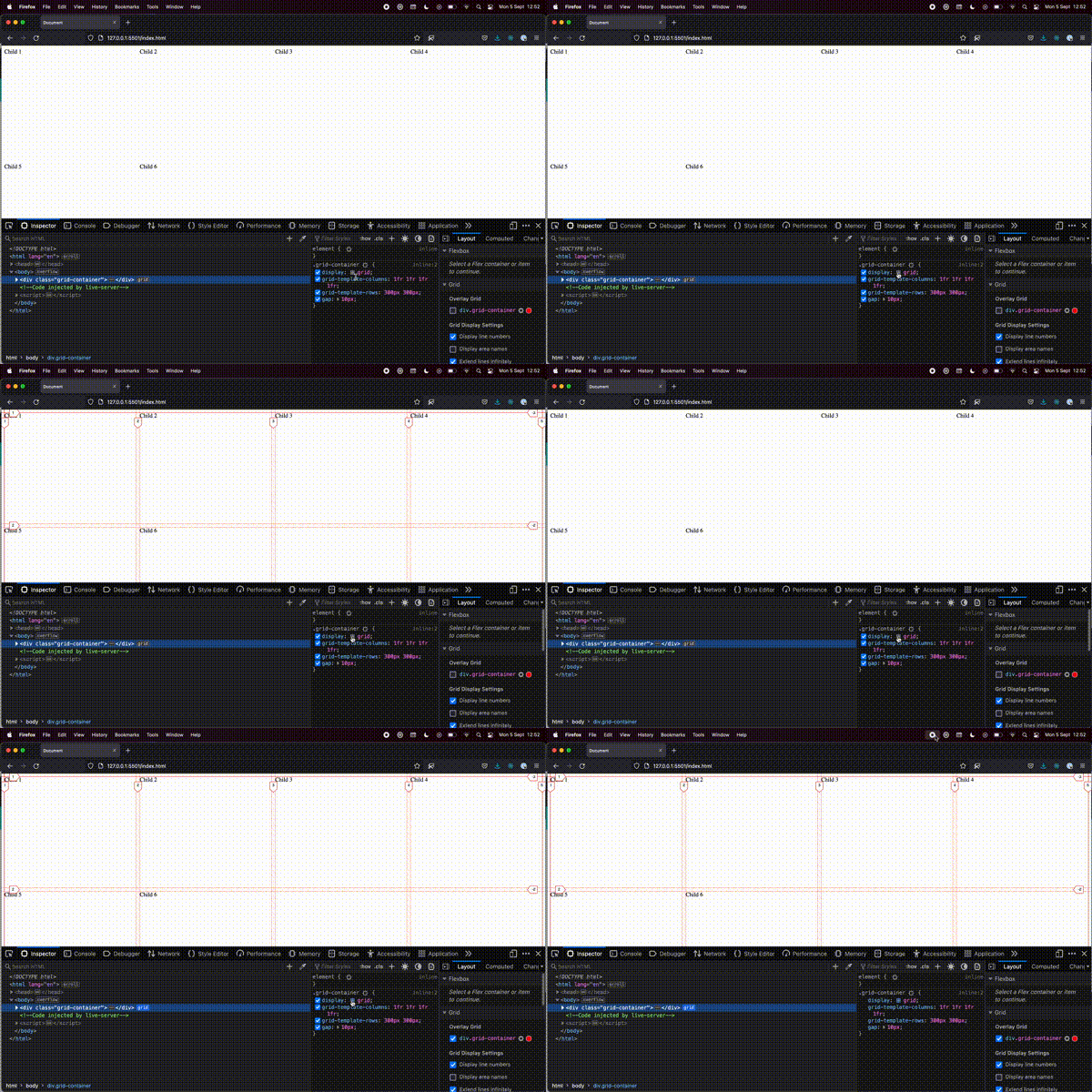
[edit]In Firefox developer tools you can show the CSS grid by clicking on the grid icon between "display" and "grid".
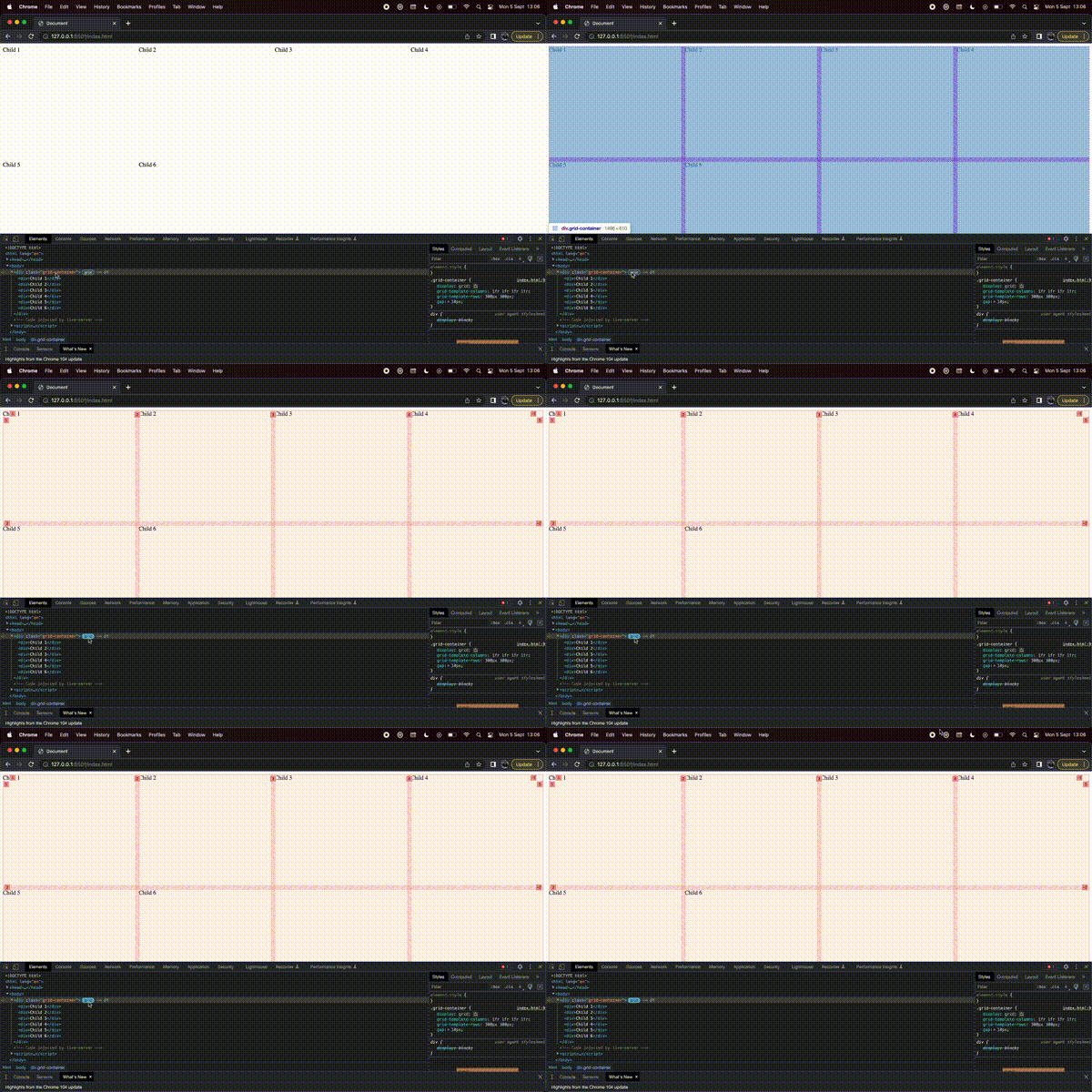
In Chrome developer tools you can click the grid icon next to the HTML element.
Resources
[edit]- W3 Schools overview of basic CSS properties including visuals
- CSS Grid course by Wes Bos is full-on in depth course on CSS Grid
- MDN Web Docs has a good introduction to CSS Grid
- CSS Grid Garden is a fun CSS grid game
- CSS Tricks has a good reference article on CSS Grid


