Lukas Engelhardt: Difference between revisions
No edit summary |
No edit summary |
||
| (23 intermediate revisions by the same user not shown) | |||
| Line 1: | Line 1: | ||
This is what team Diacrew did. | |||
= How it all started = | = How it all started = | ||
In the second lesson of the quarter, everybody from team REX shared their initial ideas and points of interest, after which we were asked to form teams. That was a long and uncomfortable situation, mostly when it came to telling someone that they were the one that "didn’t fit” the group. Somehow Carmen, Arthur, Daniel and I ended up in a group together. I took notes in that first sessions, these were our main points of interest at that point: | In the second lesson of the quarter, everybody from team REX shared their initial ideas and points of interest, after which we were asked to form teams. That was a long and uncomfortable situation, mostly when it came to telling someone that they were the one that "didn’t fit” the group. Somehow Carmen, Arthur, Daniel and I ended up in a group together. I took notes in that first sessions, these were our main points of interest at that point: | ||
Daniel | ==== Daniel ==== | ||
* Ways to attract the alumni to generate content | * Ways to attract the alumni to generate content | ||
* low cost, concepts to achieve that | * low cost, concepts to achieve that | ||
| Line 10: | Line 12: | ||
* Analogue: matrix printing to give away? | * Analogue: matrix printing to give away? | ||
Arthur | ==== Arthur ==== | ||
* explore the craft of making a magazine, translate print into digital, make the content social based! | * explore the craft of making a magazine, translate print into digital, make the content social based! | ||
* Make it open source, decentralised, customized | * Make it open source, decentralised, customized | ||
* Include people that are not finished yet? | * Include people that are not finished yet? | ||
Carmen | ==== Carmen ==== | ||
* Not one magazine | * Not one magazine | ||
* Create a publishing house of the school | * Create a publishing house of the school | ||
| Line 23: | Line 25: | ||
* A place for people to share also their own reflection etc. | * A place for people to share also their own reflection etc. | ||
Lukas | ==== Lukas ==== | ||
* Multimedia - what can that mean, maybe also analogue | * Multimedia - what can that mean, maybe also analogue | ||
* How to generate content? Who makes content? Can we use original work instead of writing about alumni’s works? | * How to generate content? Who makes content? Can we use original work instead of writing about alumni’s works? | ||
| Line 35: | Line 37: | ||
* magazines are often cheap, throwaway objects. Then there is high class magazines that you collect but that’s not so interesting for us, money and all. Can we make something cheap, with a throwaway character where it’s somehow good to throw it away? Something with recycling, or can it have another purpose after * It’s read? Like you can plant a seed with it or something like that | * magazines are often cheap, throwaway objects. Then there is high class magazines that you collect but that’s not so interesting for us, money and all. Can we make something cheap, with a throwaway character where it’s somehow good to throw it away? Something with recycling, or can it have another purpose after * It’s read? Like you can plant a seed with it or something like that | ||
= | = The Beginnings = | ||
After some initial brain storming sessions we had agreed on a few themes and general ideas, after which we created a first plan of action. I remember that Mantas was talking about the notion of what an alumni is in that first lesson; do people that quit school or changed their practice count? We decided they did, and we wanted to find a system for the school to build up a dialogue with them. | |||
= Refining the concept | One thing we were all very interested in was “openness”, also in journalism. I had initially been assigned to the Beyond Social team, and had gotten a short introduction about it before I could convince all the involved teachers that I would be much happier working on the REX assignment. I did however really like the publishing system behind REX and took some of the ideas with me into this new assignment - initially also, and especially, the print on demand function. At this point we were all very fixed on a physical component of the end publication. We were thinking about this print on demand function but also about events, talks etc. that could company the web publication. | ||
We agreed that we would try something based on content provided by the alumni, rather then just writing showcasing them. To get to these topics we wanted to interview some of them, and try to find interesting topics, themes, possibilities for content basically. It’s important to note that at this stage we were not planning to take on the roles of editors but were looking at the interviews more as a starting point for us to find about about our options in terms of content. | |||
We weren’t sure where this would ultimately go but we started looking for, and then contacting a lot of alumni. We set up a standard email, but often also just wrote personalised emails. From the beginning we had agreed that we would like to try out different kinds of interviews, but especially through the alumni's responses we got pushed further in that direction. We got a lot of answers and almost all of them were very open to the idea, so we just started to schedule interviews. The first one we did was with the cheap fashion lady. In this period we made out first plan of action: | |||
==== Generate topics ==== | |||
* Talk to the alumni! | |||
* It doesn’t matter when they graduated or what they do now | |||
* In a conversation with them try to find interesting topics, themes, statements, something | |||
==== Generate Content ==== | |||
* Ask the alumni if they would directly like to contribute to the magazine | |||
* We could publish an interview, maybe combined with or focused on photography | |||
* We could ask them to contribute original content: a piece of work, an essay, an account of events, etc. | |||
* We take topics/statements from the conversations with the alumni, and ask the school to react to it: | |||
* This can incorporate students or teachers, the people at the stations or the FaDi | |||
* There is no limit to the type of content: text, image, artworks, whatever | |||
==== Categorise content (back end) ==== | |||
* We categorise the content that we created in a sort of Wiki, or any other content management system | |||
* We tag things (cross reference) and relate it to their “origin" | |||
* There should be access to the original source of information (interviews, conversations) | |||
* It should be clear to which person this relates: what year, which domain, which alumni | |||
* It should be possible to read through the whole interview/conversation that we had with them in order to be able to react to it | |||
==== Showing content (front end) ==== | |||
* An online publication that displays the content from the back end automatically | |||
* sorted by tags etc | |||
* some kind of other manifestations of the content, however packaged: | |||
* posters | |||
* events/talks | |||
* a printed issue/selection | |||
==== Our template mail ==== | |||
''Dear (person),'' | |||
''we are four Graphic Design students from the Willem de Kooning academy working on a redesign for the school’s alumni magazine R-EX. We are in the process of creating an online magazine that is based on interviews and original content by alumni students. The current members of the school then have the option to freely react on the content in the form of texts or related art works. Hopefully this will lead to an active conversation between current and former members of the academy.'' | |||
''We’re sending you this email to ask you if you would like to contribute to this publication in the form of an interview! If so, we would really like to invite you to an informal cup of coffee or lunch, or if that is not possible drop by at your current work or set up a Skype interview! We’re focusing on things related to your time as a student at the Willem de Kooning Academy but are open to all kinds of topics, form and content!'' | |||
''We hope to hear back from you soon!'' | |||
''Best regards,'' | |||
''Lukas, Carmen, Daniel & Arthur'' | |||
= Refining the Concept = | |||
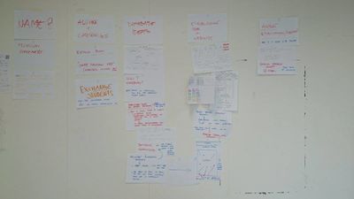
We continued discussing our concept and possible design decisions. We really wanted to make it an open interface that allows room for breaking rules and new ways of displaying and organising content. We looked at several contemporary websites and were also thinking about something that is self generating, or changes forms every time you visit the page. Daniel started scripting something that changed colour and font size based on how often a certain letter appeared in a text for example. In general we all agreed we wanted something “rough”, layered, maybe even chaotic. | |||
In this stage we also came up with our idea for the comments. We were initially inspired by Soundcloud and were trying to translate that to our website: What if it’s possible to literally comment anything anywhere on the page, like a inboard? We tried finding existing examples online but didn’t find much. | |||
At the same time we started thinking more about the content. We knew that we needed content in order to see where this was going, and we had gotten our first responses from alumni, even though we had not yet interviewed anybody. We started thinking about the situations we would be in with the alumni, and how we could influence them. Rhetorically but also through designed situations: where we would meet them, things we would prepare, how we would manage to keep the situation natural. | |||
This made us question our role as editors more and more, or rather made us aware of it. While initially we were hoping for contributions by the alumni we realised more and more that we would have a direct impact on the content we would publish, that it would include our opinions, personalities and biases. | |||
[[File:FIN_planning1.jpg|400px]] [[File:FIN_planning2.jpg|400px]] | |||
= The Interviews = | = The Interviews = | ||
==== Scheduling interviews ==== | |||
The main phase of the project had started! We scheduled more and more interviews, and started interviewing people, and recording the results. We even created a [https://www.google.com/calendar/embed?src=1ohilina3ebm50076uj6taknms%40group.calendar.google.com&ctz=Europe/Amsterdam google calendar] to schedule our interviews. | |||
At this point we had decided to try out different things in the interviews. We logged all of our experiences and ideas in our wiki, which can be found here: | |||
* [[1._Different_types_of_interviews|Types of interviews]] | |||
==== First design sketches ==== | |||
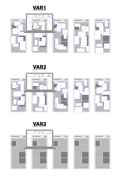
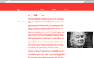
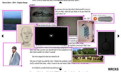
At the same time we started to design our possible end product, also because we had to give a first presentation in March. We went through a lot of different ideas and layouts, and ended at a tag/filtration based navigation. We started of with a wireframe that I made and then started exploring some visual directions. These were rough sketches, also for us, and not intended as actual end results. | |||
[[File:Wireframe v1-01.png|400px]] [[File:Fin_Sketch_1.png|400px]] [[File:Fin_Sketch_2.png|400px]] [[File:Fin_Sketch_3.png|400px]] [[File:Fin_Sketch_4.png|400px]] [[File:Fin_Sketch_5.png|400px]] | |||
==== Inspiration ==== | |||
===== Designs ===== | |||
* [[http://lust.nl/ http://lust.nl/]] | |||
* [[http://www.satellitesmistakenforstars.com/ http://www.satellitesmistakenforstars.com/]] | |||
* [[http://typojanchi.org/2013/en/#contents http://typojanchi.org/2013/en/#contents]] | |||
* [[http://www.paperrad.org/ http://www.paperrad.org/]] | |||
===== User generated art ===== | |||
* [[http://www.reeeeeeeeeeeeks.nl/ http://www.reeeeeeeeeeeeks.nl/]] | |||
===== Openness/disclosing sources ===== | |||
* [[http://jviewz.com/#/the-project http://jviewz.com/#/the-project]] | |||
===== Navigation/structure ===== | |||
* [[http://www.monramos.com/ http://www.monramos.com/]] | |||
* [[http://ro-lu.com/ http://ro-lu.com/]] | |||
===== Random ===== | |||
* [[http://homebrewserver.club/~joak/oohaah/ http://homebrewserver.club/~joak/oohaah/]] | |||
==== The Wiki ==== | |||
In this period I got also more and more interested in the idea of a wiki as a grounds for a publication system. I had heard that somebody from the publication station was behind it, so I went there, inquired a bit and after about an hour of searching and sing people who Andre Castro could possibly be, I found him and had a short conversation with him. Initially I had intended to ask him for some tips about how to approach this system, but he was enthusiastic about our project and told me about the plans for a publishing house in the WDKA. He even offered a kind of collaboration as in that he would give us workshops and walk us through the set up of such a project. Ironically this was 2 days before we all had a class with him on exactly this topic. | |||
This is when we also started looking at technical solutions for our website, different kinds of comment systems for example: | |||
* [[http://aroc.github.io/side-comments-demo/ http://aroc.github.io/side-comments-demo/]] | |||
* [[https://medium.com/the-year-of-the-looking-glass/the-idea-person-e08e36f9024d https://medium.com/the-year-of-the-looking-glass/the-idea-person-e08e36f9024d]] | |||
* [[http://genius.it/en.wikipedia.org/wiki/Christy_Walton http://genius.it/en.wikipedia.org/wiki/Christy_Walton]] | |||
* [[http://kotaku.com/the-maker-of-the-trollface-meme-is-counting-his-money-1696228810 http://kotaku.com/the-maker-of-the-trollface-meme-is-counting-his-money-1696228810]] | |||
==== The Name ==== | |||
In this period we also started thinking about a possible name for the magazine. We knew from the beginning that R-EX was not what we wanted but couldn’t come up with anything better than Wrecks, or WRCKS, which was our working title until close to the end. | |||
= Presentation 1 = | = Presentation 1 = | ||
On the 21st of March we had our first presentation to the client! | |||
[[Media:FIN_presentation_1.pdf|Presentation 1.pdf]] | |||
We got pretty good feed back from the teachers and the client: | |||
==== Feedback Xenia ==== | |||
===== Structure of the comments: ===== | |||
* We should not compromise on our concept but make it usable in some way! | |||
* maybe through tags | |||
* maybe through colour coding? | |||
===== Test it! ===== | |||
* TEST our layout on somebody that is not involved in the project | |||
* maybe we can make a photoshop sliced version of it that becomes clickable to fake usability | |||
===== WHY? ===== | |||
* What is our main point? Why are we doing this? | |||
* is it about conversation? | |||
* about creating a beautiful image? | |||
* is it a study of people’s reactions? | |||
===== IN THE FUTURE: ===== | |||
* Why should other people keep doing what we’re doing? | |||
* What is the incentive for them? | |||
* Are we going to have themes, content wise? | |||
* Who selects the people? | |||
* What is the incentive for alumni? | |||
===== Suggestions ===== | |||
* Maybe film the interviews? | |||
* Check out Daniel van der Velden from Metahaven | |||
* I there too much stuff? so we have to make the project slimmer? | |||
* She feels stressed by too much content (Is she just old?) | |||
==== Feedback Anja, Gabrielle ==== | |||
===== They like it!!! ===== | |||
* Anja really likes the going-back-in-time-thing | |||
* If it’s not so usable, it shouldn’t dominate the design though | |||
* If it’s too much effort we shouldn’t do it | |||
===== The students that take over ===== | |||
* Meeting someone can be enough incentive | |||
* if there is one person who assigns and arranges meetings it would be interesting for the students to take part! | |||
* Check out Will Holder: Yeas, but is it edible performance | |||
* The part of meeting people is enough of a physical aspect | |||
* it’s part of the design process, so really design it | |||
= Development = | |||
==== Interviews ==== | |||
We were mostly into interviewing people now. We ended up talking to and recording 6 alumni, one of them in Amsterdam, all of which can be found on our wiki: | |||
* [[ISSUE_1|List of interviews]] | |||
All of the meetings went really well, we ended up having very interesting conversations with all of them. We also started transcribing our meetings. Again, we logged all of our tips, experiences and idea in our wiki guide: | |||
* [[1._Different_types_of_interviews|Types of interviews]] | |||
* [[2._Different_methods_of_transcribing|Methods of transcribing]] | |||
* [[3._Different_deliverables_of_interviews|Different deliverables]] | |||
* [[4._Context_affects_content|Different interview contexts]] | |||
Organising these meetings took most of our time. Another very time consuming part was transcription. We had a lot of discussions about how to treat the content that we recorded, and how much we edited. In general, especially between Carmen and me there was a bit of an argument about the direction we would take as editors. While I wanted to avoid making the work too much about us as an editorial team, Carmen wanted experimental interviews to be our main focus. We eventually agreed to not limit the kind of interview at all, neither making experimentalism a requirement nor taking that option away. In this way all future editorial teams would be able to do exactly what they want to do. | |||
==== Designs ==== | |||
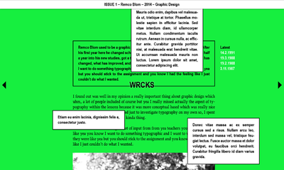
We also developed some new designs, and especially a new structure, which were meant as a solution more seriously: | |||
[[File:Fin_Sketch_6.png|400px]] [[File:Fin_Sketch_7.png|400px]] [[File:Fin_Sketch_8.png|400px]] | |||
==== Andre ==== | |||
In this time we also had two workshops with Andre. We went into detail about how to set up a wiki and how it could be converted into a webpage. Again, we documented our experiences with the wiki, on the wiki! | |||
* [[5._How_to_use_the_Wiki|Wiki knowledge]] | |||
= Endspurt = | |||
We were really working towards the final presentation now. This meant agreeing on a final website design, visualising functionality, organising our content in the wiki, planning the physical aspect of the publication and planning the presentation itself. | |||
==== The presentation ==== | |||
For our presentation we decided to use some of the experiences we had collected in the interviews. This meant some logistics and planning, since we decided that we wanted to sit down at a table together with the client and the teachers, give out beverages and present on a laptop screen. | |||
We also decided we did not want to show any bullet points, or a presentation as such. Instead, we wanted to mainly talk about our concept, the interviews and our reasoning behind it and show this on a working version of the website. This way we would not have to present the design itself at all, but it would be connected to our story and be the only necessary visualisation. Of course, our main problem was that we had neither a finished design nor any remarkable coding skills. | |||
==== Organising content ==== | |||
Organising the content was more of a structural question than a question of workload. In the final stage before our presentation, though, we all worked very close together, which made decisions like that easy. | |||
==== Physicality ==== | |||
Eventually we agreed that the aspect of the editorial team meeting the alumni is already enough of a physical aspect, especially if every editorial team records their experiences. We organised these experiences on our wiki, where a print on demand function could also be implemented, making it possible to always quickly, on the push of a button, print out the latest version. | |||
==== Name/logo ==== | |||
We had a LOT of difficulties coming up with a name. We discussed a lot of options, here are some: | |||
* talkthentalk | |||
* metalkyou | |||
* wetalkyou | |||
* hightalk | |||
* CHTS | |||
* Yakyak | |||
* az | |||
* powwow | |||
* pillow talk | |||
* talkfest | |||
* TLKFST | |||
* tête-à-tête | |||
* TTaTT | |||
* RLY | |||
* S-EX | |||
* TaT-a-TaT | |||
* RL | |||
* CRCL | |||
* out | |||
* PUT OUT | |||
* TaTaTaT | |||
* TETATET | |||
Finally Arthur came up with our final decision: fin | |||
Daniel and I then sketched with the logos for a while and arrived at a conclusion: | |||
[[File:Logolukas.png|400px]] [[File:Logodaniel1.jpg|400px]] [[File:Logodaniel2.jpg|400px]] | |||
==== Design/Visualisation ==== | |||
We made all decisions in a group but the main discussion about the design was between me and Daniel. I initially did some research into typography, and was mostly influenced by these 4 things I found on the web: | |||
* [http://practicaltypography.com/ http://practicaltypography.com/] | |||
* [http://ia.net/ http://ia.net/] | |||
* [http://peteanicholson.com/ http://peteanicholson.com/] | |||
* [http://payload255.cargocollective.com/1/3/104814/7414585/BAP_2014_OneOnOne_ImageByHelloMeTillWiedeck.jpg http://payload255.cargocollective.com/1/3/104814/7414585/BAP_2014_OneOnOne_ImageByHelloMeTillWiedeck.jpg] | |||
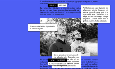
After a lot of discussions and steps in between we ended up at our final design: | |||
[[File:FIN_Daniel1.jpg|400px]] [[File:FIN_Daniel2.jpg|400px]] [[File:FIN_Daniel3.jpg|400px]] [[File:FIN_Lukas1.jpg|400px]] [[File:FIN_Final1.png|400px]] [[File:FIN_Final2.png|400px]] | |||
Daniel did all of the coding for our trial version of the site. At this stage we worked very close together and while he was coding I would send him new parts of the design or he would ask me for changes and I would execute them for him. This was really effective and also very fun to work on! | |||
Latest revision as of 02:54, 24 April 2015
This is what team Diacrew did.
How it all started
[edit]In the second lesson of the quarter, everybody from team REX shared their initial ideas and points of interest, after which we were asked to form teams. That was a long and uncomfortable situation, mostly when it came to telling someone that they were the one that "didn’t fit” the group. Somehow Carmen, Arthur, Daniel and I ended up in a group together. I took notes in that first sessions, these were our main points of interest at that point:
Daniel
[edit]- Ways to attract the alumni to generate content
- low cost, concepts to achieve that
- create a system/software to log all the data that also influences the design, publishing of the publication
- Software based! Focus on the backend.
- Analogue: matrix printing to give away?
Arthur
[edit]- explore the craft of making a magazine, translate print into digital, make the content social based!
- Make it open source, decentralised, customized
- Include people that are not finished yet?
Carmen
[edit]- Not one magazine
- Create a publishing house of the school
- Focus on topics of interest, rather than just portfolio. Literature, philosophy, sources of inspiration
- Randomness in the editorial part. Share knowledge, don’t restrict yourself
- A central place to organise content/research
- A place for people to share also their own reflection etc.
Lukas
[edit]- Multimedia - what can that mean, maybe also analogue
- How to generate content? Who makes content? Can we use original work instead of writing about alumni’s works?
- how can you go away from the magazine as just being a static magazine but make it “interactive”, multimedia, add another layer of experience? Something with folding maybe? Glueing? What is the easiest way to distribute it - as a cube that you have to assemble?
- articles: styles of writing, reports, insights: who writes the articles, how?
- interactive print - something that can be read/done together, or pieced together maybe?
- A magazine can be something that people don’t just read, but that they also act upon
- who was it targeted at? how to reach those people?
- alternative models of distribution: do it yourself? Together with other art schools, institutions maybe?
- democratisation of production: everybody has a printer, see beyond social
- magazines are often cheap, throwaway objects. Then there is high class magazines that you collect but that’s not so interesting for us, money and all. Can we make something cheap, with a throwaway character where it’s somehow good to throw it away? Something with recycling, or can it have another purpose after * It’s read? Like you can plant a seed with it or something like that
The Beginnings
[edit]After some initial brain storming sessions we had agreed on a few themes and general ideas, after which we created a first plan of action. I remember that Mantas was talking about the notion of what an alumni is in that first lesson; do people that quit school or changed their practice count? We decided they did, and we wanted to find a system for the school to build up a dialogue with them.
One thing we were all very interested in was “openness”, also in journalism. I had initially been assigned to the Beyond Social team, and had gotten a short introduction about it before I could convince all the involved teachers that I would be much happier working on the REX assignment. I did however really like the publishing system behind REX and took some of the ideas with me into this new assignment - initially also, and especially, the print on demand function. At this point we were all very fixed on a physical component of the end publication. We were thinking about this print on demand function but also about events, talks etc. that could company the web publication.
We agreed that we would try something based on content provided by the alumni, rather then just writing showcasing them. To get to these topics we wanted to interview some of them, and try to find interesting topics, themes, possibilities for content basically. It’s important to note that at this stage we were not planning to take on the roles of editors but were looking at the interviews more as a starting point for us to find about about our options in terms of content.
We weren’t sure where this would ultimately go but we started looking for, and then contacting a lot of alumni. We set up a standard email, but often also just wrote personalised emails. From the beginning we had agreed that we would like to try out different kinds of interviews, but especially through the alumni's responses we got pushed further in that direction. We got a lot of answers and almost all of them were very open to the idea, so we just started to schedule interviews. The first one we did was with the cheap fashion lady. In this period we made out first plan of action:
Generate topics
[edit]- Talk to the alumni!
- It doesn’t matter when they graduated or what they do now
- In a conversation with them try to find interesting topics, themes, statements, something
Generate Content
[edit]- Ask the alumni if they would directly like to contribute to the magazine
- We could publish an interview, maybe combined with or focused on photography
- We could ask them to contribute original content: a piece of work, an essay, an account of events, etc.
- We take topics/statements from the conversations with the alumni, and ask the school to react to it:
- This can incorporate students or teachers, the people at the stations or the FaDi
- There is no limit to the type of content: text, image, artworks, whatever
Categorise content (back end)
[edit]- We categorise the content that we created in a sort of Wiki, or any other content management system
- We tag things (cross reference) and relate it to their “origin"
- There should be access to the original source of information (interviews, conversations)
- It should be clear to which person this relates: what year, which domain, which alumni
- It should be possible to read through the whole interview/conversation that we had with them in order to be able to react to it
Showing content (front end)
[edit]- An online publication that displays the content from the back end automatically
- sorted by tags etc
- some kind of other manifestations of the content, however packaged:
- posters
- events/talks
- a printed issue/selection
Our template mail
[edit]Dear (person),
we are four Graphic Design students from the Willem de Kooning academy working on a redesign for the school’s alumni magazine R-EX. We are in the process of creating an online magazine that is based on interviews and original content by alumni students. The current members of the school then have the option to freely react on the content in the form of texts or related art works. Hopefully this will lead to an active conversation between current and former members of the academy.
We’re sending you this email to ask you if you would like to contribute to this publication in the form of an interview! If so, we would really like to invite you to an informal cup of coffee or lunch, or if that is not possible drop by at your current work or set up a Skype interview! We’re focusing on things related to your time as a student at the Willem de Kooning Academy but are open to all kinds of topics, form and content!
We hope to hear back from you soon!
Best regards, Lukas, Carmen, Daniel & Arthur
Refining the Concept
[edit]We continued discussing our concept and possible design decisions. We really wanted to make it an open interface that allows room for breaking rules and new ways of displaying and organising content. We looked at several contemporary websites and were also thinking about something that is self generating, or changes forms every time you visit the page. Daniel started scripting something that changed colour and font size based on how often a certain letter appeared in a text for example. In general we all agreed we wanted something “rough”, layered, maybe even chaotic.
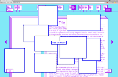
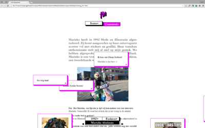
In this stage we also came up with our idea for the comments. We were initially inspired by Soundcloud and were trying to translate that to our website: What if it’s possible to literally comment anything anywhere on the page, like a inboard? We tried finding existing examples online but didn’t find much.
At the same time we started thinking more about the content. We knew that we needed content in order to see where this was going, and we had gotten our first responses from alumni, even though we had not yet interviewed anybody. We started thinking about the situations we would be in with the alumni, and how we could influence them. Rhetorically but also through designed situations: where we would meet them, things we would prepare, how we would manage to keep the situation natural.
This made us question our role as editors more and more, or rather made us aware of it. While initially we were hoping for contributions by the alumni we realised more and more that we would have a direct impact on the content we would publish, that it would include our opinions, personalities and biases.
The Interviews
[edit]Scheduling interviews
[edit]The main phase of the project had started! We scheduled more and more interviews, and started interviewing people, and recording the results. We even created a google calendar to schedule our interviews.
At this point we had decided to try out different things in the interviews. We logged all of our experiences and ideas in our wiki, which can be found here:
First design sketches
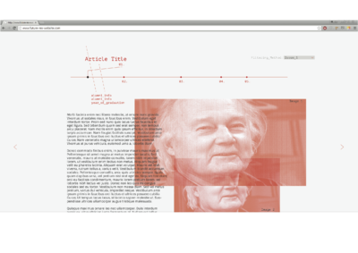
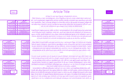
[edit]At the same time we started to design our possible end product, also because we had to give a first presentation in March. We went through a lot of different ideas and layouts, and ended at a tag/filtration based navigation. We started of with a wireframe that I made and then started exploring some visual directions. These were rough sketches, also for us, and not intended as actual end results.
Inspiration
[edit]Designs
[edit]- [http://lust.nl/]
- [http://www.satellitesmistakenforstars.com/]
- [http://typojanchi.org/2013/en/#contents]
- [http://www.paperrad.org/]
User generated art
[edit]Openness/disclosing sources
[edit]Navigation/structure
[edit]Random
[edit]The Wiki
[edit]In this period I got also more and more interested in the idea of a wiki as a grounds for a publication system. I had heard that somebody from the publication station was behind it, so I went there, inquired a bit and after about an hour of searching and sing people who Andre Castro could possibly be, I found him and had a short conversation with him. Initially I had intended to ask him for some tips about how to approach this system, but he was enthusiastic about our project and told me about the plans for a publishing house in the WDKA. He even offered a kind of collaboration as in that he would give us workshops and walk us through the set up of such a project. Ironically this was 2 days before we all had a class with him on exactly this topic.
This is when we also started looking at technical solutions for our website, different kinds of comment systems for example:
- [http://aroc.github.io/side-comments-demo/]
- [https://medium.com/the-year-of-the-looking-glass/the-idea-person-e08e36f9024d]
- [http://genius.it/en.wikipedia.org/wiki/Christy_Walton]
- [http://kotaku.com/the-maker-of-the-trollface-meme-is-counting-his-money-1696228810]
The Name
[edit]In this period we also started thinking about a possible name for the magazine. We knew from the beginning that R-EX was not what we wanted but couldn’t come up with anything better than Wrecks, or WRCKS, which was our working title until close to the end.
Presentation 1
[edit]On the 21st of March we had our first presentation to the client!
We got pretty good feed back from the teachers and the client:
Feedback Xenia
[edit]Structure of the comments:
[edit]- We should not compromise on our concept but make it usable in some way!
- maybe through tags
- maybe through colour coding?
Test it!
[edit]- TEST our layout on somebody that is not involved in the project
- maybe we can make a photoshop sliced version of it that becomes clickable to fake usability
WHY?
[edit]- What is our main point? Why are we doing this?
- is it about conversation?
- about creating a beautiful image?
- is it a study of people’s reactions?
IN THE FUTURE:
[edit]- Why should other people keep doing what we’re doing?
- What is the incentive for them?
- Are we going to have themes, content wise?
- Who selects the people?
- What is the incentive for alumni?
Suggestions
[edit]- Maybe film the interviews?
- Check out Daniel van der Velden from Metahaven
- I there too much stuff? so we have to make the project slimmer?
- She feels stressed by too much content (Is she just old?)
Feedback Anja, Gabrielle
[edit]They like it!!!
[edit]- Anja really likes the going-back-in-time-thing
- If it’s not so usable, it shouldn’t dominate the design though
- If it’s too much effort we shouldn’t do it
The students that take over
[edit]- Meeting someone can be enough incentive
- if there is one person who assigns and arranges meetings it would be interesting for the students to take part!
- Check out Will Holder: Yeas, but is it edible performance
- The part of meeting people is enough of a physical aspect
- it’s part of the design process, so really design it
Development
[edit]Interviews
[edit]We were mostly into interviewing people now. We ended up talking to and recording 6 alumni, one of them in Amsterdam, all of which can be found on our wiki:
All of the meetings went really well, we ended up having very interesting conversations with all of them. We also started transcribing our meetings. Again, we logged all of our tips, experiences and idea in our wiki guide:
Organising these meetings took most of our time. Another very time consuming part was transcription. We had a lot of discussions about how to treat the content that we recorded, and how much we edited. In general, especially between Carmen and me there was a bit of an argument about the direction we would take as editors. While I wanted to avoid making the work too much about us as an editorial team, Carmen wanted experimental interviews to be our main focus. We eventually agreed to not limit the kind of interview at all, neither making experimentalism a requirement nor taking that option away. In this way all future editorial teams would be able to do exactly what they want to do.
Designs
[edit]We also developed some new designs, and especially a new structure, which were meant as a solution more seriously:
Andre
[edit]In this time we also had two workshops with Andre. We went into detail about how to set up a wiki and how it could be converted into a webpage. Again, we documented our experiences with the wiki, on the wiki!
Endspurt
[edit]We were really working towards the final presentation now. This meant agreeing on a final website design, visualising functionality, organising our content in the wiki, planning the physical aspect of the publication and planning the presentation itself.
The presentation
[edit]For our presentation we decided to use some of the experiences we had collected in the interviews. This meant some logistics and planning, since we decided that we wanted to sit down at a table together with the client and the teachers, give out beverages and present on a laptop screen.
We also decided we did not want to show any bullet points, or a presentation as such. Instead, we wanted to mainly talk about our concept, the interviews and our reasoning behind it and show this on a working version of the website. This way we would not have to present the design itself at all, but it would be connected to our story and be the only necessary visualisation. Of course, our main problem was that we had neither a finished design nor any remarkable coding skills.
Organising content
[edit]Organising the content was more of a structural question than a question of workload. In the final stage before our presentation, though, we all worked very close together, which made decisions like that easy.
Physicality
[edit]Eventually we agreed that the aspect of the editorial team meeting the alumni is already enough of a physical aspect, especially if every editorial team records their experiences. We organised these experiences on our wiki, where a print on demand function could also be implemented, making it possible to always quickly, on the push of a button, print out the latest version.
Name/logo
[edit]We had a LOT of difficulties coming up with a name. We discussed a lot of options, here are some:
- talkthentalk
- metalkyou
- wetalkyou
- hightalk
- CHTS
- Yakyak
- az
- powwow
- pillow talk
- talkfest
- TLKFST
- tête-à-tête
- TTaTT
- RLY
- S-EX
- TaT-a-TaT
- RL
- CRCL
- out
- PUT OUT
- TaTaTaT
- TETATET
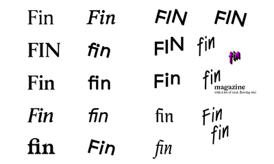
Finally Arthur came up with our final decision: fin
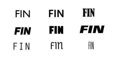
Daniel and I then sketched with the logos for a while and arrived at a conclusion:
Design/Visualisation
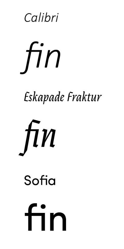
[edit]We made all decisions in a group but the main discussion about the design was between me and Daniel. I initially did some research into typography, and was mostly influenced by these 4 things I found on the web:
- http://practicaltypography.com/
- http://ia.net/
- http://peteanicholson.com/
- http://payload255.cargocollective.com/1/3/104814/7414585/BAP_2014_OneOnOne_ImageByHelloMeTillWiedeck.jpg
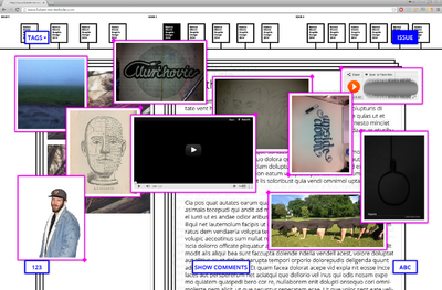
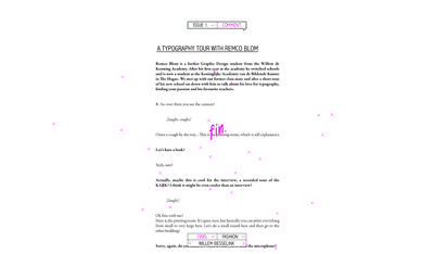
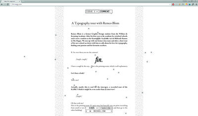
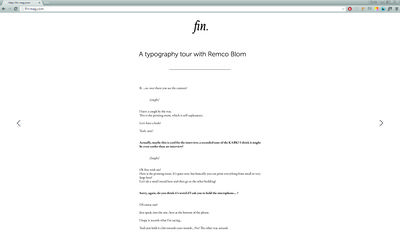
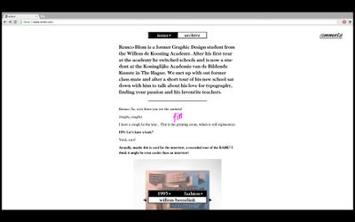
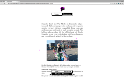
After a lot of discussions and steps in between we ended up at our final design:
Daniel did all of the coding for our trial version of the site. At this stage we worked very close together and while he was coding I would send him new parts of the design or he would ask me for changes and I would execute them for him. This was really effective and also very fun to work on!
