CSS Grid: Difference between revisions
VKranendonk (talk | contribs) No edit summary |
VKranendonk (talk | contribs) No edit summary |
||
| Line 12: | Line 12: | ||
service=vimeo | service=vimeo | ||
|id=746478143 | |id=746478143 | ||
|dimensions= | |dimensions=x420 | ||
}} | }} | ||
Revision as of 09:14, 5 September 2022
In CSS land there are multiple ways of positioning elements. The most common methods are absolute positioning position: absolute;display: flex;display: grid;
This article will describe how to create a layout with CSS Grid.
Video
You can follow the video and read the steps below the video.
{{#evt: service=vimeo |id=746478143 |dimensions=x420 }}
Parent and children
CSS grid places its direct children onto a "grid". In the following HTML snippet the parent element has the class 'grid-container' and 6 children.
<div class="grid-container">
  <div>Grid item 1</div>
  <div>Grid item 2</div>
  <div>Grid item 3</div>
  <div>Grid item 4</div>
  <div>Grid item 5</div>
  <div>Grid item 6</div>
</div>
We first have to set the parent element to be displayed as a grid via the CSS property display
<style>
.grid-container {
  display: grid;
}
</style>
Columns and rows
We also have to create columns and or rows. We can do this with the properties grid-template-columnsgrid-template-rows
<style>
.grid-container {
  display: grid;
  grid-template-columns: 200px 200px 200px;
  grid-template-rows: 300px 300px;
}
</style>
You can set the amount of columns by adding or removing values:
grid-template-columns: 200px 200px;grid-template-columns: 200px 200px 200px;grid-template-columns: 300px 500px 500px;
The following snippet combines columns and rows to create a grid.
<div class="grid-container">
  <div>Grid item 1</div>
  <div>Grid item 2</div>
  <div>Grid item 3</div>
  <div>Grid item 4</div>
  <div>Grid item 5</div>
  <div>Grid item 6</div>
</div>

<style>
.grid-container {
  display: grid;
  grid-template-columns: 200px 200px 200px;
  grid-template-rows: 300px 300px;
}
</style>
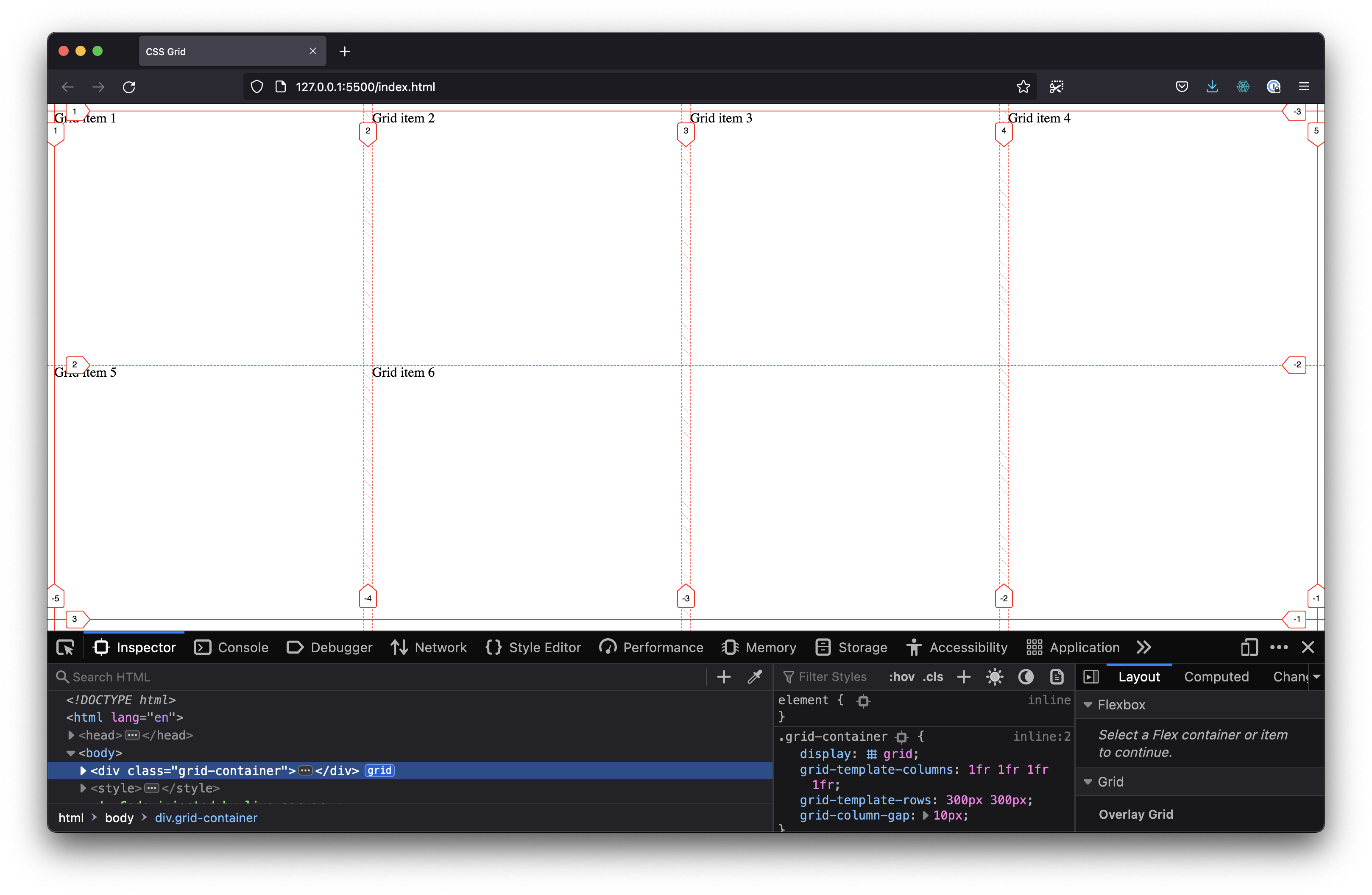
Fractions
Instead of pixels you can also use fr
In the following snippet we set grid-template-columns: 1fr 1fr 1fr 1fr;
We also add grid-column-gap: 10px;
<div class="grid-container">
  <div>Grid item 1</div>
  <div>Grid item 2</div>
  <div>Grid item 3</div>
  <div>Grid item 4</div>
  <div>Grid item 5</div>
  <div>Grid item 6</div>
</div>

<style>
.grid-container {
  display: grid;
  grid-template-columns: 1fr 1fr 1fr 1fr;
  grid-template-rows: 300px 300px;
  grid-column-gap: 10px;
}
</style>
Resources
- CSS Grid course by Wes Bos is full-on in depth course on CSS Grid
- MDN Web Docs has a good introduction to CSS Grid
- CSS Grid Garden is a fun CSS grid game
- CSS Tricks has a good reference article on CSS Grid


