Gaby lidia van Deutekom
Contents
Fantastic Forgeries
PAPER:
BLUEPRINTS:
Inspiration
(BLOG)
Pinterest "Inspiration"
Pinterest "Artist & material" Tools and Tacks Turtorials
Fantastic Forgeries : (object)
Theme Fantastic Forgeries presents alternate histories of Dutch material culture through the research and evaluation of existing artefacts – and their appropriation, transformation and remaking. Fantastic Forgeries uses historical crafted objects as a departure point to reflect on the status and practice of craft in our contemporary society. The objects will be used as tools to examine traditional ways of making as well as a formal, tactile, and decorative inspiration to compare when stretching the boundaries of digital fabrication. In this quarter you will explore into the rich past of Dutch material culture though the Applied Arts and Design collection of the museum Boijmans van Beuningen. You will choose an artefact that speaks to you through its form, function, and its surrounding folklore. You will experiment with various and scanning, modelling and production technologies in order to support the crafting of your own perfect copy of your chosen piece. The idea is to make your replica or 'fake' as convincing as possible by reproducing every detail, before breaking it open into a series of iterations that alter the form and content of the artefact. Can new rituals come about by removing the form out of its original context? Can more and flamboyant objects arise by imagining and inventing the aristocrats that would use them?
The resulting class collection will be turned into a Museum of Fantastical Forgeries with one object per student holding more relations with an actual heritage piece.
Deliverables
- (scaled) replica of your chosen artefact from the Boijmans collection using a different medium than the original
- well-crafted contemporary transformation based on your chosen object of the Boijmans collection
- document and blueprint for the remaking of your original and transformed artefacts
- 1000 word statement defining your position of where your specific 'craft' lies in relation newer technologies
- visualisation and oral presentation of your research based of mapping/iteration/storytelling assignments.
Written Assignment
- What is your craft? (define your discipline, method or approach)
- What are the tools and media of your craft?
- What are the borders of this practice? (what new media technologies have arisen / what is its future)
- Connect to a historical discourse and/or give concrete examples of contemporary practitioners
- Define your position of your practice in relation to newer technologies.
Dates: [4]
Inspiring artists
- Peter Nencini
- Emile Barret:
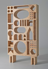
- Remembering 'Memphis' Erik Olovsson & Kyuhyung Cho
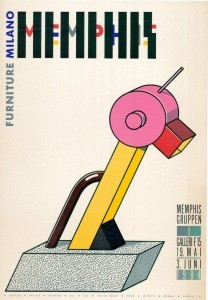
Memphis: [8]
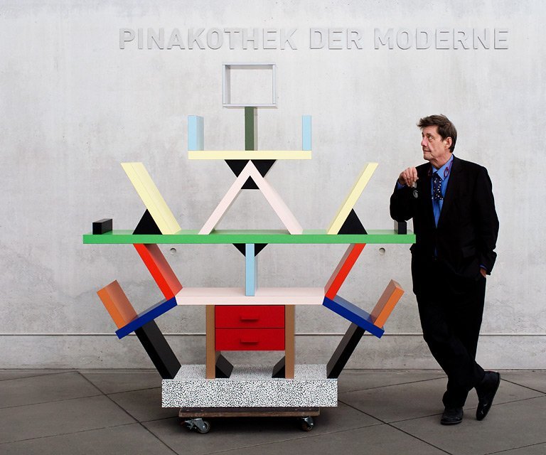
Object : Carlton - Ettore Scottsass
If the mid-century Modernists lived by Louis Sullivan’s rule “Form follows function”, the Postmodern designers like Sottsass might say “Why the heck must it function at all?”'
Design: 1981 Production // Size: 195.5 x 190 x 40 cms // Material: wood, laminated plastic
1981 to the present Manufacturer: Memphis s.r.l., Pregnana Milanese, near Milan
POST-MODERNISM
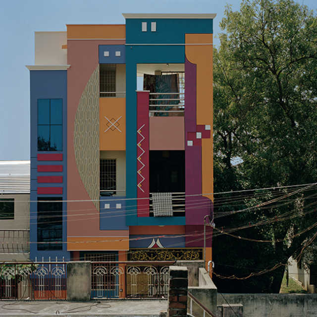
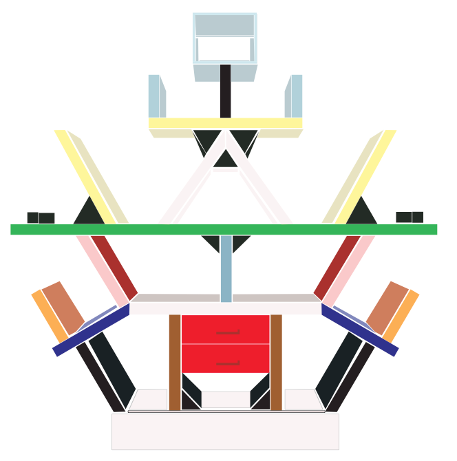
When the Milan design group Memphis gave the first public presentation of their work in September 1981, the Ettore Sottsass room divider “Carlton” was among the most noted pieces. “Carlton” symbolizes essential traits of the style which as a consequence of Memphis became known almost overnight as New Design. Mundane and depthless laminated materials are trademarks of Memphis. Their aseptic, bold superficiality makes them the ideal medium for a new, decorative aesthetic. The iconography of the patterns is the result of blending graphic or geometric structures, imitation marble or wood, African symbols, comic strips, and loud colors. (The base of “Carlton,” for example, shows the first ornamentation designed by Sottsass, the “Bacterio” patterns from 1978).
[[File:Tumblr mvjqa7hWa41qe0nlvo1 1280.jpg]
As in the world of telecommunications, the viewer no longer perceives an object in itself, but rather a medium that catches the eye by virtue of its surface and structure, and which triggers sensory perceptions. Despite their provocative nature, Sottsass designs are always based on precise relationships between individual parts. Thus, the colors of “Carlton” are carefully matched, and the structure is based on the imaginary form of a rhombus.
Ornamentation and construction create a unity conveying the “software,” or the object’s expressive contents. Traditional wall shelving, with its horizontal and vertical structure, is turned into a multipurpose, dynamic, encompassing object that, like a sculpture, claims the right to stand unrestricted in its own space. “Carlton” can be completely dismantled, which is a considerable advantage given its consider-able weight. The anthropomorphic image on the green shelf unit reminds one of a juggler or a totem figure and lends a cultish feel to the furniture. This combination of meaningful symbolism and rampant consumerism is typical for Sottsass, who derives great inspiration from Indian culture. Sottsass left Memphis in 1985, after the group had evolved from an experiment into a commercially successful venture. MK
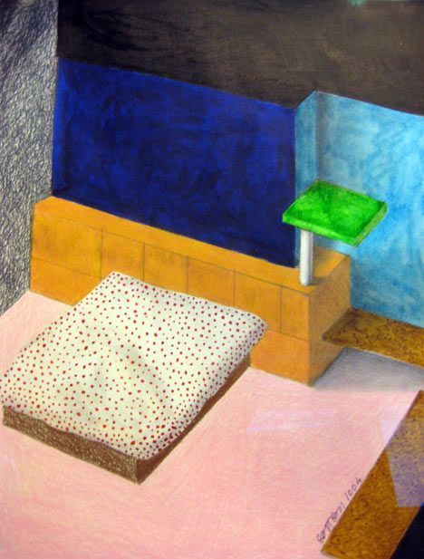
The receptionist gave me a fax and an odd look. It said, in handwritten capitals: "DEAR ROWAN MOORE… THANK YOU FOR EVER… ETTORE", above a drawing of a dishevelled bed with condoms and discarded underwear on the floor beside. It was from Ettore Sottsass, then approaching 80 years old, who liked a review I had written for the magazine where I was then working, of a book of his photographs. The review had noted his camera's fondness for post-coital beds, hence the drawing.
Ettore Sottsass by Thome, Picchi, King
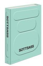
Buy the book Tell us what you think: Star-rate and review this book Sottsass (1917-2007) is now remembered most as the godfather of Memphis, the design collective whose much-imitated works released a flood of wonky angled, brightly coloured furniture in laminated plastic, striped, polka-dotted and leopard-skinned, on the 1980s. Memphis was launched in a Milan gallery in September 1981, in a near riot of 2,000 people (amazing that furniture can arouse such passions). Its original pieces now sell in auction houses for prodigious sums.
As usual in such cases, the imitators betray the inventors, and actual Sottsass designs from this period have a spirit, a presence and a touch that make their calculated outrages against taste all the more powerful. The copies are plain outrageous. But, as a handsome new Phaidon monograph amply shows, Sottsass was very much more than Memphis. At a hundred pounds sterling and seven pounds avoirdupois, it is both weighty and expensive, but within its pistachio covers and striped endpapers, on pages of varying stock and multiple colours, a life of astonishing richness is revealed. It shows a man whose young, dashing moustache becomes progressively more mournful and perplexed, but whose appetite for life never diminished.
Sottsass soldier Sottsass in uniform, c1944. Photograph: © Ettore Sottsass and Barbara Radice, courtesy Studio Ettore Sottsass Born in the Dolomites to Italian-Austrian parentage, Ettore Sottsass was a designer of furniture, buildings, ceramics, graphics, textiles, lights, jewellery and electronic products. He was a (not very good) painter, sculptor, writer and publisher of magazines. He was a voracious taker of photographs and maker of drawings. In the second world war he was an unwilling soldier on the wrong side, stationed in Montenegro. Early in his career, broke, he would "work through the night" to create "stands for a vermouth advertisement, to earn a few lire while consumed by deep boredom".
In the 1960s he had a fruitful collaboration with Olivetti, in which he created typewriters for the electronics corporation, and Elea, a computer as elegant as such things could be in the days when they were the size of rooms. At the same time he would make earthenware pots inspired by his interest in tantric art and a passion for Indian culture. He hung out with Beat poets in California and took Allen Ginsberg on a speaking tour of Italy, where the writer was at one point charged with indecency.
Sottsass typewriter Valentine typewriter, 1969, for Olivetti. Photograph: © Erik & Petra Hesmerg, © CSAC Parma/© Studio Ettore Sottsass Sottsass was a social genius. With his first wife, Fernanda Pivano, and with his later lovers, he created multiple circles of extraordinary people, documented by his photographs: Ginsberg, Bob Dylan, Picasso, Max Ernst, Alice Toklas, Chet Baker, Jack Kerouac, Helmut Newton, Robert Mapplethorpe, Alberto Moravia and Ernest Hemingway. And, as he put it: "I like girls and ladies very much."
Common to all of this was a belief that his work should be in unison with the world. For him, it was all interconnected, with his photographs helping to link the personal and the visual, or the human and the material. When he designed a typewriter or an adding machine, his primary concern was not the technology of the machinery inside it, but the physiology and feelings of the person who would use it. When he designed furniture, he was thinking less of the perfection of the object than of the room in which it might sit and of the life that might be going on in that room. "To be an architect," he said, "you have to become very gentle, very calm and extremely sensitive about life."
Sottsass kachina Kachina for Ernest Mourmans, 2004. Photograph: © Ettore Sottsass and Barbara Radice, courtesy Studio Ettore Sottsass He was opposed to standardisation and the modernist tendency to design "like a well-educated schoolboy". He was interested in uncertainty, inconclusion, sensuality, melancholy and pleasure. "Everything must remain possible," he said and: "It must be possible to design instability." He liked "bastard situations", where many factors combined. He saw design not only as the fulfilling of a function, but of proposing ways of doing so: a chair could suggest "a new way to sit", and with it a fragment of a new world.
What this meant in practice, in the physical detail of his multiple works, is harder to define. Colour, pattern and curves are the most obvious but not invariable features, as are a bringing together of unlikely companions of form and material. Also the influence of tribal and popular art – his pieces often carry totemic, ritualistic or erotic suggestions. In his buildings (and although he was better at other things, he always liked to think of himself as an architect before all else) he would favour forms reminiscent of children's drawings or building blocks.
Sottsass
The Carlton room divider, 1981. Photograph: © Ettore Sottsass and Barbara Radice, courtesy Studio Ettore Sottsass
His greatness existed less in individual creations than in the space between everything he did. Some designers, such as Arne Jacobsen or Charles and Ray Eames, are closely identified with celebrated chairs or other pieces. For Sottsass the equivalent might be his Carlton room divider for Memphis, or his Valentine typewriter for Olivetti, but these alone don't explain his fame – it was the work, ideas and life together that mattered.
If he failed at anything it was that he might have overrated the power of objects to change the world. He was part of 1960s counterculture, and suspicious of such things as marketing and consumerism, but as a product designer he was in a business that is mostly about selling things. It was all too easy for his inventions to be sucked into the 1980s orgy of acquisition and display and, again now, to become collectible signs of status. But, if so, his life was a magnificent way to fail.
Sottsass is not only one of the most influential designers of the latter half of the twentieth century but also one of the most paradoxical. While he has had a successful career producing industrial designs for the mainstream corporation Olivetti, for everything from typewriters and computers to office landscapes, he has also been iconoclastic as well, creating strikingly unconventional consumer-oriented objects that challenge the bourgeois audience at which they are aimed to reassess its assumptions of the limits of "good taste."
Between 1981 and 1988 Sottsass and a small international group of like-minded designers who called themselves Memphis, created nonconformist furniture. The totemic "Carleton" room divider is an outstanding example of his Memphis designs. Although intended for a luxury market and of fine workmanship, it is made of cheap plastic laminates rather than fine woods. The vivid colors and seemingly random interplay of solids and voids suggest avant-garde painting and sculpture. Yet, typical of Sottsass, underlying the surface brilliance is an entirely logical structural system, of real and implied equilateral triangles.
Ettore Sottsass, "Carlton" Bookcase/Room Divider, 1981. Milwaukee Art Museum, Centennial Gift of Gilbert and J. Dorothy Palay. Photo by John R. Glembin.
Postmodern design is a difficult thing to pin down or describe concisely. It refers to all manner of playful, ornamented, subversive, and/or heady things. The aesthetic is often likened to 1980s popular objects like Swatch wristwatches, but the designer’s meaning often runs much deeper.
For instance, Ettore Sottsass’s Carlton bookcase (1981) doesn’t immediately convey its rich meaning. When we first see it standing boldly outside the 20th-century Design gallery at the Museum, we see that it is brightly colored. We think it seems impractical for book storage. We might find the stick figure silly. Why is this a design classic? Why is it so important that the Museum keeps it on view?
Maybe because Carlton breaks a lot of rules? It is shockingly unconventional for a bookcase.
(Niet de functie van het product stond centraal, maar speelsheid en gevoelswaarde werden de leidraad. Als reactie op ‘form follows function’ kwam de stelling: ‘vorm volgt emotie’)
Sottsass’s bookcase is about ideas. It is paradoxical. Sottsass uses cheap industrial materials (plastic laminate), combined with vivid color (red, green), and ornament (the speckled base) to create an object that is about both the banality and the excitement of the mass popular culture environment of the shopping mall and the Las Vegas strip. On one hand, Carlton is tacky. On the other hand, it is cheerful. On one hand, it is cheaply made. On the other, is was an expensive luxury object purchased only by design collectors.
Another layer of thought to this object, discussed by Glenn Adamson (Victoria & Albert Museum, London) in his recent lecture at the Milwaukee Art Museum, is that this type of design object is about presentation in a photograph. Sottsass knew that Carleton and other wacky postmodern objects wouldn’t be mass produced, but he did know that they’d catch attention and spread in photographs. Perhaps the very meaning of the object, the very design of the object, is to captivate in an image and spread the designer’s idea around the design world. It is an object that exists primarily for a photograph.
For a little more information on Ettore Sottsass, you can visit the Ettore Sottsass exhibition website at the Los Angeles County Museum of Art website.
Also, you might find it interesting that The Metropolitan Museum of Art includes Carleton on their “Timeline of Art History”.
Experiment
Experiment with material.
- foam - carbon
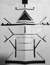
Illustrator Carlton 'Replica (1)
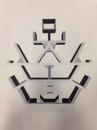
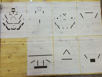
Screen print: Replica "Carlton"
Material for the screen print (surface):
Idea for the result presentation
This week I made a lot of progress. The object that I’ve chosen is a very two-dimensional object and I have struggled to find a way to get in a three-dimensional perspective. I want to make a two-dimensional replica but I don’t want to get a flat result.
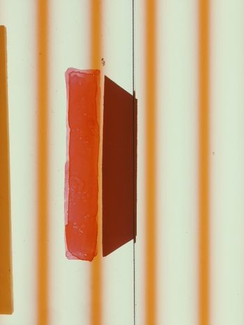
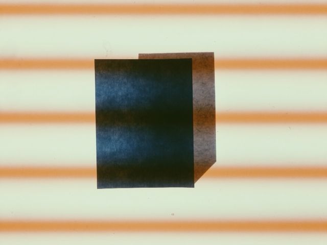
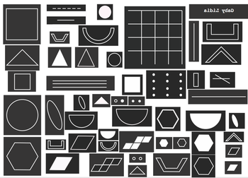
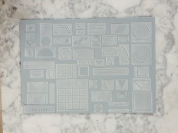
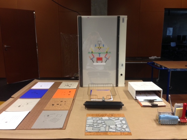
My concept is to make a screen print with 2 windows and 7 layers. The original object is made with 1 pattern and there are 11/12 different colors used. I’ve splitted the shapes in layers with the same colors.
Laser cut : 'Transformation'
Illustrator stamps for laser cut:
Laser cut result:
Stamps shapes (holders)
Presentation: 13 oct
Tools and Tacks: Pattern & Led battle
GROEPS WIKI 3 - ILLUSTRATION BY RANDOMNESS
TED LEZING FOUNDER ARDUINO:
Group:
- Marinka
- Nina
- Lotte
- Gaby
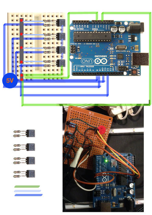
Our concept is to make e light box that has a imput and a output.
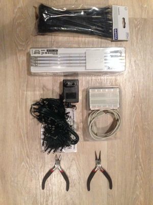
We use christmas leds to light up the outside of the light box that communicate
with the ARDUINO , where we can switch the light on and off.
Besides the leds that we use on the outside of the lightbox we also use leds in the inside of the
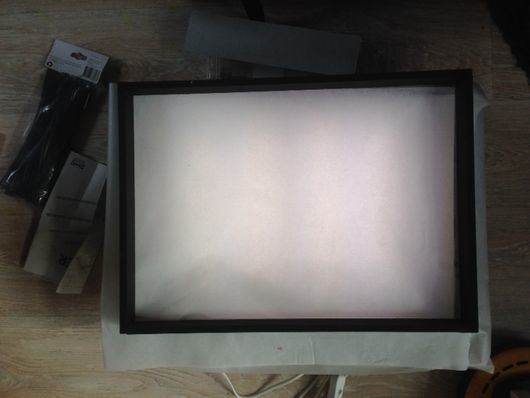
lightbox where you can see through. We have create a A3 format window where we place a glass or a transparant
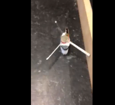
paper where the bristle bots are moving in a suspicious way that forms a pattern & texture
in sand for example or any kind of light material that the bustle bots can replace.
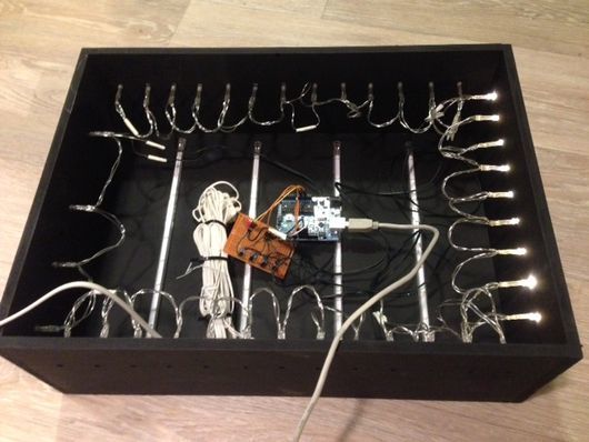
The lightbox
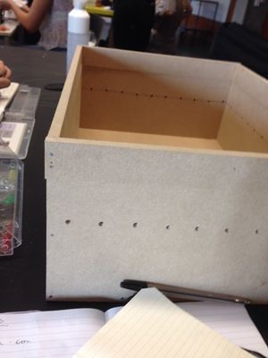
Building the A3 Lightbox
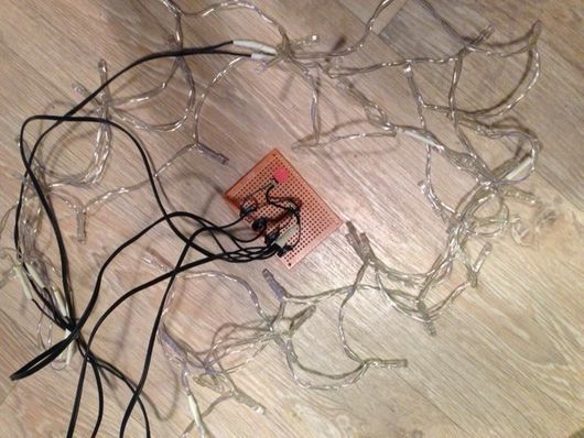
Led Circuit
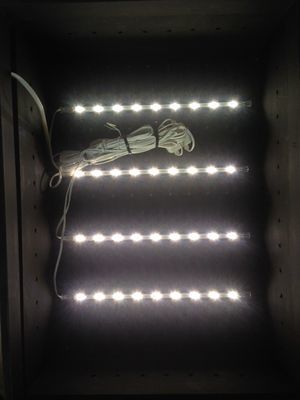
The lightbox is painted and the lightshow can begin. In the box we choose Ikea leds light up the top of the plexiglass window.
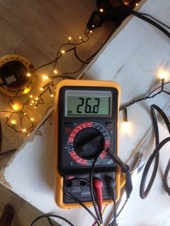
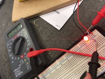
We decided to work with Christmas leds. The first led we have tried was with a adapter and was bought at Gamma. We did an experiment with the voltage and the volume and we had to figure out of whether the voltage calculator or the lights didn’t work. We got a little bit of help and us was told that it worked better and was less risky if we worked with leds with batteries.
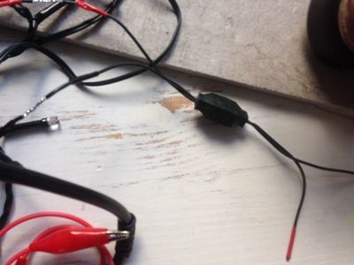
We also discover that this cube was the answer why the leds gets equally power. And that was not what we had expected, we thought that was there for the electrical wiring.
So we bought a brother and sister for the discarded green leds and start over again. First we have checked the voltage and we discovered that the battery leds also worked as a single led. That was different then the first green leds. This was very positive because that mean that we can make parallel rows and groups besides the amount of the group. By the green leds we had to calculate the amount of the group otherwise the hole led row wouldn’t work anymore. We use the wiring of the green leds that we didn't needed anymore.
So with the new battery leds in our pocket it looked like the plan what had in mind was possible and more important do-able. The idea of the lightshow was very simple because we are actually not that nerdy as we look. We had two idea’s but after experimenting only one option was left to explore
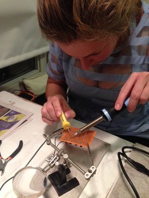
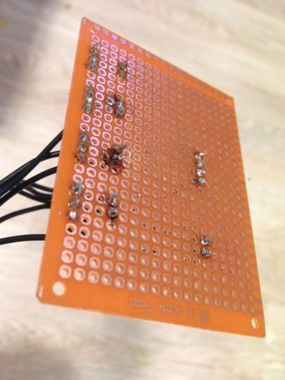
There was an problem with the wiring because every solded wire you have to tape it of otherwise you make an electrical breakdown. The leds do not work because the solded wire touch each other.
The bristle bots have to move over the plexiglass window and they are very fast and unpredictable. That the light box could’t move was a fact but we can manipulate the view of our public and let the lights move. Over and over again. Over the top!
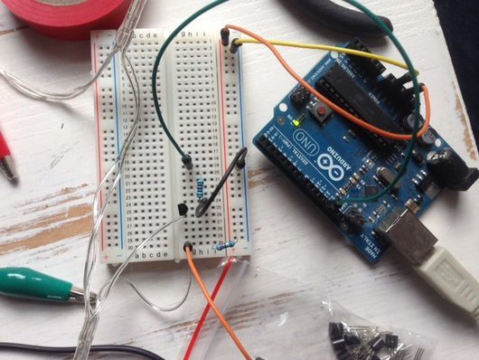
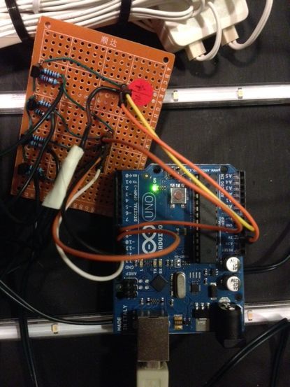
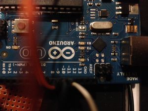
AURDUINO PROGAMING / CODING
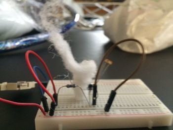
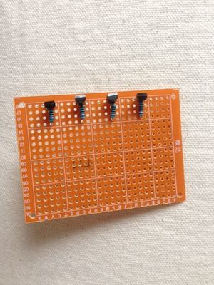
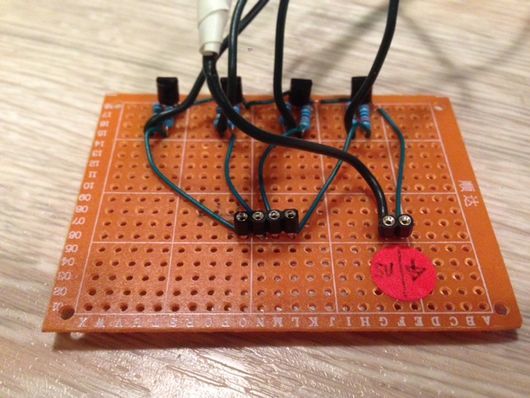
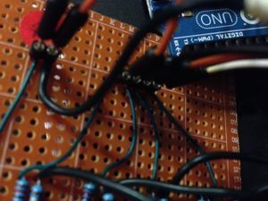
We use transistors, (weerstandjes) and a wiringpoint with one with 4 holes and one with 2 holes. The hole circuit we soled to the board. At one point he didn't work so we place an extra weerstandje. Make sure that you calculled ghe amount of the group and the voltage of the leds in relation with the codes on the aurduino. Last buth not least, tape all the wirres and solded material off with silecone tape otherwise you have a electical break down.
All the wires are connect with eachother and thats why the groups are moveing in a circle.
Bristle bots & material choose
Tools and trade
Storyboard:
File:Storyboard with script.pdf
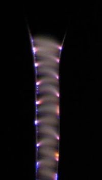
Make electricity/elektrolyse visible : We use electricity as a source for products and machinery to function, the power of a device. Electricity is the base and source of how we have shaped our environment. But what if we use the operation of electricity itself as machine? And place it in a bigger picture. Suppose you can make electricity and its operation tangible and visual.
Give electricity/elektrolyse a visual identity: Are we able to provide electricity an identity or a face? Is it possible that electricity not only serves as power for our machines and our daily operations, but also be visually a part of our identity?
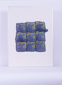
Electricity/elektrolyse as a printing technique Color with Elektrolyse/Electricity visual identity patterns icoon
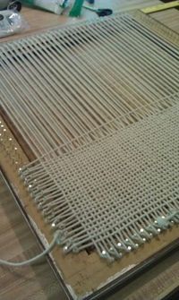
Historical tartan weaving with coper wires and cotton and silk fabrics.
Experiment/Installation; Elektrolyse, natural liquids, raw materials with energy as a tool.
-> Building lines (maakbare werking van elektricity)
Practicers:
- Nicola Tesla / make electricity visible. "Free energy"
- Jacob's Ladder
- Michael Faraday - elektrolyse.
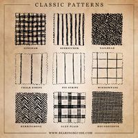
- Weaving pattern's tartan's
My theme is the magnetic field that arise when electricity wires are in contact with each other.
I want to visualize the working of elekticictiy into a visual/print of the product (like a speaker) or conductive wire on a copperplate.
I really like the idea that you can design the look of the original product with his own power.
Its like a new language, the product speak to you in a way that he tells you want he can offer you.
The difference is that it is not a information guide with numbers buth a imagination.
I would like to explore how you can make electric power in to visuals with the technic electrolyze.
There are many ways to work with electrolyze in most ways people use it for metal.
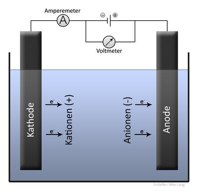
A sort explanation how the electrolyze works.
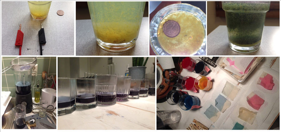
With electrolyze you have Kathode and Anode and water is a good conductor. Because i would like to work with visuals and printing i want to use red cabbage Red cabbage is a good ph indicator. So would like to experiment with red cabbage, when a red cabbage gets a different ph/acid value the color is different.
- Extreem high acid : ph <2 ---> RED
- High acid : ph <2-7 ---> PINK
- Neutral acid: ph <~ 7 ---> GREEN
- Basische acid: ph <7-12 ---> YELLOW
- NO acid: ph<12...
Notes
Expo's
- Expositie "Future fictions
WHAT IF?
Het is geen oplossing op problemen die gerelateerd zijn voor deze tijd. Ze gaan over ficties en ideologieën.
Hoe we met onze fantasie en wensen onze omgeving futuristische kunnen vormgeven. Om door te kunnen
boduren op de toekomst.
Bruce Sterlage Het verhaal vertellen over wat er achter zit of wat ze doen is niet zo zeer meer van belang. Het gaat meer over hoe we dit gebruiken en interpreten in de toekomst.
Glaswerk- Rematrialisatie ze vertegenwoordigen systemen. Waarin producties samengevoegd worden in mechanische processen dat door het nieuwe model voor efficiëntie wordt. Ze bevragen de fysieke taal van de systemen die ze vertegenwoordigen.
Hans op de Beeck: Het zijn symbolen van tijdelijkheid. Waarde van dagelijkse voorwerpen die ineens een andere of mooiere betekenis krijgen.
Dunne & raby: Deuren van de toekomst om een andere ruimte binnen te stappen.
David Benquie: Groene politiek - The new weather men. Technologie en wetenschap
Overig: effect van kleur op een ruimte plastice stad.
Documentary's
Tegenlicht:
- De nieuwe makers
- Digitaal geheugen verlies
- Groen goud 2
- Zero days
- Europese smaak als wapen
