User:ThomTrouwborst
Contents
Thom Trouwborst
Unravel The Code
Stealing from the museum
Fantastic Forgeries
Chosen object:
Information:
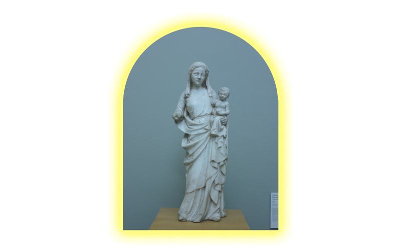
Maker: Anoniem
Titel: Maria met kind
Periode: 1350 - 1400
Materiaal: Marmer
Tekst Boijmans:
NL
Dit beeld van Madonna en kind is een karakteristiek voorbeeld van de elegante stijl, die zin in de late viertiende eeuw in Parijs en omgeving ontwikkelde en al snel in heel Europa werd nagevolgd. De dromerige uitdrukking van Maria en haar sierlijke houding zijn karakteristiek voor de zogenaamde internationale gotiek; de vaardig weergegeven draperie doet niet onder voor het beste werk uit de vroege renaissance.
EN
The sculpture of the Virgin and Child is a typical example of the elegant style that evolved in and around Paris in the late 14th century and was seen being imitated throughout Europe. The Virgin’s dreamy expression and graceful pose are characteristic of what is called International Gothic. The skillfully rendered drapery is a match for the best work of the early Renaissance.
Why
There are three main reasons why i choose this marble statue. The first reason is that i wanted to work in 3d. I, As a graphic designer you tend to work mostly in 2 dimension. So with this minor i hope to create project with more than 2 dimensions. The second reason is my fascination for religieus imagery and symbolism. For instance, the virgin which is presented in many many different ways throughout the history but through certain coder you can always tell it’s the Virgin Mary. Back then certain symbols always communicated the same things. Next to the symbolism i’m also very interested in the esthetic of religious imagery. Every time period has it’s own style and i want to use this project to really dive in to this huge topic because i never had the change to do this. The third reason is that a wanted to choose a work which is or was very iconic. Icons are used and reproduced in different contexts which makes it interesting for me. The icon of the virgin is weaved in several religions and cultures. In hese religions and cultures she is pictured differently and that makes it very interesting.
First Research
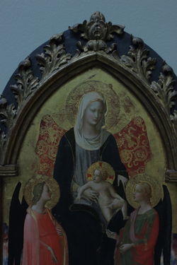
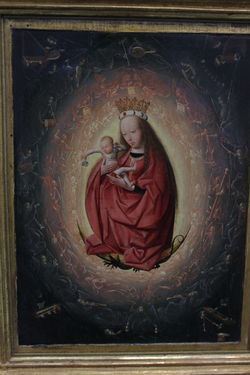
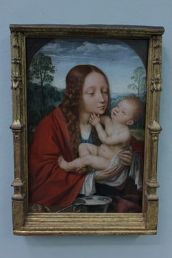
Different images of Virgin Mary's inside the Boijmans:
1st Year: ca 1420 (IT) 2nd Year: ca ...?(?) 3rd Year: ca 1490 -1495 (NL) 4th Year: ca 1520 (BE)
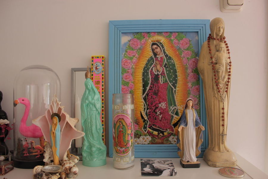
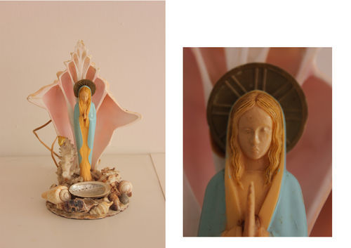
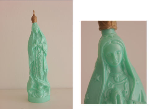
The scene above is a scene from my house. Both me and my girlfriend like the esthetic of a Virgin Mary so we collected several different ladies. Some of the imagery is Latin American, where the Virgin Mary is called "Nuestra Señora de Guadalupe". She is the patron of Mexico (and since 1945 of the entire continent; Latin America) The entire story
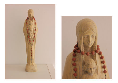
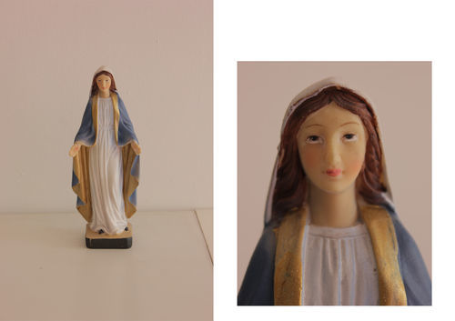
I photographed the different Virgins individually. As you can see, they al look very different but in the end you figure out it's a Virgin Mary without knowing the context. (DUH)
First steps
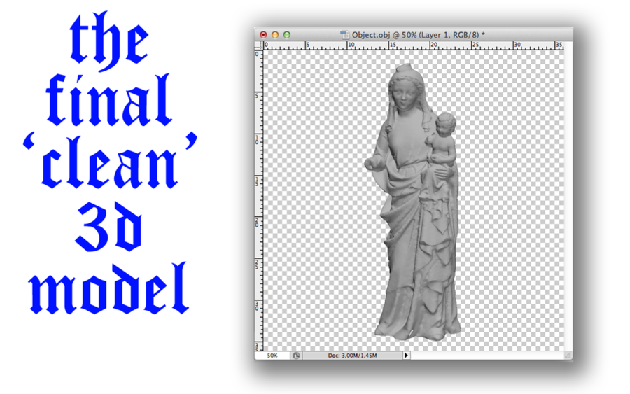
So the first thing that had to be done was making a 3d scan of the object itself. I wanted to do this in de exact same way as we did in the kick off. So i went back to the Boijmans en photographed the hell out of the statue!
LOOK @ THESE CRAZY GIFS
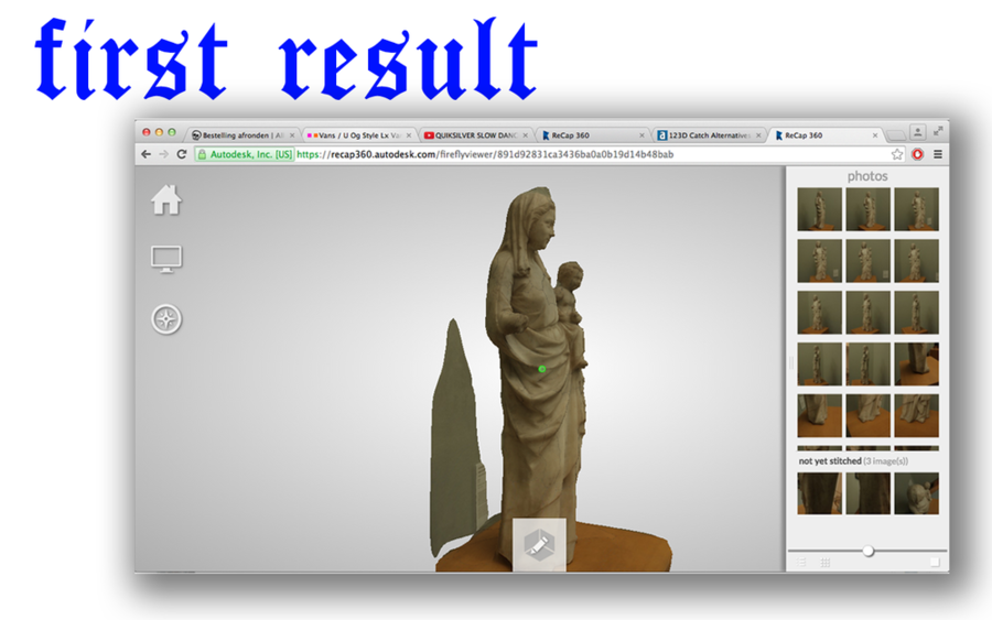
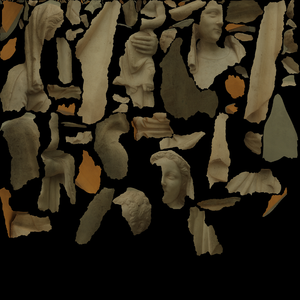
So the gifs give a glimpse in the pictures i took. Then i wanted to use 123DCatch to make the 3d scan complete. However, it didn't work on a mac..... Soooo after a few hours a found the tool RECAP360 which does exactly the same BUT you can upload more photo's, which was even beter. Recap 360 makes a pointcloud of a lthe pictures you taken of the object, just like 123dcatch.
These were the steps that followed
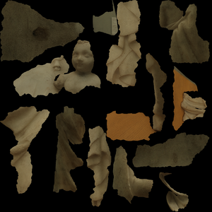
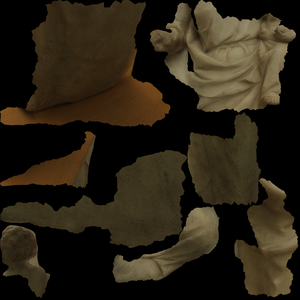
TEXTURE MAPS
First Prints
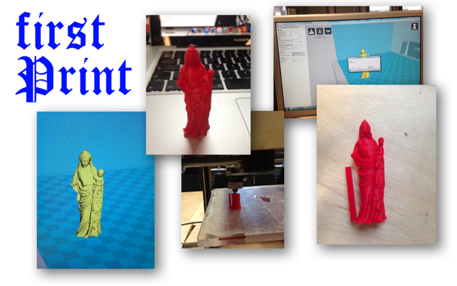
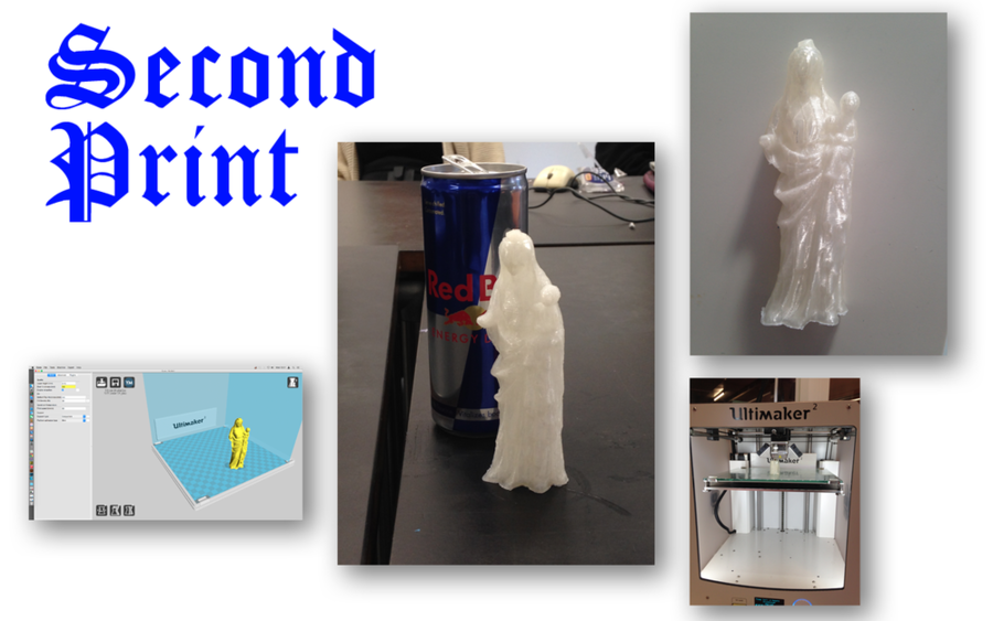
The most easy way to replicate this statue was 3d printing it. So that is what i did! At this stage i figured out i wanted to dive into making moulds. I thought this would give me the freedom to produce bootleg mary's in different materials. The 3d print would be used as negative. The first print was way to small so i figured i needed a bigger print to experiment more with molds.
Making Molds
So with the thought of making Mary of a different material, i dived into the world of making molds. Very quickly i found out the most materials are very expensive when you are making molds. Next to that, most materials used to make molds are highly toxic so doing this at home wasn't an option. I've watched a lot of tutorials on the webz and wanted to try a few techniques. 1 of those techniques was making a silicone mold. The only thing you needed for this was 100% silicone and dishwashing soap. WORLDS EASIEST SILICONE MOLD
YEAH I MELTED CHOCOLATE TO TRY OUT THE MOLD LMAO
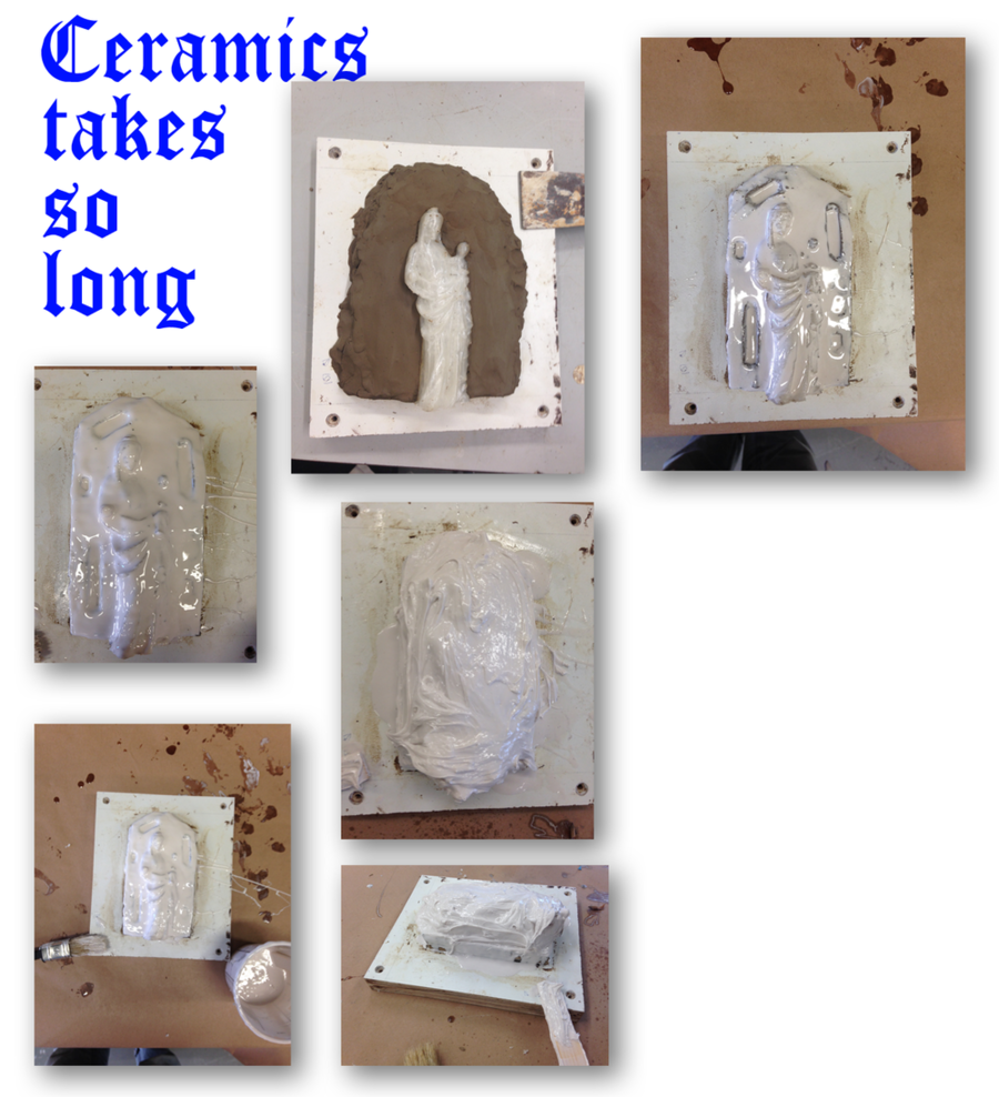
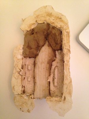
This type of mold making is quite satisfying, it's really easy and also very accurate. The down side that it is harder to make a 2 piece mold out of this... OH yeah, it reeeeaaaalllyyy smells :( The next most logical step for me was to go to Ceramics and ask/learn how to really make a mold. So i did, i knew i could use the vacuum sealer but the guy from the workplace said this wasn't the best way so he talked me into making a mold of fluid rubber. I started with this instantly. But i never could image it would take ages to do this.....
After finding out this would take ages i also started to stumble on another problem. This problem is called SCALE. Al the things i've been trying out for the past week were based on a very small scale model. But it wasn't really an option to just 3d print a model of 90cm, this would be very boring and not very interesting. At first i was kind of stressing out because i could not think of any ways to do something about this. Then eventually Tim asked; "Can't you just do it in a lower resolution?" and then thing took of in a different direction.
LOW-RES
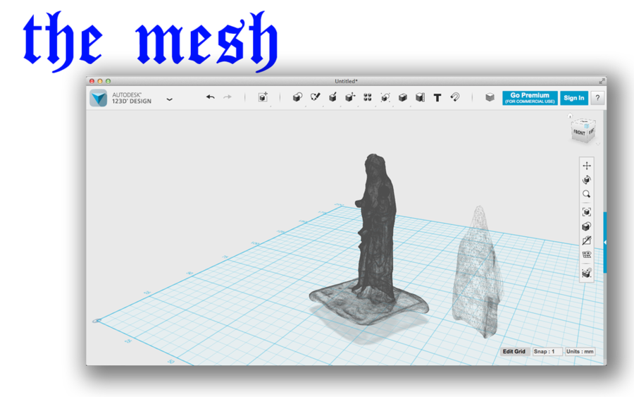
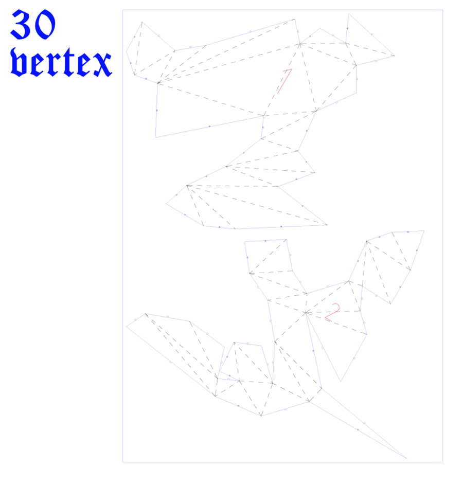
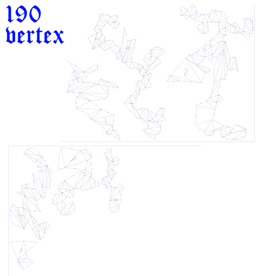
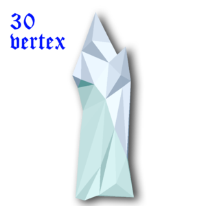
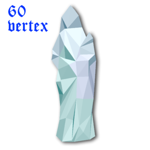
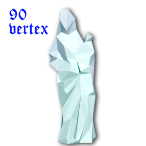
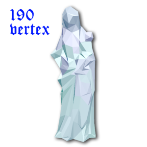
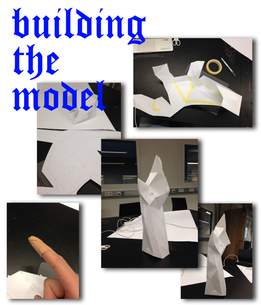
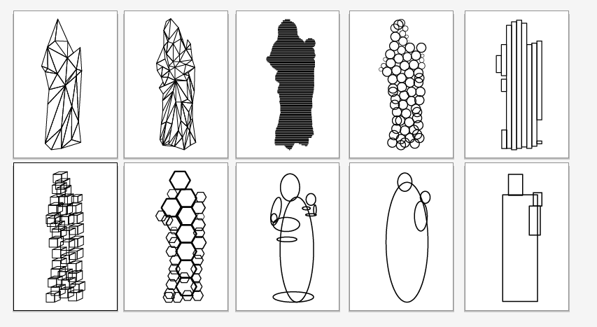
So the longer i thought of scaling up and turning the resolution down the more excited i got. In my research proces i came across a programs called 123DMAKE] which was perfect for the next step. This program can turn your mesh into a low res 3d modelkit. You can choose to slice your model or you can choose the fold your model. I choose to fold it. With this option, your 3d model wil be converted to polygonal shapes which are easy to fold. You can also can play with the resolution by changing the vertex count. I figured that i wanted to make more then 1 models so i prepared 3 different vertex counts and printed them out on A1 paper.
With 123DMake you can also generate other low res shapes. The program is made for a diy approach which is great for met because i'm very much is DIY-er myself. I think it is imported to really do thing to learn more about them.
Once i printed the models i started with the model with the lowest vertex count.
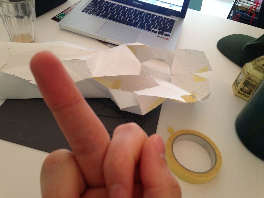
What is did not expect was that is would take a lot of time to build these things and this was just the easiest(!?) In the end i wanted to be very precise so i took my time when i was cutting the prints. With the folding a felt that sometimes the paper wasn't strong enough... With this in mind a started with the second model with 60 vertex count. I worked the same way as the last one but with more detail it also gets harder to see where the piece fits in the puzzel. I lost about 3 days with the second model, i was very determined to finish it but i couldn't figure it out. Which was very frustrating!
Moving on
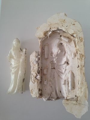
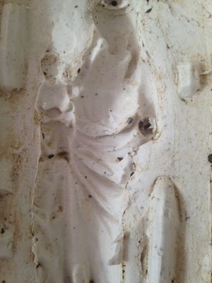
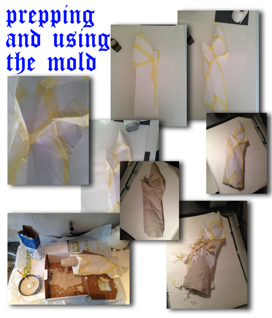
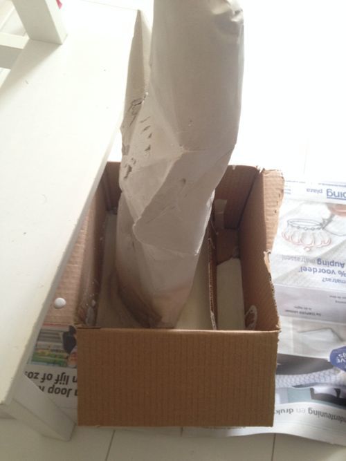
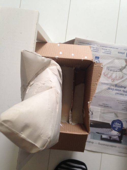
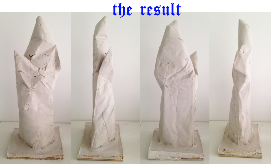
Along with the frustration on nog completing the second model also came time pressure. I've been building and trying stuf out for week but haven't thought of the transformation yet... I've made several thing that could work as a replica. The thing that was missing was a story. I went back to my research and thought of thing that could be told with the things i made. In order to tell this story if found that i needed to try te use the paper model as a mold. In the end this was the thing is was interested and this was the initial plan but i kind of forgot about it. So someone gave me a tip that is could use Plextol to make paper waterproof. I also purchase some latex early on in the proces which i haven't used yet. So i took the model with the 30 vertex count, which is a very interesting shape by the way. I taped al the seams of the model en then applies about 3 layers of Plextol on the model. This made the model indeed waterproof but it didn't made it more steady unfortunately. To really be sure i also applied the latex on the seams and soft spots. When everything was dry i started making plaster, which was also my first time. I figured i could just pour it in layer for layer. So in the end everything went quite wel. The paper was strong enough to hold 3kg of plaster so i was quite happy. When everything dried up it started to take of the mold, which didn't had to be used again so i could just tear it of. On some spots the paper and tape got stuck on the plaster but this wasn't hard to take of. The result is pretty cool, i couldn't actually imagine that it would look like this, what is a good thing in my opinion. I probably didn't completely mixed the plaster in the right way but i think the imperfections on the model are super nice. When it's standing up, you immediately get the feeling it is something holy or sacred. Which is also a good thing because i was afraid this wouldn't be the case. The only thing i'd had to do was figure out how it could stand up.
The Final low-res model
So after i completed al the steps above. I had this crazy plaster model of a low-res madonna. In able to present it proper i needed tot add a plinth so the model was able to stand up.
The Story
So as i introduced earlier, i needed to get my thoughts straight and figure out which story i wanten to tell with the object. I was thinking realy really hard of what story i should tell. The best that i came up with during the vacation was that the statue be a symbol for the dehumanization of society. But after the last talk with Tim if feel kind of stupid because that just isn't true. Society is getting harder sometime but not les humane. Still i stink that the statue is completely dehumanized.
However this isn't the interesting part. I feel like there are 2 main things that are interesting to tell a story about in combination with the work. The first one is that the image of Mary doesn't actually holds any value. For instance, the little Mary figures i have at home (top of the page) they are decorative and for me quit meaningless. They are nice to look at but the actual value we give to it is the emotional value humans have with them. The message Mary communicates always stays the same. The Mary may change a little bit in her appearance but the story doesn't. This is actually exactly what Oliver Laric shows with his versions. The image of Mary gets reproduced over and over again voor centuries now, each new one is just a different version of the original one (if there is even 1 original). Therefore it makes me think if in this case the resolution would even matter? The form that is left now isn't directly recognizable but is came from a classic version of a Madonna. If you put this form in a religious context, i think i could easily replace the classic Mary. The story stays the same, the posture is somewhat the same, Mary still is the symbol for the human part of catholic religion but just in a different resolution. I showed this work to my mother in law and it made her think of the KKK. Which basically isn't weird because the costumes the KKK uses are just a bad copy of the costumes penitents wear during Semana Santa. Which is the week before easter in catholic Spanish speaking countries. So consciously or unconsciously you connect it to some sort of religious image. I could have produced more low resolution models but for now i think this one is enough to prove the point. It could have been any low res shape. I've made some sketches of different forms. Some of them are almost the same as the model i have now, some are more 2d. But al of them are images of Mary in a different resolution.
The second topic is the actual act of reproducing. My chosen object is dated between 1350 and 1400, at the start of the international gothic. Back then this statue was carved out of marble. The maker probably studied for years to master the skill of carving the perfect human shape out of a piece of marble. He probably dedicated his life for it. Now it's 2015 and we have tons of techniques to carve shapes out of al the materials you can think of. The craft of being a sculptor is slowly changing into a virtual sculptor. Now we sculpt it in programs like Rhino, Maya or Mudbox. If we want to bring these virtual models to the real world we also have tons of techniques that can print, mill or cut out our model. In the proces of making this object is also used programs that helped me making this, it wasn't particularly hard to do and i didn't completely understand how it works but i'm able to produce a model like this. I think the model has a very interesting form but i can imagine that is real sculptor doesn't thinks the same way. I did this completely DIY without any real feedback of a professional but in the end i was able to do it. So you could say everyone could have made this. However this fact makes it a lot less valuable for me in the sense of al of the effort i personally put into it. But it becomes more valuable in the sense of the accessibility. You could say that everything should be available for everyone so that we have our own freedom to create what we want, when we want it.
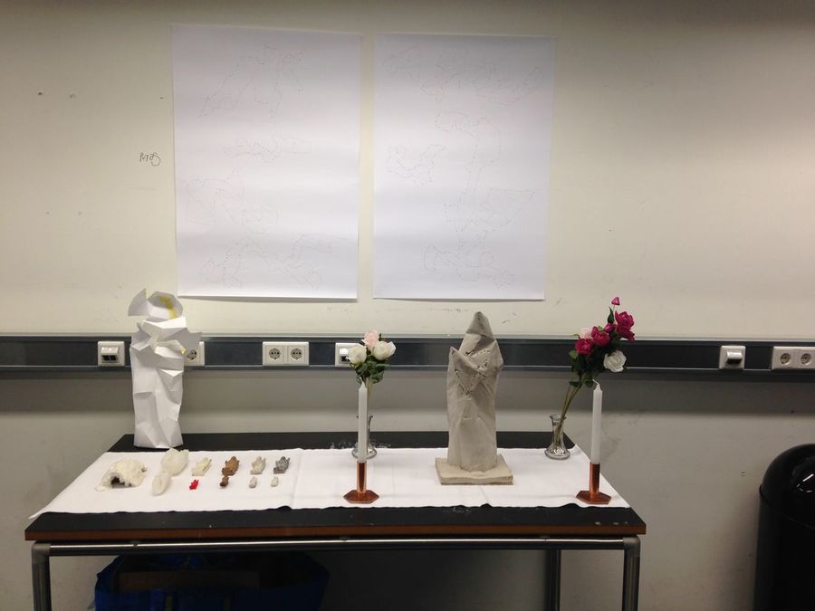
Exhibition presentation
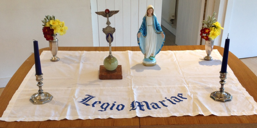
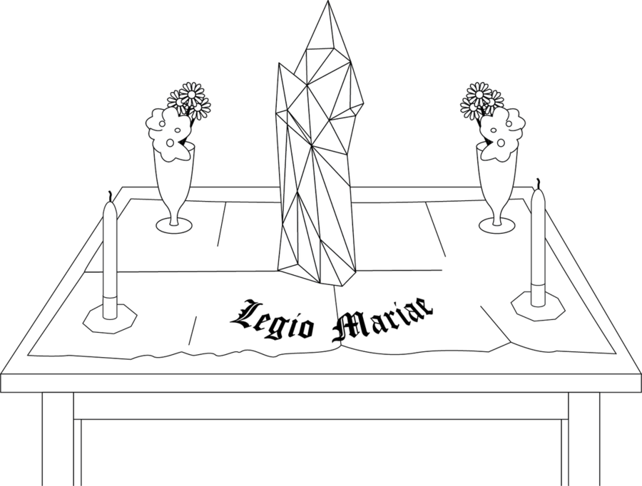
I found this image on the webz when i was looking for Mary altars. I really like this alignment, i like the typography and the symmetry. I didn't knew what ik ment though so i had the look that up. So this alignment is from the Legion of Mary,It this is a lay catholic organization whose members are giving service to the Church in almost every country. For these members there is a handbook how to set up the services they are giving. This service is called a PRAESIDIUM MEETING. The first step by setting up this meeting is arranging the altar. I think this setting is very appropriate because i want to prove the point that the image of Mary doesn't hold any value. By replacing the classical image of Mary with my Model i'm basicly showing my model has the same value as any other version of Mary.
Reflection
So this was the first project of the real Digital craft minor. Last year i also did the practice so i knew a little bit what to expect. This first assignment was quite an interesting project. First of al, i was super happy that this was an individual project. However, the amount of real lesson were low so we had a lot of time to work during the week, which was a good thing in my opinion. For me it really worked because i could focus on something different every week. In the end time wil always be your biggest enemy. I very happy about the thing i came up with the past weeks. I wanted to get more familiar with working 3 dimensional and i did. Something i felt like i didn't had enough spatial awareness. But i pushed trough and i did make a impressive 3d work for this assignment. Working with molds and plaster were also very new for me and i've learned a lot working with these materials and i'm also quite motivated now to use these techniques more often. However, if i look at al the things i have now, it feels like i could have produced some more things. But every week i've been doing tests en research so i think that i had more time i would be able come up with more low res models for instance. But for now i made the decision to focus myself on completing the first model completely en getting my presentation and story straight. Something to keep in mind for the next assignment is figuring out what story i'm telling simultaneously with the making proces. For now this was kind of a big deal because the first few week i was completely focusing on making replica's. The only thing i thought of were ways of making and i wasn't paying attention to what these ways could tell or what the eventual model could tell. Then 2 weeks before the deadline i was freaking out about this. I made al these thing without a real concept or story... But after talking to more people than just myself i realized that i indeed was telling a story but i wasn't conscious i did. So that is quite an important point to keep in mind for the future. Next to that i want to push myself to really keep making more stuff in the proces because now i did started with making things but the quantity isn't that much. But in the end i do believe in the saying "quality over quantity" so i think i can be very satisfied with my project.
Written assignment
TBA
Tools of the trade
Statement:(FOR NOW)
My mayor is Graphic Design. I’ve been studying this for 7 years now. When i was young, all i ever wanted to do when i grew up was making images. This is just a element of graphic design but a VERY important one in general but also for me personally. I am a image maker, how i make these images changes very fluidly, i draw, write, cut, paste, distort or clean up analog and digitally or both. Images can be made with a very specific purpose but images can also arise. The most interesting images for me are the ones that go beyond what i already know. This is hard because how can you make something you don’t know?
First ideas/scenarios:
- 1. How can a tool create images that i can’t make?
- 2. How can a digital tool create what i make, analog, with my hands?
- 3. How can sound literally by more integrated in my work and/or influence my work?
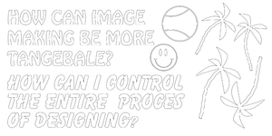
- 4. How can i make designing for printing purpose more tangible?
FEEDBACK:
2 & 4 hebben overeenkomsten, de rest is te vaag of the algemeen. 2 en 4 zijn ook algemeen maar daar heb ik al wel ideeën bij. Dezelfde dag nog kiezen.
KEUZE:
2 + 4 Dus digitale tools bekijken die kunnen tekenen/schrijven en manieren ontdekken die ontwerper tastbaarder zouden kunnen maken.
VALUABLE LINKS FOR IDEAS AND SIMILAR PROJECTS:
Longhand publishers by Indianen
Hans Schuttenbeld Tools of the trade 2014
Drawing Machine by Olivier van herpt
Conditional design workbook by Moniker
First Step
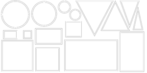
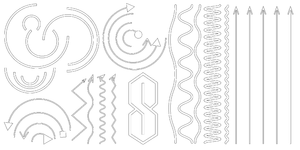
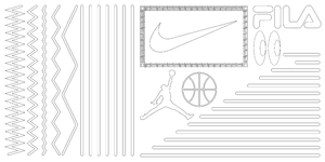
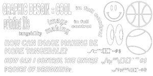
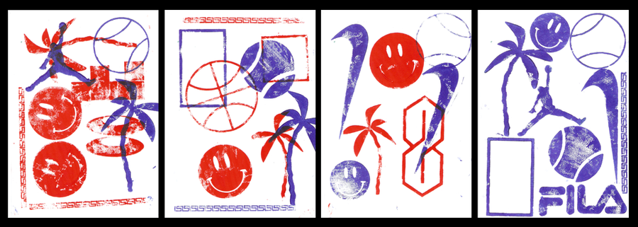
Eerste focus ligt op tastbaarder maken van het ontwerpproces zodat je meer directe controle hebt. Eerst wat ik wilde doen; Inventariseren welke vormen en zoals mogelijk zijn om bijvoorbeeld een poster te maken daarna deze vormen lasercutten en op een kopieer apparaat kijken of ik direct ontwerpen kan maken.
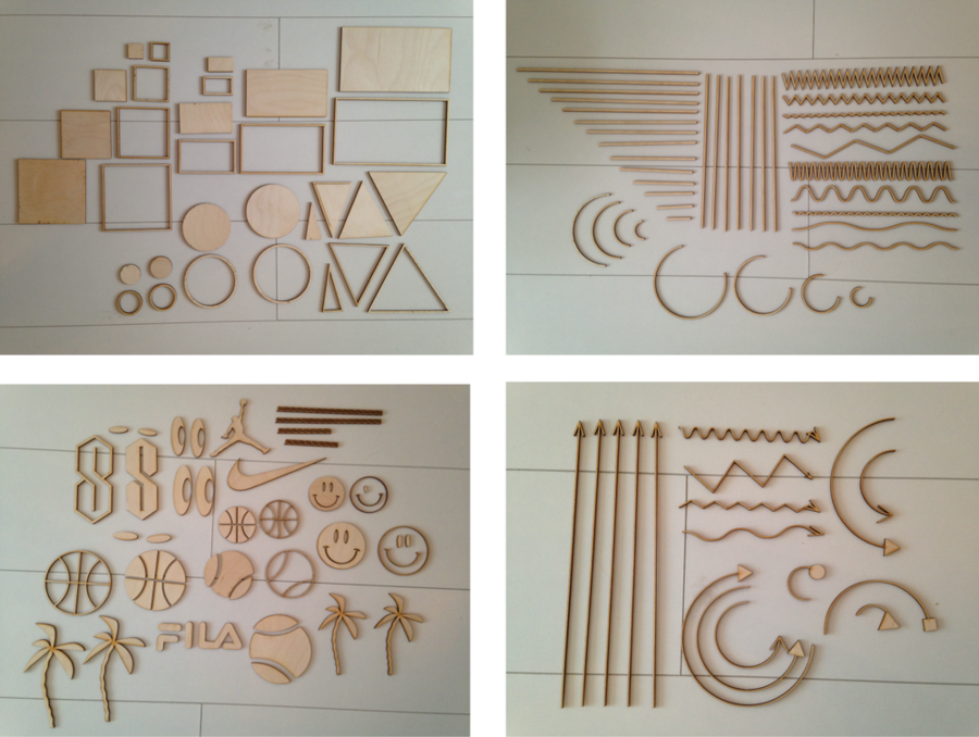
IINVENTARISATIE Deze is gebaseerd op globaal Graphisch Ontwerp, niet alleen mijn eigen werk.
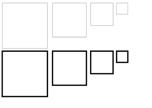
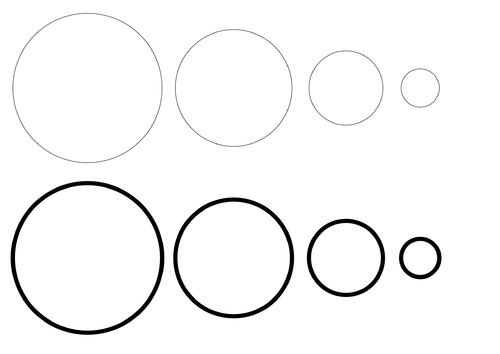
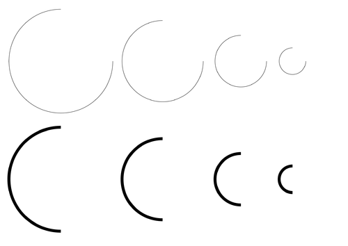
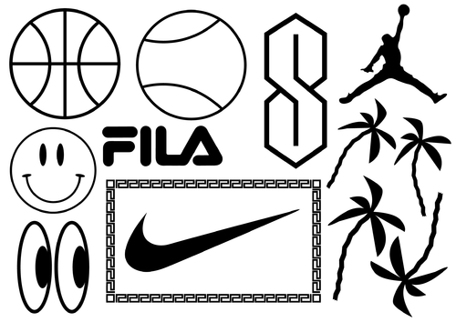
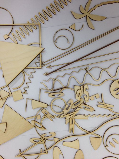
GEOMETRISCHE VORMEN
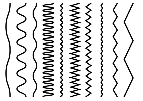
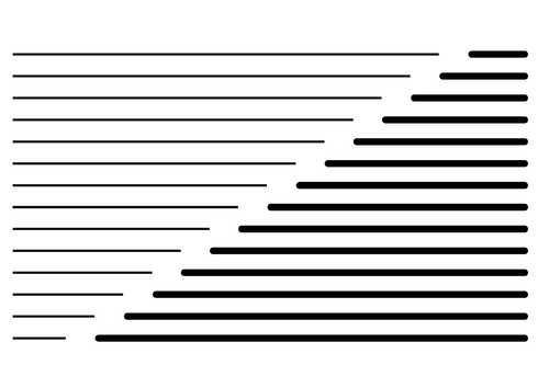
LIJNEN
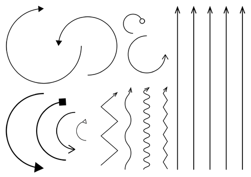
PIJLEN
SYMBOLEN/DECORATIE
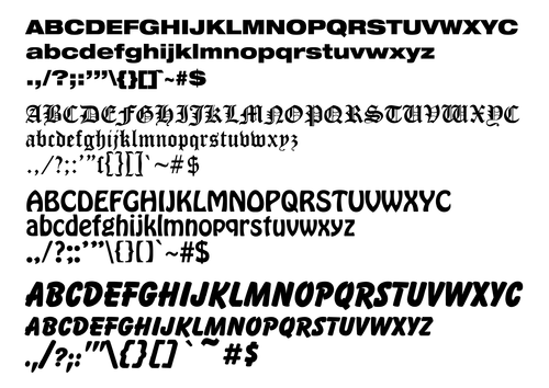
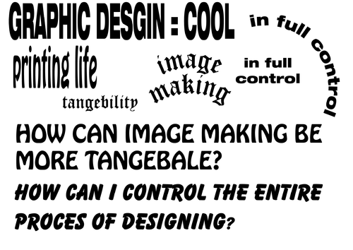
TYPOGRAFIE
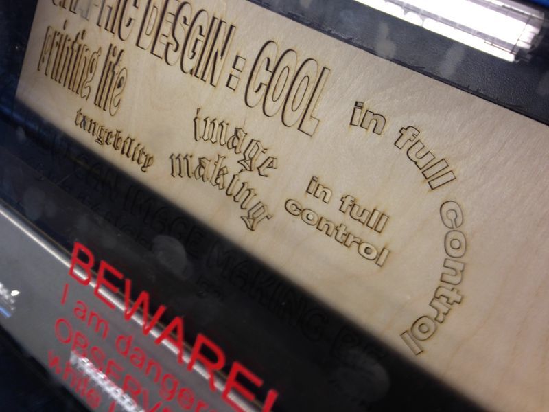
LASERCUT FILES
Using it | Copy Machine
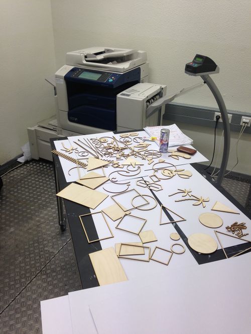
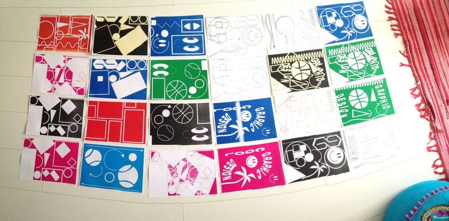
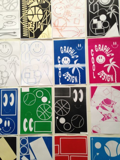
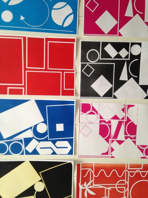
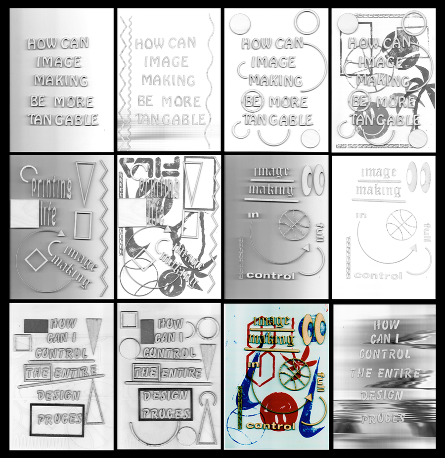
Dit werkte best goed. Er waren een aantal handelingen waardoor ik het beeld qua kleur en achtergrondkleur kon aanpassen zoals de klep open houden of een egale achtergrond boven het apparaat houden. Ik kan eerdere prints ook als achtergrond gebruiken zodat er mee gelaagdheid ontstaat. Als je klep naar beneden is, ontstaat er een soort neon outline effect. Dit word extra versterkt wanneer ik ervoor kies om in 1 kleur te printen (instelling) Bij een kleurenkopie blijft de kleur van het hout in tact, ziet er beter uit dan ik verwacht had. Alleen waren er ook een aantal problemen. 1) Ik had geen overzicht, alles lag eerst gestructureerd maar na wat testen wat het natuurlijk 1 grote vormen-berg. Hoe kan ik meer structuur in mijn vormen aanbrengen? 2) Typografie is vergeleken met de algemene voormen vrij tijdrovend. Alles moet natuurlijk wel redelijk recht liggen etc. als ik dat wil. Dit ging niet zo soepel. Ook kwam die mede doordat ik de zinnen niet van tevoren had gesorteerd dus dat sluit aan op probleem 1. Nog een praktisch probleem, het is een drama om alles te transporteren.
Sorting it
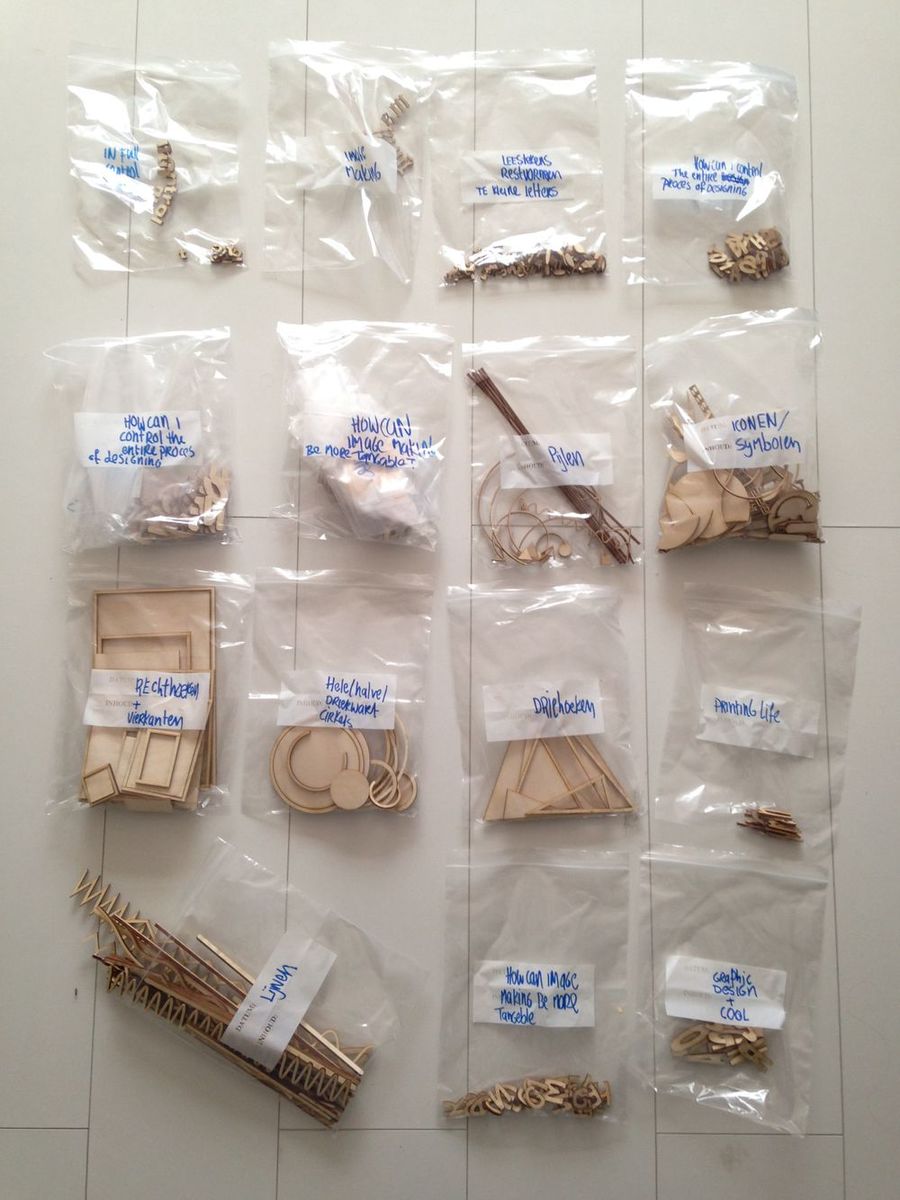
Het grootste euvel waar ik tegen aan liep bij het kopiëren was dat ik geen overzicht meer had van was ik alles wat ik in mijn 'Koffer' had. Voor nu heb ik alle verschillende elementen gesorteerd in zakjes. Op vorm, word, soort etc. Zo kan ik veel sneller zoeken en vinden wat ik nodig heb.
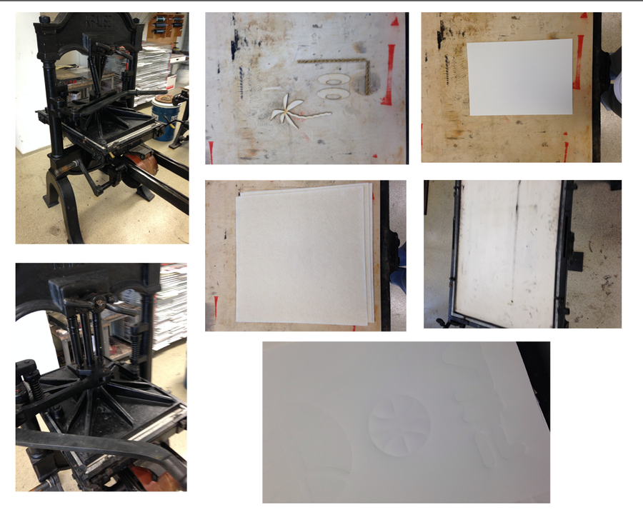
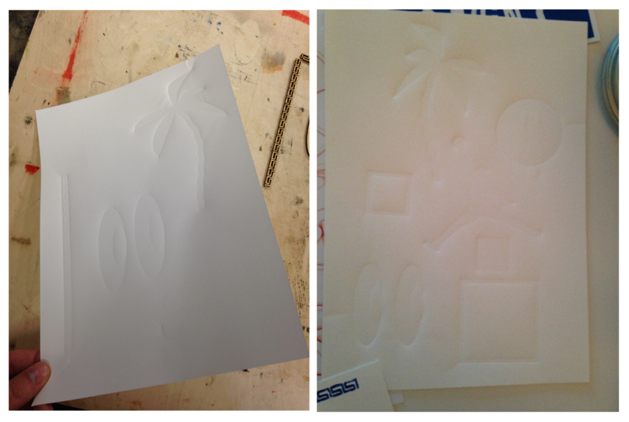
Using it | Blinddruk
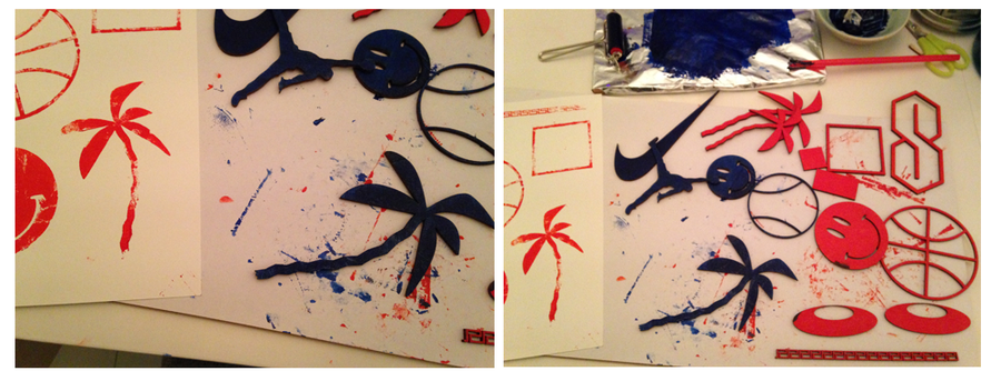
Using it | Hoogdruk
Using it | Scanner
Using it | Material tests
So al of the last images were just a selection of the scans i've made. But there are really valuable findings between them.
More input | Workshop
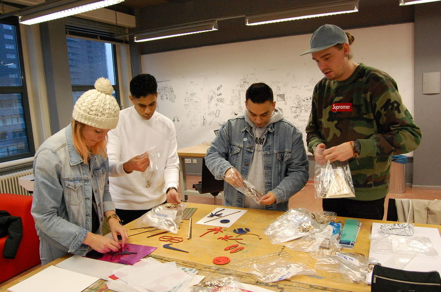
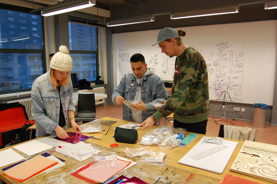
So now the question is, what do i need to do with al the output? Roel and Jon encouraged me to start using this method with other designers so i could get more input and more insight on how other people would use this toolkit. So i've reached out to some Graphic design Classmates. In the end i've found 4 people (Niels Vrijdag, Giorgio Lieuw-On, Heidi Smit, Yacine Benmial) who were willing to give up some time and play around with the toolset.
A nice coincidence was that some guy of HRO Profielen saw us working and became instantly interested. So this ended in a interview with me about the project. This interview was published on the HRO Profielen website CHECK IT OUT HERE He made a few photo's and he was nice enough to share these with me.
The set up of the workshop:
No restrictions, just make cool things with the toolkit. I was curious how other designers would use the things i've used. Also i needed input on how to bring this to another level. I didn't want to fill in to much so i did the workshop and send some questions afterwards to find out how the other designers felt about the toolkit.
The questions (in dutch):
- Wat vond je deze methode?
- Was er iets wat je miste tussen alle materialen, vormen en teksten?
- Denk je dat deze methode meer waarde geeft aan het geen wat je maakt?
- Als je nog andere feedback heb hoor ik het ook graag?
This were some of the results:
Workshop Feedback
Giorgio Lieuw-on:
- Wat vond je deze methode?
De methode is me supergoed bevallen. Het is prettig om weer een keer hands-on te werken in plaats van het pielen op het scherm elke keer. Op deze manier kan je lekker grof schetsen en ook is het prettig dat toeval een grote rol speelt in het geheel. Vaak weet je niet wat de uitkomst is totdat het daadwerkelijk gescand of gekopieerd is.
- Was er iets wat je miste tussen alle materialen, vormen en teksten?
Wat ik miste was dat er per lettertype en lettergrootte niet alle letters beschikbaar waren en wat ook een verbetering kan zijn is dat de uitgesneden vormen in meerdere kleuren beschikbaar zijn dan alleen de originele houtkleur.
- Denk je dat deze methode meer waarde geeft aan het geen wat je maakt?
Het geeft zeker een meerwaarde, omdat het je de mogelijkheid bied om lekker te spelen zoals je dat als kind deed, maar dan op een creatief/ontwerp niveau. Wat op zijn beurt weer je eigen werk weer kan inspireren.
- Als je nog andere feedback heb hoor ik het ook graag?
Meer scanners! Tijd speelt een grote rol in de ervaring, als er te lang gewacht moet worden neemt het ‘leuke’ gevoel al snel af. (zoals je kon zien bij Yacine en Heidi.)
Heidi Smit:
- Wat vond je deze methode?
Hoewel het oude technieken bevat vond ik de methode vernieuwend. Het geheel werd een nieuwe tool om beelden te maken op een manier waar we als grafische vormgevers misschien niet aan zouden denken. Het stimuleert je beeldend vermogen.
- Was er iets wat je miste tussen alle materialen, vormen en teksten?
Wellicht miste ik een bepaalde set aan vormen waarmee ik m’n eigen vormen kon maken. Er zaten veel vormen bij die dus een bepaalde stijl insinueren.
- Denk je dat deze methode meer waarde geeft aan het geen wat je maakt?
Het geen wat ik maak is mijn persoonlijke stijl. Andere vaste vormen zouden daar in de eerste instantie niet aan bijdragen om dat te behouden. Dit is mijn persoonlijke streven wat ontwerp betreft.
- Als je nog andere feedback heb hoor ik het ook graag?
Ik denk dat deze methode is leuke manier is om je beeldende vermogen te stimuleren.
Niels Vrijdag:
- Wat vond je deze methode? Ik vond het heel leuk op deze manier te werken. Een vormonderzoek om op een heel speelse manier mee om te gaan zonder na te hoeven denken over concept, context of toepassing.
- Was er iets wat je miste tussen alle materialen, vormen en teksten? Ik vond dat er ruim voldoende was. De letters vond ik overbodig, en in plaats van logo’s zou ik eerder kiezen voor vormen als vierkanten, driehoeken en cirkels
- Denk je dat deze methode meer waarde geeft aan het geen wat je maakt? Zonder deze methode had ik nooit gemaakt wat ik nu heb gemaakt. Daar in zit hem de kracht van de toolkit. Aanvankelijk lijken de mogelijkheden beperkt, maar binnen de restricties liggen juist de mogelijkheden. Je creativiteit wordt heel erg gestimuleerd wanneer de opties beperkt zijn, of althans, beperkt lijken.
- Als je nog andere feedback heb hoor ik het ook graag? Ik vond het aanbod van figuurtjes, vormpjes, papier en materialen misschien nog wat te veel. Als ik deze toolkit aan zou bieden zou ik hier waarschijnlijk een kleine opdracht bij geven waardoor er meer samenhang ontstaat tussen de uitkomsten. Ook neemt dit iets van de willekeur van de werken weg. Denk bijvoorbeeld aan instructies als; een geometrisch patroon, een mozaïek, een alfabet, een typografische poster, gradients, of een herinterpretatie van een bestaand werk. Gebruik alleen de scanner of alleen het kopieerapparaat. Of geef mensen de opdracht met het kopieerapparaat te beginnen om vervolgens met de scan- ner een laag hier aan toe te voegen. Ik zou de toolkit opsplitsen in kleinere toolkits en de gebruikers een specifieke taak geven. Persoon A creëert een achtergrond met bijvoorbeeld gradiënt en de scanner, terwijl persoon B bij op het kopieerapparaat composities aan het maken is, waar persoon C vervolgens tekst in zet.
- Mijn methode Toen de toolkit uitgestald lag op de tafel vond ik het aanbod in eerste instantie wat groot. Ik heb toen direct besloten 3 vormpjes te pakken en niet meer naar de rest te kijken. Daarbij besloot ik ook alleen het kopieer- apparaat te gebruiken. De eerste vijf kopieën die ik maakte waren nogal willekeurig, ik heb wat zigzagvormpjes bewogen boven de plaat totdat er een mooie tussen zat. Vervolgens ben ik goed gaan kijken naar de mogelijkheden van het kopieerapparaat, deze kan namelijk ver- groten en verkleinen, maar ook spiegelen en in negatief afdrukken. Met deze mogelijkheden ben ik heel erg gaan spelen. Mijn aanvankelijke kopie ben ik heel erg gaan verklein- en en heb deze negatief gedrukt. Deze heb ik vervolgens samen met mijn aanvankelijke kopietje op de glasplaat gelegd en vervolgens 70% verkleind, zodat beide kopieën vervolgens op 1 A4 gedrukt werken. Dit resultaat vervolgens gespiegeld en in negatief, en dezelfde truc herhaald. Deze methode heb ik een aantal keer herhaald en hier van alles mee geprobeerd tot ik een paar mooie had. Daarna ben ik begonnen met de mooiste blaadje dubbelvouwen en naast elkaar leggen zodat er een soort vlakverdeling ontstond. Ook deze truc een paar keer herhaald, vervolgens weer de mooiste resultaten gecombineerd door te vouwen, verkleinen en te spiegelen. Toen ik dit een aantal keer had gedaan was mijn oorspronkelijke composite al 20x verkleind, waardoor een mozaïek ontstond. Na ongeveer 30 kopietjes was mijn patroon zo klein geworden dat het origineel bijna niet meer herkenbaar was. Deze resultaten ben ik weer gaan combineren met blaadjes uit het begin van de reeks, waardoor grote vormen aangevuld werden door een heel fijn mozaïek. In mijn serie is uiteindelijk een heel mooi verloop te zien van patronen die elke stap kleiner werden maar wel altijd op elkaar aan bleven sluiten.
Reflection on the workshop and entire project
Presentation Plan
So the plan is to give a live workshop on how to make crazy images on the copy machine. I think the best set up it to start with something really basic like a gradient or some geometrical shapes. After that it's time to start copying, zooming in, out, invert, mirror, fold, combine etc. In the end it would be nice if i can make a collection of all these prints/patterns. So maybe a wall of fame would be nice.
Text:
Thom Trouwborst is a 4th yeah graphic design student who is interested in finding new ways to create images. Therefore he started investigated more tangible, hands-on and direct way making for his Tools of the trade project. His search ended at the old fashioned copy machine. Within the restrictions of this machine great things can happen. The technique behind a copy machine is called xerography and is invented in 1938. It took some time for it to become popular but when it became to the masses, it has become a important tool for self publishing. During the exhibition i wil give a live workshop on how the create impressive graphic only using the copy machine and some small add on's.
