Courses/Design & Technique-Essential Web Design/CSS4print
HTML to print
[edit]HTML to print allows you to create print layouts from your web pages.
You can create a PDF from your web-pages with specific designs for print, by using the browser function «Print to file» and dedicated CSS instructions.
We'll look into to them, however keep in mind that this system is still very unevenly implemented in browser. That can result in a lot of frustrations, discovery, surprises, and hacks.
CCS for print
[edit]Specific CSS rules allow you to specify how a webpage that was designed for screens, will be displayed in a page layout.
What browser?
[edit]Chrome/Chromium seems to be the best for designing the CSS for print as it provides a print preview option.
@page
[edit]@page rule defines context for printing.
It describes the characteristic of sheet where web page is going to be printed on.
https://developer.mozilla.org/en/docs/Web/CSS/@page
@page property: size
[edit]Possible values size: A5, A4, A3, landscape, portrait
Note: Only Chromium's print preview can take the format specified by the CSS
@page {
size: A4 landscape;
}
http://www.w3.org/TR/css3-page/#page-size
left and right @page
[edit]Pseudo-class selectors for the left and right pages
http://www.smashingmagazine.com/2015/01/designing-for-print-with-css/#left-and-right-page-spreads
@page left @page right
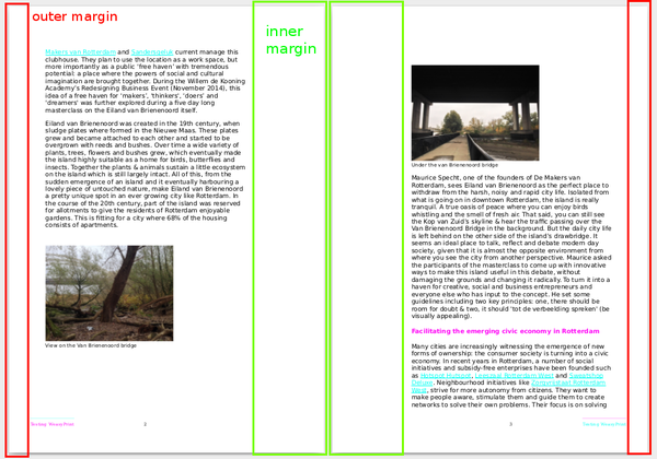
[edit]Option for the left and right pages, such as the margin sizes, which have to alternate in order to produce a bound work, are correctly rendered.
@page:right {
  margin-left: 3cm; /*inner margin*/
  margin-right:1cm; /*outer margin*/
}

@page:left {
  margin-right: 3cm; /*inner margin*/
  margin-left:1cm; /*outer margin*/
}
specific pages
[edit]Couldn't get specific pages work
@page :first {

}
The :blank pseudo-class selector targets any page that is “intentionally left blank.” To add this text, we can use generated content that targets the top-center margin box.
@page :blank {
  @top-center { content: "This page is intentionally left blank." }
}
How to write CSS Rules only for Print?
[edit]2 options:
- Link a CSS file with media="print"
- use
@media print
Link a CSS file with media="print"
[edit]Add this tag to the HTML file
<link rel="stylesheet" href="print.css" type="text/css" media="print">
Which loads only the print.css file, when the page is printed.
@media queries
[edit]@media CSS rules or media queries defines specific contexts, under which specific CSS rules can be used.
https://developer.mozilla.org/en-US/docs/Web/CSS/Media_Queries/Using_media_queries For print:
 @media print {
    body {font-size: 12pt;}
    img { width: 300px;}
 }
For screen:
 @media screen {
    body {font-size: 14pt;}
    img { width: 800px;}
 }
For screens with width smaller than 600px:
@media (max-width: 600px) { {
    body {font-size: 10pt;}
    img { width: 200px;}
 }
@media print
[edit]You can decide to style very differently you page when it is printed.
You can use it to explore how the way information is displayed influences its message.
page vs. screen
[edit]- print exists in the space of the page, with fixed page dimensions and breaks
- a webpage exists in a continuous screen space, often with varying dimensions
page breaks of the document
[edit]To control where the pages break, in HTML to print, is tricky, and in part you don't control it.
What you can control is what elements must, can or cannot break, before, after, or inside themselves.
In CSS in translates to the rules:
page-break-before; page-break-after; page-break-inside
And values
always; auto; avoid;
Example:
 h1, h2, h3, h4, h5 {
  page-break-after: always;
}

p, table, figure {
  page-break-inside: avoid;
}
http://www.smashingmagazine.com/2015/01/designing-for-print-with-css/#page-breaks
More references to HTML-to-print
[edit]http://www.smashingmagazine.com/2015/01/designing-for-print-with-css/#page-breaks

