User:BabetteVerhulst
Babette Verhulst

0916515@hr.nl

Graphic Design
Year 3
Project 1
Critical making
Cards:
Artificial intelligence for an insect to use filmed by a phone.
Concept:
Infects are not able to speak and are often not able to let other species know that they are in danger or maybe need something. Ants for example communicate through their pheromones, sound & touch. Their antennae send out signals and for these signals we created an application that informs humans in close perimeters of the ant that they are close by. This way the human will be aware of the location of the ant and will keep this in mind so that they will try to not kill the ant.
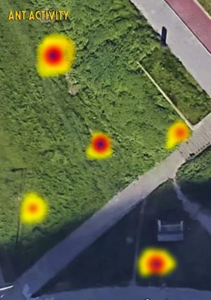
With the help of artificial intelligence, the application will be able to create a map of the location off all the ants that have ever been noticed by the app. This way it will keep being easier to let them love in piece. Below is an image of what this map could look like.
Movie:
Ant activity map.
Project 2
Cybernetic Prosthetics
Concept
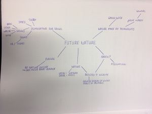
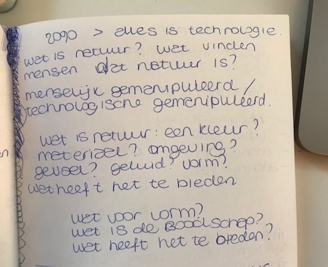
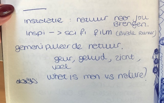
In this future nature’s functions have been completely taken over by technologies. But with that we also lost the emotional value of nature.
To embrace the natural sublime, to consume nature’s spectacle, to measure nature’s objects, to extract nature’s bounty means, obviously enough, to bring bodies into contact with nature.
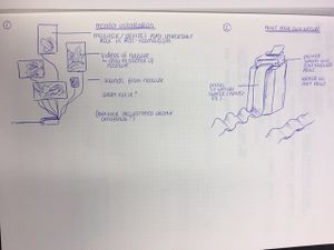
So that is what we want to do with the limited resources this future has to offer, (limited as in, only technical stuff because that is what this future has.) By creating a window, that, through algorithms, will be able to show a kind of nature scene that shows weather and nature close ups. We would like to make it responsive. Like it would respond to movement and change of do something when you would come closer to it. That way nature becomes a more important element because with these sensors the person would feel much more connected with it.
The idea for a window came because we want this to be a feature in house that is always there. It is not a luxury object that only a few people can afford.
Inspiration/references
- Christine Odlund
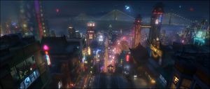
- Blade Runner movie: sci-fi movie where there doesn't excist any nature anymore.
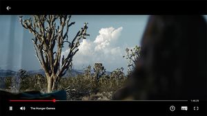
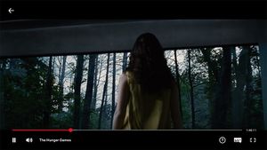
- The Hunger Games: Where there is a big display and a person can choose a view with a remote.
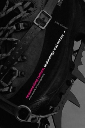
- Reconnecting Culture, Technology and Nature (From Society to Heterogeneity) Book by Mike Michael
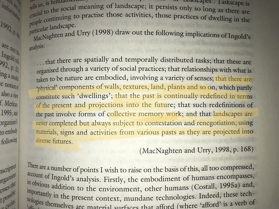
- To embrace the natural sublime, to consume nature’s spectacle, to measure nature’s objects, to extract nature’s bounty means, obviously enough, to bring bodies into contact with nature. This is no simple process, as I hope I have shown. It is shot through with the cultural, which is shot through with the technological, which is shot through with the natural, which is shot through with the cultural and so on. (Pag. 59/60)
- I regard the embodiment as a movement of incorporation rather than inscription . . . a movement wherein forms themselves are generated . . . thus organisms may be said to incorporate, in their bodily forms, the life-cycle processes that give rise to them. Could not the same be said of the environment? Is it possible to identify a corresponding cycle, or rather a series of interlocking cycles, which build themselves into forms of the landscape, and of which the landscape may accordingly be regarded as an embodiment? (Ingold, 1993, p.157)
- I regard the embodiment as a movement of incorporation rather than inscription . . . a movement wherein forms themselves are generated . . . thus organisms may be said to incorporate, in their bodily forms, the life-cycle processes that give rise to them. Could not the same be said of the environment? Is it possible to identify a corresponding cycle, or rather a series of interlocking cycles, which build themselves into forms of the landscape, and of which the landscape may accordingly be regarded as an embodiment? (Ingold, 1993, p.157)
- To embrace the natural sublime, to consume nature’s spectacle, to measure nature’s objects, to extract nature’s bounty means, obviously enough, to bring bodies into contact with nature. This is no simple process, as I hope I have shown. It is shot through with the cultural, which is shot through with the technological, which is shot through with the natural, which is shot through with the cultural and so on. (Pag. 59/60)
- Part of those cycles is the activity of organisms, humans included. Thus,
- once we think of the world in this way, as a total movement of becoming which builds itself into the forms we see, and in which each form takes shape in continuous relation to those around it, the distinction between animate and inanimate seems to dissolve. The world itself takes on the character of an organism, and the movements of animals – including those of us human beings – are part of aspects of its life-process . . . This means that in dwelling in the world, wo do not act upon it, or do things to it; rather we move along with it. Our actions do not transform the world, they are part and parcel of the world’s transforming itself. (Ingold, 1993, p.164) ((Both on Pag. 62)
Feedback How can sensors play a role in this? What perspective would this bring? And what would happen exactly? What if you looked at this from the other side. A contradiction. If you were to show the people the real nature, like what is left of it. So they would be confronted with that every time. (Wasteland images)
Project 3.1
Black Box Mapping
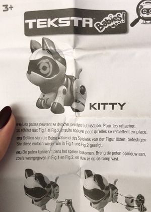
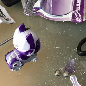
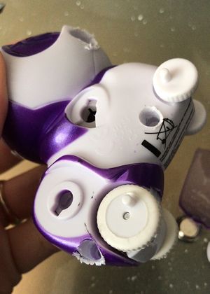
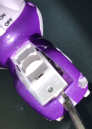
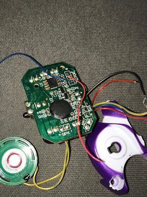
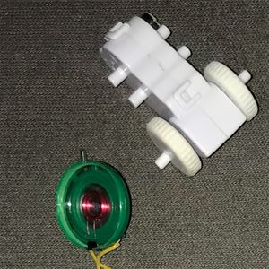
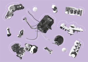
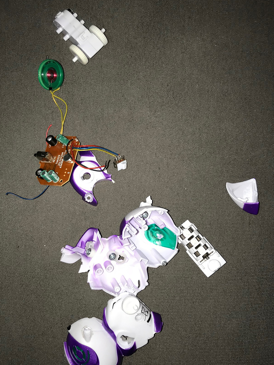
I took apart a children's toy, a robot cat that kan walk, both backwards and frontwards. It also makes cat sounds when you press a botton on it's head and I believe it is supported to react to clapping. I tried that but I did not get the feeling that worked very well. It was very cheap, which also meant that some of the screws were bad to. So in order to break the toy open I had to use a hamer and then some of the wires broke. So it does not work anymore.
Project 3.2
Black Box Remakeing
I use a dyno torch because I thought it was an interesting way of creating electricity and I did not want to take something that was to difficult with a lot of wires and the chance of me breaking something and that it would not work any more. The torch was an easy pic because it is not very complicated. My idea was to use the dynamo to sent the electricity to a adaptor to use for a phone or something, instead of creating a light. But my feedback was that I then used the torch for the same purpose, to deliver energy and that this was not good enough. A story was missing, a reason. Then I thought of still being a charger, but the reason would be different. Like in the future we are going to depend on our phones even more and we are going to get more crazy when we can't use them. So what if it was like a stress ball. You squeeze it, because you are stressed that your phone is almost empty or just any other reason like your job, school, relationship, and in the mean time you also create new energy to use.
When you think about it this is kind of like a feedback loop. By giving these 'addicts' a way to calm down and at the same time feed their addiction by charging their phone at the same time.
Project 4 - Final Project
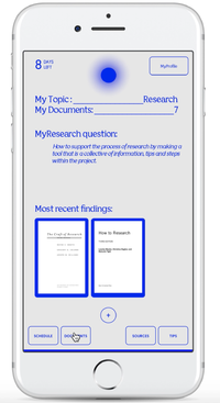
MyResearch - A Self-Help App for research
Concept:
My final project is a self-help app for students that helps them with their research for a project.
Written reflection for the research document:
THE RESEARCH APP
My final assignment is a research tool in the shape of an app.
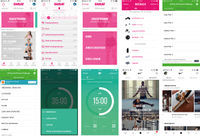
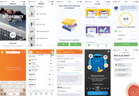
When I stated the project I did not know how to choose a topic. I was a bit stuck because I felt like I did not belong in Digital Craft. But still I had to think of something. So I started thinking of topics that I work with in my major: Graphic Design, as a way of helping me get past the problem. II put the focus more on my major than having to make something technical. I started thinking about research, structure, systems, functions of elements, things I am interested in. Pretty soon I knew I wanted to make some kind of a system for research. A tool to use, one that could help you during the process. But it was all to complicated, I would need to make a huge database with topics and link them together, way to ambitious. But this was still really interesting to me, so I tried to downsize it. Then I was brought to the the concept of the self-help app. For example an app that people use when they want to loose weight and track their food and exercise. These kinds of apps have a lot of layers of levels and possibilities to get to the end and reach their goal. So to get started on my own self help app. A research tool in the form of an app.
I started my own research looking for articles about methods, sources and the importance of research. Also looking for online research tools to use, and to put into my app. And lastly also looked at different kinds of self-help apps and how they are put together.
REFLECTION
I am happy with the design of the app. I would however have liked it to have more functions, but because of a lack of time I could not create a kind of a database. I also would have liked to have made the help with choosing a topic bigger. Like a questionnaire instead of tips. But I did not realize how much time making the app would actually take. There are so many options to click on and I had to make all of them. Also when I was making them I realized that I needed to collect even more information. Luckily I had a couple of really good and detailed books about research that I already used and I could find all I needed in there. But this did cost me more time of course.
I have not tested the app on anyone to know how they would use it and if it even works. But that would be my next step. I think it is pretty clear, but some might feel that finding everything is a little bit of a challenge. I myself like to click on every button and find out everything that is behind them. But I know that not everyone does that.
Overall I do feel like the app offers a lot of information on the different sides of research. I am sure that it contains information and sources that some people did not know about. And so in that way I feel like the app is a succes in the state that it is now, as a self-help app. But in order for it to really become that app that people would use, these functions need to be able to go deeper and do more.
How to take it further:
The idea of the app offers a lot more opportunities, especially within digital craft. This excites me a lot. The idea that I could share this with the research and education station had not even come up in my mind. Because I was just busy with focussing on finishing the project, I did not see what it had to offer. Especially to myself. Because I see now that I have this thing that I find really interesting and enjoy working on and can continue doing so during the rest of my time here.
Here are some functions that I already know I want to develop further. In the beginning, when you can make your account the app asks you if you have a topic yet. If you say ‘no’ you get some tips and a pdf that offers even more tips. What I would like to happen when you click ‘no’ is a questionnaire. About your interests, study and assignment. Hopefully this will help the student actually do it, instead of just some tips. So after this the app asks you to select a period of time. Like how many weeks do you have. The idea is that this way the app knows how much time you have to be in a specific phase of your research. Right now nothing happens, but I want this to actually happen. Like if you have 3 weeks then the app will give you more time to stay in the beginning phase because you can obviously afford to spend more time in that phase than if you only had a week. Than it would be more like a ‘crash course’.
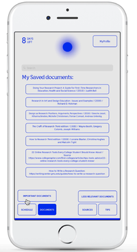
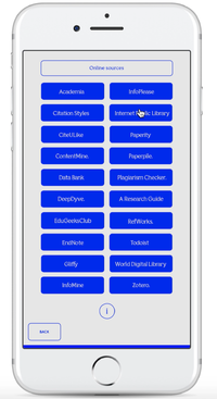
Then when you are logged in there is a submenu ‘documents’ that has a selection of your saved documents and also two folders for ‘more and less important documents’. (which can help for when you have to actually use them) Right now the way to save these documents has not been determent yet. But I would like to link this to the ‘online sources’ option. Now the app has a list of online sources that are linked to their website. But I want these sites to be linked to one search option, within the app. That way the user does not have to go to all these databases, but can find all the information in one place.
Other things that could get better are, the planning part. I would like the app to be able to give reminders, ones you make for yourself, but also ones that come from the app the knowledge has about your project.
References
Design as Research: Positions, Arguments, Perspectives / (2016) / Gesche Joost, Ktharina Bredies, Michelle Christensen, Florian Conradi, Andreas Unteidig.
Research in Art and Design Education : Issues and Examples / (2008) / Richard D. Hickman
Doing Your Research Project: A Guide for First-Time Researchers in Education, Health and Social Science / (2010) / Judith Bell
The Craft of Research Third edition / (1995) / Wayne Booth, Gregory Colomb, Joseph Williams
How to Research Third edition / (2006) / Loraine Blaxter, Christina Hughes and Malcolm Tight
10 Awesome Online Research Tools / https://elearningindustry.com/10-online-research-tools-every-online-learner-know
22 Online Research Tools Every College Student Should Know About / Source: https://www.collegeraptor.com/find-colleges/articles/tips-tools-advice/22-online-research-tools-every-college-student-know/
Position Paper
Postion Paper - What is your craft?
In graphic design, you really have to know what kind of things drive you as a designer in order to fully use the trade to your advantage. It is about connecting yourself to your client and the public. I think my project reflects on this. By working on something that interests me, I realized how I could share this interest and what I needed to actually do this.
Research is very important for me. I enjoy immersing myself into new topics. I am lucky to have this interest because it helps me to actually do the work. But a lot of students have troubles with research, not knowing how and where to start. That is how I came to my idea: A self help app in the form of a research tool. For students to use during their research. Starting this also offered me a chance to expand my knowledge and better my own research process.
Graphic design these days is mostly associated with books, publications, identities and web design. But people who are not in the same world as us really have a different idea of what it is and what graphic design can mean for them. Important tools in graphic design are communication, knowledge of your audience, of tools, skills, knowing how to think conceptually and how to experiment with all that knowledge. This is what a graphic designer does. This is what is important. So the medium does not need limits, it just has to suit the concept and the target audience etc. I chose to make an app because my target group, students, use their smartphone the most. Besides that, making it an app makes it easier to use next to their computer during research. A phone is compact and the student can also easily take it with them if they were to go to the library for example.
I think that in the future the meaning of graphic design is going to change, it might even become more confusing to the public what it means, but it also means the craft it growing. Because when you define a graphic designer from the points I mentioned above, it does get more confusing. But it describes the core, the goal and the drive of graphic design and therefore I think that is what people need to know.
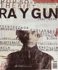
Before designers had the chance to work on computers the restrictions, rules and styles of design were much stricter then they are today. But I also think the profession had a better understanding back then. Because you needed to have more knowledge then then you do now. These days you just need a computer, not even an understanding of what you are bringing into the world. That is why people underestimate and misunderstand graphic design. David Carson(1) was the first to experiment with a computer as a new tool within graphic design. He made works that were completely beyond what anyone had ever made. He saw the tool as a new way of designing and also stated to design different, there were no rules. There was no logic to it. I think the new technologies can make sure this is going to happen again, and not just once. Works have become more interactive with it’s audience at lot in the past years.
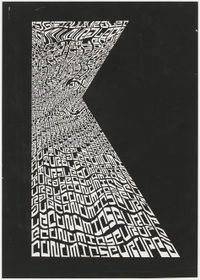
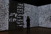
Jurriaan Schrofer(2) was a graphic designer who, before computers were even invented, succeeded in shedding new light on the possibilities in design. Just like Carson did. Schrofer was always looking for ways to visualize dynamics and movement by means of typography. He turned text into images, and got inspired by the Op Art movement. Looking at his work you would think it was made with a computer, and that is the power of it. These dynamic, ‘moving’ and meaningful typography based images formed the foundation for project from LUST. They created an interactive installation for the exhibition ‘Type/Dynamics’ at the Stedelijk Museum in Amsterdam. The installation was a visualization of the information that is always around us and accessible(3). What is interesting about this project is that it shows the possibilities that we have these days in the design world. Where new media, information technologies and graphic design overlap. It shows how we can reach a bigger audience with these technologies and a better understanding of them.
I think that, because technologies play such a big role in our lives, we as designers can not hide from it any longer. We need to use it if we want to reach our audience and share our thoughts and ideas. That is why I chose to go to Digital Craft. I wanted to learn more about these options and at the same time reflect on my own work. Forcing myself in way, to look at what I could reach if I put my focus with the technical side for once. There I realized that there is this great way for me to share my interest of research with an audience that could actually benefit form me wanting to share it with them and that is honestly the most inspired I have been in a while. I am very exited for what this project is going to bring and teach me.
Link to video from the installation
Year 2
Cutting Edge of the Present
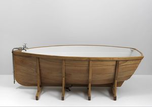
Badboot made by Wieki Somers
The artist herself said that the work was more about the thin line between relaxing in a bath and floating in a boat on the water. In our time, right now this artwork means so much more than she had intended for it. It's about harmony, differences and acceptance.
The combination of the bath and the boat, both having their own function and meaning, and both having the element of water playing a big role in that. The bath is to contain water in it, whereas the boat is to float in it. However the boat could never float if it was to contain water. You see how these two lie so very close to each other, but yet could never be the same. It is not about the experience that both the bath and the boat give us, but about their function and how they can stand strong together. I think this is something I could want to work with.
My statement
My chosen artwork is 'badboot' by Wieki Somers, made in 2005. I chose it because I was intrigued by the combination of the bath and the boat and how she was able to find a balance between the two objects. Their function, shape and the contraction I thought were interesting starting points.
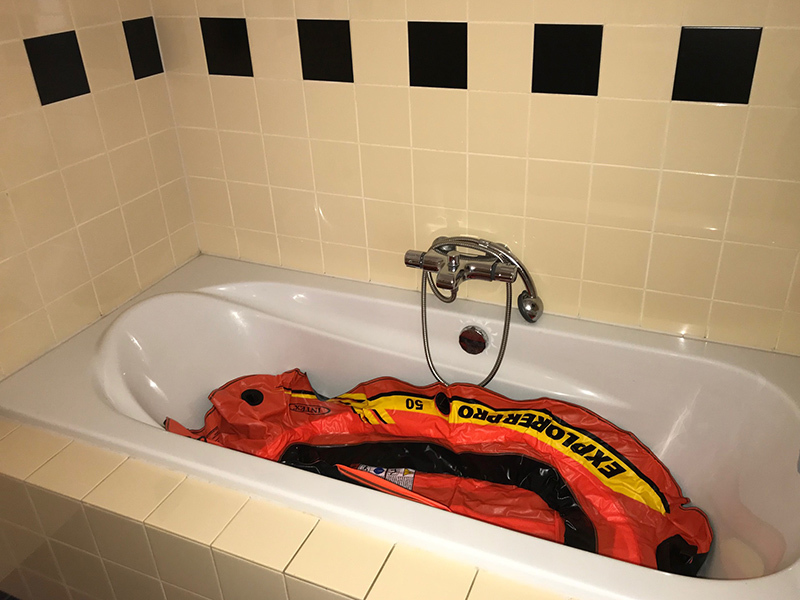
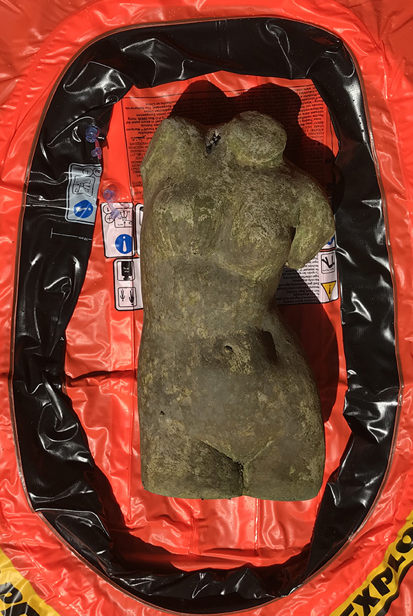
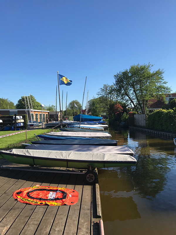
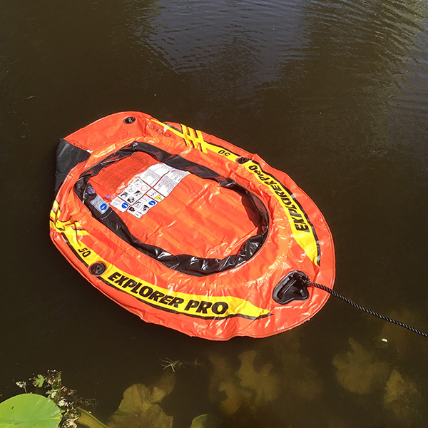
My transformation of the artwork 'badboot' by Wieki Somers is a series of pictures that contain an uninflated inflatable boat. There are two series, one for the bath and one for the boat. In these photographs I try to show elements that are a part of the bath and the boat and to show how they are different from each other.
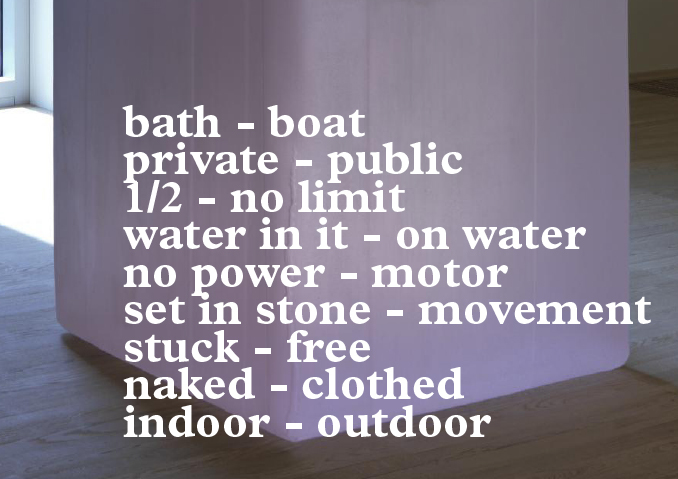
During my research on the subject I realized something interesting. The bath and the boat, to me, in a way address the issue of public and private. Without thinking about it, the original artwork got another layer to it, and this made me think of taking a different approach with the work. Showing something in between.
A bathroom is to most people a private place. It is closed off, with a door and a lock. So, when you take a bath in this private place, you feel comfort in knowing that you are.
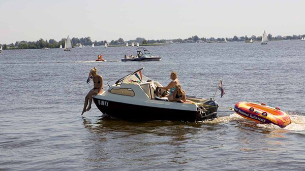
A boat on the other hand is always in a public space, the water. On a lake or on the sea, it is always public, and the only way to make use of the boat. So, if you are on a boat there are no rooms to close yourself of in with locks.
But mostly the series is about taking the one object, the inflatable boat, and putting them in different surroundings and using different objects, to show the difference between the bath and the boat. The reason that I chose to do it this way, was to show the thin line between the two, and at the same time how different they are. Obviously, the original artwork is showing the bath and the boat as a whole, together. So that is also why I chose just one key element.
The subject public and private is very hot topic right now. Especially online. People are very concerned about their privacy and their personal information. So, I definitely see a link to the new technologies with the subject of my work. Because, as much as we would like our personal information to be locked up safe in a room, we all know it is out there on the water for everyone to see.
During my research I also found other contradictions for the bath and the boat. Obviously, they have different functions, but another example is, their positon. The thing about a boat is that it can move and that it can take you places. A bath on the other hand is set in stone. It is built in and meant to be in the exact spot that it is. There is no movement. It can't leave. A boat can, a boat is more about its surroundings and its position.
Then I started thinking about what makes them the same, and with which elements one could attach them together. The element water plays the biggest role. The materials are altered to it, and so it the shape. People are meant to be in it. Only thing is a boat is bigger and meant for more people. That is why a boat has seats. A bath does not. Because a bath is inside and a boat outside, the weather also plays a role. In the winter people do not really go out on the lake with their small boats for an afternoon, this is what people do when the weather is nice. Of course, with big boats on the sea it's different, but that is not important right now. And so that is why for the copy I wanted to do something with the materials.
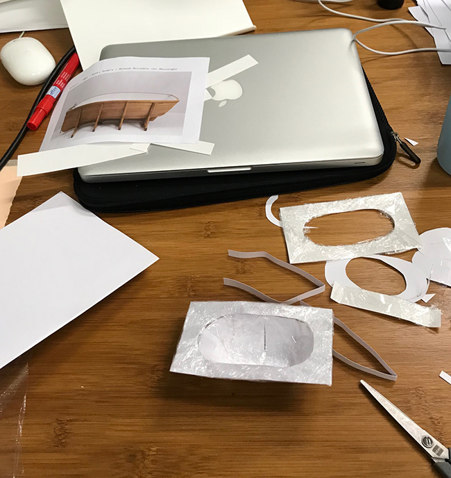
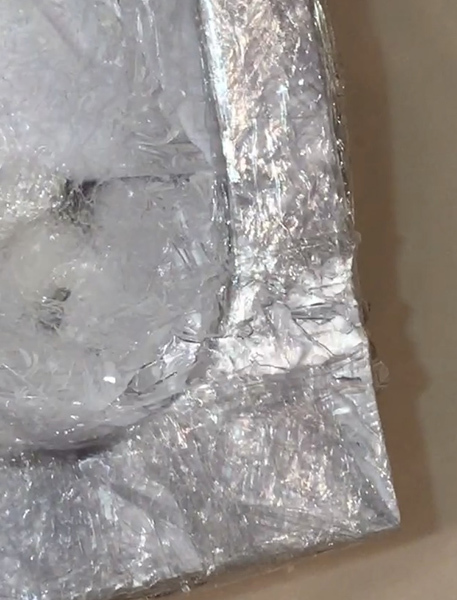
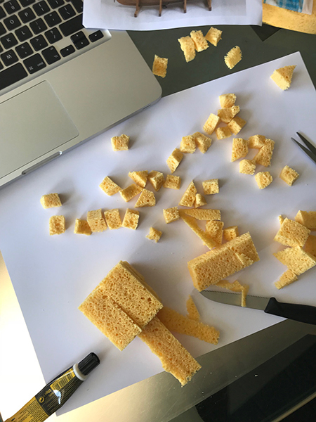
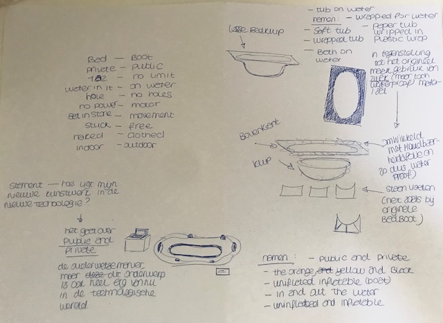
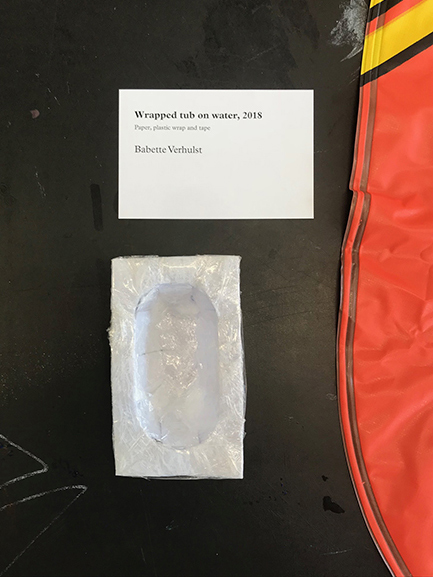
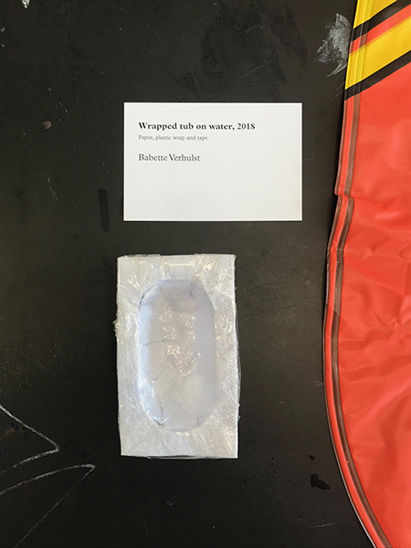
So, getting back to the materials, they are also different. But, both are very strong. So, I started looking at materials that work well with water yet are soft and easy. Plastic, sponges, aluminum foil, cling film I used to try to create new shapes. That is how I came to the idea to make a bathtub from paper, but to wrap it in cling film to protect it from the water. Because first I thought I want to make a boat/bath shape from a sponge. So I bought a sponge and cut it in pieces, Then I tried to glue them together and I realized this would not work because the sponge absorbed the glue. Then I thought I could make the pieces a whole by wrapping them in cling foil. Only now it was not the shape I wanted. Then I decided to make it out of paper and then wrap that in the cling foil. I wanted it to be soft and vulnerable, because I wanted it to be the opposite of a real bath and boat. For it to reflect on how vulnerable our privacy is, like I was saying before. So, this is what I made as my reproduction from the original artwork and it is based on the texture and the idea.
For my group
Speculative Future
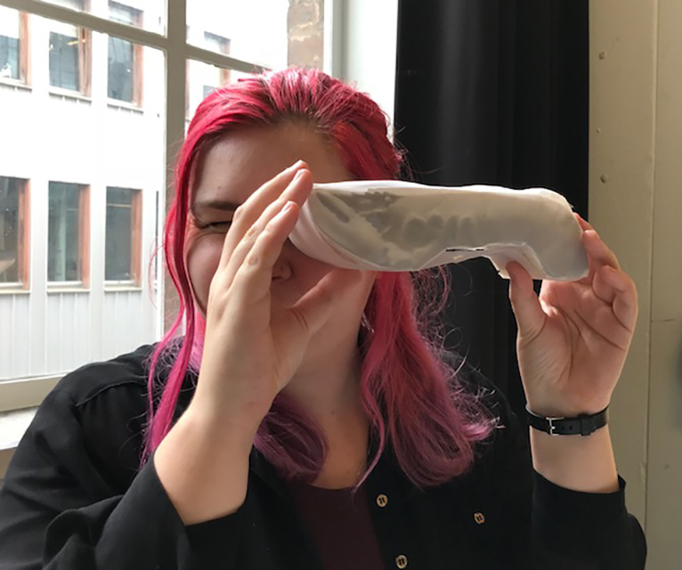
For Larissa, who has chosen the artwork: White Aphrodisiac Telephone by Salvador Dalí (1936), I made a future phone. With the original artwork, the lobster on the phone, for me, is the one telling the user something. The lobster is giving information, it is communicating with us, in a way that is difficult to comprehend. And because the work I made was focussed on the future, I chose to let the lobster show us, instead of telling us. Because it is the future and the way we communicate with each other is going to change. So I made a binocular in the shape of the lobster and that can be used to see whatever it is the lobster would want to show.
Contrafactual Past
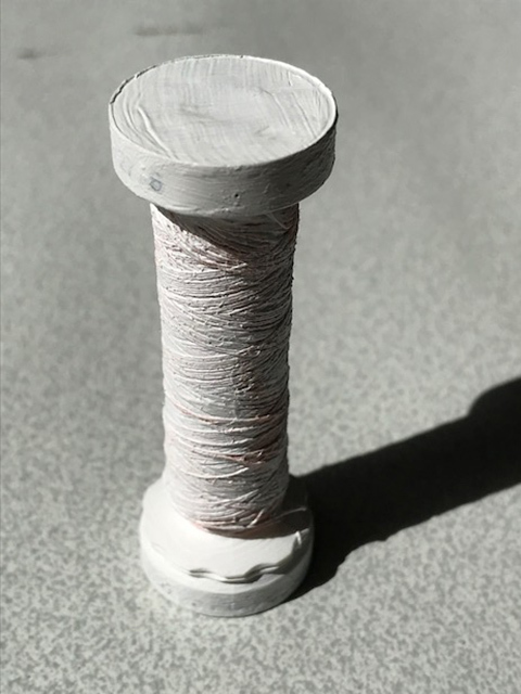
For Andres, who has chosen the artwork: Shirt Wrapped on Tailor Mannequin by Christo (1958), I made a piece of yarn from the past. With the original artwork the shirt on the mannequin was wrapped with yarn and after that is was painted, to become more of a whole and to be able to stay in that quality for a long time. So the materials the artist used were very soft, light and flexible and so it was easy to create the shapes in the fabric. So I thought what if the used material wasn't light and soft, what if it was already hard and painted. Thus I painted a spool of yarn with this idea in mind. How would the artwork have looked then, would it have broken or would it have taken much longer to make the work?
Reproduction from texture and idea
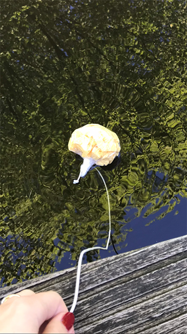
The final work I named: Wrapped tub on water.
And that is because it is the shape of a real bathtub and I wrapped it in plastic wrap. And thus it is waterproof and able to float on water, which is what I would want it to do. That is how I envision it.
Contemporary transformation
For my final work I made a series of photo's and then made a website where they are to be shown.
And here are just a few of the pictures I took.
Blueprint
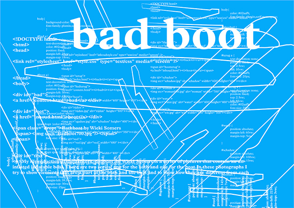
For the blueprint I used the code from the website I made, and added shapes to it. These shapes I made from drawing outlines on the origional artwork.
Research
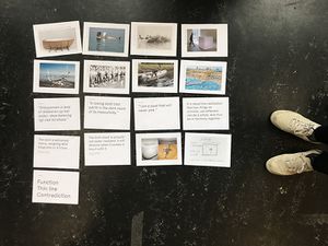
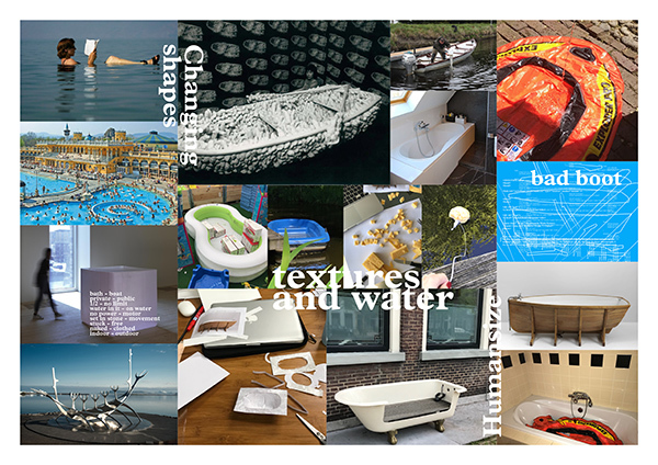
So during my research I was interested in the contradiction of the original artwork. And so I started thinking of other contradictions of the bath and the boat. And came to public and private, this was to me the most interesting so I continued on that. After that I also started looking at different kinds of baths and boats to see how I could use them in a different way if I wanted to.
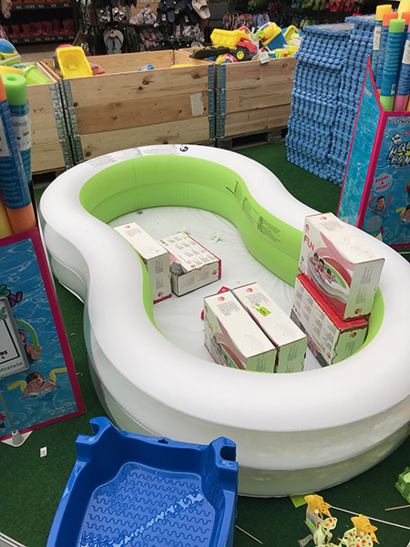
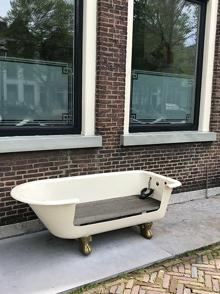
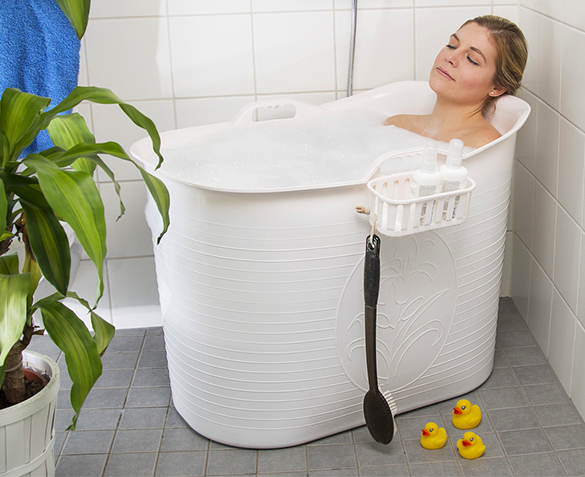
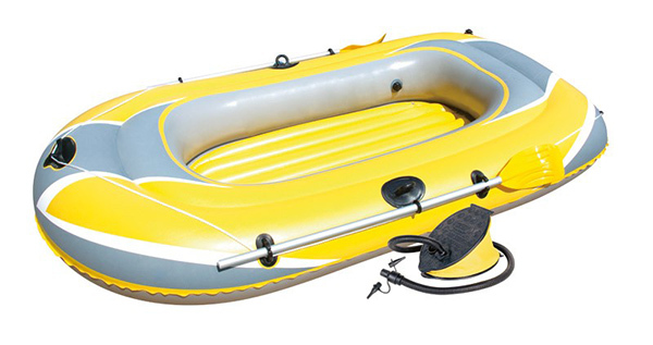
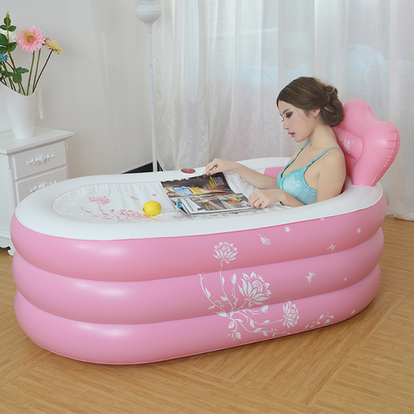
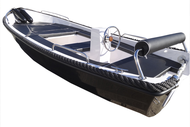
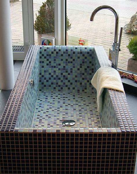
So these images from my research helped me come to the decision of choosing the uninflated inflatable boat. I found a lot of images of boats and baths made from that material and so I thought this was a nice way to find a balance. Then I chose to not flate the boat, because then to me it would be to much of a boat and I wanted it to be both the bath and the boat.
Research visualisation
Final presentation
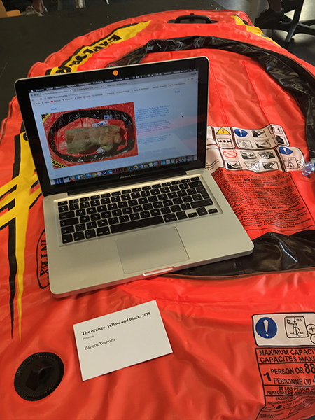
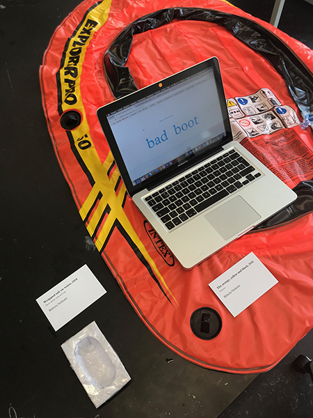
I brought the inflatable boat to the expo, because I wanted it to be a part of the way I presented it. But this object is not my contemporary transportation, I used it as a prob to visualize the difference between a bath and a boat and I wanted to use it as something that is in between those two. But it is really about the pictures on the website that I made. That is the final transformation.
