User:Floor/week6
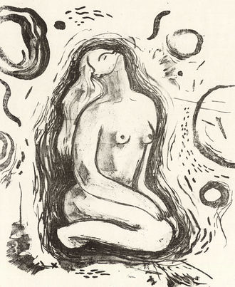
Lithography part 2
The lithography experiment continues...
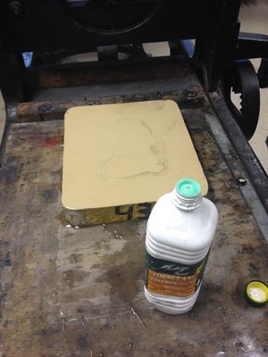
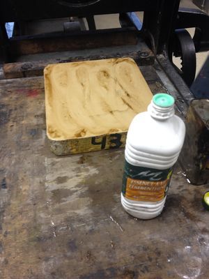
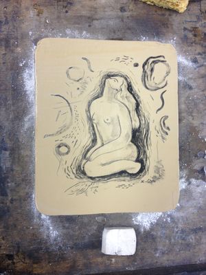
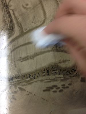
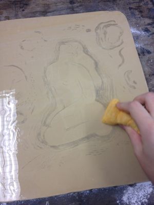
This day involved a lot of chemicals and substances being put onto the surface, then being removed again, the image being 'erased', and coming back again.. I honestly have to say I can't quite remember every step of the process exactly, due to the amount. Anyhow: the properties and effects of two substances are especially important to the process of creating a lithograph print: 1. 'arabisch gom' is only soluble in water. 2. grease repels water, and allows ink to stick to it.
After removing the 'gom' mixture using water, you have to wash off your drawing using turpentine. This looks and feels strange, but the design hasn't really disappeared. The grease still sits in the pores, and therefor it still repels water.
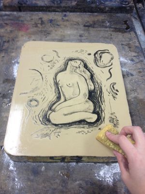
Then you use a very tough kind of ink (that becomes soft when you move it?) and roll it onto your stone, revealing the design. Then you clean it off again.
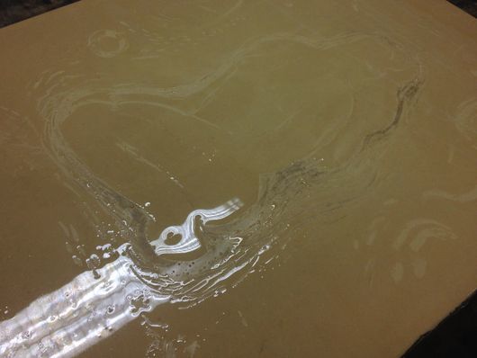
And bring it back once again.. This time using the actual printing ink. You have to keep the surface wet constantly so the ink doesn't stick to the blank parts of your design.
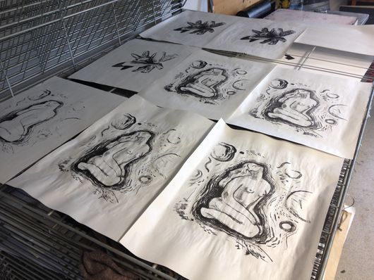
I'm sure I missed a few in-between steps.. It's really quite a lot, but once you have it ready, the printing part is easy and fast. Therefor it is not surprising that this was a very popular and commonly used printing technique.That is, before they invented offset printing, which is actually very similar to the way lithography works.
Start on statement and artefact
For my "Why I Make" statement I started by reading over my notes and highlights on the texts from this quarter and picking out quotes that I felt I could relate to.
I also started thinking about what really drives me to make, to create, to draw.. This seems to be the central 'theme' this year, starting with my first illustration assignment of the year, in which we had to present ourself and our identity as an illustrator/artist/maker. And most recently: the 'competentie assessment'. In which you are also 'forced' to reflect upon your progress, work and aspirations for the future. Through all these assignments it is slowly it is becoming more and more clear to me what my drive is, why I do what I do and what I want my work to communicate.
I think what is most important to me is that I can be vulnerable through my work. I can visualize and communicate how I feel inside. I want to make images that are sensitive, intimateand symbolic. I want to connect to people through these emotions that everyone has, but few express. Sometimes it can feel like you're all alone, and it can be very comforting to see that you're not.
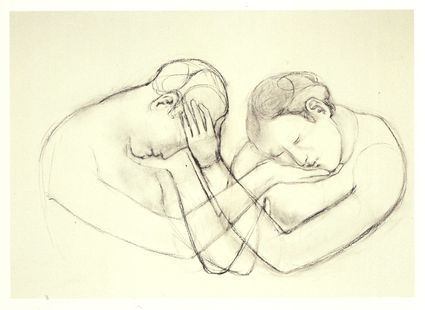
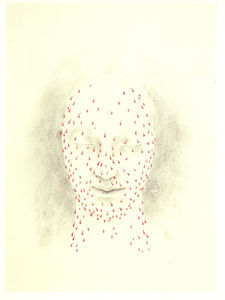
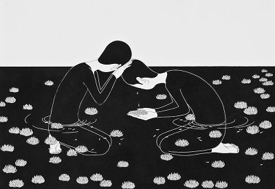
Juul Kraijer and Moonassi are two artists who make beautiful, sensitive and symbolic images that inspire me very much.
Juul Kraijer
Moonassi
For my artefact I want to do something with this vulnerability, sensitivity. To let the technique and material express this. Maybe playing with something that can be hidden and exposed, or using some sort of translucent material. The first thing that came to mind in the brainstorm during class was to paint symbols and images on a persons body and photograph them. And then to print the photos in the dark room, using light-sensitive paper...
